REFLECTION //
Albert's connection has been an inspiring project that has generated some really interesting work and will continue to do so as some of this work becomes realised for the design festival in May.
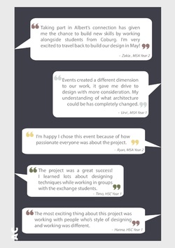
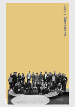
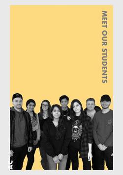
In the image above the first and second year Manchester students along with the Coburg students shared their thoughts on the Albert's Connection project.
Posted 6 Apr 2019 14:03
FLIGHT HOME //
After 11 days of hard work it was time to fly home. The event was a great success and this was made easier by our host university and their warm welcome and great hosting skills. The students cannot wait to get back out there to build and realise both group three's and group five's designs.
Posted 6 Apr 2019 14:01
WINNERS //
After an energetic debate the jury decided that group three had highlighted a key aspect of the site through there curtain. As a result they wish to construct this aspect of their final design. They believed that this visual metaphor was enough to highlight the juxtaposition of the state of the site.
On reflection the mixed groups form Manchester and Coburg gained a lot of experience through the schools differing approaches. With an emphasis on the technical side the Coburg students learned a lot from the Manchester students approach to site analysis. Also the Manchester students learned technical details and construction details from their German peers.
Posted 6 Apr 2019 13:50
WINNERS //
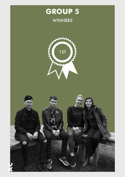
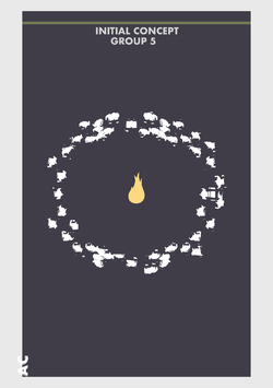
The jury felt that group 5 had a strong concept from the beginning and have found a program that will draw people to the space and encourage them to stay and engage with one another throughout the evening, ideal considering the small number of spaces that accommodate Coburg's nightlife.
On reflection the mixed groups form Manchester and Coburg gained a lot of experience through the schools differing approaches. With an emphasis on the technical side the Coburg students learned a lot from the Manchester students approach to site analysis. Also the Manchester students learned technical details and construction details from their German peers.
Posted 6 Apr 2019 13:47
LIBELLE //
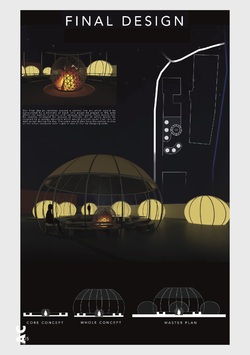
Final Design
What was particularly nice in Libelle's project was the fact that they had developed stages of priority when it came to their design being realised, with the fire pit as the core concept, the canopy and seating around the fire as the whole concept and then the added illuminated tents as final master plan.
As a joint participation, both projects will continue to be developed and refined by all students involved in the design festival competition to represent Albert's Connections competition entry. All participants of this events project are looking forward to our return trip to Coburg in order build and realise the hybrid of both spatial interventions, used by Creapolis, the community of Coburg and competition entry.
Posted 6 Apr 2019 12:42
LIBELLE //
Development Design
It was very impressive how the team edited their work to make sure the things they were presenting were clear and really sold the project without putting things into their presentation that were unimportant or didn't add to their story. It was also good to see how the group had been thinking about how their design would actually be constructed looking into materiality and detailing.
Posted 6 Apr 2019 12:41
LIBELLE //
Concept Design
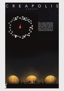
The jury felt that their initial tool of fire to bring people together was a really impressive theme as it has a history that runs through the whole of humanity. They also felt that this theme fitted well with the site as it would introduce a new life to the sight in the evenings illuminating the site in new ways.
Posted 6 Apr 2019 12:40
JURY VERDICT //
Libelle and MCO are the winners!
Libelle presented a high level of work with eye catching atmospheric visuals and detailed models which caught the jury's eyes and established them as the joint winners alongside MCO - Schwelle. Their key concept of the element fire was evident in every part of the design which impressed the jury greatly.
Posted 6 Apr 2019 12:40
MCO //
Final Design
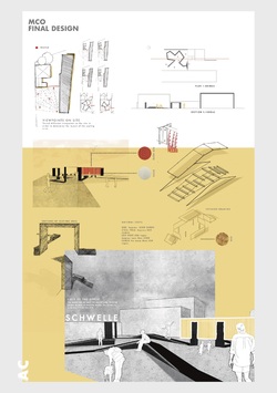
After an intense two week project, group 3 worked comprehensively as a group, using the knowledge and skills from both Manchester and Coburg students, to execute a well-designed and stylistic presentation that the jury was highly impressed with.
Posted 5 Apr 2019 20:09
MCO //
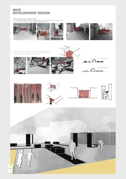
Development Design
The jury also determined how the position of the curtain threshold outlines a past building façade that use to be present on the site, enhancing the design proposal to consider a significant historical connection between the site and artist experience of the curtain.
Posted 5 Apr 2019 20:08
MCO //
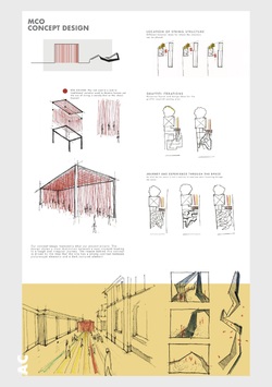
Concept Design
Collaborating MCO’S artistic approach to the spatial invention with the social and useable spaces designed by Libelle would work cohesively for both Creapolis’ functionality as well as elevating the atmospheric experience to the site.
Posted 5 Apr 2019 20:07

JURY VERDICT //
After a tough deliberation between all participating design project proposals, the jury found potential in elements of all projects. However, ultimately agreed on the realisation of two spatial interventions that mutually displayed the strongest proposals to the sites framework; community of Coburg and the buildability of each installation. Therefore, the jury established a collaborative design to be built for the Design Festival Open over summer.
With that in mind, a huge congratulations to the winners: MCO (Group 3) and Libelle (Group 5)!
MCO //
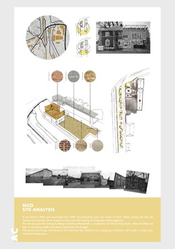
Site Analysis
After presenting a very thorough and well-defined proposal, the jury seized a direct interest to the threshold transition of the red curtain design to their proposal. They believed the reveal of the ‘dark side of Coburg’ was an interesting concept to explore and refine to a greater potential. The evidence found of the initial perception Coburg being observed as picturesque and a well-kept place compared to the groups discovery of the ‘rough and ready’ quality that Coburg doesn’t yet celebrate would be an interesting concept to reveal to the community that they might not have been previously aware of.
Posted 5 Apr 2019 20:07
THANKS //
We would like to thank all the first and second year Manchester students for the commitment to the Alberts Connection event. They have all created amazing schemes with exciting concepts in such a short time. We would also like to thank the Coburg students for being amazing hosts and participances for our event. Their local knowledge and aptitude for construction grounded every scheme into the context of the site and made them buildable. We look forward to returning to Coburg to build the winning schemes.
Posted 5 Apr 2019 19:38

GROUP 1 FINAL PRESENTATION //
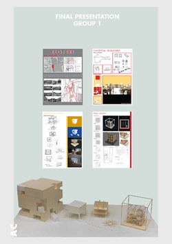
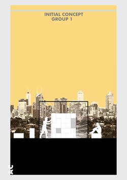
After being introduced to the site by Dr. Marcus Neufeld, Group 1 were very surprised that the facilities and the opportunities that laid right by the university and suburban area of Coburg was so underutilized. They began their presentation by pointing out how their initial response was grounded on the current use of the site as they found out by talking to students that: ‘The general opinion was that Creapolis is often overlooked by the public and not many people are even aware that it exists.’ Therefore, their goal was to solve this issue. They started by thinking about how they could create a beacon where the people of Coburg are drawn to.
In their initial observations of the site they saw that the bridge acted as a spine connecting the suburban area into the inner city. Residents of Coburg circulate around the site as a part of the daily routine to work, to school or into the town centre. They wanted their spatial intervention to become an alien imposing on their routine.
Then, they talked about the metaphor of the game Klotsky that they used as an initial idea, that has one key piece that is central to the game but is flexible too. They wanted people to directly interact with the space and their key drivers were: meet, stay and event. To realize their proposal, they played around with the idea of a fixed central space with a flexible space around it. From this they explored many iterations, until their final proposal.
They talked about their first design idea that revolved around having a 7x7 grid cube structure made up of blocks which could be used for different seating arrangements. This overall structure is 3.15x3.15m and would be framed by a scaffolding and another scaffolding structure literally framed the installation visually. On the frame they proposed to have spotlights illuminating the inner cube structure, to create this beacon object.
After that they found that perhaps although their structure would be visible from many key views, it wasn't large enough to act as this attraction that can draw people in from all around, so they scaled up the structure to almost double - creating this two storey structure. Although, with this iteration they thought they lost the playful aspect of their design as to make it structurally sound it needed to have some fixed spaces. Nonetheless, this was an important step in their design process as it was here that the group began to explore the idea of an interior space as part of the design, discussing the voids that could be left behind when blocks are taken out.
When describing their final design proposal, the group mentioned that they wanted to create flexible spaces to give the users the opportunity to be creative and interact with Creapolis in a playful way. By removing ‘pieces of the game’ and adding more the users could create dynamic spaces in which they could read, chat with friends, play games, be creative and ‘make a space’. The group aimed to offer freedom to the users by not establishing a predetermined program.
Posted 5 Apr 2019 17:54

GROUP 2 FINAL PRESENTATION //
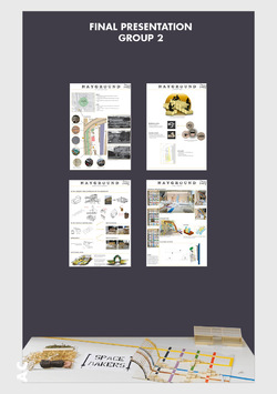
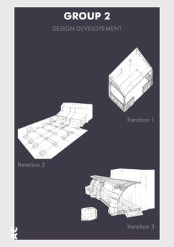
Group 2 started their presentation by first giving a thorough introduction into their site analysis. They considered the access on the site, the different views within it and the range of textures and materials found there.
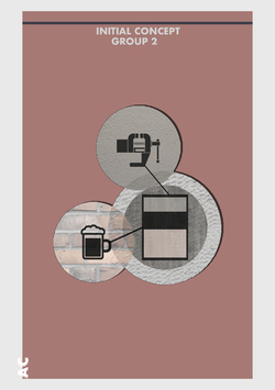
Then they presented their initial ideas that started from their initial discussions with Dr. Marcus Neufeld. They found out from him that Creapolis wants to extend their workshop space so one of their initial ideas was to create an outdoor flexible working space. They also wanted to create a space for people from Coburg to meet and spend time together, therefore they thought of making the outdoor space multifunctional so it could also be used as a beer garden. Beer gardens originated in Munich in the 19th century and they are very common throughout Germany, but it seems that the city of Coburg has only one.
Next, Group 2 presented their initial models. When they first modelled the design, they considered the use of the existing gridline pattern from the surrounding buildings. They emphasised this gridline by drawing coloured lines on the pavement between the workshop building and the cool house. They also matched the timber framing of their proposed extension with each pillar on the existing workshop space. Then they modelled the hay cubes that would act as the seating arrangement for the public. What they realised was that the two functions were disconnected, therefore they had to find a solution which would merge the two together. They resolved this by incorporating the cubes themselves as part of the workshop structure, that way they created a link as to why the hay cubes are being used for the multipurpose space.
They approximated the cost for the hay bales to be around 2000€, as they estimated that they would need 200 straw cubes which costs 10€ each. They concluded that the 4000euro budget is probably sufficient to build the workshop.
Posted 5 Apr 2019 17:53

GROUP 3 FINAL PRESENTATION //
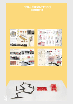
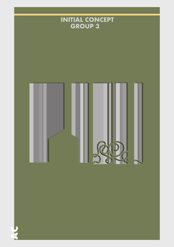
The scheme proposed by Group 3 was initially developed from the site analysis, sharing a strong connection directly to the site and this is displayed throughout their project. They started off their presentation by describing the site’s history and its current conditions. They identified the numerous textures and materials found around the area, the red brick, concrete, OSB, and stone and concluded that each of these textures bring a different quality to the site giving it a strong identity. They picked on the visible contrast between the slaughterhouse and the very neat, clean facade of the Creapolis building and used it as a starting point for their design process as they wanted to emphasise this contrast. The site has two different types of buildings. One has a very clean and appealing facade whereas the other has a rough, graffiti wall. These two different features bring an interesting personality to the site and give it a strong identity. Group 3 wanted to emphasise and celebrate this contrast within their design. Coburg is seen as a very picturesque city and they wanted to explore its almost non-existent dark side.
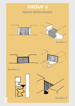
Their Concept image represents this idea of contrast which they wanted to emphasise by making a border and transitional experience for users which lead to the idea of a stringed structure. They decided to use the colour red because it resembles a red curtain within a theatre and it represents the suspense of not knowing what is going to happen behind this curtain. Rather than having an actual curtain they thought strings would be a better option, so people can enter from any point rather than directly from the centre.
They continued the presentation by talking about their different iterations for the two experiences. The first iterations they did was for the string structure. They decided on a timber structure with a grid pattern as the roof that will allow the red strings to be attached. The iterations highlight how they want to implement the graffiti which is already visible on the site into their design. Translating this through harsh, strong black lines that will vary in height and rise from the floor. This interesting angular pattern will contrast the flowy and inviting pavilion.
They talked about how they want the users to experience the contrast of the space by following the coloured pathway into their proposed vibrant and inviting red pavilion and to get the users to feel excited. After experiencing this they want for the users to feel the complete opposite when seeing the harsh black lines, painted in different angles along the floor.The graffiti inspired pathway is there to make users question what they are walking upon, the idea is to make them feel an emotion different to when experiencing the string pavilion. Users can socialize, meet and use this interesting and adaptive space for performances.
Next they talked about their first initial sketch model and how from there they improved the design further as they decided to create a single curtain of string that will be attached to the side of both buildings. By doing this it makes it feel a part of the site rather than an addition. Another detail they decided to change was the multi-coloured stripes leading the individuals to the site as the colour and visual appearance of the red strings was enough to attract people to the space.
Then they described the seating area concept that was developed from the idea that this would reflect the graffiti on the walls and mimic their harsh, bold lines. The reason for the colour black was that is represents the roughness of the space. After creating a number of sketch models, they drew the different viewpoints within the seating area from an individual’s perspective. Having these viewpoints enabled them to determine the best areas for arches and seating spots. The iteration they decided on is a route which travels around the site and offers good views. This has six seating areas and three arches. The ramp and arches will be built from OSB and this is an exploded structural detail highlighting the different components of the ramp.
Lastly they spoke about costs and how the pricing of the materials used for their proposal will be within the 4000 euros budget. After some research into manufacturers and costs they concluded that the OSB will be approximately 2000 euros, the steel pole 250 and the red string less than 1800.
Posted 5 Apr 2019 17:53

GROUP 4 FINAL PRESENTATION //
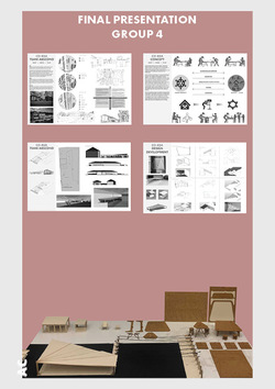
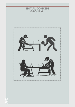
For the final presentation Abscond first discussed how impressed they were by the Creapolis Makers Space and how it was a shame that it was so underutilised by Coburg’s general population. As a result, they developed a program they coined ‘Co-Kea’ (Coburg Ikea). To be launched at the Campus Design Open Festival Co-Kea would demonstrate to the locals how to make simple beautiful furniture including tables, chairs, stools and more, using their step by step instruction manual that would utilise the free materials and tool available in the Creapolis Makers Space. The result of this program would increase the number of people using the makers space and better integrate Coburg university’s students into the local community and vice versa.
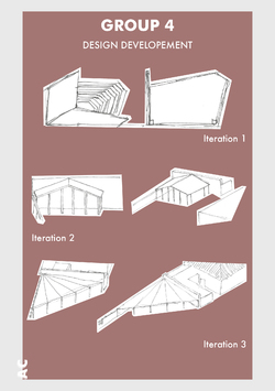
Further to this Abscond propose to extend the workshop by building an external workspace that would also act as an exhibition space during the design festival. Built against the exterior wall of the workshop the timber framed construction would fan out over the sight creating a large canopy. The roof would be made from ‘Eisengarn’ which translates to ‘Iorn Yarn.’ Eisengarn is a strong waxed-cotton thread that was invented and manufactured in Germany in the mid-19th century. It is made by soaking cotton threads in a starch and paraffin wax solution. The result is a lustrous, tear-resistant yarn which is extremely hard wearing.
Posted 5 Apr 2019 17:49

GROUP 5 FINAL PRESENTATION //
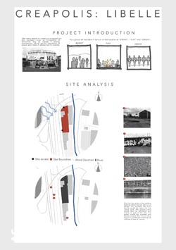
For the final presentation Libelle first spoke about the origins of their concept. It came from our first meal with the Coburg students which was around a long narrow table, the Manchester students at one end, the Coburg students at the other. The separation was clear and it wasn’t until later in the week when they where put into mixed teams that the students got to know one another. Have discussed that first day with one another they spoke about how much better the first meeting would have been if we where sat around a circular table where everyone could see one another and group discussion was encouraged. This lead to the team looking into experiences that encourage this type of gathering and their conclusion was a camp fire.
The team then discussed how a combination of wind study, sun path and view points on the site led them to ground this fire in a specific area on the site. This location allowed for long vistas from north to south meaning that the fire could attract a crowd from a distance as well as it being seen from the highway bridge and the train tracks. The fire would also be protected from the prevailing wind by the executive villa and a canopy.
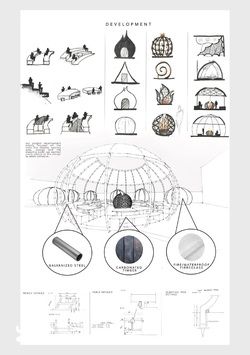
Taking inspiration from their name Libelle, German for fire fly, the team increased the number of light sources on the site by adding tents made from a steel frame wrapped in a translucent canvas that would glow from internal light sources giving the whole site a warm comforting feeling on a summer’s night.
Looking further into material choices the group decided to make much of their construction specifically the base platform, the large canopy and furniture out of carbonised wood, this would make the build cheaper whilst also reducing potential fire hazards. It would also be aesthetically powerful as in the day the installation would contrast with the bright graffiti and at night create a powerful silhouette that would frame the fire.
Posted 5 Apr 2019 17:48

LECTURE //
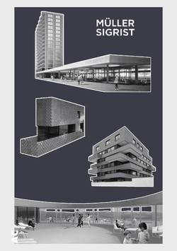
On Tuesday the Swiss firm Müller Sigrist Architects presented a lecture to the students. Founded in 2002 the practice focuses on a lot of mid to high density residential as well as community orientated projects. Through their bold use of colour, they aim to create new cultural nodes within the environment they build in.
Their first significant project was realised in 2005, the ‘Municipal Administrative Center Affoltern Am Albis.’ The building offers two big gestures to engage with the public, first is the large canopy at the entrance of the centre facing the existing market square. The canopy welcomes the visitors and serves as a generous, covered market area. The coloured roof glass forms beautiful light reflections on the floor, which correspond with the yellow-green colour of the glass façade of the building. The second gesture is the convertible community hall. Decorated in different shades of red, with large cylindrical light falling from the ceiling, the room provided opportunities for the community to use the space as they wish from a performances space, to a banquet hall, to market hall.
This lecture was very inspiring and although the students are only designing a small scale instillation it made them think about how bold colour can have an interesting impact on a space and the environment it creates.
Posted 5 Apr 2019 12:51
PENULTIMATE DAY //
Today is the final day for the student's to refine their projects and presentations in preparation for the jury tomorrow. We have given the groups a deadline of 6pm tonight so that we can open up the studio/exhibition space to the staff and students at the Campus Design. This will be a nice opportunity to preview the work before the students present tomorrow.
The emphasis today has been on competition presentation. The student's have been concentrating on presenting their projects in a way which tells a clear narrative and can be easily understood when the jury look back over the work during the deliberation. The Co-ordinators have also been setting up the room ready for the students to present their work and models in a professional way.
Posted 2 Apr 2019 13:04

WORKING MODELS //
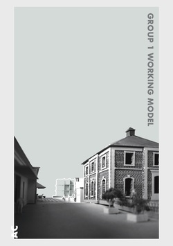
Group 1
Implementing their interest of visibility through their design brief, group 1 needed to define where on the site their spatial intervention would be sited in order to evoke the people of Coburg to come and engage with the space. This was determined by situating their working model onto the site to capture and experiment with different viewpoints and scales. Initially, their design was composed of a 7x7x7 component, however revealed the scale was too insignificant which did not create an impact to the site and propose the ‘beacon’ first implied. To resolve this issue, they decided to implement a raised platform to ensure the installation would be visible over the surrounding facades of the buildings. Also, doubling the scale of their whole design created a greater impact to the site and emphasising the concept of the Klotsiki game.
They finalised the specific location of their game-inspired intervention to be visible from the main pedestrian access route through the site as it revealed a main source of attraction in relation to the surrounding buildings. In addition to this, with their illuminating beacon, the light would also disperse down through the passage alongside the slaughterhouse and Creapolis building to create an further point of inquisitiveness.
Posted 2 Apr 2019 12:52

WORKING MODELS //
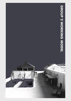
Group 2
Since the site analysis demonstrated by group 2 previously determined the location of their spatial intervention, the model was utilised to gain an understanding of how to apply the use of levels and perspectives to this zone and design key points of interest to this space. It began to form a visual understanding of the spaces to which the people of Coburg would engage with, by extending the grid systems of the surrounding buildings onto the site. When modelling this, they matched the timber framing with each pillar on the workshop space to derive the design of the hay cubes that would act as the seating arrangement for the public.
This enabled them to visualise and form basic guidelines to bring a sense of order to the reuse of scattered objects found within the site boundaries in a three dimensional form. Also, it made them aware that the two functions were disconnected. Consequently, they had to find a solution to which would merge the two together. As a result, the addition of incorporating and extending the hay cubes into the structure of the workshop shelter would act as a link between the multipurpose spaces.
Posted 2 Apr 2019 12:14
WORKING MODELS //
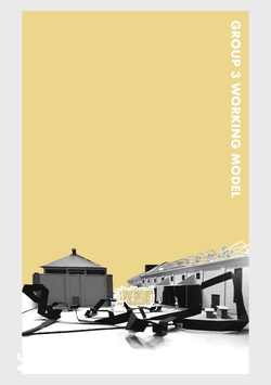
Group 3
Through their analysis of the site, group 3 revealed a significant location within the space to present their transition between the contrasting identities of Coburg. By creating a model they were able to visualise how their wall/curtain design would affect the site with the idea of the interaction of the change between the two spaces. This also under covered the scale of their wall/curtain was too large for the specific location, as a result they reduced the scale of this element to their design.
In addition, to explore and develop their idea of a visual journey, they began to implement different paths through the external space on the model to apprehend how this would be designed to create an experience celebrating the contrasting qualities, as well as useable sociable areas for people to engage and interact with.
Posted 2 Apr 2019 12:12
WORKING MODELS //
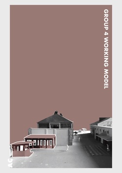
Group 4
Using the site model, it allowed group 4 to place their concept design idea in context. Therefore, were able to gain an understanding of how to develop and elevate their design, in a three dimensional form, making it more site specific and visualise the spaces created. Following this, it enabled them to continue to produce both sketch and physical models, using a mix of materials, to develop their design and show a stronger connection to their concept to build together as a community.
Reflecting from this, it made them consider redirecting their concept down a more refined direction to make their spatial invention achieve a more attractive and systematic approach to benefit the location of the site and the community of Coburg.
Posted 2 Apr 2019 12:09
WORKING MODELS //
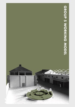
Group 5
Once group 5 positioned their model on the site, it was clear that the fire pit and seating was the fundamental centre to their invention. Therefore, the addition of the shading canopy extending over the workshop was no longer an element to their design proposal, though did make them aware of the scalability of the fire pit to be of greater significance, emphasising its importance and connection to the site. Additionally, it made them consider how the light produced from the fire would illuminate the site, making it viewable from the surround area giving the space a warm and inviting atmosphere for people to explore.
Posted 2 Apr 2019 12:08

DESIGN DEVELOPMENT //
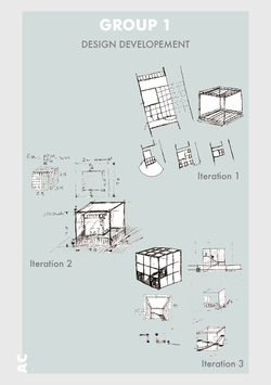
Group 1
'Our design began looking into movable modules that offer several different kinds of spaces for certain programmes with the various configurations that were possible. These modules would move sliding along a train track system. This idea manifested as a variation of the game of Klotski, which was a basic wooden block puzzle, where you rearrange the blocks to solve it.
Moving on from that point, we began to question the purpose of the original purpose of the installation and going taking out design back a bit, we investigated how we wanted to attract people to Creapolis and the Makerspace. Following that idea, the form of our installation evolved into this cube structure that would act a beacon, catching the attention of people passing the site. At this point in the design we started to consider the scale of these modules and reverted to smaller blocks that could be used as seating and stacked to form partitions, allowing for the different configurations that we planned for before. When modelling our design, we found that although we had managed to incorporate movable modules and embody the playful aspect of the game in our design, it would fail to be the beacon that we intended and so we scaled the whole design up to nearly double to create this immense mass that could be seen from nearly any angle and would surely attract attention.’
For the buildability of Klotski’s design they have been exploring modular ways of creating this large cubic structure. One of these system was to use scaffolding, within this process their are many ways to achieve the desired outcome of the structure. There are also load and wind calculations to factor into the final form.
Posted 2 Apr 2019 11:06

DESIGN DEVELOPMENT //
Group 2
'Initially, our idea consisted of a geometric structure which was up against the the workshop as a type of extension. The timber frame would match the columns and would be expressed through the construction and the floor to form a gridline pattern, with which the seating is arranged for public use. In addition to this, we were thinking of how to merge the workshop with the seating space. In order to resolve this, we came up with a proposal of incorporating the hay bale cubes into the construction, these would be stacked onto of eachother to form the front ‘columns’. An advantage of this is that you can easily grow plantlife directly onto the hay.
This modular system that Space Maker’s are deploying will aim to be interchangeable along the inferred grid lines. Although these aren’t fixed to the grid lines the mere suggestion of this rule, should make the user stick to the layout. However if these aren’t used then there is a freedom for he user to create different spaces to work and play.
Posted 2 Apr 2019 11:05
DESIGN DEVELOPMENT //
Group 3
'We began with the idea of a red string pavilion and wanted to create an interesting experience for the users and create a ‘threshold/schwelle' between the different identities of the site. However, we realised that this may be too large for people to pass through regularly, so we decided to convert it to a wall/curtain.’
The key to this design is create a heavy and clean threshold to the site, in order to create a drama and theatre to reveal the chaotic nature that lies beyond this border. The red used is a nod to traditional curtains used in theatre houses yet the use of string is merely hint at the chaos beyond.
Posted 2 Apr 2019 11:04

DESIGN DEVELOPMENT //
Group 4
'Since starting the project at the Slaughterhouse, we have had various designs linking back to our concept, still finding the one idea that fits perfectly. Allowing the community to build their stay. We aim to provide the blank canvas, the base structure and the basic diagrams to show how this is done. Co-kea will be the future of the slaughterhouse communal area. Would you like a seat? They’re are 5 levels of difficulty. Fancy playing on a football table? You’re going to have to help build it first. Each person will have to create their piece by piece in order to play a game, this principle applies for the football table, the pingpong table and chess pieces that can be 3D printed.
With the existing offices containing various pieces of workshop machinery, our goal is to bring the community together, in an outdoor environment. The outdoor area will be covered by a canopy, sheltering the play space, workshop space and exhibit. Protecting you from harsh weather conditions and also slowing warm air flow in the summer days of the year.’
The main driver behind ‘Co-kea’ is to create a scaled up version of the Creapolis format. This is done by inviting the public into the considered proposed landscape and giving the public a kit of parts and a manual to erect the furniture used in the space. This aims to show the community that how easy and accessible it is to create and share resources.
Posted 2 Apr 2019 11:03
DESIGN DEVELOPMENT //
Group 5
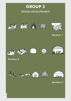
'Our project development mainly focuses on the main fire display, seating area, canopy and the sleeping pods. We wanted every aspect of the design to seem cohesive.’
In order to create a cohesive design, Libelle have looked at the scaleability of the elemental design. This has been achieved by focusing on the circular format taken form the seating of the fire this form has been transformed 3-dimensionally to create a scalable form for both the tents and canopy.
Posted 2 Apr 2019 11:02
WEEK TWO SCHEDULE //
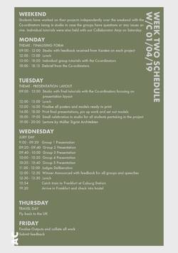
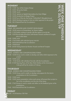
The second week of our events project focuses on form, buildability and presentation. The groups will continue to develop their designs and finesse their project ready for the jury presentation on Wednesday. Each group will have just 20 minutes to sell their project to the jury and so tips on clear, concise and informative verbal presentations will be given to the groups ahead of their review.
Posted 1 Apr 2019 14:23
INTERIM REVIEW //
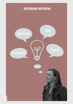
On Saturday evening, Anja and the coordinators had an interim review with each of the groups. The students had to present their design ideas starting with their initial site analysis and concepts and then talking through their developed proposals. Some of the groups made great use of the existing site model as they placed their own interventions’ models on it which made it really easy for us to understand their schemes. As we discussed through the ideas we all made a mental exercise to try to picture ourselves in the created spaces, on the site. This was very important to do as it helped us realize how different people would inhabit the spatial interventions and what the students should consider to further improve in their designs. Going forward the groups were encouraged to think more about atmosphere and construction techniques while also considering the budget. We are looking forward to seeing how each project develops from this point into a fully resolved scheme.
Posted 1 Apr 2019 14:23

GERMAN ENVIRONMENT AGENCY – UMWELTBUNDESAMT //
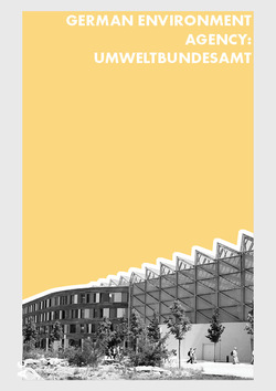
After visiting the Bauhaus, the Manchester and Coburg students travelled across Dessau to the German FEA (Federal Environmental Agency) building. Our tour guide Timo explained to us that Dessau was chosen as the location for the FEA’s headquarters in order to promote the development of the former East German town.
Built on a former industrial contaminated wasteland, the FEA building is a case study for sustainable structures through its use of active and passive strategies for the reduction of energy consumption and carbon dioxide production.
The building, though large, is a compact volume considering the number of users and has a high degree of thermal insulation supported by intelligent engineering strategies and the use of renewable energy sources. It generates energy through the uses of solar panels and preserves energy using a large geothermal heat exchange system. All the building materials were selected according to their ecological suitability.
A large effort has been made to make this building as open to the public as possible through the development of a public park, as well as a public lecture theatre and public library, with most of the literature focusing on the environment. This public engagement has been implemented to encourage an awareness of our impact on the environment and how we all have a responsibility to take care of our planet.
STUDENT RESPONSES //
Zakia: “It was encouraging to see Germanies promotion of sustainable building technologies and the way in which they use the governments needs for office space to engage with regional towns and cities.”
Alice: “The development of brown field sights and the use of the historic fabric of Dessau (the new building is attached to a 20th century train station) demonstrates how the German government has used architecture to integrate its political policy into the local community’s psyche.”
Posted 1 Apr 2019 11:19

BAUHAUS TRIP //
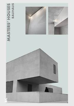
Parallel to the Bauhaus Building, the city of Dessau commissioned Walter Gropius to construct three pairs of identical semi-detached houses for the Bauhaus masters and a detached house for the director. These were built in a small pine wood on the street now known as the Ebertallee.
Gropius planned to build the complex based on a modular principle, using industrially prefabricated components. With this he wished to realise the principles of rational construction, both in the architecture and in the process of building per se. In view of the technical resources available at the time, his plan was only partially realised.
The buildings take the form of interlocking cubic structures of various heights. Towards the street the semi-detached houses are distinguished by generously glazed studios; vertical strip windows on the sides let light into the staircases. Only the director’s house featured an asymmetric arrangement of windows.
After the closure of the Bauhaus in 1932 the houses were let to third parties. The director’s house was destroyed in the war; work on its reconstruction began just a few years ago.
The 5 houses that weren't destroyed have been restored to resemble the original layout and style that was intended for them in 1925. Many questions were raised as to what to do with the reconstruction of the two houses that were destroyed in the war. One option was to re-establish the original design as it was in 1925, the other was to conceptually reconstruct the buildings to resemble a monument or memorial to what was there before. This idea was developed and they proposed to use modern construction techniques while finding new innovative ways to pay tribute to the original design without reconstructing an exact replica. In 2014 Bruno Fioretti Marquez Architects created a new form for the houses which were destroyed in WWII. The exterior vaguely calls to mind the historic Masters' Houses; the interior however is no longer a dwelling, but an exhibition space. The interior spaces have been opened up while still acknowledging the original spaces. This gives the opportunity for you to imagine the space as it was back in 1925 due to the silhouette of the original structure being suggested in the architecture.
An interesting element to the interior of the property was created by Olaf Nicolai and called 'Le pigment de la lumiére (The colour of light). Nicolai schematically utilises two materials already present in the building: the surface render of the walls and the light entering the space. He applied layers of marbel dust with various granule sizes to the walls in a geometric grid, in doing so creating a discreet relief that responds to changing lighting conditions.
Viewing these houses was particularly inspiring particularly the reconstructed elements. It helped the students to imagine how spatial interventions can react to the existing site while also creating new atmospheres for the user.
Posted 1 Apr 2019 11:18

BAUHAUS TRIP //
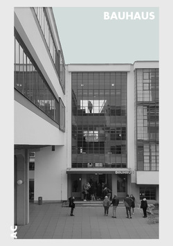
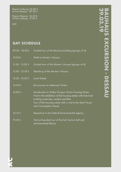
Early Friday morning we and a group of students from Coburg University embarked on three buses for a day trip to Dessau. Our first stop was at the Bauhaus, the former German school of art that was designed by Walter Gropius and opened in 1926. When we got there, we were given a guided tour of some of the most important spaces inside the building and we were presented information about its design and history.
The design of the school was realised as a further development of one of Gropius’s buildings, the Fagus factory in Ahlfeld an der Leine. The Bauhaus building has a curtain wall system that is carried over 3 floors with no opaque spandrel panels which allow views in the interior working spaces. By doing this Walter Gropius tried to create an impression of transparency. The interior fittings were made in the Bauhaus workshops by the different teachers and students of the school. The pieces of furniture were designed to be mainly functional and their components were reduced to simple geometric forms.
The school played a significant part in shaping the modern society after the WWI. The initiators and teachers at the Bauhaus were rejecting traditional knowledge and were trying to radically rethink life, society and the everyday world. Their intention was to create a school of design in which young people could give shape to the modern age and meet its many demands through developing their artistic creativity. Rather than focusing on the individual works of art, they chose to focus on the everyday objects and to explore working with different materials by pushing their limits and manufacturing them on an industrial scale.
In 1928 Walter Gropius transferred the leadership of the school to Hannes Meyer, who placed the focus of the Bauhaus on social aims, being mainly concerned with the question of how well designed products and buildings might be made affordable for all. The students under Meyer became politically radicalised and involved with communism. As a consequence, politicians were feeling threatened so they decided to remove Mayer from its position. Next, Mies van der Rohe took the leadership and he changed the preliminary course by focusing on architecture, constructive logic and free-flowing open space.
In 1932 the National Socialists have got a majority in the municipal assembly of Dessau and they decided to close the Bauhaus Dessau, as they were against the principles of the school considering it to be ‘Anti-German’. Therefore, Mies Van der Rohe had to move the Bauhaus school to Berlin-Steglitz. He directed it from there for one more term, but after many disagreements with the National Socialists he announced the closure of the Bauhaus on August 1933.
Posted 1 Apr 2019 10:57

POPUP HOSTEL //
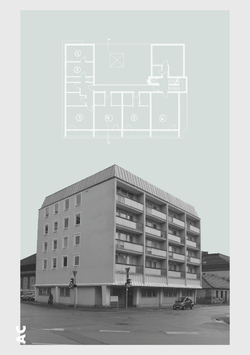
During the lead up to our visit to Coburg, our hosts from the university were tasked as a small internal project to design and set up a popup hostel to accommodate us for the duration of the events weeks. In the hostel there were five rooms that needed to be designed, each with a different concept theme to create interesting and distinct spaces throughout the rooms. In addition to this a kitchen, shower facilities and communal living space were also created to ensure a comfortable stay for our time in Coburg.
The three rooms located at the front of the building all have balconies facades, capturing the morning sun that looks over the quaint streets of Coburg and its German architecture. Across the street is the gothic Heilig-Kreuz church that rings its bells every quarter of the hour, not to mention its 7:00am wakeup call with a whole minute of bell ringing. Meaning no excuses turning up late for a full day in the studio!
Room 1
Room 1 was painted full grey with dispersed beams of yellow geometry around the room to signify light sources within the space, extending from the walls onto the ground. One beam centred from the corner frame of the window to symbolise the incoming natural light through the window. The same effect was then replicated with the ceiling light fitting to create an abstract illumination pattern around the room. The overall use of the painted geometry also provided a more comfortable space to occupy as the bright colours made the long narrow space feel a lot brighter.
Posted 31 Mar 2019 16:39
POPUP HOSTEL //
Room 2
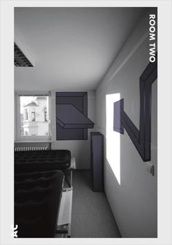
Due to room 2 being the smallest out the five and only being accessed through room 1, the aim of the space was to increase the volume and give it a more welcoming atmosphere with the use of colour. Taking inspiration from Tape Art, the hosts designed different motifs within the space to create perspective illusions, concentrating of the corners of the room to create a sense of a greater scale to the room. The illustrations were designed with black edges and filled with high contrasting block colours of yellow and green to create a fresh and friendly atmosphere to the overall design. The inspiration from the Tape Art was then carried through the furniture within the room which used the same design and colours as the walls, completing the space as a whole.
Posted 31 Mar 2019 16:37
POPUP HOSTEL //
Room 3
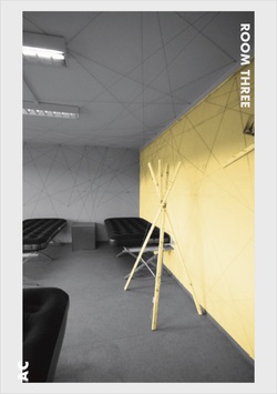
Room 3 took inspiration through the connection of Albert between Manchester and Coburg. The lines designed around the room were ordered in a random formation that showed links between the two different places, connected with historic imagery relating to Prince Albert. Even though the lines were designed in a chaotic formation, the lines spanned from one corner of the room to the other, covering both the ceiling and walls, which all meet at a final connection. As a contrast, the remaining walls were painted in a plain light grey tone, giving the space a distinction between the chaotic line design around the room but using a similar shade to the black and white imagery of Albert. Continuing the theme of the space within the furniture design, the hosts designed lamps and side tables with a rustic appearance that reflected the old historic photographs visible around the room.
Posted 31 Mar 2019 16:36
POPUP HOSTEL //
Room 4
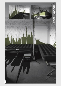
Room 4 was designed with the inspiration to highlight the connection between Coburg and Manchester by illustrating their skylines, included both university buildings. In addition to this, the design of threads used around the room suggest the connection between the two cities but also blurred the contours of the room. In order to provide a sense of privacy to each sleeping compartment, the hosts built partition frames between each bed and designed personal storage, reusing beer crates to give each guest the facilities to store their personal belongings. Overall, their main intention was to create a space offering a pleasant stay for their guests in Coburg.
Posted 31 Mar 2019 16:35
POPUP HOSTEL //
Room 5
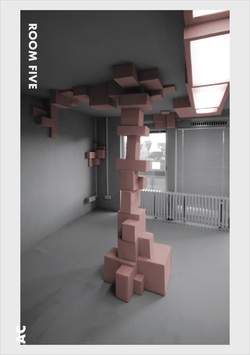
The idea behind room 5 was to change the structure of the space. Therefore, the hosts designed the addition of hanging and standing boxes in different formations around the room. The box designs on the ceiling and walls intended to break up edges of the room, but also provide shelving to store personal belongings, and the column in the centre of the room was designed to form a zoning component for the sleeping arrangement. The choice of using light monochrome colours was in order to provide a strong contrast between the shadows formed from the geometry of the box structures, but also create a sense of softness to the room.
Posted 31 Mar 2019 16:33
SITE ANALYSIS //
Group 1
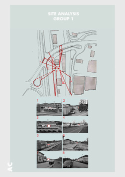
The key driver on the site for Group 1 proposal is the visibility as their aim is to draw the attention of the public to the site. With the network of roads surrounding the site and the frequency of car travel, the site and their installation would be seen from nearly all angles. In addition to this, there is the train line which goes along the West face of the site, which can be a key source of attraction.
Posted 28 Mar 2019 16:14
SITE ANALYSIS //
Group 2
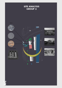
Group 2 have presented a focus on materiality on the site; identifying stone, tarmac, brick and wooden pallets and the location of these materials. As all materials appear to congregate in one particular area in the space, it has formed an interesting opportunity to explore this specific zone, as highlighted in red, further to form a potential location for their spatial intervention.
Moving forward, they began to capture viewpoints of their identified zone from different perspectives and levels, this has made them aware that their design will be visible from multiple locations around the site.
Posted 28 Mar 2019 16:11
SITE ANALYSIS //
Group 3
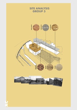
The site analysis executed by group 3 instigated from the particular interest towards the contrast of buildings found on the site. The high contrast between the “nice, clean buildings” compared to the “exposed, rough types of buildings” emphasised a strong distinction between these typologies; using this concept to translate through their proposal by celebrating the contrast between the use of existing materials as well introducing new elements into the space.
The materials discovered on site comprised of red brick, concrete, plywood, ceramic blocks, wood and stone. To which the group highlighted how each texture brought a different quality and identity to the space. Therefore, initiated their consideration to how to move forward with introducing new elements into the site and how these could work alongside the existing materials of both the slaughterhouse and Creapolis building.
Posted 28 Mar 2019 16:11

SITE ANALYSIS //
Group 4
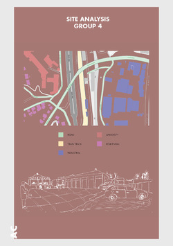
Group 4 did a good SWOT analysis of the site.
Strengths:
- The floor are and size of the given site is quite large and rectilinear, providing great design opportunities
- The Coburg train station is located on the north with the main highway running on the west, providing transport connections
- The sunpath convers the entire site throughout the day
Weaknesses:
- The landscape on site is in disorder, with unattended vegetation at the front of the cool house and the office as well as at the back
- The given site is relatively dull, and is not lively nor inviting
- The existing buildings on site have a monotone colour scheme
- The site is quite far from the city centre and train station; it is not convenient to get to by foot
Threats:
- Noise levels on site are great as the site is located adjacent to a main highway and a train track
- Winds will mainly be blowing from the South to the North-West; the surrounding and existing buildings aren’t tall, therefore the given site is exposed to strong direct winds
Opportunities:
- Since the site isn’t lively nor inviting, we could utilise our communal hub to enliven the site with a variety of events and provide a grand entrance that leads the users into an experience
- With the dull surroundings and monotone colour scheme of the existing buildings, we could bring colour and artificial lighting into the site
- In terms of materiality, wood is the best to use within our design as it can be sourced locally and is a sustainable material
Posted 28 Mar 2019 16:09
SITE ANALYSIS //
Group 5
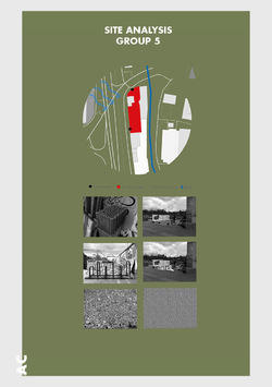
The Site has quite a few existing features which Group 5 can use in their design. For example the brick blocks could be used for the raised deck, the bicycle stand would also be refinished and remain as part of the site. The gravel could be crushed and placed around the fire to help control it, whilst still allowing the ruffness of site to remain.
The site has an industrial feel which can be relate back to Manchester. The loaction being beside the train station adds to the affect. There is a graffiti wall separating it from the street which adds character to the site and the group think it should remain like that. It also creates a relationship between the site and the nearby river ITZ as it too has decoration hidden by moss, which was the main inspiration for this idea.
Posted 28 Mar 2019 16:09
PRESENT //
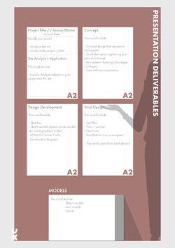
Today we set out the parameters for the jury presentation next Wednesday. The work will be presented in an exhibition format so that tutors and students from the university will be able to view the work after the presentation. This presentation should showcase the skills the students have developed over the events period in site analysis, concept design, competition design, construction and presentation skills. It will be interesting to see how each group will have developed their own approaches to the project as well as the different ways they have evolved each of their presentation styles through working as a team.
Posted 28 Mar 2019 14:26

LECTURE //
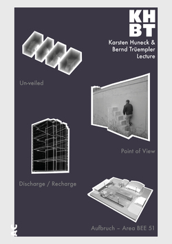
On Tuesday evening Karsten Huneck and Bernd Trüempler from KHBT presented to the design campus as part of a student led lecture series. These lectures are available for the entire design campus school and are also open to the residents of Coburg.
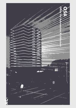
The lecture featured several of their own practice work, alongside some of the work that has been undertaken though their other collaborative collective, Office for Subversive Architecture (OSA). Below are a few of the projects presented within their own words;
Un-Veiled
To mark the launch of RIBA North, Un-veiled visually and spatially interpreted the aims and purpose of the new national architecture centre.
The resulting pavilion in the Winter Gardens, a covered public area at the entrance to RIBA North, used curtains of mesh fabric, used on building site scaffolding, to create sections through some of the most iconic architectural structures across the Northern Powerhouse. Scale negatives of these buildings wafted in and out of focus as visitors walked through, beyond and within, The Sage in Gateshead, Imperial War Museum North, Liverpool Catholic Cathedral and York Minster.
Point Of View
osa in collaboration with Blueprint magazine took direct action and built the first viewing platform for the 2012 Olympic Games.
At 6am, on 12 June, without permission, Point of View has been erected, a stair-like structure painted regulation Olympic blue. It has been placed alongside the fence that surrounds the park, not as a provocation but as a gesture of friendliness, openness and enthusiasm for the games a spirit seemingly unknown to the many official bodies organising them and developing the east London site.
It wasn’t just information about the building programme that was hard to come by. Access to and views of the site were nearly impossible for the curious visitor to obtain.
Point of View was installed at the blue fence on the Greenway, close to the point where it crosses the Lea River. It lasted around 60 hours, during which time it was used by the public, before being removed.
Discharge / Recharge
As part of the Urban Lights Festival in the Ruhr Area of Germany, an architectural performance of light and sound, focusing on a tower block in the centre of Bergkamen, had been created. Simultaneously a landmark and an eyesore, the structure had been unoccupied for 15 years and was demolished by the end of 2015.
As a farewell, the building was painted black signifying its ominous fate but also transforming it into a screen for the projection of an absorbing laser show that tracks the story of the building. Interviews undertaken with former inhabitants of the building were transmitted via a radio channel located at the top of the building allowing visitors to tune in on their own devices while enjoying the spectacle.
The work was created in collaboration with artist Christoph Rodatz.
Aufbruch – Area BEE 51
A parking lot located on the Benjamin Franklin Village, a former American Military Barrack, is converted into a multi-functional Public Space.
The space is dominated by one material, the asphalt, that becomes the central element of the design.
The idea is to cut out the existing surface by framing the existing graphic elements as independent icons. The cut outs are used to and re-arrange the space and make room for other features, enhancing the contrast between the sealed and unsealed parts. Usually stigmatised, the asphalt is seen as a positive element. It also symbolises a material that is central to new American sports such as street-ball and skateboarding, sports that have been introduced to the German Culture by the Americans. All the cut outs (openings) are left natural to create a contrast with the hard and artificial platforms.
The concept develops through two phases.
The first phase will offer a basketball pitch, a boules court/sand pit and a platform that functions as a performance stage. The planted areas will be a mix of spontaneous vegetation as well as formal plants in order to relax or exercise. There will be space for a beer garden, flea markets and other social activities.
The second phase will add a water feature as well as additional platforms for seating and activities. More green areas will provide the opportunity to plant trees and create a vegetable garden.
The yellow observation hut will serve as home for the bees.
Posted 28 Mar 2019 14:22
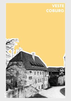
VESTE COBURG CASTLE //
On Wednesday the students went to Veste Coburg. Also known as the "Frankish Crown," sits high above the town at 464m above sea level, 176m above the town. Widely visible with its buildings, towers, defensive walls and bastions, it dominates not only the cityscape, but the whole landscape in the wider area.
The beginnings of the present castle complex date back to the 13th century. At the beginning of the 16th century the castle became home to Saxon Electors used it for frequent stays. In the 19th century, the dukes of Saxe-Coburg and Gotha began to establish world-class art collections there.
Posted 28 Mar 2019 14:21
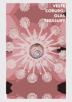
VESTE COBURG CASTLE: GLAS TREASURY //
On Wednesday the students went to Veste Coburg Castle to see their historical Arts and Crafts Glas Treasury, one of the most significant of its kind in Europe.
The collection contains more than 1000 years of history in glass and is held in the former Congress Hall. A large proportion of the exhibit is made up of Duke Alfred of Saxe-Coburg and Gotha’s precious 15th to 17th century venetian glass collection which was donated to the museum by the Dukes widow.
The collection also holds Baroque, Art Nouveau and Art Déco pieces.
Posted 28 Mar 2019 13:43
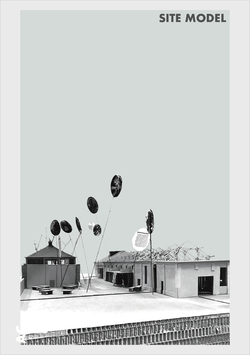
SITE MODEL //
Creapolis brought in their scaled 1:50 site model of their next proposed construction phase to the Cool House (building located on the right hand side), situated within the site of the brief. The model displays all buildings typologies located on the site as well as different access routes through the spaces and the main open area the students are working with.
The students have access to use the model and benefit their proposals to gain a further understanding into how their spatial interventions can coexist alongside existing structures on the site, in addition to visualising how their designs will emerge and translate through the landscape.
Posted 28 Mar 2019 11:02
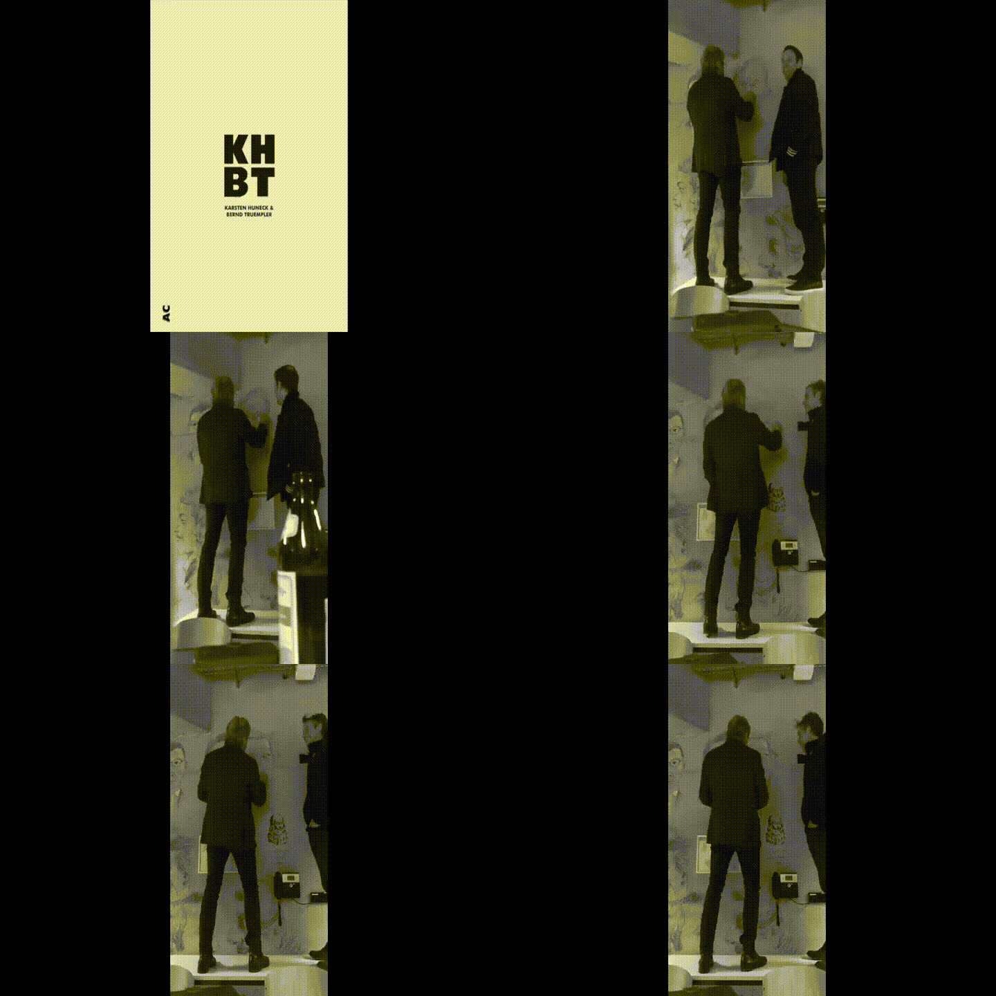
LECTURE //
After an inspirational presentation there was an opportunity to talk with the speakers, guests and students over some beer and food.
It has become a tradition at the Coburg Campus Design that when there has been a guest lecture, the visiting speaker afterwards has either their portrait or profile drawn onto the concrete walls of the atrium.
Here Karsten Huneck and his practice partner Bernd Trüempler are having their portrait drawn onto to the wall by Prof. Helmūt Bielenski.
Posted 27 Mar 2019 21:17
CONCEPT //
Group 1
'Our proposal draws the city's residents together by illuminating the night sky pulling them towards Creapolis. We visually engage and evoke people of Coburg to come and ‘’make a space” at Creapolis maker space. Our design is a interactive exhibition space derived from the traditional game of Klotski. In the centre of the plot stands a Cube which unfolds to form building components in which users can slide around and form their very own space'.
Itz Klotsiki have started to explore the themes of 'Stay,' ‘Meet’ and 'Event,' form the brief from their proposal.
They have a conceptual intention to implement a new game-inspired typology onto the site. By doing this they hope to catch the eye from the surrounding area by making their intervention a beacon that draws people into the site.
Posted 27 Mar 2019 21:11
CONCEPT //
Group 2
'Our concept revolves around the sense of community, allowing people from different backgrounds to come and interact with the spaces available. Our design reflects the already existing Coolhouse by using the spacing's of the column to form a grid line for our design'.
Space Maker have started to explore the themes of 'Meet,' 'Make' and ‘Event,’ from the brief for their proposal.
After visiting the site, the Spaces Maker’s drew from the Slaughter Houses features and the objects scattered throughout the yard to drive their initial concept.
Posted 27 Mar 2019 21:04
CONCEPT //
Group 3
'Our project's initial concept is the contrast between the two identities of Coburg. The picturesque side and the almost none existing dark part which is hidden. These two elements will drive our design process and create an experience for the user, taking them on this visual journey'.
MCO (Manchester Coburg Original) have started to explore the themes of 'See,' ‘Stay,’ and 'Meet,' from the brief for their proposal.
They have found an interesting juxtaposition on the site which has two key qualities of space. By amplifying these two qualities they hope to create an interesting 'shock' effect when the user moves from one space into the next.
Posted 27 Mar 2019 21:01
CONCEPT //
Group 4
'Social Interaction. We aim to bring together a diverse range of people into one. All with one vision, to input something for others to benefit from. See, meet, stay. You are greeted with a grand entrance flowing through the site up to the folding workshop and cafe by day and outdoor cinema accompanied by a bar in the evenings. We are going to encompass a ‘außerhalb spielzimmer’ into our design, for the community, created by the community'.
Abscond have started to explore the themes of 'Order,' ‘Meet,' and ‘See,’ from the brief for their proposal.
Abscond intend to increase footfall by introducing a wooden canopy creating a sheltered avenue between the Cold Hall and Executive Villa from the front entrance to the yard.
In the yard they have proposed an exterior workshop where handmade games equipment can be made for entertainment in their open-air cafe.
Posted 27 Mar 2019 20:54

CONCEPT //
Group 5
'When it comes to bringing people together, campfires have always been a point of gathering, throughout time society has changed to interacting digitally. By creating an atmosphere which allows people to escape from usual aspects of life, using circular shapes to encourage people to socialize with each other, we are bringing back the idea of gathering at a source of fire for social interactions.'
Libelle have started to explore the themes of ‘Event,' ‘Play,’ and 'Order,' to form the brief for their proposal.
Following the introduction from Dr Markus Neufeld (project director of Creopolis), Libelle have chosen to design a multifunctional open-air space that will house a wood workshop and exhibition/ gathering space. They intend to make a retractable solar shading roof over the workshop which would be the secondary feature of this installation.
The primary feature of their installation will revolve around the theme of fire. By reimagining the camp fire experience they hope to create a space that will encourage the gathering and socialization of people while also providing the ability for people to stay overnight at the installation.
Posted 27 Mar 2019 20:51
ROUND TABLE DISCUSSION //
Today, Manchester (MSA) and Coburg (AR and IR) students had their first round table discussion with our Manchester collaborator, Karsten Huneck, and his practice partner Bernd Trüempler. Collectively, each group introduced their first initial concepts and interpretations to the brief and how their spatial intervention can elevate the site, as well as engage with other areas of Coburg.
The main output of the discussion was to carry through a strong narrative of the concept behind the each intervention before refining the ultimate function of the space, addressing key links found through historical and site analysis. The question raised was what makes the proposal of each intervention site specific, in terms of its relationship between the spaces within Creapolis, the Schlachthof and the town of Coburg?
Posted 26 Mar 2019 16:23

LECTURE //
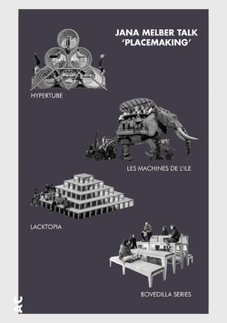
This morning we had a captivating talk from Jana Melber. She is an architect working at ASP Architects in Stuttgart and a research collaborator at Creapolis. Jana introduced us to a range of projects to use as inspiration in our own designs. She presented a few projects from Enorme Studio, an architecture and design office based in Madrid that is characterized by their radical approach to architecture, city and people. Their aim is to foster alternative ways to examine urban issues and to motivate the creation of a proactive citizen culture. Some of their projects are: Lacktopia, Manifesta 12, Urban Spa, Hypertube and Bovedilla Series and Jean d’arc on wheel. Another very interesting project that we were presented is ‘Les Machines de L’ile’. The designers François Delaroziere and Pierre Orefice’s are creating strange looking machines which resemble different oversized animals or creatures. The machines are put in motion and brought to life by machinists so that people can embark on an amazing journey inside or on top of them.
Posted 26 Mar 2019 14:19

LECTURE //
As part of the ongoing lecture series that the Campus Design hosts, we are attending a lecture held by our very own Manchester School of Architecture tutor Karsten Huneck and his partner Bernd Trüempler (KHBT).
ABOUT //
KHBT is a creative studio set up by Karsten Huneck and Bernd Trümpler in London and Berlin.
KHBT has consistently created spatial works of local and international significance which are published widely as well as winning various awards such as the prestigious Young Architect Of The Year Award (YAYA)in 2009 where KHBT was gaining the first ever ‘special commendation’ in the competitions history.
Karsten and Bernd are also partners of the experimental architectural network osa_office for subversive architecture which acts as a platform for spatial research that feeds into the practice.
with;
OVER 8 years running KHBT in UK and Germany (London and Berlin)
AND
15 years of experience in architecture working at Foster and Partners amongst others on major projects
AND
25 years of spatial experimentation in the urban context with osa – office for subversive architecture
AND
10 years of teaching at various universities
"we follow with our design a process of progressive refinement towards the goal of defining the essential"
Posted 26 Mar 2019 10:57
WEEK ONE SCHEDULE //
The first week of our events project focuses on brief, site and concept. The students will be introduced to the project and placed in mixed groups of 4 to work on competition proposals that they will present next week. We also will have the exciting opportunity to visit the Bauhaus at the end of the week!
Posted 26 Mar 2019 10:18

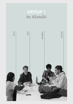
GROUP 1: ITZ KLOTSIKI //
Concept
Our proposal draws the city's residents together by illuminating the night sky pulling them towards Creapolis. We visually engage and evoke people of Coburg to come and ‘’make a space” at Creapolis maker space. Our design is a interactive exhibition space derived from the traditional game of Klotski. In the centre of the plot stands a Cube which unfolds to form building components in which users can slide around and form their very own space.
Urvi Nandha
Manchester School of Architecture
BA Architecture
First Year
I like exploring hidden places
Jordan Wong
Manchester School of Architecture
BA Architecture
Second Year
What interests me most about architecture is urban planning and how architects can design to change the way in people experience the city.
Jan Müller
HS Coburg University
Architecture
First Year
A year ago, I won a throughout Bavaria architecture competition (Bavarian Gymnasiums were the participants). The prize was spending a week in Venice at the Bau Kultur Camp architecture camp during the Biennale.
Jonas Ralphlejsek
HS Coburg University
Architecture
Second Year
Most interesting fact about why I wanted to study architecture, is, that I was moved by the happenings of 911.
Posted 26 Mar 2019 09:53
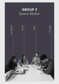
GROUP 2: SPACE MAKER //
Concept
Our concept revolves around the sense of community, allowing people from different backgrounds to come and interact with the spaces available. Our design reflects the already existing Coolhouse by using the spacing's of the column to form a gridline for our design.
Ryan Dunkley
Manchester School of Architecture
BA Architecture
Second year
I have an allergic reaction to kiwi. I also collect coins with unique designs on them.
Lisa Marie Senne
HS Coburg University
Interior Design
Third Year
I don't like chocolate and I also work in a theatre.
Marie Hieronymus
HS Coburg University
Architecture
First Year
I survived the first year of Architecture! I have once fell asleep while walking.
Thomas Verdnik
HS Coburg University
First Year
Architecture
Coffee makes me more tired and I also want to conquer the world with my sketchbook.
Posted 26 Mar 2019 09:52

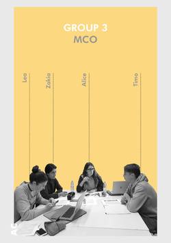
GROUP 3: MCO //
Concept
Our project's initial concept is the contrast between the two identities of Coburg. The picturesque side and the almost none existing dark part which is hidden. These two elements will drive our design process and create an experience for the user, taking them on this visual journey.
Zakia Ahmed
Manchester School of Architecture
BA Architecture
Second year
I have always had an interest in the design of buildings and the concept behind them, which lead to the choice of architecture. Specifically, Thomas Heatherwick's work inspires me, especially the Paperhouse, which was an interesting approach to redesigning newspaper kiosks.
Alice Vetrugno
Manchester School of Architecture
BA Architecture
Second year
My interest in art and design lead me to visit an architectural practice and since then, I have always known I would like to pursue this career. I am interested in brutalist architecture and Carlo Scarpa's work particularly inspires me, an example would be Brion Cemetary.
Lea Hartmann
HS Coburg University.
Architecture
Second year
I grew up on construction sites, so studying architecture was the perfect solution to pursue my passion. I like that architecture combines multiple topics in a complex but simple way. Gerber Architekten are one of my favourite architects.
Timo Dötzer
HS Coburg University.
Architecture
First year
I really like the projects of the Japanese architects SANAA. I'm intrigued by the concept that architecture combines creative and technical aspects. Architecture is also very practical and involves a lot of model making, therefore another reason for this choice of study.
Posted 26 Mar 2019 09:50

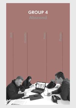
GROUP 4: ABSCOND //
Concept
Social Interaction. We aim to bring together a diverse range of people into one. All with one vision, to input something for others to benefit from. See, meet, stay. You are greeted with a grand entrance flowing through the site up to the folding workshop and cafe by day and outdoor cinema accompanied by a bar in the evenings. We are going to encompass a ‘außerhalb spielzimmer’ into our design, for the community, created by the community.
Gianetta Wong
Manchester School of Architecture
BA Architecture
Second Year
I play water polo for the University of Manchester
Jack Kinniburgh-Dickie
Manchester School of Architecture
Architecture
First Year
I am a photographer and specialise in aerial images.
Franz Otto
HS Coburg University
Architecture
First Year
I like tuning cars and watching racing cars.
Florian Gogolinski
HS Coburg University
Architecture
Second Year
I studied Mathematics and wanted to do the Bachelor of Science, but I dropped out because it wasn't challenging enough. I also used to ski in a ski club.
Posted 26 Mar 2019 09:49
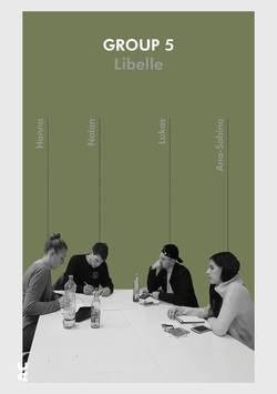
GROUP 5: LIBELLE //
Concept
When it comes to bringing people together, campfires have always been a point of gathering, throughout time society has changed to interacting digitally. By creating an atmosphere which allows people to escape from usual aspects of life, using circular shapes to encourage people to socialize with each other, we are bringing back the idea of gathering at a source of fire for social interactions.
Lukas Gedeikis
Manchester School of Architecture
BA Architecture
Second year
I am interested in the works of Shigeru Ban.
Nolan Nieves
HS Coburg University
Architecture
Third year
My favourite kind of memes by far are wavy synth a e s t h e t i c s.
Ana-Sabina Nistor
Manchester School of Architecture
BA Architecture
First Year
I'm strangely addicted to gummy bears and angular designs.
Hanna Dietel
HS Coburg University
Architecture
Second Year
I am Intrigued by Postmodernist structures.
Posted 26 Mar 2019 09:49
SITE VISIT //
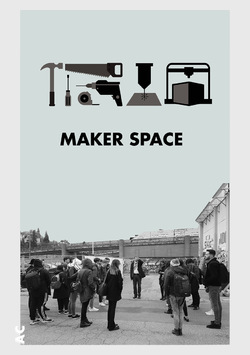
Today, Dr. Marcus Neufeld showed us around the Makerspace and the site. Makerspace is located in the director’s villa of the former Slaughterhouse and is a well-equipped open workshop including both high-tech machinery and traditional tools. This is a place of innovation where Creapolis aims to bring the know-how and competencies of Coburg University staff and students to the region. It is open to all citizens and is based on the community and the sharing of knowledge and experience so that everyone can benefit. Students, citizens, partners and all interested parties can come together and collaborate to implement their ideas and learn new skills. With this in mind, the outdoor space needs to be transformed to work in collaboration with the community and the Campus Design Open festival.
Posted 25 Mar 2019 22:55

BRIEF //
See. Stay. Meet. Make. Event. Play. Order. Narrate. These are the topics how an open platform, in the context of spatial interventions, can be created.
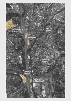
Exploring the outdoor space of Creapolis around the Schlachthof (Slaughterhouse), Albert's Connection will work to design and construct an intervention that will integrate engaging spaces for events to practice as well as act as an open platform to share with the local community.
As part of the brief, you will begin to engage with the space and its relationship to the surrounding areas to design a visible approach to the site. It should consider all users of the space and its connection to the Markerspace that lies within Creapolis, crafting a collective experience of both social and physical qualities. The space has no limits to its potential innovativeness so consider all possibilities from a wider thought; its relation to Prince Albert’s historical link with Coburg and Manchester as well as the lasting experience of the place.
Posted 25 Mar 2019 22:46
SUNDAY //
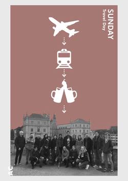
Yesterday we travelled to Coburg, Germany in preparation for our exciting 2 week event. After a very early flight and a long day traveling accross Germany by train we finally arrived in Coburg and were greeted at the station by our Collaborator Anja and some of the students from The Campus Design School who will be working with us over the next two weeks.
Later that evening the students gave us a brief tour around the picturesque town showing us historic landmarks and architecture such as the Ehrenburg Palace (pictured behind). The palace served as the main Coburg residence for the ruling princes from the 1540's until 1918. The palace's exterior today mostly reflects Gothic Revival style. Once the tour was complete we went for a meal and some drinks with the students which was a great icebreaker before the teamwork began.
Posted 25 Mar 2019 21:57

EXTERNAL COLLABORATOR //
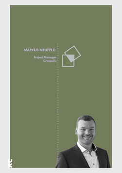
To bring the Coburg University closer to the companies and people in the region. That's the goal of Dr. Markus Neufeld. He recently took over the project management of CREAPOLIS, the transfer and networking platform of Coburg University of Applied Sciences. For him, the threads of the new lighthouse project will converge in the future. He wants to intensify the regional network of the university and initiate further cooperation with companies and organizations in the region.
"I am looking forward to a very dynamic environment, a really exciting new activity for CREAPOLIS and the opportunity to contribute my experience in regional development," notes the new project manager.
The 35-year-old Bamberger was born and raised in East Westphalia. After studying geography, business administration and statistics at the University of Bamberg, he gained his first professional experience in the marketing and sales of a book publisher. He then worked for two years at the Economic Development Department of the City of Bamberg. Most recently, Neufeld worked as a research assistant at the Institute of Geography of the Friedrich-Alexander-University Erlangen-Nürnberg and recently did his doctorate. There he worked and directed numerous projects of regional development. He states: "Almost everything was involved, from demographic change through spatial development reports to regional added value."
CREAPOLIS is the transfer and networking platform of Coburg University of Applied Sciences. It will be funded by the Federal Ministry of Education and Research with around 6.5 million euros over the next five years. The aim of the project is to systematically increase regional networking and knowledge transfer in order to create added value for the economy and society in the region. The central component of CREAPOLIS is to become a Makerspace. This high-tech workshop will be open to everyone - from leisure crafting to StartUp prototyping.
Creapolis will be home to the winning design and will be implemented in May.
Posted 25 Mar 2019 21:51
LOCAL TRIVIA //
Germans have a saying: Alles hat ein Ende nur die Wurst hat zwei. Which translates to 'Everything has an ending, but the sausage has two'. Basically it just means that everything comes to an end… Except for the sausage obviously…
This is only one of the many (many) German proverbs that have to do with the wurst (sausage).
The history of the hot dog explains the terms frankfurter and wiener. The hot dog traces its lineage to the 15th-century Viennese sausage, or wienerwurst in German. Johann Georghehner, a butcher from the German city of Coburg, in Bavaria, is credited with inventing the “dachshund” or “little dog” sausage in the 17th century, and brought it to Frankfurt. Yet, it was still a sausage eaten with a knife and fork, no bun.
Posted 12 Mar 2019 17:09

BAUHAUS EXCURSION – DESSAU //
On the 29th March, students from both Manchester and Coburg will have the opportunity to travel to Dessau. Celebrating one hundred years of Bauhaus,
the trip will offer a rediscovery of the models of modern construction - educating visitors on their architecture, use and inhabitants.
Arriving in Dessau, we have the privilege to be given guided tours for both the Bauhaus building and Masters’ Houses, accessing areas to the Bauhaus building that have not been permitted in recent years.
The Bauhaus Building – Walter Gropius (1925-26)
The Bauhaus proposed to develop new forms of housing and living. It offered a three-storey workshop, another three-storey professional school and a five-storey studio building for students and junior masters. Gropius separated these three functional programmes asymmetrically to design a complex form which can only be understood by moving through the building.
Masters’ Houses – Walter Gropius (1925-26)
Located parallel to the Bauhaus building, Gropius designed three identical semi-detached houses for the Bauhaus masters and a single detached house for the director. These designs followed a modular principle, using prefabricated components in order to realise the concept of rational construction.
In the afternoon we will then be taking a bus journey to Settlement Törten. Here we will be given an introduction to the housing estates concept and building history, following a visit to its exhibition – showcasing historical building materials, models and films. After we will take a short tour around the housing estate with visits to both the Consumption House and Steel House.
Settlement Törten – Walter Groupis (1926-28)
During the Weimar Republic, a lack of efficient affordable housing was recognised. The cubic terraced housing development of the settlement, proposed by the Bauhaus, was considered as a solution for low-cost mass housing construction.
Consumption Building – Walter Gropius (1928)
The consumption building became a centre of the Törten settlement due to its location, height and function. It compromises two buildings: a low-rise building intended for sales and a five-storey house which occupied three three-room apartments, staff room and attic space.
Steel House – Georg Muche and Richard Paulick (1926-27)
The steel house is a singular construction of thick steel panels mounted on a steel skeleton structure located in Dessau. It is determined by two unique sized cubes which have been pushed together to facilitate a vast area of living space, surpassing the square meter of Gropius’ settlement houses.
https://www.bauhaus-dessau.de/bauhaus-bauten-dessau.html
Our day will end with a visit to the Federal Environmental Agency, which we will be given a guided tour around the building.
Federal Environmental Agency – Sauerbruch Hutton (2002-05)
Located in the home of the modernist movement of Bauhaus, the Federal Environmental Agency Building highlights concepts of design and aesthetics to modern architecture. It provides new concepts for sustainability and green design which work alongside Bauhaus modernism.
http://www.sauerbruchhutton.de/en/project/ubaPosted 12 Mar 2019 16:35

RESEARCH //
Coburg is a town located on the Itz river in the Upper Franconia region of Bavaria, Germany. Today, Coburg's population is close to 41,500. Since it was little damaged in World War II, Coburg retains many historic buildings, making it a popular tourist destination. As a result of the large presence of the US Army prior to German re-unification, Americans and American culture are still present in Coburg and the surrounding area. This influence ranges from American-style pubs and restaurants to two sports clubs sponsoring baseball teams.
Coburg has the typical features of a former capital of a German princely state with numerous houses from the 16th, 17th and 18th centuries. Coburg is also known as the location of Veste Coburg, one of Germany's largest castles.
Coburger Rathaus, the town hall, is part of the ensemble of structures on the market square that also includes other traditionally German buildings and the central statue of Prince Albert. The seat of the public administration of Coburg was moved here in 1438. The original Gothic building proved to be too small and after 1570 the town bought additional properties and erected a Renaissance building at the corner with Ketschengasse. In another rebuilding in 1750-2 both structures were merged. The appearance of the town hall changed, only the round bay on the corner remained. The old roofs were replaced by the current garret roof and the colourful paintings were added to the facade in the 18th century. Another renovation took place in 1903, when the balcony to the market square was added and stairwell and entrance were redesigned.
We are looking forward to getting to experience the culture and architecture of Coburg during our two week stay. Our week will begin with a relaxed tour of the town presented to us by the students of Coburg who we will be working with.
Posted 12 Mar 2019 11:17

OSA //
Office for Subversive Architecture is an international architecture collective of which Anja Ohliger and Karsten Huneck are active contributors. Huneck, founder of OSA describes
it's intent as such: to push the boundaries of common practice in architecture and develop projects that sit between art and architecture.
The collective also acts as a research platform which feeds into KHBT’s work and vice versa.
THE BLADE FACTORY, 2016 //
The playful temporary structure was sat a top an existing industrial building in Liverpool serving as a beacon drawing people into the surrounding area throughout distinctive red double skin facade. The structure also offered amazing views to Liverpool city centre and the river Mersey.
It was built to house a series of talks and discussions looking at the relationship between art and architecture and was commissioned by Greenland Street in collaboration with Liverpool Culture Company's Cities.
DISCHARGE / RECHARGE, 2013 //
In collaboration with the artist Christoph Rodatz, OSA created an architectural performance of light and sound as a part of the Urban Lights Festival in the Ruhr Area of Germany. The installation celebrated tower block in the centre of Bergkamen, which was seen by the locals as both a landmark and eyesore unoccupied for 15 years.
With plans to demolish the tower bloc in 2015 the installation was seen as a farewell to the building. It was painted black to signifying its ominous fate but also transforming it into a screen for the projection of an absorbing laser show that tracks the story of the building. At night the lasers highlighted the floor plates and layouts within, the lift shafts and stairways along with its brutal silhouette. Interviews with former inhabitants of the building were broadcast via a radio channel located at the top of the building allowing visitors to tune into the stories on their own devices while enjoying the light show.
https://vimeo.com/202025780
Below is a link to OSA's website for more information on the innovative projects they have made:
http://osa-online.net/cms/
Posted 12 Mar 2019 11:12
MEET THE STUDENTS //
Last week we met up with the students to give them the intinery for the upcoming event.
It was great to meet them and run through the details of the event. There was lots of enthusiasm and questions. Can not wait to start now!
Posted 12 Mar 2019 11:11
PRODUCTION //
Coburg is a town located on the Itz river in the Upper Franconia region of Bavaria, Germany.
Through successful dynastic policies, the ruling princely family married into several of the royal families of Europe, most notably in the person of Prince Albert, who married Queen Victoria in 1840 and this year we mark Albert's 200th birthday.
Coburg doesn't have a major airport so in order to get to Coburg, the group will fly into Germany's biggest cities and then from there we will arrive in the centre by train. Coburg is a small town and is very walkable to and from the outlined sites.
Posted 12 Mar 2019 11:06
ACCOMMODATION //
We are excited to announce that we will be staying in a 'pop up hostel' during our events stay in Coburg.
The hostel is being designed by the University of Coburg students prior to our arrival as part of their studies. The building is a disused office building, and the hostel will be occupying the entire fourth floor.
During the events period all the Manchester students will be staying here in Coburg. We are excited to see what the Coburg students come up with for the hostel design.
Posted 12 Mar 2019 10:25
DESIGN FESTIVAL //
CREAPOLIS is an additional scheme within the framework of the University of Coburg, which runs alongside its teaching and research programmes. Promoting innovations
and networking people, it aims to build a stronger connection with the university and regional partners.
The three main aims it aspires to reach are to connect, make and support.
The students work produced during the events weeks will work alongside the CREAPOLIS programme and contribute to the annual exhibition “Campus.Design Open”. The festival provides a platform to bring together programmes including architecture, product design, civil engineering and interior design.
CREAPOLIS: https://www.hs-coburg.de/forschung-kooperation/creapolis.html
Campus.Design Open: https://www.hs-coburg.de/ueber-uns/veranstaltungen/campusdesign-open.htmlPosted 12 Mar 2019 09:15

PUBLICATION //
For the end of year exhibition, we will produce a physical publication documenting the research, process and development of the Events project that we will be conducting during the two weeks spent in Coburg. We aim to make our content as visually appealing as possible. We started preparing by looking at the steps we need to take in order to produce our own custom publication. We will start by creating a content plan for all pages, including the front and back covers. Then we will create a detailed plan for each article that we want to include. Next we will create a design mock-up that will provide a visual guide to help us envision the layout of each article. Before we start working on the final design we will need to proofread and edit all the articles. At this stage we will make sure that the design of every spread is consistent and works with the design of the publication as a whole. Finally, before we send it in for printing, we will double-check to make sure everything is in order.
Posted 25 Feb 2019 08:43
FUNDING GRANTED //
We are excited to announce that we have received funding from an innovative teaching fund at the University of Coburg.
The funding will allow us to provide all the materials needed to realise our design proposals of the installations.
The design proposals will be worked on during the events period where the Manchester students will collaborate with the Coburg students to come up with exciting proposals for the installation. The works will then be realised in May, which is when we use the materials which are funded for to build the winning design proposals to be displayed at the Creopolis design festival.
Posted 18 Feb 2019 10:05

BAUHAUS' 100TH BIRTHDAY //
2019, Germany celebrates 100 years of Bauhaus.
The short-lived building hosted the space for experimentations in the free and applied arts, architecture and educational practice. The school existed in three German cities: as the ‘State Bauhaus” in Weimar 1919 to 1925; the ‘school of design’ in Dessau 1925 to 1932; and as a private education institute in Berlin 1932 to 1933, directed by three different architect-directors: Walter Gropius from 1919 to 1928; Hannes Meyer from 1928 to 1930; and Ludwig Mies van der Rohe from 1930 until 1933. Its influence went beyond the school and effected both its locations and its time.
To celebrate the 100th anniversary of Bauhaus, the Centenary programme ‘100 years of bauhaus’ is providing a country spread journey of discovery – taking people to the origins and places of modernism.
In conjunction to ‘100 years of bauhaus’, the University of Coburg have organised a visit to the Bauhaus 29th March, for both Coburg and Manchester students, to be involved with Germany's celebration and experience its significant importance to modern design.
Even though this trip is optional, we recommend it should not be missed!
Posted 11 Feb 2019 16:10
