MCO //
Final Design
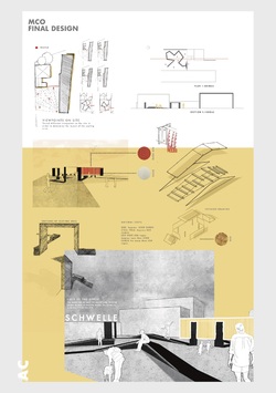
After an intense two week project, group 3 worked comprehensively as a group, using the knowledge and skills from both Manchester and Coburg students, to execute a well-designed and stylistic presentation that the jury was highly impressed with.
Posted 5 Apr 2019 20:09
MCO //
Development Design
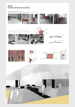
The jury also determined how the position of the curtain threshold outlines a past building façade that use to be present on the site, enhancing the design proposal to consider a significant historical connection between the site and artist experience of the curtain.
Posted 5 Apr 2019 20:08
MCO //
Concept Design
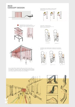
Collaborating MCO’S artistic approach to the spatial invention with the social and useable spaces designed by Libelle would work cohesively for both Creapolis’ functionality as well as elevating the atmospheric experience to the site.
Posted 5 Apr 2019 20:07

JURY VERDICT //
After a tough deliberation between all participating design project proposals, the jury found potential in elements of all projects. However, ultimately agreed on the realisation of two spatial interventions that mutually displayed the strongest proposals to the sites framework; community of Coburg and the buildability of each installation. Therefore, the jury established a collaborative design to be built for the Design Festival Open over summer.
With that in mind, a huge congratulations to the winners: MCO (Group 3) and Libelle (Group 5)!
MCO //
Site Analysis
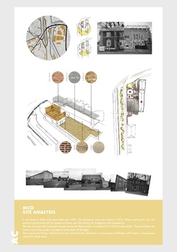
After presenting a very thorough and well-defined proposal, the jury seized a direct interest to the threshold transition of the red curtain design to their proposal. They believed the reveal of the ‘dark side of Coburg’ was an interesting concept to explore and refine to a greater potential. The evidence found of the initial perception Coburg being observed as picturesque and a well-kept place compared to the groups discovery of the ‘rough and ready’ quality that Coburg doesn’t yet celebrate would be an interesting concept to reveal to the community that they might not have been previously aware of.
Posted 5 Apr 2019 20:07

WORKING MODELS //
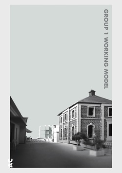
Group 1
Implementing their interest of visibility through their design brief, group 1 needed to define where on the site their spatial intervention would be sited in order to evoke the people of Coburg to come and engage with the space. This was determined by situating their working model onto the site to capture and experiment with different viewpoints and scales. Initially, their design was composed of a 7x7x7 component, however revealed the scale was too insignificant which did not create an impact to the site and propose the ‘beacon’ first implied. To resolve this issue, they decided to implement a raised platform to ensure the installation would be visible over the surrounding facades of the buildings. Also, doubling the scale of their whole design created a greater impact to the site and emphasising the concept of the Klotsiki game.
They finalised the specific location of their game-inspired intervention to be visible from the main pedestrian access route through the site as it revealed a main source of attraction in relation to the surrounding buildings. In addition to this, with their illuminating beacon, the light would also disperse down through the passage alongside the slaughterhouse and Creapolis building to create an further point of inquisitiveness.
Posted 2 Apr 2019 12:52

WORKING MODELS //
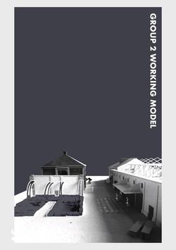
Group 2
Since the site analysis demonstrated by group 2 previously determined the location of their spatial intervention, the model was utilised to gain an understanding of how to apply the use of levels and perspectives to this zone and design key points of interest to this space. It began to form a visual understanding of the spaces to which the people of Coburg would engage with, by extending the grid systems of the surrounding buildings onto the site. When modelling this, they matched the timber framing with each pillar on the workshop space to derive the design of the hay cubes that would act as the seating arrangement for the public.
This enabled them to visualise and form basic guidelines to bring a sense of order to the reuse of scattered objects found within the site boundaries in a three dimensional form. Also, it made them aware that the two functions were disconnected. Consequently, they had to find a solution to which would merge the two together. As a result, the addition of incorporating and extending the hay cubes into the structure of the workshop shelter would act as a link between the multipurpose spaces.
Posted 2 Apr 2019 12:14
WORKING MODELS //
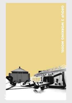
Group 3
Through their analysis of the site, group 3 revealed a significant location within the space to present their transition between the contrasting identities of Coburg. By creating a model they were able to visualise how their wall/curtain design would affect the site with the idea of the interaction of the change between the two spaces. This also under covered the scale of their wall/curtain was too large for the specific location, as a result they reduced the scale of this element to their design.
In addition, to explore and develop their idea of a visual journey, they began to implement different paths through the external space on the model to apprehend how this would be designed to create an experience celebrating the contrasting qualities, as well as useable sociable areas for people to engage and interact with.
Posted 2 Apr 2019 12:12
WORKING MODELS //
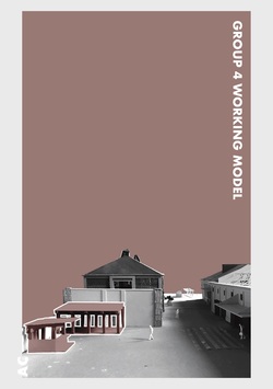
Group 4
Using the site model, it allowed group 4 to place their concept design idea in context. Therefore, were able to gain an understanding of how to develop and elevate their design, in a three dimensional form, making it more site specific and visualise the spaces created. Following this, it enabled them to continue to produce both sketch and physical models, using a mix of materials, to develop their design and show a stronger connection to their concept to build together as a community.
Reflecting from this, it made them consider redirecting their concept down a more refined direction to make their spatial invention achieve a more attractive and systematic approach to benefit the location of the site and the community of Coburg.
Posted 2 Apr 2019 12:09
WORKING MODELS //
Group 5
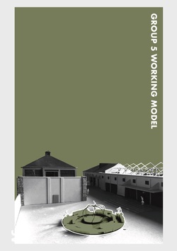
Once group 5 positioned their model on the site, it was clear that the fire pit and seating was the fundamental centre to their invention. Therefore, the addition of the shading canopy extending over the workshop was no longer an element to their design proposal, though did make them aware of the scalability of the fire pit to be of greater significance, emphasising its importance and connection to the site. Additionally, it made them consider how the light produced from the fire would illuminate the site, making it viewable from the surround area giving the space a warm and inviting atmosphere for people to explore.
Posted 2 Apr 2019 12:08

POPUP HOSTEL //
During the lead up to our visit to Coburg, our hosts from the university were tasked as a small internal project to design and set up a popup hostel to accommodate us for the duration of the events weeks. In the hostel there were five rooms that needed to be designed, each with a different concept theme to create interesting and distinct spaces throughout the rooms. In addition to this a kitchen, shower facilities and communal living space were also created to ensure a comfortable stay for our time in Coburg.
The three rooms located at the front of the building all have balconies facades, capturing the morning sun that looks over the quaint streets of Coburg and its German architecture. Across the street is the gothic Heilig-Kreuz church that rings its bells every quarter of the hour, not to mention its 7:00am wakeup call with a whole minute of bell ringing. Meaning no excuses turning up late for a full day in the studio!
Room 1
Room 1 was painted full grey with dispersed beams of yellow geometry around the room to signify light sources within the space, extending from the walls onto the ground. One beam centred from the corner frame of the window to symbolise the incoming natural light through the window. The same effect was then replicated with the ceiling light fitting to create an abstract illumination pattern around the room. The overall use of the painted geometry also provided a more comfortable space to occupy as the bright colours made the long narrow space feel a lot brighter.
Posted 31 Mar 2019 16:39
POPUP HOSTEL //
Room 2
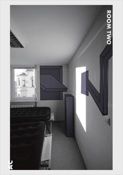
Due to room 2 being the smallest out the five and only being accessed through room 1, the aim of the space was to increase the volume and give it a more welcoming atmosphere with the use of colour. Taking inspiration from Tape Art, the hosts designed different motifs within the space to create perspective illusions, concentrating of the corners of the room to create a sense of a greater scale to the room. The illustrations were designed with black edges and filled with high contrasting block colours of yellow and green to create a fresh and friendly atmosphere to the overall design. The inspiration from the Tape Art was then carried through the furniture within the room which used the same design and colours as the walls, completing the space as a whole.
Posted 31 Mar 2019 16:37
POPUP HOSTEL //
Room 3
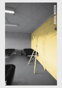
Room 3 took inspiration through the connection of Albert between Manchester and Coburg. The lines designed around the room were ordered in a random formation that showed links between the two different places, connected with historic imagery relating to Prince Albert. Even though the lines were designed in a chaotic formation, the lines spanned from one corner of the room to the other, covering both the ceiling and walls, which all meet at a final connection. As a contrast, the remaining walls were painted in a plain light grey tone, giving the space a distinction between the chaotic line design around the room but using a similar shade to the black and white imagery of Albert. Continuing the theme of the space within the furniture design, the hosts designed lamps and side tables with a rustic appearance that reflected the old historic photographs visible around the room.
Posted 31 Mar 2019 16:36
POPUP HOSTEL //
Room 4
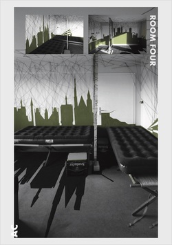
Room 4 was designed with the inspiration to highlight the connection between Coburg and Manchester by illustrating their skylines, included both university buildings. In addition to this, the design of threads used around the room suggest the connection between the two cities but also blurred the contours of the room. In order to provide a sense of privacy to each sleeping compartment, the hosts built partition frames between each bed and designed personal storage, reusing beer crates to give each guest the facilities to store their personal belongings. Overall, their main intention was to create a space offering a pleasant stay for their guests in Coburg.
Posted 31 Mar 2019 16:35
POPUP HOSTEL //
Room 5
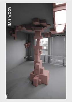
The idea behind room 5 was to change the structure of the space. Therefore, the hosts designed the addition of hanging and standing boxes in different formations around the room. The box designs on the ceiling and walls intended to break up edges of the room, but also provide shelving to store personal belongings, and the column in the centre of the room was designed to form a zoning component for the sleeping arrangement. The choice of using light monochrome colours was in order to provide a strong contrast between the shadows formed from the geometry of the box structures, but also create a sense of softness to the room.
Posted 31 Mar 2019 16:33
SITE ANALYSIS //
Group 3
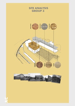
The site analysis executed by group 3 instigated from the particular interest towards the contrast of buildings found on the site. The high contrast between the “nice, clean buildings” compared to the “exposed, rough types of buildings” emphasised a strong distinction between these typologies; using this concept to translate through their proposal by celebrating the contrast between the use of existing materials as well introducing new elements into the space.
The materials discovered on site comprised of red brick, concrete, plywood, ceramic blocks, wood and stone. To which the group highlighted how each texture brought a different quality and identity to the space. Therefore, initiated their consideration to how to move forward with introducing new elements into the site and how these could work alongside the existing materials of both the slaughterhouse and Creapolis building.
Posted 28 Mar 2019 16:11
SITE MODEL //
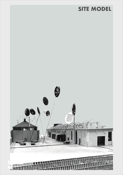
Creapolis brought in their scaled 1:50 site model of their next proposed construction phase to the Cool House (building located on the right hand side), situated within the site of the brief. The model displays all buildings typologies located on the site as well as different access routes through the spaces and the main open area the students are working with.
The students have access to use the model and benefit their proposals to gain a further understanding into how their spatial interventions can coexist alongside existing structures on the site, in addition to visualising how their designs will emerge and translate through the landscape.
Posted 28 Mar 2019 11:02
ROUND TABLE DISCUSSION //
Today, Manchester (MSA) and Coburg (AR and IR) students had their first round table discussion with our Manchester collaborator, Karsten Huneck, and his practice partner Bernd Trüempler. Collectively, each group introduced their first initial concepts and interpretations to the brief and how their spatial intervention can elevate the site, as well as engage with other areas of Coburg.
The main output of the discussion was to carry through a strong narrative of the concept behind the each intervention before refining the ultimate function of the space, addressing key links found through historical and site analysis. The question raised was what makes the proposal of each intervention site specific, in terms of its relationship between the spaces within Creapolis, the Schlachthof and the town of Coburg?
Posted 26 Mar 2019 16:23

BRIEF //
See. Stay. Meet. Make. Event. Play. Order. Narrate. These are the topics how an open platform, in the context of spatial interventions, can be created.
Exploring the outdoor space of Creapolis around the Schlachthof (Slaughterhouse), Albert's Connection will work to design and construct an intervention that will integrate engaging spaces for events to practice as well as act as an open platform to share with the local community.
As part of the brief, you will begin to engage with the space and its relationship to the surrounding areas to design a visible approach to the site. It should consider all users of the space and its connection to the Markerspace that lies within Creapolis, crafting a collective experience of both social and physical qualities. The space has no limits to its potential innovativeness so consider all possibilities from a wider thought; its relation to Prince Albert’s historical link with Coburg and Manchester as well as the lasting experience of the place.
Posted 25 Mar 2019 22:46

BAUHAUS EXCURSION – DESSAU //
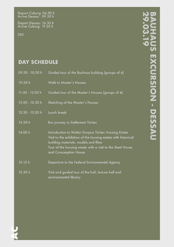
On the 29th March, students from both Manchester and Coburg will have the opportunity to travel to Dessau. Celebrating one hundred years of Bauhaus,
the trip will offer a rediscovery of the models of modern construction - educating visitors on their architecture, use and inhabitants.
Arriving in Dessau, we have the privilege to be given guided tours for both the Bauhaus building and Masters’ Houses, accessing areas to the Bauhaus building that have not been permitted in recent years.
The Bauhaus Building – Walter Gropius (1925-26)
The Bauhaus proposed to develop new forms of housing and living. It offered a three-storey workshop, another three-storey professional school and a five-storey studio building for students and junior masters. Gropius separated these three functional programmes asymmetrically to design a complex form which can only be understood by moving through the building.
Masters’ Houses – Walter Gropius (1925-26)
Located parallel to the Bauhaus building, Gropius designed three identical semi-detached houses for the Bauhaus masters and a single detached house for the director. These designs followed a modular principle, using prefabricated components in order to realise the concept of rational construction.
In the afternoon we will then be taking a bus journey to Settlement Törten. Here we will be given an introduction to the housing estates concept and building history, following a visit to its exhibition – showcasing historical building materials, models and films. After we will take a short tour around the housing estate with visits to both the Consumption House and Steel House.
Settlement Törten – Walter Groupis (1926-28)
During the Weimar Republic, a lack of efficient affordable housing was recognised. The cubic terraced housing development of the settlement, proposed by the Bauhaus, was considered as a solution for low-cost mass housing construction.
Consumption Building – Walter Gropius (1928)
The consumption building became a centre of the Törten settlement due to its location, height and function. It compromises two buildings: a low-rise building intended for sales and a five-storey house which occupied three three-room apartments, staff room and attic space.
Steel House – Georg Muche and Richard Paulick (1926-27)
The steel house is a singular construction of thick steel panels mounted on a steel skeleton structure located in Dessau. It is determined by two unique sized cubes which have been pushed together to facilitate a vast area of living space, surpassing the square meter of Gropius’ settlement houses.
https://www.bauhaus-dessau.de/bauhaus-bauten-dessau.html
Our day will end with a visit to the Federal Environmental Agency, which we will be given a guided tour around the building.
Federal Environmental Agency – Sauerbruch Hutton (2002-05)
Located in the home of the modernist movement of Bauhaus, the Federal Environmental Agency Building highlights concepts of design and aesthetics to modern architecture. It provides new concepts for sustainability and green design which work alongside Bauhaus modernism.
http://www.sauerbruchhutton.de/en/project/ubaPosted 12 Mar 2019 16:35
DESIGN FESTIVAL //
CREAPOLIS is an additional scheme within the framework of the University of Coburg, which runs alongside its teaching and research programmes. Promoting innovations
and networking people, it aims to build a stronger connection with the university and regional partners.
The three main aims it aspires to reach are to connect, make and support.
The students work produced during the events weeks will work alongside the CREAPOLIS programme and contribute to the annual exhibition “Campus.Design Open”. The festival provides a platform to bring together programmes including architecture, product design, civil engineering and interior design.
CREAPOLIS: https://www.hs-coburg.de/forschung-kooperation/creapolis.html
Campus.Design Open: https://www.hs-coburg.de/ueber-uns/veranstaltungen/campusdesign-open.htmlPosted 12 Mar 2019 09:15

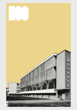
BAUHAUS' 100TH BIRTHDAY //
2019, Germany celebrates 100 years of Bauhaus.
The short-lived building hosted the space for experimentations in the free and applied arts, architecture and educational practice. The school existed in three German cities: as the ‘State Bauhaus” in Weimar 1919 to 1925; the ‘school of design’ in Dessau 1925 to 1932; and as a private education institute in Berlin 1932 to 1933, directed by three different architect-directors: Walter Gropius from 1919 to 1928; Hannes Meyer from 1928 to 1930; and Ludwig Mies van der Rohe from 1930 until 1933. Its influence went beyond the school and effected both its locations and its time.
To celebrate the 100th anniversary of Bauhaus, the Centenary programme ‘100 years of bauhaus’ is providing a country spread journey of discovery – taking people to the origins and places of modernism.
In conjunction to ‘100 years of bauhaus’, the University of Coburg have organised a visit to the Bauhaus 29th March, for both Coburg and Manchester students, to be involved with Germany's celebration and experience its significant importance to modern design.
Even though this trip is optional, we recommend it should not be missed!
Posted 11 Feb 2019 16:10
COBURG COLLABORATORS //
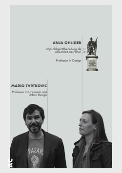
Anja Ohliger is a Professor in Design in Principle in the BA 1&2. As partner of OSA: Office for Subversive Architecture she was involved in many projects dealing with the question of perception of public spaces.
Mario Tvrtkovic is a Professor in Urbanism and Urban Design. He is one of the main initiators of Creaopolis, the experimental space close to the University of Coburg, which is the main subject of our workshop. In past experiences, he has already launched interventions with his students to make the potential of the space visible. Mario is hoping to ultimately design and install a "laboratory“ for social change and engagement in participation with the population of Coburg.
Please find some works (Sülzer Findlinge, Eintritt Frei, Frankfurter Garten, Kölnisch Wasser, etc) on their website.
Posted 28 Jan 2019 21:04
MANCHESTER COLLABORATOR //
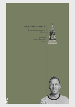
Karsten carried out his studies in Germany at the Technische Universität in Darmstadt. Throughout his education, he attained the assistant role of Ottmar Horerl, an artist whose work focused on public spaces. After graduating with a Diploma in Architecture, Karsten has had involvement with the OSA (Office for Subversive Architecture) where he continued to explore spatial conditions regarding agendas concerning art and architecture, at both local and global scales.
Posted 26 Jan 2019 13:07
