DAY 7
After the past few days of analysing our case studies and designing templates for our team’s digital exhibition concepts, we have begun to prepare for making our final concept design!
Today we began by learning how to use interactive PDF’s using InDesign as we will be using this to create a template of how we would like our digital exhibitions to look and function. We have been exploring the possible ways to indicate to users that aspects of our pages are interactive, and how we might indicate this.
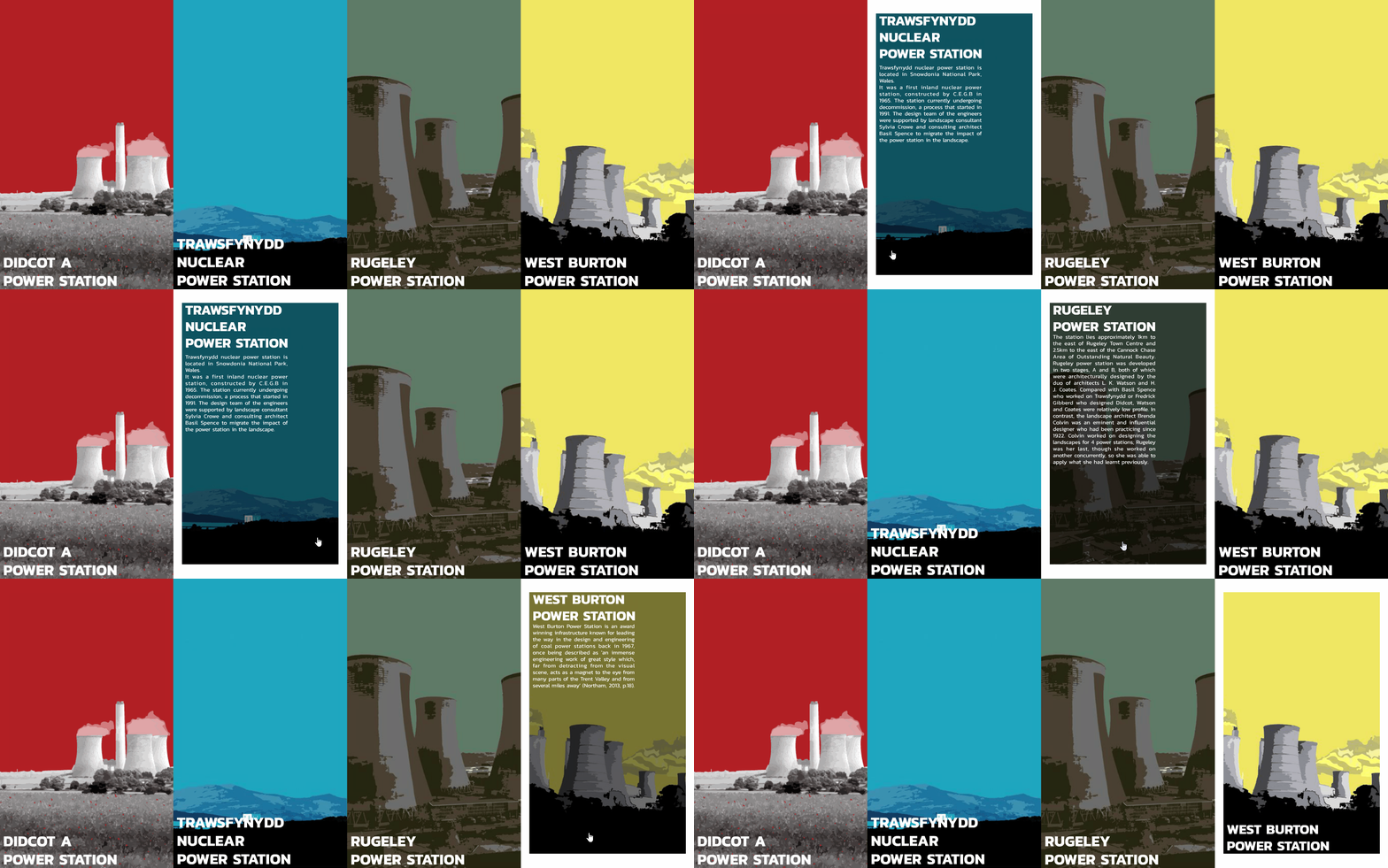
Above is an example of one of our tests. This example allows users to scroll over the case studies and gain more information about them before clicking to learn more.
Posted 2 Apr 2019 18:35


