//DAY 07//BRANDING & MATERIALITY
For a shop its brand is its identity, a set of aesthetic qualities that when done successfully can achieve a variety of goals. Firstly, it can link all the products or facilities that fall under the same company/organisation. This creates familiarity and consistency making it easier for a customer to know who they are buying their products or services from and aware of where to return if they enjoy the experience. Combined with this the brand can highlight an ideal demographic through colours and font styles. More bright colours with bolder fonts will often appeal to a younger audience and pastel colours with simple fonts will present a more sophisticate persona and attract an older clientele.
The Pop-Up shop will work as an extension of the special collections and therefore must work alongside the museums’ visual palette. Through their research the students found that there was no defined branding for both the special collections and the university. They collected together all the fonts and colours that have been used on documentation/websites for both and created profiles detailing them. It was agreed that golden yellow was frequently used and complemented the deep blue more commonly associated with the university.
We encouraged the students to consider a typical client that they want to visit the shop. Commonly know as a pen profile, it would combine characteristics into one ‘Person’ and not an average overall client which can make a design feel vague. At the first meeting with Janneke she described the type of person who would buy the most from a museum shop. This was a middle-aged/older woman with grandkids and would buy cards for future occasions, a gift for the grand kids and a memento for herself. With this as a base we wanted the students to consider this but also think of a ‘future’ client and who they want to attract and buy more from the Pop-Up shop. Collectively we agreed that students would want to be our new pen profile as they will be using the facilities, have the most access to the shop and perhaps buys the least from similar shops. We therefore encouraged the students to design a brand trying to appeal to both audiences but create somewhere they themselves would want to buy from.
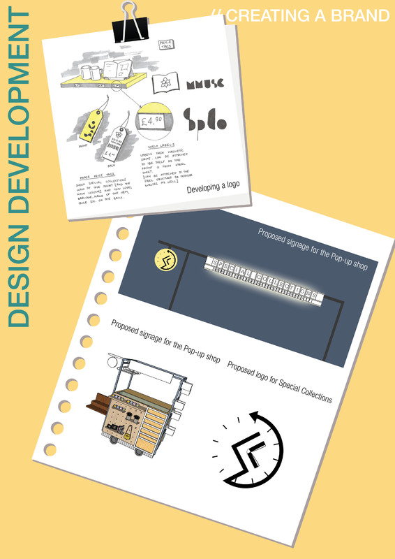
Following this they focused on the signage looking at how different size shops promote their brand. They came across various methods of displaying the company name and ways they are affixed to the outside of the shop. Using this information, they created a board on which they could add letters to so that sign could be changed depending on location or stock. To Accompanying this, they decided that a logo was a key component for an organisations’ branding. So, they started to draft a logo that could be used by special collections and would bring the whole brand together.
For a shop its brand is its identity, a set of aesthetic qualities that when done successfully can achieve a variety of goals. Firstly, it can link all the products or facilities that fall under the same company/organisation. This creates familiarity and consistency making it easier for a customer to know who they are buying their products or services from and aware of where to return if they enjoy the experience. Combined with this the brand can highlight an ideal demographic through colours and font styles. More bright colours with bolder fonts will often appeal to a younger audience and pastel colours with simple fonts will present a more sophisticate persona and attract an older clientele.
The Pop-Up shop will work as an extension of the special collections and therefore must work alongside the museums’ visual palette. Through their research the students found that there was no defined branding for both the special collections and the university. They collected together all the fonts and colours that have been used on documentation/websites for both and created profiles detailing them. It was agreed that golden yellow was frequently used and complemented the deep blue more commonly associated with the university.
We encouraged the students to consider a typical client that they want to visit the shop. Commonly know as a pen profile, it would combine characteristics into one ‘Person’ and not an average overall client which can make a design feel vague. At the first meeting with Janneke she described the type of person who would buy the most from a museum shop. This was a middle-aged/older woman with grandkids and would buy cards for future occasions, a gift for the grand kids and a memento for herself. With this as a base we wanted the students to consider this but also think of a ‘future’ client and who they want to attract and buy more from the Pop-Up shop. Collectively we agreed that students would want to be our new pen profile as they will be using the facilities, have the most access to the shop and perhaps buys the least from similar shops. We therefore encouraged the students to design a brand trying to appeal to both audiences but create somewhere they themselves would want to buy from.
Following this they focused on the signage looking at how different size shops promote their brand. They came across various methods of displaying the company name and ways they are affixed to the outside of the shop. Using this information, they created a board on which they could add letters to so that sign could be changed depending on location or stock. To Accompanying this, they decided that a logo was a key component for an organisations’ branding. So, they started to draft a logo that could be used by special collections and would bring the whole brand together.
Posted 3 Apr 2019 11:45