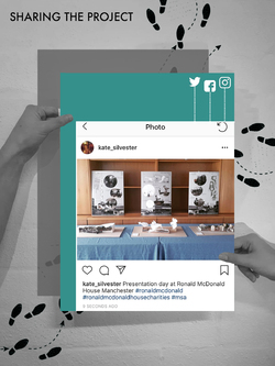
Instagram posts about the final output of this project was shared to the public through social media outlets and word of mouth. The main aim of this event is to create awareness and public understanding regarding the importance and significance of the Ronald McDonald House Charities. The amazing work the charity participates in deserves to be shared. Every students participated in this event REFLECT were encouraged to spread the awareness to people around them.
Posted 9 Apr 2019 15:18
Group 1: CAELI
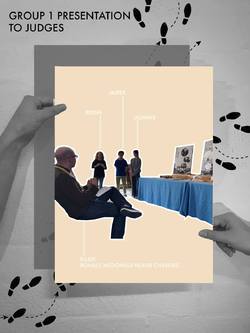
Group 1 presented their work to the panel of judges invited to represent Ronald McDonald Charity House and AEW Architects.
The students each took an allocated time to present their group idea to the panel of judges in a systematic and well composed way. They started by talking about initial ideas, research development, precedent inspiration, feedback from previous presentation, choice of materiality and final concept. They also answered questions regarding their design confidently to the panel of judges.
Posted 9 Apr 2019 14:45
ARCHI-POD
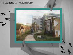
Final render demonstrating the overall mood and atmosphere created by the roof terrace design. Besides that, render also show the relationship between the proposed design with the charity house and how users could interact with the space.
The pods were furthur developed in terms of materiality and opening size. Semi transparent materials were integrated into the overall design of the pods to control the privacy value of each pods. Grasslands were also proposed to be placed around the pods to soften the overall design and provide picnic areas for the users.
Posted 9 Apr 2019 14:43

GROUP 1 - FINAL POSTER
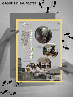
Group 1's final poster clearly demonstrated the unique experiences that would be found within the terrace proposal. After photographing the already detailed physical model we were able to populate them to clearly show the uses of each area of the design.
These included a more enclosed space that could be used for individual self reflection throughout the day as well as social theatre screenings throughout the evening. Communal seating were shown both in the open area as well as the covered. The interactive green planting wall can also be seen, a change for the residents to take part in daily activities and add to design of the terrace in a personal way.
The plan of the terrace design was also included on the poster in order to clearly show where each perspective image is located from.
It was important to show the existing terrace on all of the posters in order to make it clear for the need of these new design proposals, especially for those that are not aware of the House design.
Posted 7 Apr 2019 09:05
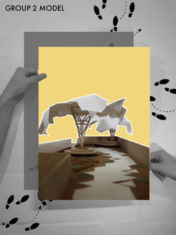
Group 2 Final Model
Group 2 have focused on the detail within the structural elements of their proposal, highlighted in the model that clearly shows the lightweight tree canopies. The integrated seating areas around these structures are also apparent, with materiality being a key concept.
The landscaping follows in the geometric nature of the overall tree canopy proposal, something that is apparent throughout the entire Ronald Mcdonald House.
The lightweight canopies themselves provide intimate seating areas for the residents to escape from their daily stress. The intricate detailing enables for a tranquil atmosphere brought about by the shadows created.
Posted 5 Apr 2019 10:10
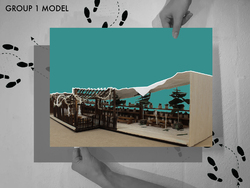
Group 1 Final Model
Group 1 have been extremely successful in the amount of detail produced within their final physical model. They have managed to capture the key concepts of their design well, especially the materiality and social aspect of the green wall planting scheme.
The idea of 50/50 enclosed and open spaces is also apparent, pairing the open lightweight timber structure with the fully covered membrane. This will enable the terrace to be used more frequently throughout the year, as well providing protection from the sun from those on certain medication.
Posted 5 Apr 2019 10:04

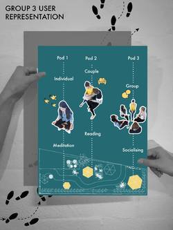
Group 3 User Representation:
Focussing on user entered design, group 3 wanted to provide different sensory environments for the different needs the residents may have.
Something this group picked up on from the resident feedback was a calm and tranquil space to relax as well as more of a social area. For this reason, this group created 3 different environments of different sizes.
Pod 1 is intended for an individual experience such as meditation. The pod is designed to be dark and ambient, allowing the residents to reflect. The pod is only large enough for one person to ensure an individual experience.
Pod 2 is medium size, intended for 2 people. Activities such as reading can the place in this pod, as well as ensuring an intimate experience for couples as well as friends. Private conversations can take place in these pods with little distraction from others.
Pod 3 is the biggest pod, intended for a group of people to socialise inside. The social aspect is important for the residents, however it isn’t as important as the other individual experiences therefore only one of these group pods is provided.
Posted 4 Apr 2019 10:28
We provided some advice and skills tutorials on how the students could turn their Sketchup digital models into diagrammatic analysis to best showcase their proposals. Using exploded axonometric drawings helped explain how the structure the designs would work, something that Alex and Emma were eager to see.
The first and second year students were keen to jump straight onto using real time rendering software from their Sketchup models. However, we have provided precedents and advice into alternative methods of showcasing their final visuals in a softer approach. Simple line drawings from the digital software could be partnered with photoshop work in order to capture the atmosphere in their designs.
Posted 2 Apr 2019 11:02
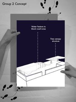
Group 2: Alice, Yumian, Roxandra
As a way of disentangling from the hospital environment, Group 2's terrace encompasses a tranquil and calm environment. The comfortable seating flourishes into tree shaped shelters that have views of the water feature and garden of vivid flowers.
Pioneering the balance between shelter and open space, the sweeping waterfall acts as a buffer both visually and acoustically. Each of the users have their own plant incorporated within the garden wall behind which can be looked after and watered which creates a sense of community within the terrace.
Following the natural flow of water the glass walkway creates a private space where their senses take over.
Posted 2 Apr 2019 10:23
Day 4 - Reviews with AEW Architects
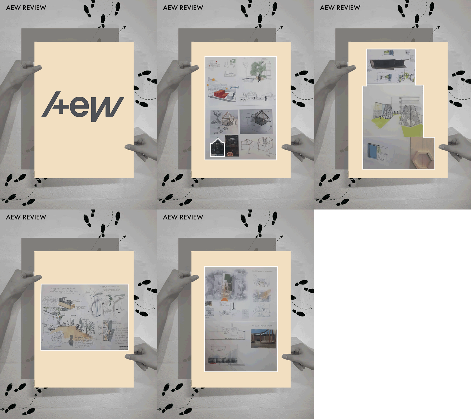
This afternoon we had the pleasure welcome Alex and Emma from AEW Architects to the studio to review the students work up to date. Each group took turns to present their initial concept design ideas, showing sketches as well as physical and digital models.
After each group had presented their ideas Alex and Emma were able to give valuable feedback on their designs, giving them advice on where they should focus their concepts as well as thoughts on materiality and structure. It was great to see 3 completely separate and unique design concepts from the groups and the presentations were all of very high quality.
Some great suggestions were made from both the students and the architects on ways to move forward on the design and we were happy to see Alex and and Emma so excited about the project. The students will now have a couple of days to finalise their designs, taking on board all the valuable feedback from today.
Posted 29 Mar 2019 10:41

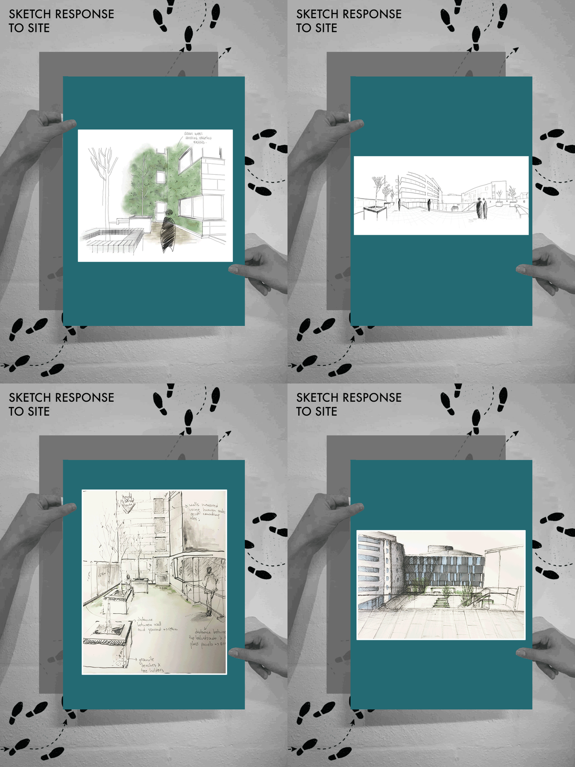
Day 2 - Sketch Response to the site
During the site visit the student groups started to produce some excellent sketches, annotating their findings. Notations on materiality, access and environmental qualities were being made as well as initial thoughts on how to improve the space.
A key theme of vegetation was apparent throughout all of the groups, both on the current lack of vegetation on the roof terrace and how greenery could be introduced to the space. We were able to advise the students on non invasive lightweight methods of introducing this greenery to the site including green walls and hanging trellis’.
It was also interesting to see how many of the sketches included the main garden area. This relationship between the ‘playground’ area and the roof terrace needs to be considered, inducing access, materiality choices and views.
Scale was also apparent in many of the drawings, highlighting the contrast between the roof terrace level and the mass of the attached House. Scale in their pavilion designs could be a crucial aspect in helping them move forward. We are excited to see what they come up with!
Posted 26 Mar 2019 16:36

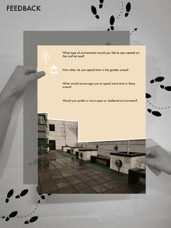
In order to gain valuable information on our design proposal we decided to create a feedback form to be handed to each of the residents. This will form some key research from our target audience and provide an interesting design driver.
The questions included:
What type of environment would you like to see created on the roof terrace?
How often do you spend time in the garden areas?
What would encourage you to spend more time in these areas?
Would you prefer a more open or sheltered environment?
We decided to post these question ahead of our events 2 week period in order to provide the students with a strong starting point on their projects. The feedback forms were placed in the rooms of each of the residents in order to remain respectful of their current situations. All feedback will be collected on the 24th March in preparation for our events period.
It will be crucial for the opinions of the residents to be taken into consideration when it comes to the design of the roof terrace. In order to create a suitable and sensitive environment the needs and desires of the residents must be at the forefront of design.
Posted 18 Mar 2019 13:26

The Royal Manchester Children's Hospital provides specialist healthcare services for children and young people throughout the North West, as well as nationally and internationally. The hospital tends to over 140,000 patients each year across a range of specialities including oncology, haematology, bone marrow transplant, burns and orthopaedics.
The Hospital is the largest and busiest children’s hospital in the UK with 371 paediatric beds. A further 60 neonatal cots also operate, within the same building, in the tertiary neonatal unit of Saint Mary’s Hospital. This enables the staff of the two hospitals to deliver completely joined up services for families, from prenatal care through birth and beyond.
The specialist equipment that is provided at the Royal Manchester Children's Hospital results in families from all across the UK, and in some situations even internationally, to travel to it. This highlights the importance of the Ronald McDonald House Charities providing free accomodation to families who are so far away from their own homes.
Posted 16 Feb 2019 18:19
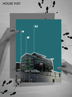
Group site visit to the Ronald McDonald House - observing its location and close relationship to the Children's hospital.
The House is directly opposite The Royal Manchester Children's Hospital in central Manchester, enabling families to continue their lives with some degree of normality, knowing they are just moments from their child's bedside. This quick visit showed us the importance of the Ronald McDonald House Charities and all of the great work they are doing.
Posted 13 Feb 2019 12:15
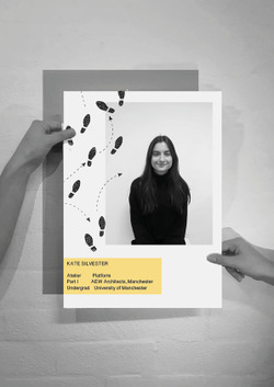
Meet the group: Kate Silvester
Posted 22 Jan 2019 18:38
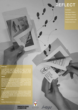
As a group we have decided to collaborate with Ronald McDonald House Charity that provides free 'home away from home' accommodation to families with children in hospital.
Our event proposes to aid in the conceptual re-design of the RMH Manchester terrace, turning it into a garden of reflection for the residents. You will not only have the chance to work on a live design project but also the opportunity to help an extremely worthwhile cause.
Please see our poster for more event information
Posted 9 Jan 2019 11:31
