THANKS //
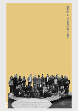
We would like to thank all the first and second year Manchester students for the commitment to the Alberts Connection event. They have all created amazing schemes with exciting concepts in such a short time. We would also like to thank the Coburg students for being amazing hosts and participances for our event. Their local knowledge and aptitude for construction grounded every scheme into the context of the site and made them buildable. We look forward to returning to Coburg to build the winning schemes.
Posted 5 Apr 2019 19:38

GROUP 1 FINAL PRESENTATION //
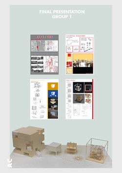
After being introduced to the site by Dr. Marcus Neufeld, Group 1 were very surprised that the facilities and the opportunities that laid right by the university and suburban area of Coburg was so underutilized. They began their presentation by pointing out how their initial response was grounded on the current use of the site as they found out by talking to students that: ‘The general opinion was that Creapolis is often overlooked by the public and not many people are even aware that it exists.’ Therefore, their goal was to solve this issue. They started by thinking about how they could create a beacon where the people of Coburg are drawn to.
In their initial observations of the site they saw that the bridge acted as a spine connecting the suburban area into the inner city. Residents of Coburg circulate around the site as a part of the daily routine to work, to school or into the town centre. They wanted their spatial intervention to become an alien imposing on their routine.
Then, they talked about the metaphor of the game Klotsky that they used as an initial idea, that has one key piece that is central to the game but is flexible too. They wanted people to directly interact with the space and their key drivers were: meet, stay and event. To realize their proposal, they played around with the idea of a fixed central space with a flexible space around it. From this they explored many iterations, until their final proposal.
They talked about their first design idea that revolved around having a 7x7 grid cube structure made up of blocks which could be used for different seating arrangements. This overall structure is 3.15x3.15m and would be framed by a scaffolding and another scaffolding structure literally framed the installation visually. On the frame they proposed to have spotlights illuminating the inner cube structure, to create this beacon object.
After that they found that perhaps although their structure would be visible from many key views, it wasn't large enough to act as this attraction that can draw people in from all around, so they scaled up the structure to almost double - creating this two storey structure. Although, with this iteration they thought they lost the playful aspect of their design as to make it structurally sound it needed to have some fixed spaces. Nonetheless, this was an important step in their design process as it was here that the group began to explore the idea of an interior space as part of the design, discussing the voids that could be left behind when blocks are taken out.
When describing their final design proposal, the group mentioned that they wanted to create flexible spaces to give the users the opportunity to be creative and interact with Creapolis in a playful way. By removing ‘pieces of the game’ and adding more the users could create dynamic spaces in which they could read, chat with friends, play games, be creative and ‘make a space’. The group aimed to offer freedom to the users by not establishing a predetermined program.
Posted 5 Apr 2019 17:54

GROUP 2 FINAL PRESENTATION //
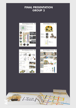
Group 2 started their presentation by first giving a thorough introduction into their site analysis. They considered the access on the site, the different views within it and the range of textures and materials found there.
Then they presented their initial ideas that started from their initial discussions with Dr. Marcus Neufeld. They found out from him that Creapolis wants to extend their workshop space so one of their initial ideas was to create an outdoor flexible working space. They also wanted to create a space for people from Coburg to meet and spend time together, therefore they thought of making the outdoor space multifunctional so it could also be used as a beer garden. Beer gardens originated in Munich in the 19th century and they are very common throughout Germany, but it seems that the city of Coburg has only one.
Next, Group 2 presented their initial models. When they first modelled the design, they considered the use of the existing gridline pattern from the surrounding buildings. They emphasised this gridline by drawing coloured lines on the pavement between the workshop building and the cool house. They also matched the timber framing of their proposed extension with each pillar on the existing workshop space. Then they modelled the hay cubes that would act as the seating arrangement for the public. What they realised was that the two functions were disconnected, therefore they had to find a solution which would merge the two together. They resolved this by incorporating the cubes themselves as part of the workshop structure, that way they created a link as to why the hay cubes are being used for the multipurpose space.
They approximated the cost for the hay bales to be around 2000€, as they estimated that they would need 200 straw cubes which costs 10€ each. They concluded that the 4000euro budget is probably sufficient to build the workshop.
Posted 5 Apr 2019 17:53

GROUP 3 FINAL PRESENTATION //
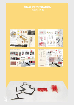
The scheme proposed by Group 3 was initially developed from the site analysis, sharing a strong connection directly to the site and this is displayed throughout their project. They started off their presentation by describing the site’s history and its current conditions. They identified the numerous textures and materials found around the area, the red brick, concrete, OSB, and stone and concluded that each of these textures bring a different quality to the site giving it a strong identity. They picked on the visible contrast between the slaughterhouse and the very neat, clean facade of the Creapolis building and used it as a starting point for their design process as they wanted to emphasise this contrast. The site has two different types of buildings. One has a very clean and appealing facade whereas the other has a rough, graffiti wall. These two different features bring an interesting personality to the site and give it a strong identity. Group 3 wanted to emphasise and celebrate this contrast within their design. Coburg is seen as a very picturesque city and they wanted to explore its almost non-existent dark side.
Their Concept image represents this idea of contrast which they wanted to emphasise by making a border and transitional experience for users which lead to the idea of a stringed structure. They decided to use the colour red because it resembles a red curtain within a theatre and it represents the suspense of not knowing what is going to happen behind this curtain. Rather than having an actual curtain they thought strings would be a better option, so people can enter from any point rather than directly from the centre.
They continued the presentation by talking about their different iterations for the two experiences. The first iterations they did was for the string structure. They decided on a timber structure with a grid pattern as the roof that will allow the red strings to be attached. The iterations highlight how they want to implement the graffiti which is already visible on the site into their design. Translating this through harsh, strong black lines that will vary in height and rise from the floor. This interesting angular pattern will contrast the flowy and inviting pavilion.
They talked about how they want the users to experience the contrast of the space by following the coloured pathway into their proposed vibrant and inviting red pavilion and to get the users to feel excited. After experiencing this they want for the users to feel the complete opposite when seeing the harsh black lines, painted in different angles along the floor.The graffiti inspired pathway is there to make users question what they are walking upon, the idea is to make them feel an emotion different to when experiencing the string pavilion. Users can socialize, meet and use this interesting and adaptive space for performances.
Next they talked about their first initial sketch model and how from there they improved the design further as they decided to create a single curtain of string that will be attached to the side of both buildings. By doing this it makes it feel a part of the site rather than an addition. Another detail they decided to change was the multi-coloured stripes leading the individuals to the site as the colour and visual appearance of the red strings was enough to attract people to the space.
Then they described the seating area concept that was developed from the idea that this would reflect the graffiti on the walls and mimic their harsh, bold lines. The reason for the colour black was that is represents the roughness of the space. After creating a number of sketch models, they drew the different viewpoints within the seating area from an individual’s perspective. Having these viewpoints enabled them to determine the best areas for arches and seating spots. The iteration they decided on is a route which travels around the site and offers good views. This has six seating areas and three arches. The ramp and arches will be built from OSB and this is an exploded structural detail highlighting the different components of the ramp.
Lastly they spoke about costs and how the pricing of the materials used for their proposal will be within the 4000 euros budget. After some research into manufacturers and costs they concluded that the OSB will be approximately 2000 euros, the steel pole 250 and the red string less than 1800.
Posted 5 Apr 2019 17:53
PENULTIMATE DAY //
Today is the final day for the student's to refine their projects and presentations in preparation for the jury tomorrow. We have given the groups a deadline of 6pm tonight so that we can open up the studio/exhibition space to the staff and students at the Campus Design. This will be a nice opportunity to preview the work before the students present tomorrow.
The emphasis today has been on competition presentation. The student's have been concentrating on presenting their projects in a way which tells a clear narrative and can be easily understood when the jury look back over the work during the deliberation. The Co-ordinators have also been setting up the room ready for the students to present their work and models in a professional way.
Posted 2 Apr 2019 13:04
INTERIM REVIEW //
On Saturday evening, Anja and the coordinators had an interim review with each of the groups. The students had to present their design ideas starting with their initial site analysis and concepts and then talking through their developed proposals. Some of the groups made great use of the existing site model as they placed their own interventions’ models on it which made it really easy for us to understand their schemes. As we discussed through the ideas we all made a mental exercise to try to picture ourselves in the created spaces, on the site. This was very important to do as it helped us realize how different people would inhabit the spatial interventions and what the students should consider to further improve in their designs. Going forward the groups were encouraged to think more about atmosphere and construction techniques while also considering the budget. We are looking forward to seeing how each project develops from this point into a fully resolved scheme.
Posted 1 Apr 2019 14:23

BAUHAUS TRIP //
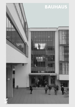
Early Friday morning we and a group of students from Coburg University embarked on three buses for a day trip to Dessau. Our first stop was at the Bauhaus, the former German school of art that was designed by Walter Gropius and opened in 1926. When we got there, we were given a guided tour of some of the most important spaces inside the building and we were presented information about its design and history.
The design of the school was realised as a further development of one of Gropius’s buildings, the Fagus factory in Ahlfeld an der Leine. The Bauhaus building has a curtain wall system that is carried over 3 floors with no opaque spandrel panels which allow views in the interior working spaces. By doing this Walter Gropius tried to create an impression of transparency. The interior fittings were made in the Bauhaus workshops by the different teachers and students of the school. The pieces of furniture were designed to be mainly functional and their components were reduced to simple geometric forms.
The school played a significant part in shaping the modern society after the WWI. The initiators and teachers at the Bauhaus were rejecting traditional knowledge and were trying to radically rethink life, society and the everyday world. Their intention was to create a school of design in which young people could give shape to the modern age and meet its many demands through developing their artistic creativity. Rather than focusing on the individual works of art, they chose to focus on the everyday objects and to explore working with different materials by pushing their limits and manufacturing them on an industrial scale.
In 1928 Walter Gropius transferred the leadership of the school to Hannes Meyer, who placed the focus of the Bauhaus on social aims, being mainly concerned with the question of how well designed products and buildings might be made affordable for all. The students under Meyer became politically radicalised and involved with communism. As a consequence, politicians were feeling threatened so they decided to remove Mayer from its position. Next, Mies van der Rohe took the leadership and he changed the preliminary course by focusing on architecture, constructive logic and free-flowing open space.
In 1932 the National Socialists have got a majority in the municipal assembly of Dessau and they decided to close the Bauhaus Dessau, as they were against the principles of the school considering it to be ‘Anti-German’. Therefore, Mies Van der Rohe had to move the Bauhaus school to Berlin-Steglitz. He directed it from there for one more term, but after many disagreements with the National Socialists he announced the closure of the Bauhaus on August 1933.
Posted 1 Apr 2019 10:57
SITE ANALYSIS //
Group 1
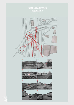
The key driver on the site for Group 1 proposal is the visibility as their aim is to draw the attention of the public to the site. With the network of roads surrounding the site and the frequency of car travel, the site and their installation would be seen from nearly all angles. In addition to this, there is the train line which goes along the West face of the site, which can be a key source of attraction.
Posted 28 Mar 2019 16:14
SITE ANALYSIS //
Group 2
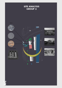
Group 2 have presented a focus on materiality on the site; identifying stone, tarmac, brick and wooden pallets and the location of these materials. As all materials appear to congregate in one particular area in the space, it has formed an interesting opportunity to explore this specific zone, as highlighted in red, further to form a potential location for their spatial intervention.
Moving forward, they began to capture viewpoints of their identified zone from different perspectives and levels, this has made them aware that their design will be visible from multiple locations around the site.
Posted 28 Mar 2019 16:11

SITE ANALYSIS //
Group 4
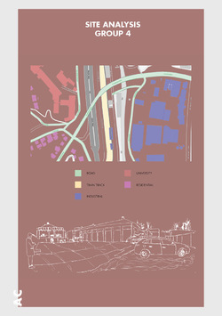
Group 4 did a good SWOT analysis of the site.
Strengths:
- The floor are and size of the given site is quite large and rectilinear, providing great design opportunities
- The Coburg train station is located on the north with the main highway running on the west, providing transport connections
- The sunpath convers the entire site throughout the day
Weaknesses:
- The landscape on site is in disorder, with unattended vegetation at the front of the cool house and the office as well as at the back
- The given site is relatively dull, and is not lively nor inviting
- The existing buildings on site have a monotone colour scheme
- The site is quite far from the city centre and train station; it is not convenient to get to by foot
Threats:
- Noise levels on site are great as the site is located adjacent to a main highway and a train track
- Winds will mainly be blowing from the South to the North-West; the surrounding and existing buildings aren’t tall, therefore the given site is exposed to strong direct winds
Opportunities:
- Since the site isn’t lively nor inviting, we could utilise our communal hub to enliven the site with a variety of events and provide a grand entrance that leads the users into an experience
- With the dull surroundings and monotone colour scheme of the existing buildings, we could bring colour and artificial lighting into the site
- In terms of materiality, wood is the best to use within our design as it can be sourced locally and is a sustainable material
Posted 28 Mar 2019 16:09
SITE ANALYSIS //
Group 5
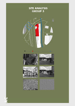
The Site has quite a few existing features which Group 5 can use in their design. For example the brick blocks could be used for the raised deck, the bicycle stand would also be refinished and remain as part of the site. The gravel could be crushed and placed around the fire to help control it, whilst still allowing the ruffness of site to remain.
The site has an industrial feel which can be relate back to Manchester. The loaction being beside the train station adds to the affect. There is a graffiti wall separating it from the street which adds character to the site and the group think it should remain like that. It also creates a relationship between the site and the nearby river ITZ as it too has decoration hidden by moss, which was the main inspiration for this idea.
Posted 28 Mar 2019 16:09

LECTURE //
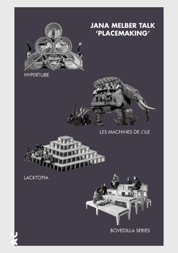
This morning we had a captivating talk from Jana Melber. She is an architect working at ASP Architects in Stuttgart and a research collaborator at Creapolis. Jana introduced us to a range of projects to use as inspiration in our own designs. She presented a few projects from Enorme Studio, an architecture and design office based in Madrid that is characterized by their radical approach to architecture, city and people. Their aim is to foster alternative ways to examine urban issues and to motivate the creation of a proactive citizen culture. Some of their projects are: Lacktopia, Manifesta 12, Urban Spa, Hypertube and Bovedilla Series and Jean d’arc on wheel. Another very interesting project that we were presented is ‘Les Machines de L’ile’. The designers François Delaroziere and Pierre Orefice’s are creating strange looking machines which resemble different oversized animals or creatures. The machines are put in motion and brought to life by machinists so that people can embark on an amazing journey inside or on top of them.
Posted 26 Mar 2019 14:19
SITE VISIT //
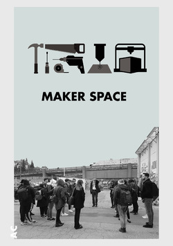
Today, Dr. Marcus Neufeld showed us around the Makerspace and the site. Makerspace is located in the director’s villa of the former Slaughterhouse and is a well-equipped open workshop including both high-tech machinery and traditional tools. This is a place of innovation where Creapolis aims to bring the know-how and competencies of Coburg University staff and students to the region. It is open to all citizens and is based on the community and the sharing of knowledge and experience so that everyone can benefit. Students, citizens, partners and all interested parties can come together and collaborate to implement their ideas and learn new skills. With this in mind, the outdoor space needs to be transformed to work in collaboration with the community and the Campus Design Open festival.
Posted 25 Mar 2019 22:55

PUBLICATION //
For the end of year exhibition, we will produce a physical publication documenting the research, process and development of the Events project that we will be conducting during the two weeks spent in Coburg. We aim to make our content as visually appealing as possible. We started preparing by looking at the steps we need to take in order to produce our own custom publication. We will start by creating a content plan for all pages, including the front and back covers. Then we will create a detailed plan for each article that we want to include. Next we will create a design mock-up that will provide a visual guide to help us envision the layout of each article. Before we start working on the final design we will need to proofread and edit all the articles. At this stage we will make sure that the design of every spread is consistent and works with the design of the publication as a whole. Finally, before we send it in for printing, we will double-check to make sure everything is in order.
Posted 25 Feb 2019 08:43

READING LIST //
In preparation for our trip to Coburg we compiled a list of books to dive into before we fly there. This reading list is meant to prepare us for applying wider knowledge to the work we will be producing during the competition stage of the project. It includes some books that are intended to help us think more conceptually when coming up with initial design ideas and some others that will help us at a later stage when thinking about how the proposed spatial interventions can be constructed.
-Atmospheres: Architectural Environments ;surrounding objects by Peter Zumthor, Published Basel: Birkhäuser, 2006
-Thinking Architecture by Peter Zumthor, Published Boston: Birkhäuser, 2015
-Vacancy Studies - Experiments and Strategic Interventions in Architecture by Erik Rietveld, Ronald Rietveld, Published Rotterdam: nai010 publishers, 2014
-Constructing Architecture: Materials, Processes, Structures by Andrea Deplazes Published Basel: Birkhäuser, 2013
-Curating Architecture and the City by Sarah Chaplin & Alexandra Stara, Published Florence: Taylor and Francis, 2009
-How to like everything: a utopia by Paul Shepheard, Published Winchester: Zero Books, 2013
Posted 11 Feb 2019 08:48
COLLABORATION //
Whilst in Germany, students from both Manchester and Coburg will be asked to work on a design competition in groups. There are many benefits of working as part of a team. It is an effective and valuable way to learn and is also extremely significant to the workplace. Working together will allow you to analyse your ideas in more depth and also to combine a range of skills that will help you to define a better design solution, than if you were working individually. In addition, teamwork can make study more efficient and fun and you will get to make new friends in another country.
Teamworking can provide a great chance for you to develop skills such as:
• Organisation
• Delegation
• Effective communication
• Co-operation
• Leadership
• Following
Posted 29 Jan 2019 10:15
