EDUCATION OUTCOME//
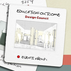
After a really engaging two weeks, the educational sub group have completed their final design. As you can see from the visual representation, we have designed a moveable and foldable installation which engages people with the slides in an educational way.
The way in which it does this is with 4 different uses; the four uses are situated within an installation that is a foldable and moveable object in order for it to be placed in any location.
The first use is the light box towers, which through a clever mechanism attach sheets of the design slides onto the outside of a Lightbox in order for people to see them. We have then designed a magnifying device frame that allows the user to zoom into the detail of the individual slides.
The second use is actual storage of the slides itself; we have designed a storage tower in which the slides will be categorised in order of their genre so people can scroll throw the slides to find their specific choices.
Once they have their chosen slides the aim is for them to take them to use one or two devices, either the Lightbox desk or the projector. The Lightbox desk allows users to sit down, place the slides on a Lightbox table and then use a moveable magnifying device to closely examine the slides. The projector allows the users to blow up the size of the images of the slides so people can see them clearly.
Posted 5 Apr 2019 12:33
