FLIGHT HOME //
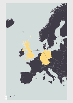
After 11 days of hard work it was time to fly home. The event was a great success and this was made easier by our host university and their warm welcome and great hosting skills. The students cannot wait to get back out there to build and realise both group three's and group five's designs.
Posted 6 Apr 2019 14:01
WINNERS //
After an energetic debate the jury decided that group three had highlighted a key aspect of the site through there curtain. As a result they wish to construct this aspect of their final design. They believed that this visual metaphor was enough to highlight the juxtaposition of the state of the site.
On reflection the mixed groups form Manchester and Coburg gained a lot of experience through the schools differing approaches. With an emphasis on the technical side the Coburg students learned a lot from the Manchester students approach to site analysis. Also the Manchester students learned technical details and construction details from their German peers.
Posted 6 Apr 2019 13:50
WINNERS //
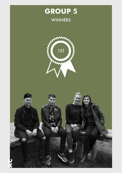
The jury felt that group 5 had a strong concept from the beginning and have found a program that will draw people to the space and encourage them to stay and engage with one another throughout the evening, ideal considering the small number of spaces that accommodate Coburg's nightlife.
On reflection the mixed groups form Manchester and Coburg gained a lot of experience through the schools differing approaches. With an emphasis on the technical side the Coburg students learned a lot from the Manchester students approach to site analysis. Also the Manchester students learned technical details and construction details from their German peers.
Posted 6 Apr 2019 13:47

DESIGN DEVELOPMENT //
Group 1
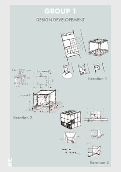
'Our design began looking into movable modules that offer several different kinds of spaces for certain programmes with the various configurations that were possible. These modules would move sliding along a train track system. This idea manifested as a variation of the game of Klotski, which was a basic wooden block puzzle, where you rearrange the blocks to solve it.
Moving on from that point, we began to question the purpose of the original purpose of the installation and going taking out design back a bit, we investigated how we wanted to attract people to Creapolis and the Makerspace. Following that idea, the form of our installation evolved into this cube structure that would act a beacon, catching the attention of people passing the site. At this point in the design we started to consider the scale of these modules and reverted to smaller blocks that could be used as seating and stacked to form partitions, allowing for the different configurations that we planned for before. When modelling our design, we found that although we had managed to incorporate movable modules and embody the playful aspect of the game in our design, it would fail to be the beacon that we intended and so we scaled the whole design up to nearly double to create this immense mass that could be seen from nearly any angle and would surely attract attention.’
For the buildability of Klotski’s design they have been exploring modular ways of creating this large cubic structure. One of these system was to use scaffolding, within this process their are many ways to achieve the desired outcome of the structure. There are also load and wind calculations to factor into the final form.
Posted 2 Apr 2019 11:06

DESIGN DEVELOPMENT //
Group 2
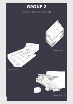
'Initially, our idea consisted of a geometric structure which was up against the the workshop as a type of extension. The timber frame would match the columns and would be expressed through the construction and the floor to form a gridline pattern, with which the seating is arranged for public use. In addition to this, we were thinking of how to merge the workshop with the seating space. In order to resolve this, we came up with a proposal of incorporating the hay bale cubes into the construction, these would be stacked onto of eachother to form the front ‘columns’. An advantage of this is that you can easily grow plantlife directly onto the hay.
This modular system that Space Maker’s are deploying will aim to be interchangeable along the inferred grid lines. Although these aren’t fixed to the grid lines the mere suggestion of this rule, should make the user stick to the layout. However if these aren’t used then there is a freedom for he user to create different spaces to work and play.
Posted 2 Apr 2019 11:05
DESIGN DEVELOPMENT //
Group 3
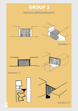
'We began with the idea of a red string pavilion and wanted to create an interesting experience for the users and create a ‘threshold/schwelle' between the different identities of the site. However, we realised that this may be too large for people to pass through regularly, so we decided to convert it to a wall/curtain.’
The key to this design is create a heavy and clean threshold to the site, in order to create a drama and theatre to reveal the chaotic nature that lies beyond this border. The red used is a nod to traditional curtains used in theatre houses yet the use of string is merely hint at the chaos beyond.
Posted 2 Apr 2019 11:04

DESIGN DEVELOPMENT //
Group 4
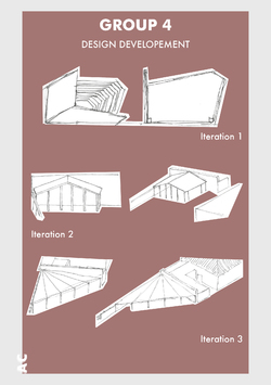
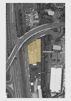
'Since starting the project at the Slaughterhouse, we have had various designs linking back to our concept, still finding the one idea that fits perfectly. Allowing the community to build their stay. We aim to provide the blank canvas, the base structure and the basic diagrams to show how this is done. Co-kea will be the future of the slaughterhouse communal area. Would you like a seat? They’re are 5 levels of difficulty. Fancy playing on a football table? You’re going to have to help build it first. Each person will have to create their piece by piece in order to play a game, this principle applies for the football table, the pingpong table and chess pieces that can be 3D printed.
With the existing offices containing various pieces of workshop machinery, our goal is to bring the community together, in an outdoor environment. The outdoor area will be covered by a canopy, sheltering the play space, workshop space and exhibit. Protecting you from harsh weather conditions and also slowing warm air flow in the summer days of the year.’
The main driver behind ‘Co-kea’ is to create a scaled up version of the Creapolis format. This is done by inviting the public into the considered proposed landscape and giving the public a kit of parts and a manual to erect the furniture used in the space. This aims to show the community that how easy and accessible it is to create and share resources.
Posted 2 Apr 2019 11:03
DESIGN DEVELOPMENT //
Group 5
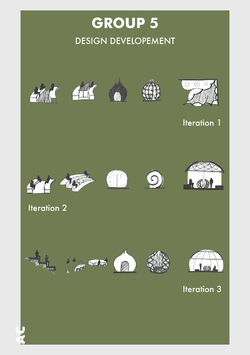
'Our project development mainly focuses on the main fire display, seating area, canopy and the sleeping pods. We wanted every aspect of the design to seem cohesive.’
In order to create a cohesive design, Libelle have looked at the scaleability of the elemental design. This has been achieved by focusing on the circular format taken form the seating of the fire this form has been transformed 3-dimensionally to create a scalable form for both the tents and canopy.
Posted 2 Apr 2019 11:02

LECTURE //
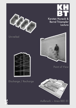
On Tuesday evening Karsten Huneck and Bernd Trüempler from KHBT presented to the design campus as part of a student led lecture series. These lectures are available for the entire design campus school and are also open to the residents of Coburg.
The lecture featured several of their own practice work, alongside some of the work that has been undertaken though their other collaborative collective, Office for Subversive Architecture (OSA). Below are a few of the projects presented within their own words;
Un-Veiled
To mark the launch of RIBA North, Un-veiled visually and spatially interpreted the aims and purpose of the new national architecture centre.
The resulting pavilion in the Winter Gardens, a covered public area at the entrance to RIBA North, used curtains of mesh fabric, used on building site scaffolding, to create sections through some of the most iconic architectural structures across the Northern Powerhouse. Scale negatives of these buildings wafted in and out of focus as visitors walked through, beyond and within, The Sage in Gateshead, Imperial War Museum North, Liverpool Catholic Cathedral and York Minster.
Point Of View
osa in collaboration with Blueprint magazine took direct action and built the first viewing platform for the 2012 Olympic Games.
At 6am, on 12 June, without permission, Point of View has been erected, a stair-like structure painted regulation Olympic blue. It has been placed alongside the fence that surrounds the park, not as a provocation but as a gesture of friendliness, openness and enthusiasm for the games a spirit seemingly unknown to the many official bodies organising them and developing the east London site.
It wasn’t just information about the building programme that was hard to come by. Access to and views of the site were nearly impossible for the curious visitor to obtain.
Point of View was installed at the blue fence on the Greenway, close to the point where it crosses the Lea River. It lasted around 60 hours, during which time it was used by the public, before being removed.
Discharge / Recharge
As part of the Urban Lights Festival in the Ruhr Area of Germany, an architectural performance of light and sound, focusing on a tower block in the centre of Bergkamen, had been created. Simultaneously a landmark and an eyesore, the structure had been unoccupied for 15 years and was demolished by the end of 2015.
As a farewell, the building was painted black signifying its ominous fate but also transforming it into a screen for the projection of an absorbing laser show that tracks the story of the building. Interviews undertaken with former inhabitants of the building were transmitted via a radio channel located at the top of the building allowing visitors to tune in on their own devices while enjoying the spectacle.
The work was created in collaboration with artist Christoph Rodatz.
Aufbruch – Area BEE 51
A parking lot located on the Benjamin Franklin Village, a former American Military Barrack, is converted into a multi-functional Public Space.
The space is dominated by one material, the asphalt, that becomes the central element of the design.
The idea is to cut out the existing surface by framing the existing graphic elements as independent icons. The cut outs are used to and re-arrange the space and make room for other features, enhancing the contrast between the sealed and unsealed parts. Usually stigmatised, the asphalt is seen as a positive element. It also symbolises a material that is central to new American sports such as street-ball and skateboarding, sports that have been introduced to the German Culture by the Americans. All the cut outs (openings) are left natural to create a contrast with the hard and artificial platforms.
The concept develops through two phases.
The first phase will offer a basketball pitch, a boules court/sand pit and a platform that functions as a performance stage. The planted areas will be a mix of spontaneous vegetation as well as formal plants in order to relax or exercise. There will be space for a beer garden, flea markets and other social activities.
The second phase will add a water feature as well as additional platforms for seating and activities. More green areas will provide the opportunity to plant trees and create a vegetable garden.
The yellow observation hut will serve as home for the bees.
Posted 28 Mar 2019 14:22
LECTURE //
After an inspirational presentation there was an opportunity to talk with the speakers, guests and students over some beer and food.
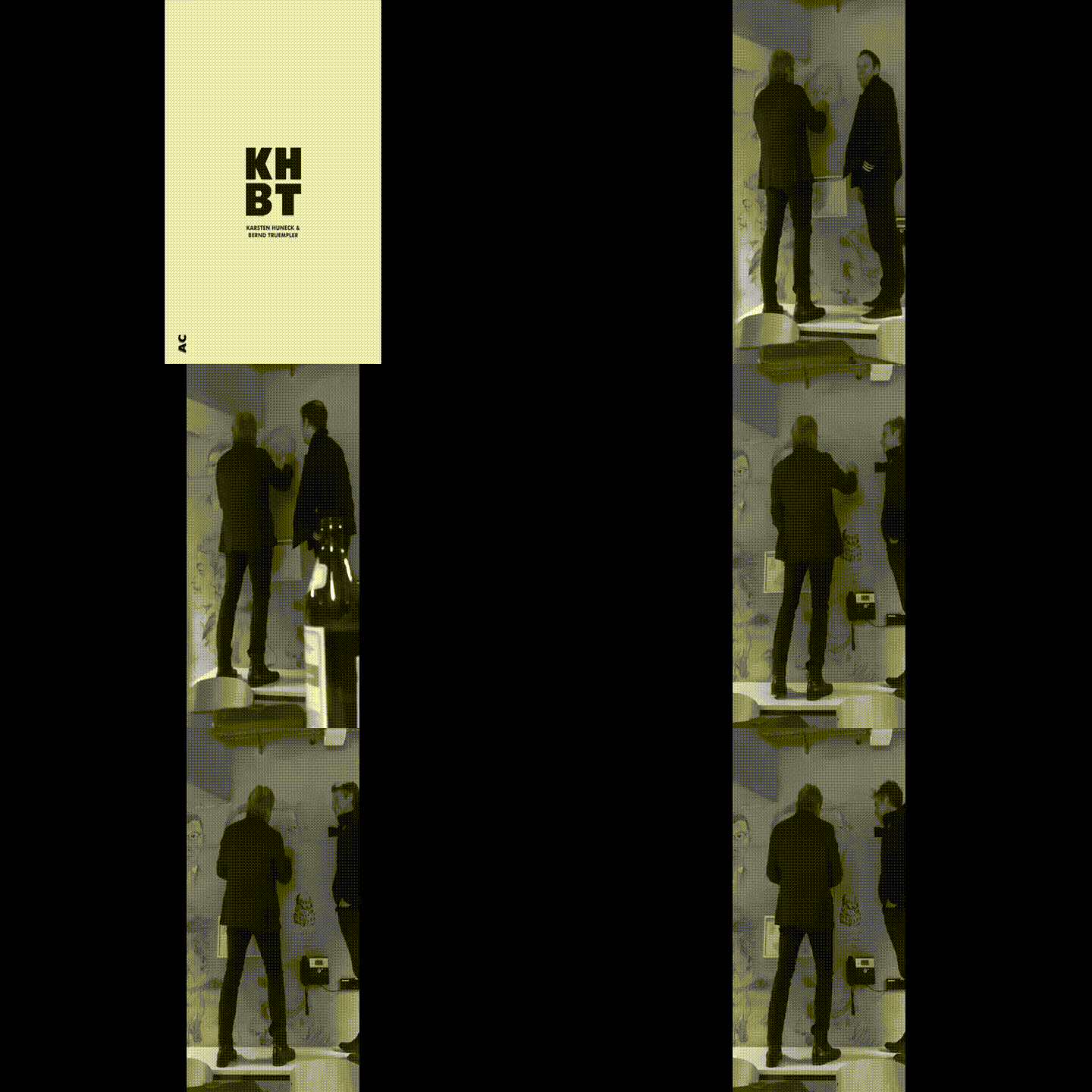
It has become a tradition at the Coburg Campus Design that when there has been a guest lecture, the visiting speaker afterwards has either their portrait or profile drawn onto the concrete walls of the atrium.
Here Karsten Huneck and his practice partner Bernd Trüempler are having their portrait drawn onto to the wall by Prof. Helmūt Bielenski.
Posted 27 Mar 2019 21:17

LECTURE //
As part of the ongoing lecture series that the Campus Design hosts, we are attending a lecture held by our very own Manchester School of Architecture tutor Karsten Huneck and his partner Bernd Trüempler (KHBT).
ABOUT //
KHBT is a creative studio set up by Karsten Huneck and Bernd Trümpler in London and Berlin.
KHBT has consistently created spatial works of local and international significance which are published widely as well as winning various awards such as the prestigious Young Architect Of The Year Award (YAYA)in 2009 where KHBT was gaining the first ever ‘special commendation’ in the competitions history.
Karsten and Bernd are also partners of the experimental architectural network osa_office for subversive architecture which acts as a platform for spatial research that feeds into the practice.
with;
OVER 8 years running KHBT in UK and Germany (London and Berlin)
AND
15 years of experience in architecture working at Foster and Partners amongst others on major projects
AND
25 years of spatial experimentation in the urban context with osa – office for subversive architecture
AND
10 years of teaching at various universities
"we follow with our design a process of progressive refinement towards the goal of defining the essential"
Posted 26 Mar 2019 10:57

EXTERNAL COLLABORATOR //
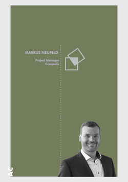
To bring the Coburg University closer to the companies and people in the region. That's the goal of Dr. Markus Neufeld. He recently took over the project management of CREAPOLIS, the transfer and networking platform of Coburg University of Applied Sciences. For him, the threads of the new lighthouse project will converge in the future. He wants to intensify the regional network of the university and initiate further cooperation with companies and organizations in the region.
"I am looking forward to a very dynamic environment, a really exciting new activity for CREAPOLIS and the opportunity to contribute my experience in regional development," notes the new project manager.
The 35-year-old Bamberger was born and raised in East Westphalia. After studying geography, business administration and statistics at the University of Bamberg, he gained his first professional experience in the marketing and sales of a book publisher. He then worked for two years at the Economic Development Department of the City of Bamberg. Most recently, Neufeld worked as a research assistant at the Institute of Geography of the Friedrich-Alexander-University Erlangen-Nürnberg and recently did his doctorate. There he worked and directed numerous projects of regional development. He states: "Almost everything was involved, from demographic change through spatial development reports to regional added value."
CREAPOLIS is the transfer and networking platform of Coburg University of Applied Sciences. It will be funded by the Federal Ministry of Education and Research with around 6.5 million euros over the next five years. The aim of the project is to systematically increase regional networking and knowledge transfer in order to create added value for the economy and society in the region. The central component of CREAPOLIS is to become a Makerspace. This high-tech workshop will be open to everyone - from leisure crafting to StartUp prototyping.
Creapolis will be home to the winning design and will be implemented in May.
Posted 25 Mar 2019 21:51
MEET THE STUDENTS //
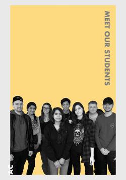
Last week we met up with the students to give them the intinery for the upcoming event.
It was great to meet them and run through the details of the event. There was lots of enthusiasm and questions. Can not wait to start now!
Posted 12 Mar 2019 11:11
PRODUCTION //
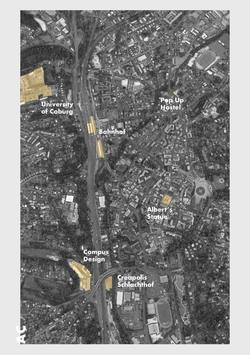
Coburg is a town located on the Itz river in the Upper Franconia region of Bavaria, Germany.
Through successful dynastic policies, the ruling princely family married into several of the royal families of Europe, most notably in the person of Prince Albert, who married Queen Victoria in 1840 and this year we mark Albert's 200th birthday.
Coburg doesn't have a major airport so in order to get to Coburg, the group will fly into Germany's biggest cities and then from there we will arrive in the centre by train. Coburg is a small town and is very walkable to and from the outlined sites.
Posted 12 Mar 2019 11:06

RESEARCH //
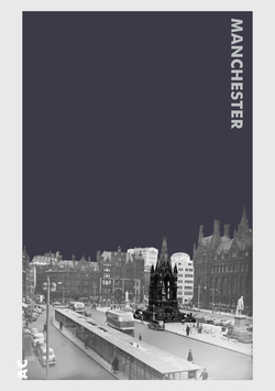
Queen Victoria's consort, Albert died in December of 1861. Following his death there was a great deal of discussion in Manchester about an appropriate memorial. There were those who thought that a practical memorial like a hospital or a School of Art might be the best choice but in the end Thomas Goadsby, the Mayor of Manchester, offered to donate £500 to finance the creation of a statue of the prince on the condition that it be housed in a "proper temple" somewhere in the city.
Grade I listed Albert Memorial, features a marble statue of Albert standing on a plinth and facing west, designed by Matthew Noble (1862–1867). The figure is placed within a large Medieval-style ciborium which was designed by the architect Thomas Worthington. Noble was commissioned by the then mayor, Thomas Goadsby, to sculpt the Prince's likeness, and the designs were personally approved by Queen Victoria.
The memorial is topped with an ornate spire, and on each side a crocketed gable with canopied pinnacles on colonettes. Within the canopies stand symbolic figures representing art, commerce, science and agriculture. Below these stand secondary figures representing particular disciplines:
The Four Arts: painting, architecture, music, sculpture
Commerce: the Four Continents
The Four Sciences: chemistry, astronomy, mechanics, mathematics
Agriculture: the Four Seasons
The coloured sett paving which was laid around the memorial in 1987 depicts floral representations of the Four Home Nations of England, Ireland, Scotland and Wales.
Posted 11 Feb 2019 11:19
PRODUCTION //
A trademark for Coburg, almost a brand, are the Coburg Designtage, which took place in 2018 for the 30th time and this year will be the 31st annual festival. The creative
as well as innovative from regional economy took this event to present their ideas and products.
For visitors from the region and beyond, it is an annual highlight that attracted more than 6,000 people last year despite the inclement weather. And for creatives from near and now also from far away, it is the event in which ideas are presented vividly, in a special ambience.
Exhibition, presentation, demonstration and seduction at the same time, the designtage are a creative mix that invites you to actively participate. Nobody can resist the aesthetic demands of designtage. You can shape everything: things, processes, companies, regions, life. Everything that takes shape can be designed.
http://www.c-d-o.de/coburger-designtage.html
Posted 29 Jan 2019 10:36
PRODUCTION //
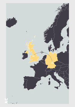
This exciting collaboration between Manchester and Coburg gives you the opportunity to travel to the city of Coburg in Germany.
We will fly to Coburg for two weeks to participate in a collaborative design competition which aims to see your proposals realised in a prestigious design competition.
We are fortunate enough to be given funding for your travel and accommodation. This will cover our trip to Coburg in March as well as in May, when we revisit the city to build our proposal.
Posted 24 Jan 2019 13:47
