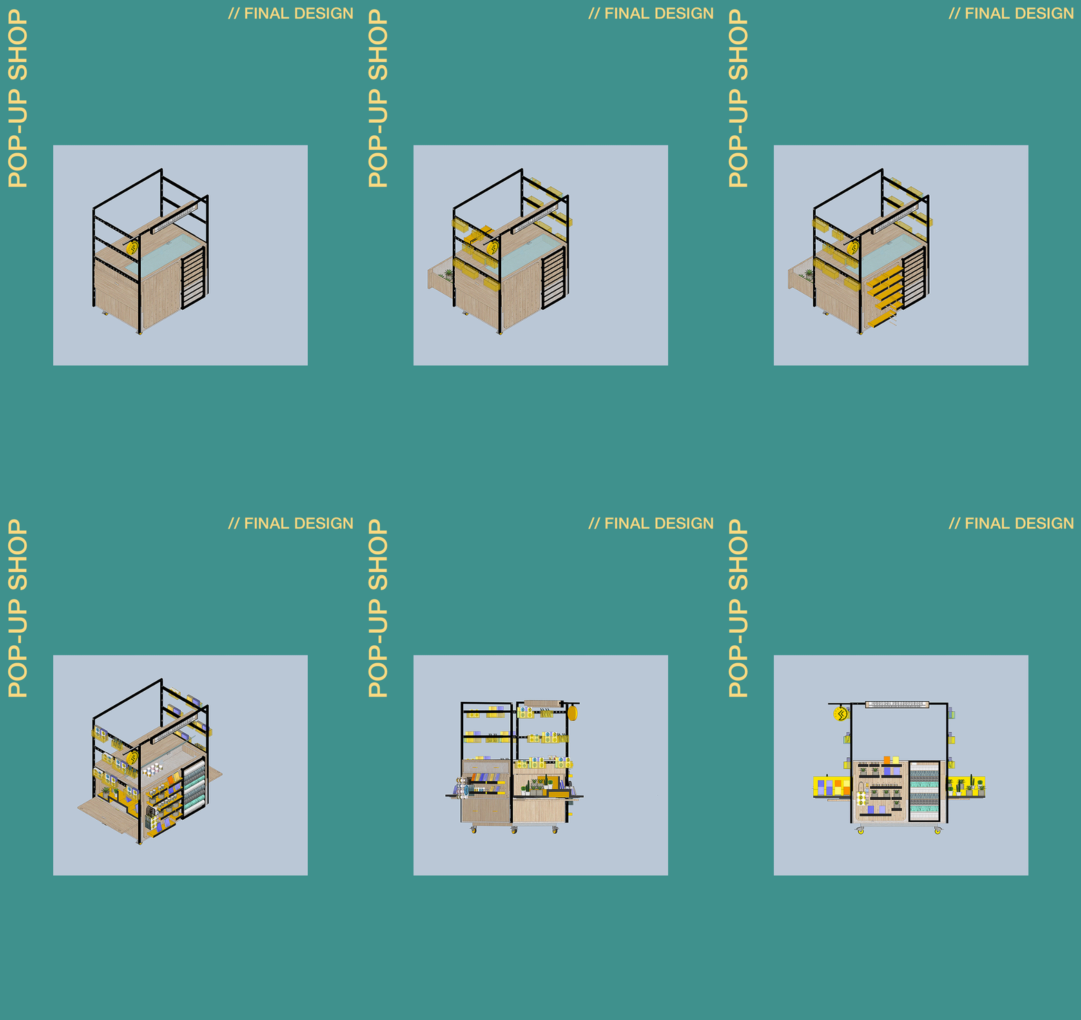
//DAY 10//FINAL PROPOSAL
As team leaders, we were incredibly impressed with the quality of the Pop-Up shop and the innovation that the undergraduates used in designing each of the components combining to make the final product. We would like to take the opportunity to thank all of our undergraduate students for offering their time and creative skills for the two weeks.
We hope during their time that they learned some new valuable skills in the design process. We aimed to create a project that closely reflected life in practice giving them a chance to meet with the client, brainstorm their designs, utilise sketch/computer-based mediums and develop time management. All of the students showed an aptitude in all of these areas and the output reflects this in the shops’ creative storage and display resolutions. It is also apparent in how tangible the approach is considering the fixtures and fittings that must be used to make the different functions a reality.
We would also like to thank our collaborator and client Janneke Geene for providing the brief. She has made the process a joy to be a part of showing a passion for all of the ideas for all of the special collections Events. Her presence at the presentations at key points in the development has been crucial not only for the students, to raise questions they have on the project, but also for the schemes sharing her preference towards varying design ideas. She has shaped the final product through her input and allowed us to produce something that can be realistically used by the special collections.
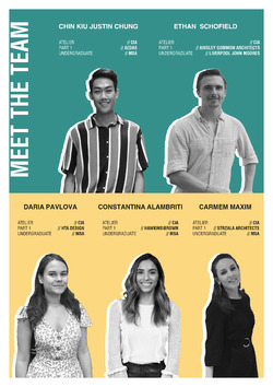
Thank you, everyone, involved in Group K from, Constantina Alambriti, Justin Chung, Carmen Maxim, Daria Pavlova, and Ethan Schofield.
Posted 5 May 2019 17:10
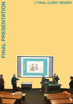
//DAY 10//FINAL CLIENT REVIEW
With the design finalised and set up in a construction booklet type set up, we created a full presentation outlining all the stages in the process, from the inception to the final product. On the final day of Events as a team we gathered with the other Events groups involved in special collections and Janneke for the review presentation. This brought the process in a full circle allowing us to show our progress and observe how the other groups went about tackling their brief leading to the overall outcomes.
Janneke was impressed with the our progress and was overjoyed with the final design commenting on the professional standard. She noted the success of all the elements of the design with the use of modular railing containers, openable drawer units and adaptable peg boards. Also commenting on how authentic the scheme is as a real world concept stating she could see it being used in the makers markets or in other museum shops
Posted 5 Apr 2019 21:14
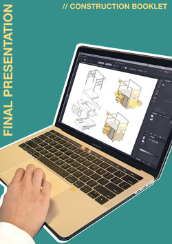
//DAY 9// CONSTRUCTION BOOKLET
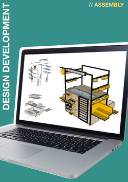
To form the construction booklet the teams used the SketchUp models to create exploded isometric views. From research into other documents that detail the process of constructing similar products, like furniture, this method was the most effective. By exploding the model, all of the individual components can be seen and using dotted lines as guides you can see how the elements come together. For any construction instructions the clear communication of steps is fundamental. The assembly process needs to obvious to people of any skill level so that it is fully accessible. The style; line weights, colour, view positioning, must be consistent and text kept to a minimum to avoid any need for translation. Each of the individual stages must be clear in what fixings or components they involve and how they go together.
Posted 5 Apr 2019 16:41
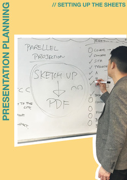
// DAY 9// SETTING UP THE PRESENTATION SHEETS
For the final presentation with Janneke on Friday, it was very important to produce a coherent presentation that would clearly explain our final concept. The teams started working on the presentation and the construction booklet.
Posted 5 Apr 2019 16:28

//DAY 08//ASSEMBLY
With all of these new elements for the new design concept we needed more resolution to ensure that when the features are brought together, they work collectively to create the end product. Continuing in the same sub groups we encouraged the undergrads to communicate with each other. The team working on the base unit needed to attach the peg boards and draws, making sure that none of the components restricted any of the overall functionality.
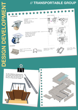
The team working on the frame then had to confer with the base team so that the frame fits around the base exactly. This is to allow the display and storage draws to be pulled out without obstruction whilst maintaining the full adaptability of the removable rails and modular boxes. Accompanying this they created a list of all the fixings from the hinges to the wheels used noting their functions and average prices.
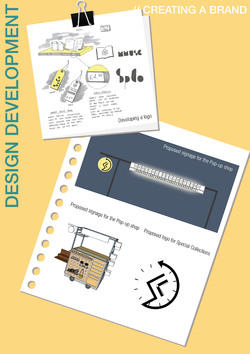
From the previous day the branding team created a logo and a concept for the signage. They presented this to the group working on the frame so that they could include it in the design. Once all the components of the shop had be brought together it was down to the branding team to apply the colour scheme and materials. This ties the whole concept together bringing to life the shops identity which they can then place into the environment to create the evocative visuals to fully realise the design.
Posted 4 Apr 2019 16:18

//DAY 08//MATERIALS & ASSEMBLY
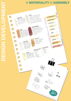
As part of the construction, careful consideration has to be taken into the use of materials as this will affect the types of fixings that will be used, the overall cost and flexibility. Early on in the process it was agreed that the main body of the shop will be timber with the inclusion of a metal frame and fixings. Following this several students explored the different materials that a commonly used in furniture as these will be robust, durable an easiest to cut into the individual surfaces. Through analysis they agreed upon using Ash for most of the shop. Being a hardwood it is longer living than most timbers, and costs considerably less when compared to more premium hardwoods like Oak or Maple. It also has a natural pale brown which complements the colour palette of the branding and matches similar wooden cabinets used throughout special collections.
For the design of the construction process we looked to the IKEA for inspiration. The layout and style that they use is simple but extremely effective clearly outlining each stage of the process. Each of their stages is also shown from the same orientation so that it is obvious how each step follows on from the other. This style we will utilise to show how the Pop-Up shop is put together and then how it opens out for use and closes down for storage.
Posted 4 Apr 2019 16:18

//DAY 07//FIXTURES & FITTINGS
For a Pop-Up shop the interaction with the elements is a key area for consideration, how will the member of staff supervising the shop interact and what are the fixtures/fittings that will enable the transformations. The students need to decide the aesthetic of these and their placement, whether they will be visible form the outside or hidden. If they are hidden, how will the shop assistant know how the draws open and the elements go together without prior knowledge.
With these questions in mind a team looked at the functionality of the base unit, how the draws would be fitted and what type of brackets will be necessary to ensure it is robust. A key feature was the wheeled system that which was a key component of the original design. It is important that the shop is easy to manoeuvre but also secure when open. Initially two wheels were used with supports in front, but this was later changed to four wheels with 360 degrees of rotation and breaks so that staff can reposition the shop with minimum effort.
Another aspect they looked at was the mechanisms that attach to the pull-out shelving positioned on both sides of the shop. They researched existing draw units from the internet to see how they resolve the issue and opted to use a similar system which would sit on the base of the shelving. This will mean that they can more effectively support the pull-out elements and remain hidden.
The peg board feature also needed further analysis to ensure that the back board will provide enough support for the shelving. Although at first glance the peg system appears a simple elegant and adaptable solution for displaying items there are a number of factors that must be considered. Firstly, the depth of the board must be deep enough to receive the pegs and securely hold the shelves. The placement of the holes must also be taken into consideration, where the pegs will be positioned on the shelves and how deep the shelving will be.
Posted 3 Apr 2019 12:10

//DAY 07//BRANDING & MATERIALITY
For a shop its brand is its identity, a set of aesthetic qualities that when done successfully can achieve a variety of goals. Firstly, it can link all the products or facilities that fall under the same company/organisation. This creates familiarity and consistency making it easier for a customer to know who they are buying their products or services from and aware of where to return if they enjoy the experience. Combined with this the brand can highlight an ideal demographic through colours and font styles. More bright colours with bolder fonts will often appeal to a younger audience and pastel colours with simple fonts will present a more sophisticate persona and attract an older clientele.
The Pop-Up shop will work as an extension of the special collections and therefore must work alongside the museums’ visual palette. Through their research the students found that there was no defined branding for both the special collections and the university. They collected together all the fonts and colours that have been used on documentation/websites for both and created profiles detailing them. It was agreed that golden yellow was frequently used and complemented the deep blue more commonly associated with the university.
We encouraged the students to consider a typical client that they want to visit the shop. Commonly know as a pen profile, it would combine characteristics into one ‘Person’ and not an average overall client which can make a design feel vague. At the first meeting with Janneke she described the type of person who would buy the most from a museum shop. This was a middle-aged/older woman with grandkids and would buy cards for future occasions, a gift for the grand kids and a memento for herself. With this as a base we wanted the students to consider this but also think of a ‘future’ client and who they want to attract and buy more from the Pop-Up shop. Collectively we agreed that students would want to be our new pen profile as they will be using the facilities, have the most access to the shop and perhaps buys the least from similar shops. We therefore encouraged the students to design a brand trying to appeal to both audiences but create somewhere they themselves would want to buy from.
Following this they focused on the signage looking at how different size shops promote their brand. They came across various methods of displaying the company name and ways they are affixed to the outside of the shop. Using this information, they created a board on which they could add letters to so that sign could be changed depending on location or stock. To Accompanying this, they decided that a logo was a key component for an organisations’ branding. So, they started to draft a logo that could be used by special collections and would bring the whole brand together.
Posted 3 Apr 2019 11:45

//DAY 07//MODULAR FRAME & CONTAINERS
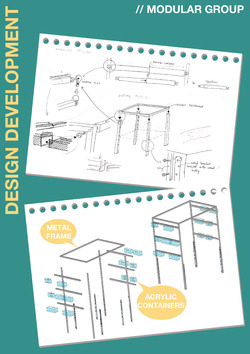
Now that the overall components and basic form for the shop had been agreed upon, we needed to consider the design on a detail level. For building construction, details are fundamental drawings in the design process. They are on a small scale specifying technical information for junctions labelling the build up of materials and the placement of any fixtures and fittings. For the Pop-Up shop this will be fundamental for how the shop goes together, how the sliding elements work and the attachment of handles or signage. With the intention for the creation of a full set of technical drawings the details will ensure that the shop will successfully function and be robust enough for daily use.
A number of the undergrads researched the horizontal railings which will hold the modular storage. They devised a system whereby the end of the horizontal bars are hooked and which then slot into holes in vertical frame. This method will allow the containers to be positioned at varying heights to accommodate an array of container sizes. Leading on from this they explored how the modular display containers will be easily hung, ensuring they are stable when put in place and can be stored quickly after use. For the Pop-Up shop this will be its cladding, so we tried to encourage the students to come up with some inventive forms. A final consideration is how the frame overall attaches to the base unit whether it will be permanent or removable and what fixings are most suitable to attach an aluminium frame to timber.
Posted 3 Apr 2019 11:30

//DAY 06//DEVELOPMENT
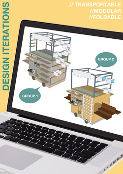
Using the model produced for the wheeled variation the teams came together and put forward their thoughts on the elements they liked the most about the other approaches. Using the previous idea of a frame attached to the top of the unit we added adjustable rails with modular boxes hung off them. This will create more display area and provide a flexibility of modular design something the base unit lacked.
A component that Janneke favoured was the use of peg boards.
Similarly, to the modular boxes this creates potential for the shop to adapt to the quantities and type of stock they look to sell. Peg boards will allow for individual hanging and the placement of shelving. It will be important for the students to consider the safety of these elements in case people knock into them.
Another feature that was raised in the interim meeting was the presence of a pay-point or bagging facility. This is a key area for the shop having a space where the staff can place payment equipment securely and access bags for items. Following a discussion with the students they concluded that only card payment would be necessary as none of them paid with cash on a daily basis. They decided that if cash was used the staff member would carry a payment pouch on their person. To accommodate this a draw in the top of the unit was incorporated.
With this new design the students formed two groups to explore if these elements can be added two or changed. One team explored repositioning the draw for storing the payment/bagging system to make it more conveniently located. It was decided that the bagging area should also include a wrapping facility as the items could be bought as gifts. This area had to be out of the way of the display stock so that items wouldn’t be knocked, it also needed to be within reach of an open wrapping surface.
The second group developed the modular area extending it to the full height of the unit. This would add more display space and was favoured by several students, noting how it animated the form, making it appear less rigid.
Posted 2 Apr 2019 12:50

//DAY 05//FEEDBACK
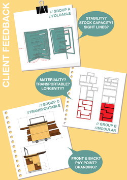
After the presentations on Day 05 it was discussed with Janneke ‘the client’ which of the schemes she saw as being the most viable for further development. She felt that all the concepts provide promise but taking into consideration, stability, storage space, and longevity that the transportable strategy would be the most feasible approach to progress.
Potential limitations for the modular design were its longevity and ease of assembly as the design in its current form would require to be put together and reshaped after every use. This will inevitably create wear on the material and one of the key issues would be its aesthetic after a few months.
For the folding method initial concerns were about its stability when folded for transportation and where stock is placed for storage.
With more time we would have loved to have explored all the approaches in more detail and produce a full technical package for each of them. Unfortunately, with the limited time frame and amount of work to complete it was agreed that only one design could be developed further.
The promise of the different styles of construction will not be ignored however, as a whole group we began to experiment with the transportable design as a base looking into ways modular and foldable aspects could be incorporated. We also went about adding or altering features which respond to questions raised by Janneke, including space for payment, an area for wrapping paper and the question of frontage.
Posted 2 Apr 2019 12:07

//DAY 05//SOFTWARE SKILLS
Within architectural practice the design process now involves a large amount of computer software in order to create designs. In the beginning this can be daunting, it is far easier to pick up a pencil or pen and draw out a floor plan with no previous knowledge. Hand draughting can, however be time consuming, with renders taking many days and any errors difficult to erase.
Once the learned, the skills that can be achieved through computers are unrivalled in their efficiency and potential for quality. Even with basic knowledge schemes can be assembled and iterated with ease when compared with hand drawing. It is important therefore that we shared some of our experience as 5th years with the undergraduates, teaching them some priceless tips and tools for the most frequently used software.
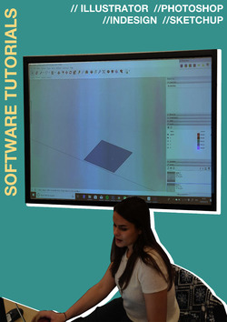
In the afternoon a few of the team leaders presented skills in using Photoshop, Illustrator, InDesign and SketchUp. In Photoshop they learnt about the importance of masking and possible solutions to adding shadows for rendering. Looking at illustrator we taught them how Sketchup images can be imported and adjusted to create professional quality diagrams. For the early stages of design students were already using SketchUp, an entry level 3D modelling software, so we showed them the importance of using components and levels. InDesign was a package few of them had heard of so we highlighted how useful it is for setting up presentations and layouts for portfolio style sheets. During this time we gave the students the opportunity to share any questions they had regarding the computer packages and problems they may be facing for possible solutions.
Posted 1 Apr 2019 17:06

//DAY 05//PRESENTATION TO THE CLIENT
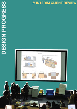
First thing in the morning each of the groups presented to the other Events projects involved in special collections and Janneke. This is a vital stage in the process as it gives the students the opportunity to sell their early concepts and get feedback from the client so that they can develop the designs further.
As team leaders we were very impressed with the quality of the images that were produced and the enthusiasm each of the groups showed when talking about their proposals. Each of the groups were very competent and professional utilising the skills they had learnt the day before. They presented the early iterations up to the current form of their designs.
Janneke was very impressed with the level of detail that the students had achieved praising the process each group has gone through and how advanced each scheme was. She applauded the originality of each approach enjoying how each explored the brief and mentioned things to consider for further development. Questions she raised included the stability for the foldable and modular designs so that they don’t present potential hazards within the space. Other comments included materiality and longevity so that the shop is robust and can be assembled and disassembled with minimal wear on the overall design. She also wanted the students to consider the elevations and ways of showing clear frontage making the shop easily approachable.
Looking forward to next week the groups will take all of these comments on board and will use them to alter their concepts. From this they will create the technical drawings by the end of the week which can be used as a construction manual for the potential to be constructed.
Posted 1 Apr 2019 15:46
//DAY 04//DESIGN PROGRESS//GROUP C
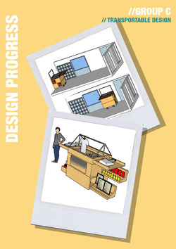
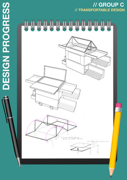
With a base model for a transportable unit, the students began to look at a way to make their design more engaging. They looked at how the storage elements could be expandable increasing the overall area for displaying the sale items.
Their design features a strong sense of front through the form and it was suggested that they try to explore are more radial approach so that it could function both up against a wall but also more centrally within a space. By looking at a shop that is approachable from all sides it creates a potential for more display area and would make the design more integrated within its’ environment. This is an important factor to consider as they end product doesn’t want to be limited to the one location.
Posted 1 Apr 2019 14:58
//DAY 04//DESIGN PROGRESS//GROUP B
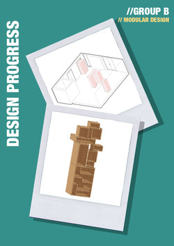
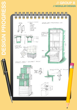
The modular group delved deeper into creating a system of different sized elements which could be brought together to create the final shop.
They sketched out a grid proposal of the design, looking at how the boxes could fit within one and other for storage then separated out. A key aspect of their design was how it would sit within the space and the potential for creating a number of display stacks.
Once they agreed upon the number and size of the boxes then explored the possible composition the shop could be assembled into. This is a key advantage of the modular system of design. A key component to consider they need to explore is the longevity of the design and ease of assembly. The shop needs to be quick and easy to put together without the need for instructions or tools.
Posted 1 Apr 2019 14:56

//DAY 04//DESIGN PROGRESS//GROUP A
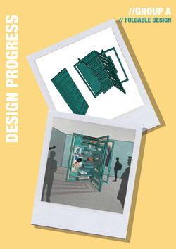
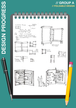
Moving forward from their initial design concepts centred around a foldable programme Group A looked more closely at collapsible frames and the mechanisms involved. They concluded after numerous iterations that this system was limiting. This was due to the frames constricting the form as it depended upon the shelving as the main bracing structure to inform the design.
Taking this onboard we suggested that they look at pop up cards for inspiration. Using this they could explore more dynamic shapes in order to create an original design. We set them the task of using single sheets of cards to form storage and areas for display.
Their final iteration presents this in an elegant 3-dimensional way with the shop reaching out into space. It invites the public to engage and walk around the space investigating all items on sale. For development, it is important to consider the stability of the individual elements and the amount of storage and display per shop area.
Posted 1 Apr 2019 14:55

//DAY 04//PRESENTATION SKILLS
To push the designs further and get feedback on their progress the students will present their design developments to Janneke the client and the other Events groups involved in special collections. This closely mirrors the process of design within a practice, providing an opportunity to discuss how the scheme has progressed and receive comments to ensure the outputs meet the clients vision.
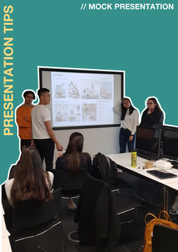
So that the students feel confident in talking about their concepts Justin went through basic presentation skills. He gave the students a range of tips about maintaining interest in the subject and making the topic engaging. These included maintaining eye contact with the audience, establishing key points to talk about and rehearsing a script outlining what they will talk about. It is important that the students learn these techniques not only for this project but for all future presentations so that they can efficiently sell their ideas.
Following his guidance, the students then used these notes and, in their groups, ran through a practice presentation in preparation for the review on the following day.
Posted 29 Mar 2019 14:59
//DAY 03 //DESIGN DEVELOPMENT
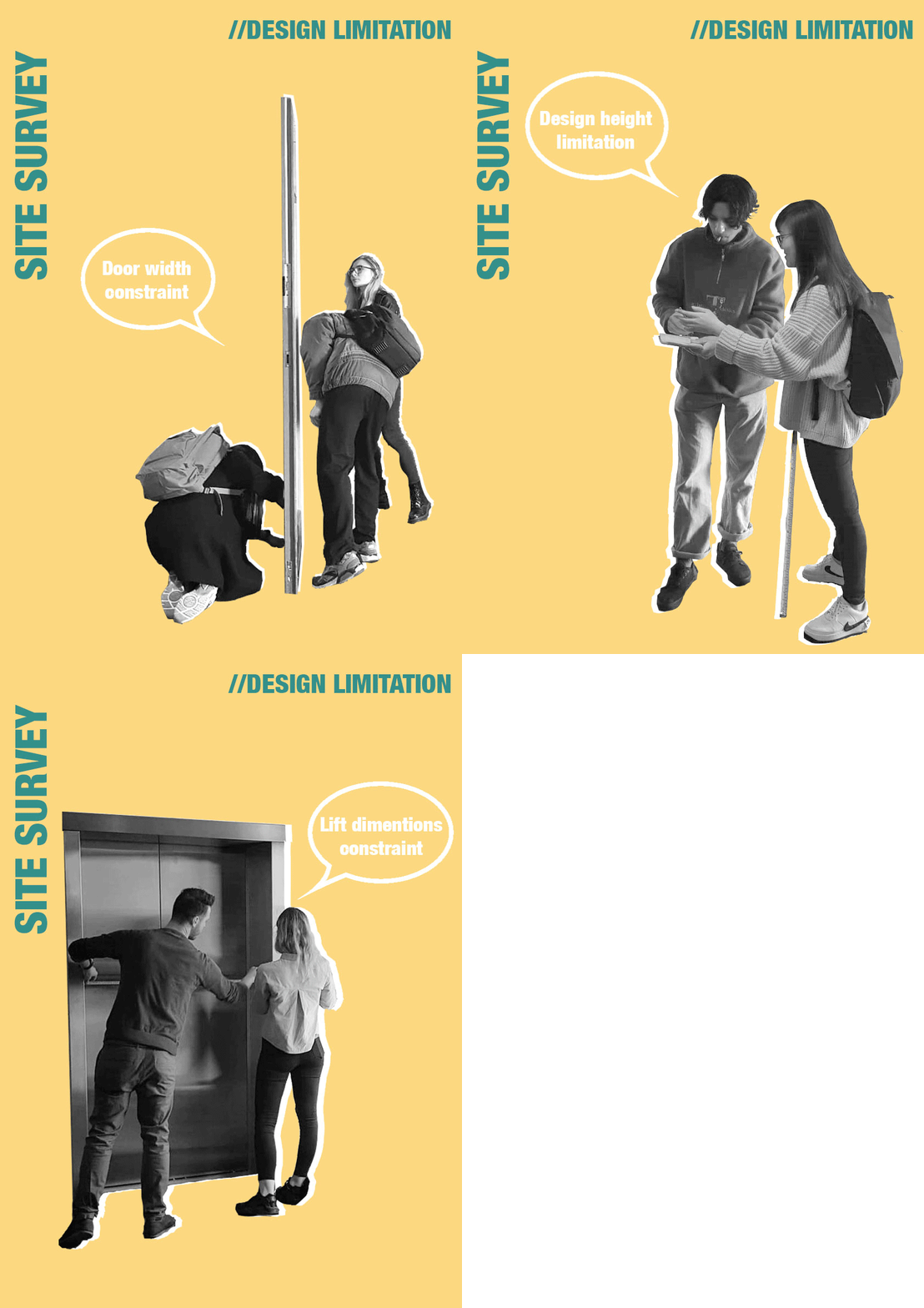
Within their sub groups, the students took their initial conceptual design further, trying to rationalise it. They researched alternative methods of connecting units of various sizes together and how they could be stored within one and other, considering the location constraints (door width, lift dimensions)
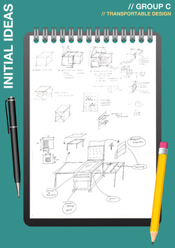
Group C; Nur Serena Ahmad Faiza, Eliot Johnson, Agnes Cheah, Yik Hin Lam used the concept of a shop that focuses around wheels for transportation. They have also explored a panel that has a grid of holes so that hangers can be added or removed to provide dynamic methods of hanging stock. Testing the scale of their Pop-up shop design in order to fit their wheeled design into the lift of the library was very important. They have also looked at the way their shop is able to unfold and present the items it is selling when the shop is positioned in its location
Posted 28 Mar 2019 12:28
//DAY 03 //DESIGN DEVELOPMENT
Within their sub groups, the students took their initial conceptual design further, trying to rationalise it. They researched alternative methods of connecting units of various sizes together and how they could be stored within one and other, considering the location constraints (door width, lift dimensions).
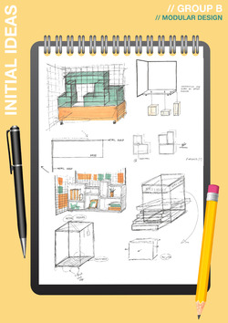
Group B; Enrica Agnus Klumper, Keta Silina, Roland Burt, Franci Tafilaj looked into the modular design and focused on the way the modules of their design come together and are able to interchange if desired or necessary.
Posted 28 Mar 2019 12:03
//DAY 03 //DESIGN DEVELOPMENT
Within their sub groups, the students took their initial conceptual design further, trying to rationalise it. They researched alternative methods of connecting units of various sizes together and how they could be stored within one and other, considering the location constraints (door width, lift dimensions)
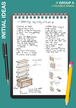
Group A; Season Adak, Xii Don Lim, Lulia Nastasache, Rodica Earmacov started testing the foldability of their design in order to improve it and make the transition of foldability smooth. This would make the shop compact for storage and make it easier to move to different locations. They also investigated how the frame would work and what hinges and joints would be required.
Posted 28 Mar 2019 12:00

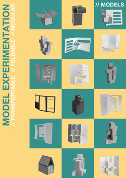
//DAY 03 //INITIAL MODELS
Within the three sub groups, the students took their initial steps at conceptual designs based around the design methods that were established by looking at various precedents. Group A looked at the foldable design solution for the Pop-up shop. Group B researched into modular design and Group C were interested in an easily-transportable design on wheels. During the 3rd day it was important to look at the design process through making sketch-models. The groups were able to test various design solutions and key ideas that they came up with. Group A tested the foldability of their design in order to improve it and make the transition of foldability smooth. Group B focused on the way the modules of their design come together and are able to interchange if desired or necessary. For Group C it was especially important to test the scale of their Pop-up shop design in order to fit their wheeled design into the lift of the library. They have also looked at the way their shop is able to unfold and present the items it is selling when the shop is positioned in its location. After looking at the sketch models we had a group discussion with suggestions and comments in order to progress the initial design.
Posted 28 Mar 2019 11:20
//DAY 02//INITIAL SKETCHES
Within the three sub groups, the students took their initial steps at conceptual designs based around the design methods that were established by looking at various precedents. They all jumped straight into sketching eager to start the process and explore what form the shop would take.
Group C; Nur Serena Ahmad Faiza, Eliot Johnson, Agnes Cheah, Yik Hin Lam used the concept of a shop that focuses around wheels for transportation. They have also explored a panel that has a grid of holes so that hangers can be added or removed to provide dynamic methods of hanging stock.
Posted 27 Mar 2019 11:09
//DAY 02//INITIAL SKETCHES
Within the three sub groups, the students took their initial steps at conceptual designs based around the design methods that were established by looking at various precedents. They all jumped straight into sketching eager to start the process and explore what form the shop would take.
Group B; Enrica Agnus Klumper, Keta Silina, Roland Burt, Franci Tafilaj looked into a modular method with initial ideas revolved around connecting units through the use of magnets. They researched alternative methods of connecting units of various sizes together and how they could be stored within one and other.
Posted 27 Mar 2019 11:08
//DAY 02//INITIAL SKETCHES
Within the three sub groups, the students took their initial steps at conceptual designs based around the design methods that were established by looking at various precedents. They all jumped straight into sketching eager to start the process and explore what form the shop would take.
Group A; Season Adak, Xii Don Lim, Lulia Nastasache, Rodica Earmacov began by exploring a foldable system of design looking at how shelving would compress down into a base unit. This would make the shop compact for storage and make it easier to move to different locations. They started to look at how the frame would realistically function and what hinges would be required.
Posted 27 Mar 2019 11:07

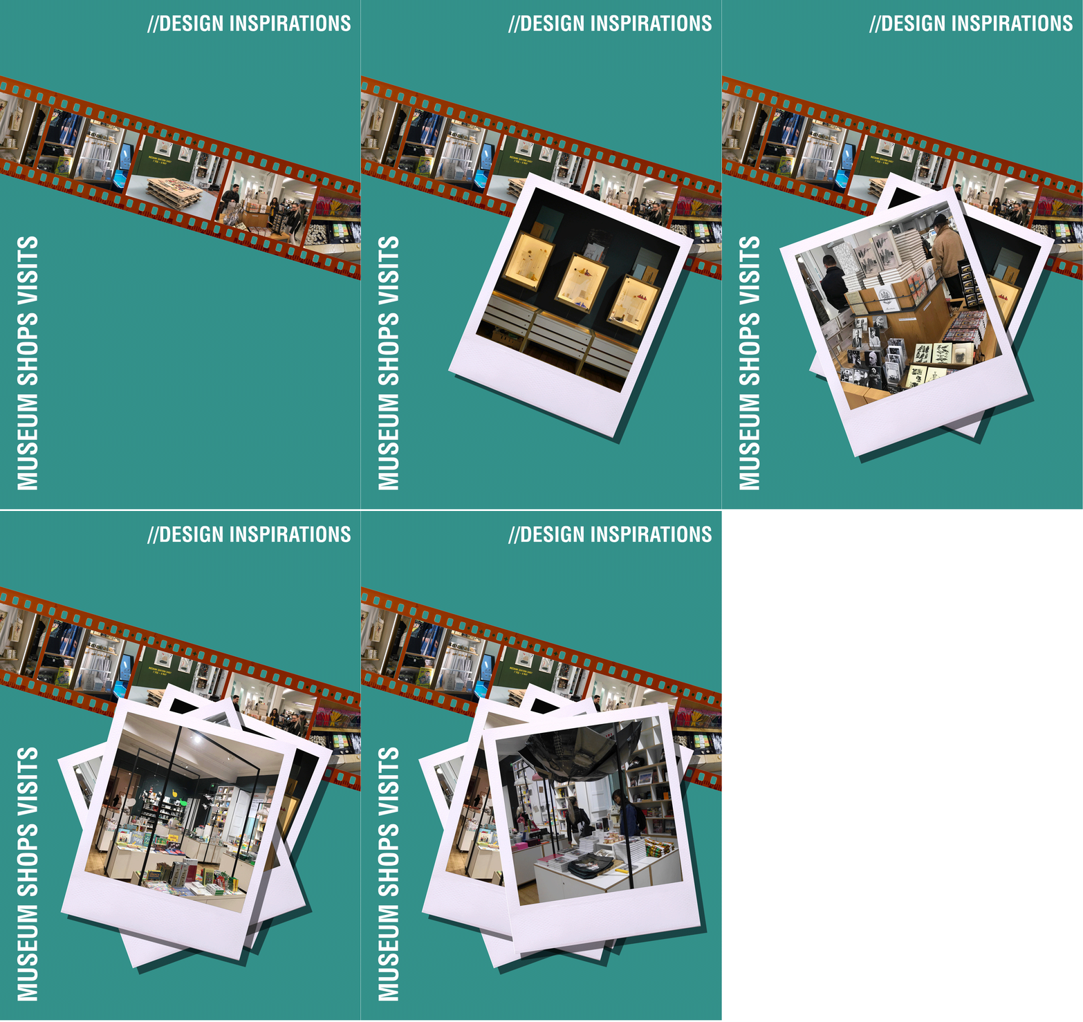
//DAY 02//MUSEUM SHOPS VISITS
The morning session provided a series of opportunities for students to draw inspirations from various museum shops as well as independent shops. Students were encouraged to document the spaces through photography, and catalogued the items sold within each museums, followed by a general discussion within the group to discuss on the merits and limitations of each design. Three contrasting shop layouts were explored:
The Manchester Central Library//
The library contains a small display unit with a limited range of items stacked on shelves. The students pointed out the weakness of the pricing system as well as the absence of library image within the shop and hope to improve upon this limitation. A catalogue of items that could potentially be sold in the MMU specials collections were documented and photographed.
The Manchester Art Gallery//
The gallery housed the largest collection of items between the 3 spaces. A series of cupboards with hanging frames centralised the shop, with post cards and various bespoke decorative pieces hanged from the structures. The students admired the simplicity and systematic arrangement utilised, as well as the storage system within each display unit. During the discussion, students were encouraged to think about materiality in unifying the overall space and creating a design language suitable for the shop.
The Crafts and Design Centre//
The centre is home to various independent shops, each with unique characteristics selling a range of bespoke items. The items were generally displayed in draws and on the walls without a systematic organisation system. The students were able to recognise these limitations but praised the branding strategy in creating a sense of presence for visitors, which was lacking from the other two places.
Posted 27 Mar 2019 02:03

//DAY 01//PRECEDENTS
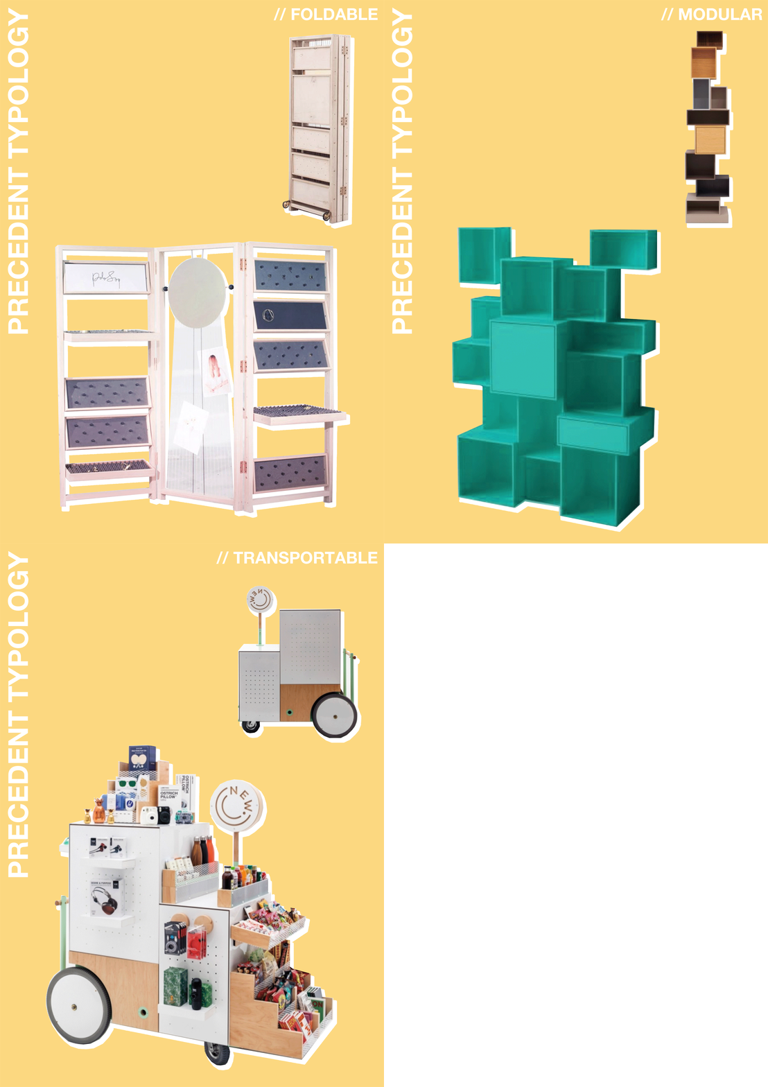
In order to create innovative designs, it is important to observe existing examples and their approach to a design problem. Once the plans of the existing site were underway, members of the groups began collecting precedents for shop designs that align with the design criteria established in the brief. The core factors to consider would be portability and flexibility so that the shop can be put in place, assembled quickly, and safely stored in the evening with ease.
Through discussion and looking at existing small retail units the sub groups came up with several design strategies that have been implemented to meet the design requirements and would be fundamental attributes for the final shop.
- Modular
- Foldable
- Transportable
Each of the sub groups will explore these design attributes in more depth when producing initial sketches. The different categories provide alternative methods of construction and varying number of components from hinges to wheels; thus these design factors will drive each group forward upon experimenting with bespoke innovative solutions.
Posted 26 Mar 2019 16:50

//DAY 01//EXISTING SITE
Following the briefing, the group met in the design room to discuss the notes they had from the presentation and what information they would need moving forward to start designing. With this in mind, the group visited the Special Collections to get a feel for the primary location the shop will be placed.
At the site, the team was divided into three subgroups in order to quickly gather all the necessary measurements from which they could draw up a site model. This will enable the groups to create designs sensitive to the space something that is vital when beginning the design process. Once the existing space is established the design groups can decide how the shop will inhabit the space and ways in which it can promote the special collections. This is of great importance for the progression of the shop as currently when visitors exit the elevator on the third floor they are met with vacant transitional space with limited recognition for the current exhibitions.
Looking at the space the groups were able to establish the limitations that would affect the form of the shop and how it can be transported. This included the low ceiling height of 2300mm and access to other floors through two narrow lifts. The strategy of a modular shop was agreed has great potential moving forward.
Posted 26 Mar 2019 16:10

//DAY 01//BRIEFING
Morning presentation by the client and Special Collections manager Janneke Geene alongside groups E, I and V all of whom are working on Events involved with the special collections. This provides the opportunity for every group to be aware of what other Events are taking place and the potential to relate with one and other.
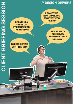
The meeting gave the members of our team to ask the ‘client’ any questions they had about what the project would involve and their role in the process. Janneke showed her excitement for all the events and her vision of bringing about more awareness for the special collections with the overall goal to create a branding that would tie all of the events together.
All of us at group K are grateful for Janneke taking her time to present giving us a jumping off point from which the team was able to begin their primary ideas. This meeting gave all of the students a chance to experience a similar process to practice engaging with a client which provides the basis for a brief.
Posted 26 Mar 2019 15:30

//INSPIRATION
When starting the design process one of the initial considerations is what method of construction will be implemented and how will shape the outcome of the end product.
For the Pop-Up shop, flexibility is one of the key elements which was raised by the members of team K and a primary objective the end product should achieve. It is important that the prospective shop can evolve over time to accommodate new items for sale or adapt to new surroundings.
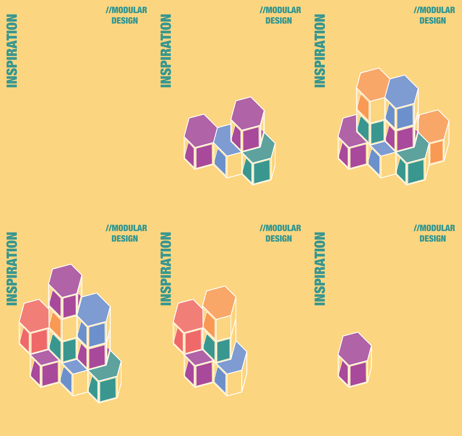
One of the strategies which will allow for this continued growth is modular units. This concept utilises a number of smaller parts/modules that can act as a self-contained element or interlinked with other modules to create one cohesive unit. Through this method, each part plays a role even when other elements are missing making the whole design functional. It also means that the modules can be assembled in alternative configurations allowing for flexibility and the potential for numerous iterations of the final form. This provides the potential for dynamic designs as the shop will be able to have a varying degree of presence within a space whether it stands proud of its habitat or becomes more intertwined with the surroundings.
Moving forward Team K will be able to experiment with this strategy for design in the coming days looking into the potential of this method and how it will interact with the current special collections space.
Posted 25 Mar 2019 22:01
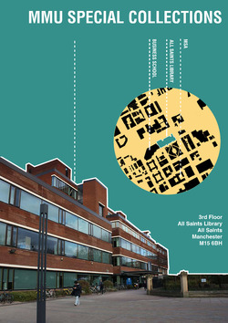
The MMU Special Collections is located on the 3rd floor of All Saints Library and the project finds itself within the lobby of the department. Its unique situation currently makes it hard for visitors to notice its presence and often unaware of the hidden gem within the university campus. Through our design engagement, the project seeks to reconnect the aforementioned space back to the university campus and the city beyond, attracting visitors to a range of exhibitions, art and book collections, as well as artifacts in the Special Collections. The map indicates the site location where the design will situate in our project.
Posted 21 Mar 2019 01:00
//SKILLS
Presentation is a vital skill to have working in an architectural or design field.
As part of a group we will be proposing three schemes for the Special Collections' team with a great potential with one of them being built in the future.
As part of this programme we will have two presentations to Ganneke and Special Collections' team. One as an interim review, where we will have an opportunity to present our initial ideas at the end of the first week and have an informal discussion with some feedback for the following week.
At the end of the events programme we will prepare and present three presentations and three schemes in order for the Special Collections' team to choose a potential winner for the Pop-up shop design.
Posted 20 Mar 2019 23:03
//SKILLS
Various software can be used in architecture in order to make presentations, drawings and digital models.
Those tools often can save time and improve precision while working on an architectural project.
During the events we will be using various software such as InDesign, Illustrator, Photoshop and SkethUp in order to portray our ideas and proposals for the Pop-up shop for the Special Collections.
We will be using Adobe package in order to create illustrations and the final IKEA-like booklet to demonstarte the construction sequence of our proposals.
We will also be using SketchUp as a 3D modeling software in order to test and digitally build our potential design in order to help us create the IKEA-booklet.
This gives us, as a team, an opportunity to learn and/or improve skills in various software programmes that can be then used in our future architectural careers.
Posted 20 Mar 2019 22:57
//SKILLS
Drawing is one of the most fundamental and essential way to represent an architectural idea.
During the two weeks of events as a group we will be sketching the ideas for a pop-up shop on paper and computer, brainstorming and exchanging initial ideas.
We will have an amazing opportunity to transfer the initial sketches into more precise architectural drawings such as plans, sections and elevations by using either hand-drawing skills or AutoCAD.
This brings us a chance to improve our drawing skills and/or learn new ways of representing design through software.
Posted 20 Mar 2019 22:47
//SKILLS
The important part of this design project within the group is collaboration. During the events we as a team will learn and improve our skills at working together as a one in a large group, joining people from different years with various skills and knowledge. This design project will teach us how to communicate clearly within a group as a whole and with a collaborator in order to design to our best ability and meet the requirements of the Special Collections' brief. It is an excellent opportunity to exchange skills and knowledge with each other while creating a design for a pop-up store.
Posted 20 Mar 2019 22:39
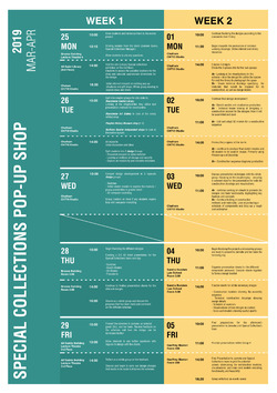
The session plan outlines the scheduled activities and tasks we will be doing for the 2 weeks of our event. During the 2 weeks, we will have the opportunity to learn about the special collections and design a modular & movable pop-up shop for the library. Working as a collective as well as smaller group, our aim is to produce a full drawing package, including technical drawings and visuals for our client. Additionally, students will also have to opportunity to enrich their software and modelling skills which will be useful in future projects. At the end of the event, our collaborator will choose one of the three designs as a winning project, and the selected design will have to potential to be built in the near future. This is an excellent opportunity to participate in a live-design process with a client and a fantastic chance to see your design realise. We look forward to seeing all your amazing ideas!
Posted 20 Mar 2019 20:20
Special Collections Pop-Up Shop// The Collaborator
Meet our collaborator: Jannake Geene
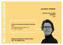
Jannake is the special collections manager for MMU Library, home to a range of artist’s books, fine and decorative art, book and archive collections, as well as prints and albums. Her aim for the project is to reconnect the collections back to the university and give this cultural hidden gem its rightful place in the city, through design and use of modular retail units.
Posted 20 Mar 2019 00:11
Special Collections Pop-Up Shop// The Team
Introducing The Special Collections Pop-Up Shop Team Members:
The team consists of 5th year students from Manchester School of Architecture. We are passionate architecture students interested in working with existing structures and historic buildings. Our experience ranges from building regeneration to infrastructure, housing development, as well as master planning.
Should you have any questions with regards to the project or wish to know more about our design approach, please do not hesitate to contact us for more information.
We look forward to working with you!
Posted 19 Mar 2019 23:53

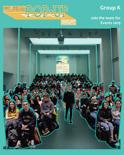
Messaging all Year 1 and 2 Architecture students. Could you be a member of Group K for Events 2019?
Following the all too brief presentation, we want to share more details on our events project.
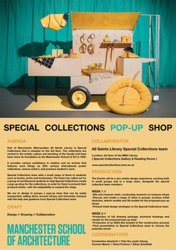
Currently, the Special Collections at MMU has limited facilities for displaying and storing the products which they have available for sale. This is where we come in, our goal is to produce a complete set of technical drawings for a Pop-Up shop. It will require duel functionality, housing stock when closed providing compact storage and expanding during the day to display and sell items.
During the two weeks, we will work alongside our collaborator, Janneke Geene, the manager at the special collections to create an innovative mobile shop that has the potential for flexibility in use. We are looking for students who want to enhance their detailing abilities and understanding of adaptiveness within the design which can be transferred into architectural practice. We also want students with an aptitude for ingenuity and inventiveness to create a proposal that can redefine gift shop storage.
More information will follow about the current team. We are excited to see how this project will unfold.
Posted 8 Feb 2019 19:42
Special Collection team sells a small range of items to students such as books, prints and bookmarks. The team has called out for a group of architectural students to help Special Collections create a pop-up shop for the collections, in order for them to present their products better, with the adaptability to expand the range. We are to design in groups a pop-up shop that can be easily transported, selling items around Library and University Campus with the help and guidance from Special Collections team.
Posted 9 Jan 2019 12:00
