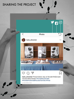
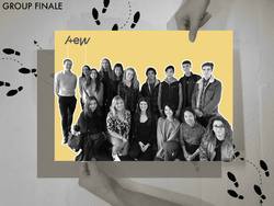
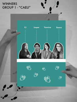
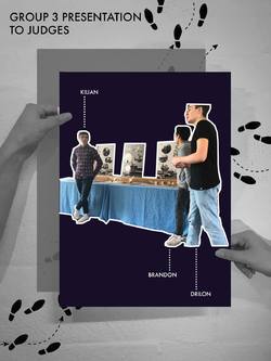
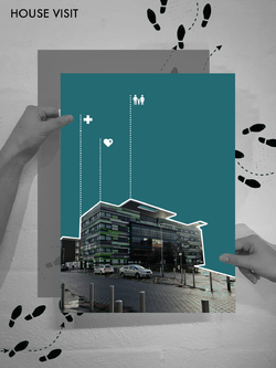
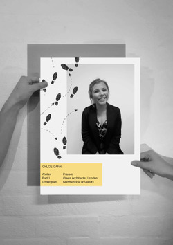
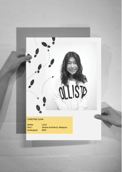
Instagram posts about the final output of this project was shared to the public through social media outlets and word of mouth. The main aim of this event is to create awareness and public understanding regarding the importance and significance of the Ronald McDonald House Charities. The amazing work the charity participates in deserves to be shared. Every students participated in this event REFLECT were encouraged to spread the awareness to people around them.
Posted 9 Apr 2019 15:18
Many thanks to Ronald McDonald House Manchester for your input and support throughout the event's project. The feedback from the users has been vital to the progression of our project.
Thanks to Alex and Emma for your involvement in REFLECT. Without such participation, this bespoke events group would not have come about.
Finally, thank you to all of the undergraduate students for your excellent contribution over the past two weeks! We hope you've enjoyed it as much as we have!
Posted 9 Apr 2019 15:00

Congratulations to Group CAELI: KJ, Beena, Jasper & Yasmine!
The collaborators along with Alex and Emma from AEW architects came to the conclusion that group 1 should be the winning scheme. However, all of the projects were to an excellent standard! Well done events group, REFLECT!
The winning concept:
The design prioritises its users, hence, careful consideration was integrated into the design process.
Sunlight, sound and privacy were the first factors studied which later branched into secondary uses of the decided installations.
The terrace required shaded and unshaded spaces where its users can choose where they wished to be. The shaded areas are required where medical conditions prevent direct exposure to sunlight while the unshaded are for other users wish to bask in the sun when possible.
Overall, the canopy designed is a dynamic form which varies in height and space; an airy and lightweight space is created, allowing a relaxed ambience to seep into the user. The trellis will support creeper and tendril plants, hence shadows form will sway to create a whimsical play to entertain thoughts.
To break up sound from entering the terrace, a green wall is placed, street-side, where a concrete wall exists; the growing wall will provide privacy from the street and houses that may be able to peer into the space. Additionally, the green wall can provide cleaner air and a natural touch to the harsh, concrete context. It is also planned in a way where the residents can place their favourite plants on the rack and raise them.
An enclosed space at the end is designed as a semi-private area of the terrace. Movie nights could be set up or used as a meditative space.
By the balustrades, picnic tables are placed for the parents to have their morning coffee and breakfasts. The view towards the inner garden is clear, hence the children can also be observed from the terrace.
Posted 9 Apr 2019 14:53
Group 3: ARCHI-POD
Group 3 presented their work in a clear and professional manner. As part of the final design, the group focused on different user experiences.
Following the draft presentation, the group improved the discussion to explain each type of pod and its dedicated user group.
The projects focus on each individual user was praised by the collaborator at Ronald McDonald House. A discussion was initiated on how to provide different user functions if the project were to progress.
Posted 9 Apr 2019 14:51
Group 2: RE-FOLD
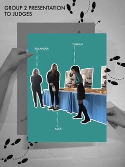
The final presentation for group 2 received great feedback from the collaborators and their peers. The development from the first week through to the final presentation was conveyed well through the model and final poster.
Following the draft presentation conducted on day 9, the group improved their presentation to include a detailed explanation as to how their project developed from the initial presentation to AEW architects on day 5.
The development of the project was discussed at length between the collaborators in the post crit discussion. This displayed to the students the importance of documenting the progression of a design project.
Posted 9 Apr 2019 14:50
Group 1: CAELI
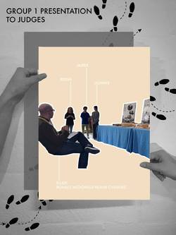
Group 1 presented their work to the panel of judges invited to represent Ronald McDonald Charity House and AEW Architects.
The students each took an allocated time to present their group idea to the panel of judges in a systematic and well composed way. They started by talking about initial ideas, research development, precedent inspiration, feedback from previous presentation, choice of materiality and final concept. They also answered questions regarding their design confidently to the panel of judges.
Posted 9 Apr 2019 14:45
ARCHI-POD
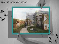
Final render demonstrating the overall mood and atmosphere created by the roof terrace design. Besides that, render also show the relationship between the proposed design with the charity house and how users could interact with the space.
The pods were furthur developed in terms of materiality and opening size. Semi transparent materials were integrated into the overall design of the pods to control the privacy value of each pods. Grasslands were also proposed to be placed around the pods to soften the overall design and provide picnic areas for the users.
Posted 9 Apr 2019 14:43
RE-FOLD.
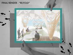
Poster demonstrating the final render of rood terrace proposal where different lightweight papermetrics structures positioned around the site to create semi open space for the users. The render also showed the overall mood and atmosphere of the space generated from the design installation. Different size of seating treatment were also designed at the bottom of each 'tree' to create a nice environment for the users to relax.
The geometrical pattern along the pavement which was generated from the pattern of the roof structure also produced a nice and subtle circulation path along the site.
Posted 9 Apr 2019 14:42
CAELI
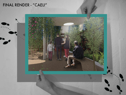
Final Render of Group 1's project CAELI. The render displayed the area of the design where it is more enclosed with high privacy value. This is also a convertible space that could be used as a weekend outdoor theater space during the summer.
Render also demonstrated the proposed furniture design of the space and how users could interact with the space created in relation to the type of planting chosen by the designers. As seen in the render, small trees and trellis were chosen to create a more enclosed atmosphere for the area so that the users would have a space to reflect and get their mind off from the hospital setting.
Posted 9 Apr 2019 14:42
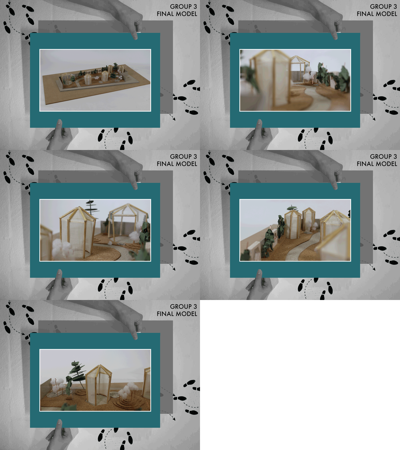
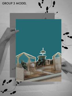
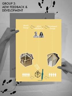
Finally, here is group 3's final model. They did a great job on it, we love it!
Group 3 used different textiles and materials to experiment with the privacy and envelope opacity of the pods. It was difficult to transcribe this exactly into a model with limited materials and time, however the students did a great job using three different materials including net and linen.
The structure was created using timber structures, and the terrace flooring was represented using a flexible cork sheet. We also loved the way the group used foam for plants!
Posted 9 Apr 2019 13:29

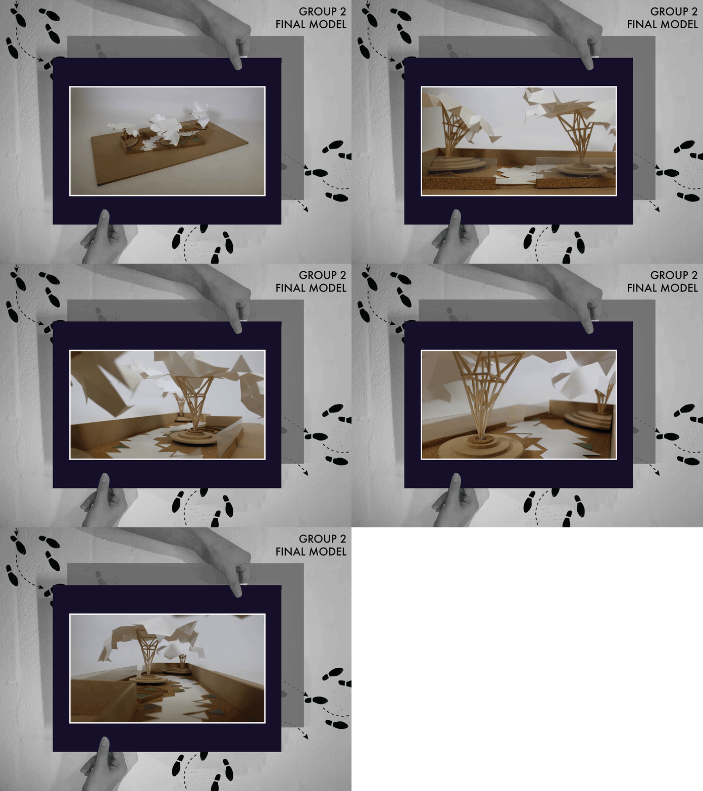
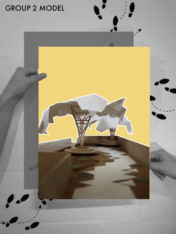
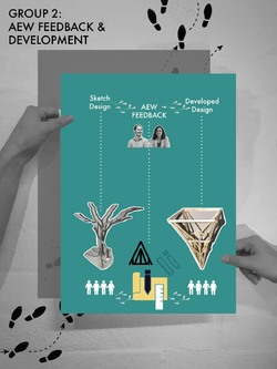
Next, we have Group 2's re-fold model! Group 2 responded really well to AEW feedback in events week one, and this is reflected through their model.
Group 2 created delicate structural columns which hold the sheltering canopy. We loved the simplicity of their model, allowing the beautiful geometrical shapes of the column, canopy and flooring to have an impact.
Wooden sticks were used to represent the timber columns. They were carefully glued together to create the strong structure required. Proto paper was used to create the folding canopy, and again on the ground for the path so that the geometric pattern was repeated. A quick visit to the workshop allowed the students to quickly cut out the circular seating from a MDF sheet.
We did have some issues with getting the structures to stay up, with one taking a bashing from the wind. This taught the students how the structure of a model is just as important. If it can't stay up in a model, it probably wouldn't on site! We were able to fix this and create a great technical model.
Posted 9 Apr 2019 13:10
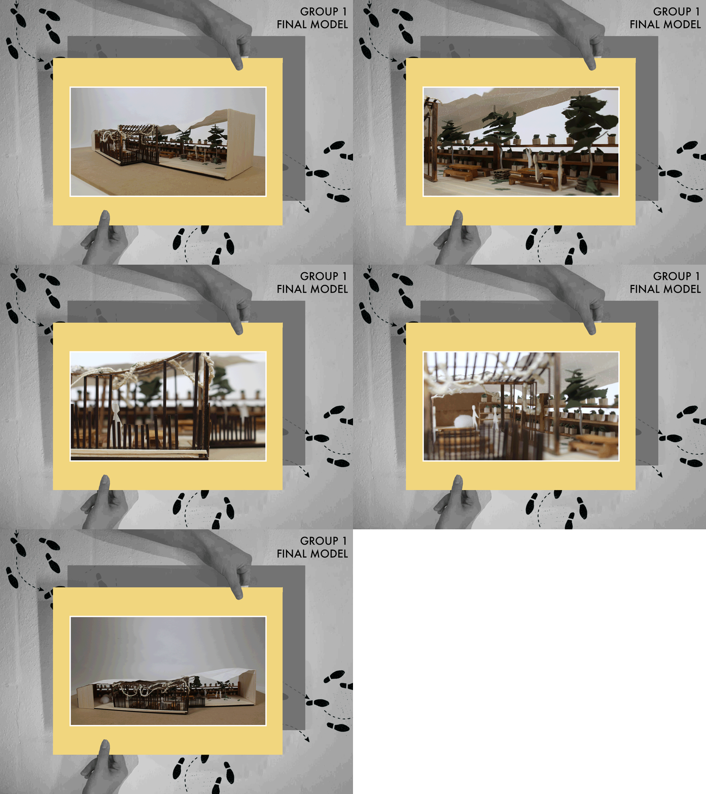
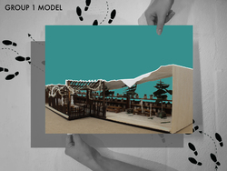
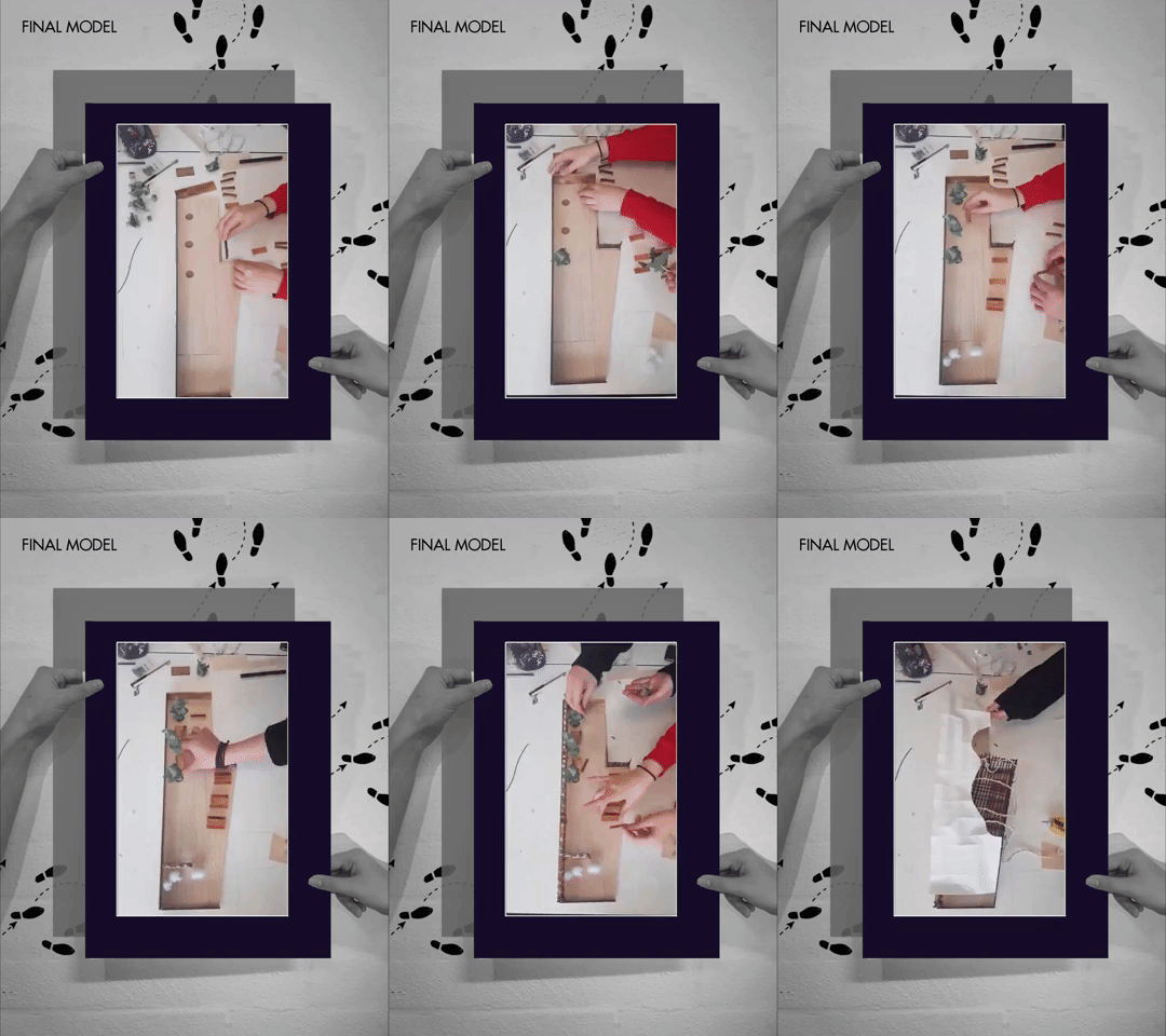
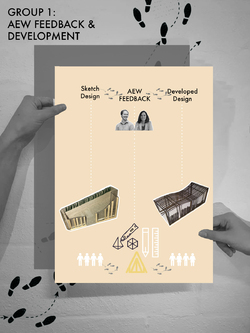
Here's a quick GIF of our Group 1's final model! We're so proud of what they achieved over events. They did a great job developing their concept through to a feasible design.
We particularly loved the way they created different spaces to respond to the resident feedback, for example the covered seating areas as well more open areas for the summer months.
Group 1 created the main structure using a laser cutter. Each beam was carefully glued together. Balsa wood was used for the furniture elements; the tables, benches and plant shelves. A piece of proto paper was used to create the curving canopy impact.
The detail the students went to was really impressive, they even included fallen leaves on the floor and plant pots.
Well done Group 1! You worked really hard and created a beautiful presentation model.
Posted 9 Apr 2019 13:01

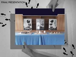
FINAL PRESENTATION
All 3 groups presented at the Ronald McDonald House Charities, Manchester in the board room situated below the terrace.
The groups had one model and one poster each and took it in turns to present to Alex and Emma from AEW and Elliot who works at the Ronald McDonald House.
The 5th years introduced the project to the judging panel to recap them about the brief and introduced each group. All 3 groups had prepared a 5 minute presentation where they spoke clearly and concisely about their proposals.
Each presentation was followed by feedback from the judging panel and comments from the rest of the group. The judges were also asked if they were to take each of the proposals further, what would they look for next from the group.
The afternoon exposed the BA students to presenting to a client and gave them valuable insight to Stage 2 in a real-life project, allowing them to assess what they would have to do next.
After a difficult decision, the judges decided on a winning team, although it was a very close call. Group 1 - Caeli was the winning team and all received Easter eggs as a prize.
The 5th years also gave the collaborators Easter eggs as a thank you for working with us and gave the rest of the group cream eggs as a thank you and a well done.
AEW were asked if they would take part in 'Events' again and they said they definitely would if asked, noting that they thoroughly enjoyed the experience.
The presentation acted as an excellent way to finish the 2 weeks.
Posted 8 Apr 2019 10:56
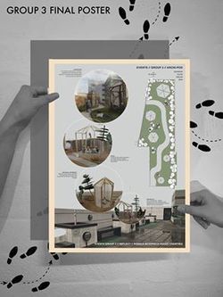
GROUP 3 - FINAL POSTER
Group 3's final poster indicates their final proposed plan of the roof terrace. The series of collages on the poster also demonstrates the type of spaces created by the proposed design of the team.
Pods of different sizes will be placed at different part of the site where the entrance point for each pods were carefully calculated to improve privacy as well as create mini private gardens at different area of the terrace. The difference in pod sizes also provided opportunity for different activities to take place within each of the pods. For example, the larger pods will be used for BBQ and team bonding activities while the small pods can be used for meditation.
Besides that, the pictures also reflected the type of materiality as well as atmospheric pressure created by the proposed design. The whole terrace will provide an opportunity for the users to reflect upon themselves and get their mind off the hospital surrounding.
Posted 8 Apr 2019 10:06
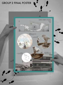
GROUP 2 - FINAL POSTER
The poster layouts work as a series of the 3 teams together showcasing the different proposals of the terrace re-design.
Group 2's poster consists of the terrace plan, showing the pavilions, landscaping and seating areas. The pictures of the model populated with people show the types of activities people are doing in those areas, as well as the light and shaded areas under the canopies. The exploded axonometric drawing showing the structure of the timber tree-like legs and waterproof membrane canopy. The render shows clearly everything brought together, as well as the atmospheres created within the terrace.
The variation in media used to convey the tree-like structure pavilion idea is contrasted with the dismal picture of the existing terrace, clearly showing the existing and proposed in an artistic way.
Group 2 should be extremely pleased with what they have produced, bringing many different skills within the group into one great idea.
Posted 7 Apr 2019 11:28

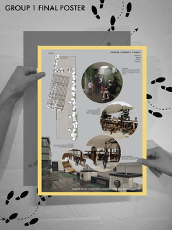
GROUP 1 - FINAL POSTER
Group 1's final poster clearly demonstrated the unique experiences that would be found within the terrace proposal. After photographing the already detailed physical model we were able to populate them to clearly show the uses of each area of the design.
These included a more enclosed space that could be used for individual self reflection throughout the day as well as social theatre screenings throughout the evening. Communal seating were shown both in the open area as well as the covered. The interactive green planting wall can also be seen, a change for the residents to take part in daily activities and add to design of the terrace in a personal way.
The plan of the terrace design was also included on the poster in order to clearly show where each perspective image is located from.
It was important to show the existing terrace on all of the posters in order to make it clear for the need of these new design proposals, especially for those that are not aware of the House design.
Posted 7 Apr 2019 09:05

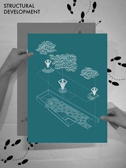
Group 2 - STRUCTURAL DEVELOPMENT
Group 2 came out with their final proposal with the concept of the tree garden being integrated into part of the canopy structure. The 'tree trunks' was proposed to be constructed through timber joists while the canopy will be constructed through carbon fiber. The whole structure will generate a light and open environment to the whole roof terrace. Timber seating were also in cooperated as part of the structure to provide seating for the users.
The organic roof structure will also be built it repetitions of triangles where the same triangle language will be reflected to the pavement design on the roof terrace. The triangular pavement design will be used to provide guidance for the user along the site, creating a circulation path. The triangular pavement will be placed at strategic locations to create a 'fading' effect and to soften the boundary between the pavement and wetpour material used for the other parts of the site. Certain triangular formed grass patches were also integrated as part of the pavement design.
Posted 7 Apr 2019 08:44
For our final presentation we will be using posters to support the models, showing the groups ideas with renders and plans.
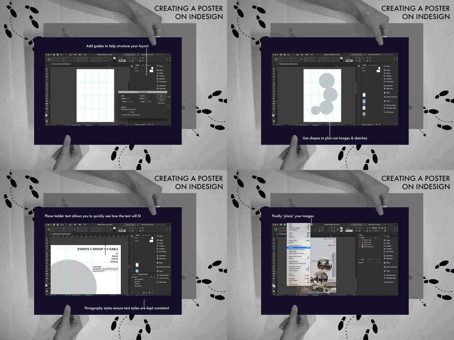
Yesterday, MArch students did an indesign workshop with the BA students, giving tips on how to create the perfect presentation layout. We showed how to add grids, paragraph styles, place filler text as well as the basics for the 1st years who haven't used the programme before.
A good layout is key for any portfolio or presentation, as will assist telling the story behind the project. This is particularly important when presenting to those who aren't familiar with architecture drawings, like the staff and guests at Ronald McDonald House Charities. A poster can be the make or break of any presentation.
Posted 5 Apr 2019 10:41
Group 3 Final Model
Group 3's final model comprises of multiple pod enclosures integrated within a well thought out landscape. Each 'pod' will house a different environment catering for families, couples or individual experiences.
The materiality chosen within the model successfully showcases the lightweight nature of the structures as well as the circulation created within the landscaping.
The group used a selection of different materials to display their model. The entire model was created without the use of the workshop, showing that cheap materials and easy modelmaking skills can be used to create a presentation style model.
Posted 5 Apr 2019 10:21
Group 2 Final Model
Group 2 have focused on the detail within the structural elements of their proposal, highlighted in the model that clearly shows the lightweight tree canopies. The integrated seating areas around these structures are also apparent, with materiality being a key concept.
The landscaping follows in the geometric nature of the overall tree canopy proposal, something that is apparent throughout the entire Ronald Mcdonald House.
The lightweight canopies themselves provide intimate seating areas for the residents to escape from their daily stress. The intricate detailing enables for a tranquil atmosphere brought about by the shadows created.
Posted 5 Apr 2019 10:10
Group 1 Final Model
Group 1 have been extremely successful in the amount of detail produced within their final physical model. They have managed to capture the key concepts of their design well, especially the materiality and social aspect of the green wall planting scheme.
The idea of 50/50 enclosed and open spaces is also apparent, pairing the open lightweight timber structure with the fully covered membrane. This will enable the terrace to be used more frequently throughout the year, as well providing protection from the sun from those on certain medication.
Posted 5 Apr 2019 10:04
Today each group printed draft posters prior to the final presentation at Ronald McDonald House.
Each group presented their final proposal in a professional format, then proceeded with a discussion as to how their presentation techniques could improve for tomorrow.
This session has been informative, It has allowed the first and second years to see areas that are strong within the project. The students have been able to practise their presentation techniques and improve where necessary.
Posted 4 Apr 2019 18:13
Group 3
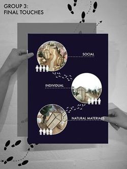
To prepare for the final presentation to AEW architects and Ronald McDonald House Manchester, group 3 have considered the following themes; Social; Individual; and Natural Materials.
The social concern that group 3 focused on is reflected in the open public walkways and stop off areas throughout the proposed site.
Individual zones are provided within the pods. These spaces provide the user with closed off, secluded areas for reflection.
Natural materials have been considered to introduce an element of calm. This aims to blur the barrier between the busy adjacent main road and a calm area for the users.
Posted 4 Apr 2019 17:51
Group 2
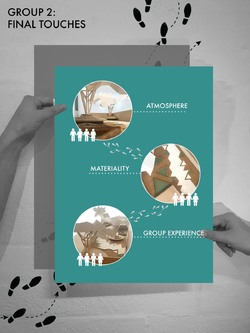
The group have designed a space which blurs the boundaries between nature and structure. To prepare for the final presentation at Ronald McDonald House, the group members focused on the following themes:
Atmosphere: To introduce a natural element on a site that can be seen as uninviting, the group have designed a structure which reflects the form of a tree. This creates an inviting atmosphere which provides pockets of covered spaces whilst being open to the elements.
Materiality: The group sought to blur the boundary between the public walkway and landscaped areas. This is a reflection of the roof canopy formation and further portrays the combination of nature and structure.
Group experience: Individual and group experience has been thread into the design concept. The group developed this design following feedback from the present users on site.
Posted 4 Apr 2019 17:31
Group 1
Today is the final day to finalise each project.
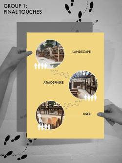
In preparation for the presentation to Ronald McDonald House along with Alex and Emma at AEW architects, the group focused on 3 main themes which represent their project.
Landscaping has been introduced to soften the boundary between the secluded, relaxed environment and main road. This doubles up as a sound barrier, something which has been highlighted as an issue on the existing terrace.
The space has been designed to create a calm and relaxed atmosphere in an attempt to provide the user with a space for reflection.
Following the questionnaire feedback, the user has been the focal point around the design in terms of, spatial zoning, light, sound and materiality.
Posted 4 Apr 2019 17:30

Group 3 User Representation:
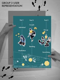
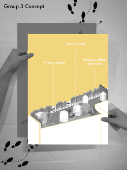
Focussing on user entered design, group 3 wanted to provide different sensory environments for the different needs the residents may have.
Something this group picked up on from the resident feedback was a calm and tranquil space to relax as well as more of a social area. For this reason, this group created 3 different environments of different sizes.
Pod 1 is intended for an individual experience such as meditation. The pod is designed to be dark and ambient, allowing the residents to reflect. The pod is only large enough for one person to ensure an individual experience.
Pod 2 is medium size, intended for 2 people. Activities such as reading can the place in this pod, as well as ensuring an intimate experience for couples as well as friends. Private conversations can take place in these pods with little distraction from others.
Pod 3 is the biggest pod, intended for a group of people to socialise inside. The social aspect is important for the residents, however it isn’t as important as the other individual experiences therefore only one of these group pods is provided.
Posted 4 Apr 2019 10:28

Group 2 User Representation:
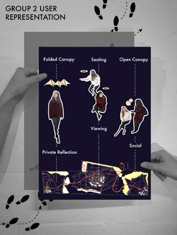
Group 2 decided to focus on the canopy structure creating different experiences for the user underneath it. Group 2 have a vision to create a mix of private and social experiences within the pavilion.
The folded canopy roof membrane folds up and down to create these different settings. Where the roof folds down, the resident can spend time alone within the confines of the structure. With light still being able to penetrate through the membrane, this gives the resident an ambient experience.
The incorporated seating underneath the tree canopies is designed into the structure. This stepped seating creates a theatre type atmosphere with residents able to chat in a group or a couple or purely sit on their own and resonate with the environment.
The open areas of the folded canopy allow for residents to physically act more openly, encouraging more social interactions. The penetration of light in between the canopies allows for light to cast brilliant shadows on the open areas.
Posted 4 Apr 2019 10:27

Group 1 User Representation:
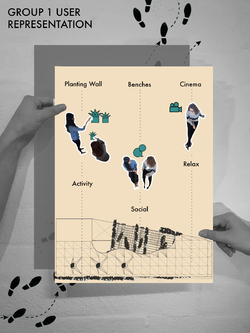
With this project being all about the end user, the group acted out what they envisioned the user doing in each area of their pavilion.
The focus of their project is about creating a mix of social and individual spaces. For this reason they came up with 3 different areas allowing for different activities.
The planting wall can be seen as a group of individual activity, allowing residents to have their own pot and plant and maintain anything they want in them. This is an activity for the whole family, keeping their mind’s at ease and allowing them to forget about the hospital environment. This was an important part of the resident’s feedback therefore this group wanted to really push this idea.
Benches are provided for more of a social experience. These can be used for eating or chatting between families and residents. The benches also allow for informal chats to take place between families and staff at the hospital.
The cinema area is a cosy, relaxing area for residents to go and unwind at any point in the day. This cinema area can be used in the day time or the evening due to the enclosed canopy above. This area tends to be more of an individual experience due to the quiet atmosphere, allowing residents to reflect and relax.
Posted 4 Apr 2019 10:20
Group 1: KJ, Beena, Jasper & Yasmine
Assembling of final presentation model at scale 1:50 which included canopy, landscape, urban furniture and vertical planting.
Urban furniture and roof canopy were added at the side of the canopy that overviews the existing garden to provide a pleasant environment for users to have breakfast and socialize while overlooking their children playing at the playground on ground floor. A dynamic canopy will also be added to half of the terrace to provide shading from the rain and control of sunlight for users that are sunlight sensitive.
Posted 4 Apr 2019 09:49
Group 3
Kilian, Nina, Brandon & Drilon proposed to have multiple pods that were scattered around the terrace to create different spaces.
The question regarding the flexibility of the pods were raised during the feedback by AEW and 5th years. The students were suggested to improve the flexibility of the design through the play of sizes, materiality and function of the pods. Pods of different sizes could be designed to provide different function where smaller pods will be more suitable for couples and larger pods will be more suitable for groups. The materaility of the pods were also a topic of discussion where students were suggested to play with both semi-translucent and completely covered materials. This will ensure different privacy level within each pods.
Last but not least, students were also asked to look into the positions of the pods within the site as well as play with the boundary lines between soft and hardscape to enhance the circulation through the terrace.
Posted 4 Apr 2019 08:39
Group 2: Yumian, Alice & Roxandra
Group 2 wanted to create sheltered outdoor spaces using overhanging canopies which are inspired by trees. The artificial structures would provide a natural form without the weight, soil and maintenance of real trees.
Alex and Emma from AEW Architects really liked the concept, however suggested the group begin to look at how the technical feasibility. Using this feedback, Group 2 developed the design creating uniform structures which still reflect the tree form with through timber materiality.
Posted 3 Apr 2019 19:46
Group 1: KJ, Beena, Jasper & Yasmine
The initial concept enclosed the entire floor space of the terrace and sought to segregate zones with fixed structure.
Following the feedback from Alex and Emma at AEW Architects, group 1 progressed and developed their design to focus around the user.
The terrace requires shaded spaces due to the needs of children who have medical conditions, while the unshaded are for other users who wish to bask in the sun when possible. Alex and Emma saw this reflection in the initial design and provided direction as to which elements could be more open and exposed to the surroundings.
During the presentation it was suggested that the canopy could be opened up internally. Permeability in the roof surface was introduced to create ‘zones’ in replace of the fixed structure. Overall, the project progressed, the result is a dynamic form which varies in height and space.
Posted 3 Apr 2019 13:22
MODEL MAKING
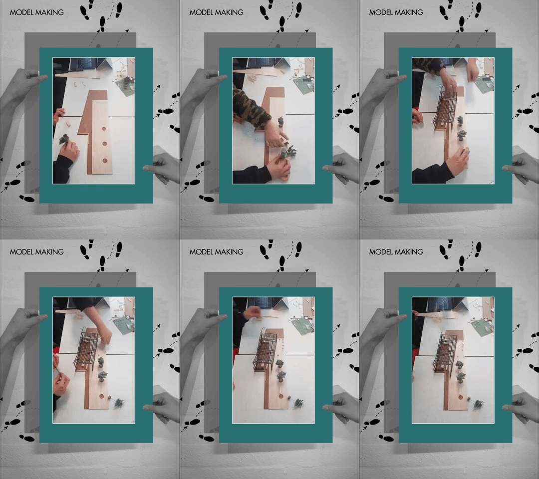
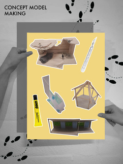
Group 1 decided to make their final model through a range of materials and skills. They were taught to prepare a CAD file for laser cut as well as directed by the 5th years to produced certain part of their final model using this method. They also decided to hand cut specific elements of the model.
Their design will consist a combination of both softscape and hardscape to create a pleasant journey for the user of the space. Vertical plantings and planter boxes were also in cooperated into parts of the design to create a peaceful environment.
Posted 3 Apr 2019 11:16
MODEL MAKING
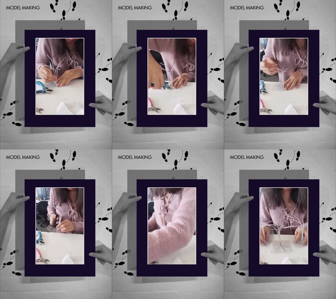
Group 2 decided to make their physical model our of foam board, wire mesh and bendable metals.
Their concept that revolves a direct reflection of garden allowed them to explore tree like structures placed at strategic parts of the canopy in order to provide shading, privacy as well as control the viewpoints of the users. The structure of the trees will be constructed in the form of tree trunks with integrated public seating underneath it. The canopy of the trees were also proposed to be redirected the rain water in order to create a unique water feature at assigned area within the roof terrace.
Posted 2 Apr 2019 14:16

MODEL MAKING
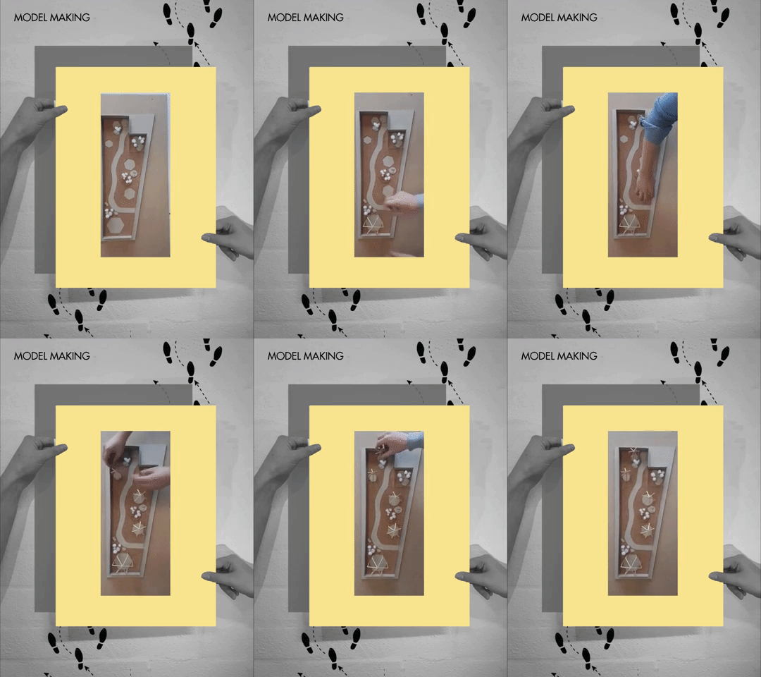
Group 3 decided to make their final physical model at scale 1 to 50 to be used for the final presentation on Friday. They decided to hand build their physical model by using MDF, cork, balsa wood and cotton.
Individual pods were made using wood strips. These pods can be attached and detached from the site model to provide flexibility in terms of position and orientation for the user of the space.
Each pods were also designed slightly differently to provide different programs, user experience and privacy levels. For example, different pods were designed to enhance different sensory experiences like: sight, scent, touch and sound. This would in turn enhance the overall experience and provide an opportunity for relaxation to the user of the charity house. These elements will be achieved by the play of different pod sizing, spatial compositions, materiality and transparency setting where the students are still experimenting simultaneously with the model making process. This provides the element of choice to the user where user are allowed to pick the preferred pods to relax and meditate.
Posted 2 Apr 2019 13:23
Group 3: Design Inspiration
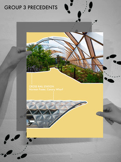
Beena, KJ, Jasper and Yasmine's structure was inspired by Norman Foster's Cross Rail Station in Canary Wharf. The group liked how the lattice roof structure provides shelter whilst also creating a light atmosphere through the scattered openings.
Posted 2 Apr 2019 13:19
Group 2: Design Inspiration
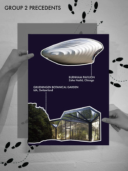
Yumian, Alice & Roxandra's were inspired by two design precedents. Zaha Hadid's Burnham Pavilion in Chicago influenced the composition and shape of the overhanging canopies.
The structure of the 'trees' is inspired by the Greenhouse Botanical Garden Grueningen by idA in Switzerland. The group liked the way the structure reflected a tree trunk branching out, providing shelter.
Posted 2 Apr 2019 13:04
Group 1: Design Inspiration
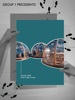
Kilian, Nina, Brandon & Drilon's design is inspired by the 'igloo' style pods.
They were inspired by the form of the shelters, and how they create an intimate and private space, whilst still providing a connection to the outside. The group liked how the igloos allow for outside activities in all weather conditions, as they provide shelter from the elements.
Posted 2 Apr 2019 12:50
We provided some advice and skills tutorials on how the students could turn their Sketchup digital models into diagrammatic analysis to best showcase their proposals. Using exploded axonometric drawings helped explain how the structure the designs would work, something that Alex and Emma were eager to see.
The first and second year students were keen to jump straight onto using real time rendering software from their Sketchup models. However, we have provided precedents and advice into alternative methods of showcasing their final visuals in a softer approach. Simple line drawings from the digital software could be partnered with photoshop work in order to capture the atmosphere in their designs.
Posted 2 Apr 2019 11:02
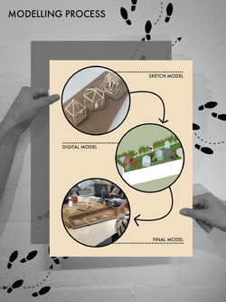
We chose to use models as our medium for events as they are an accessible form of presenting architecture designs.
Due to the nature of the project, we wanted our output to be easy to read and understand by all people involved within the project, including the Ronald McDonald House Charity Staff, as well as guests if they wish to visit the presentation on Friday.
As well as this, models are an excellent way of testing designs. Concept models allow us to sketch designs in a 3 dimensional form. They can become abstract or literal, an excellent way to quickly test an idea or form.
Using digital model software, such as sketchup, allows us to add precision to the design. This provides an understanding of how feasible a design will actually be. Environmental and physical context can be quickly added to test the design against reality.
Posted 2 Apr 2019 10:55
Group 3: Kilian, Nina, Drilon, Brandon
The group came up with their final concept, taking inspiration from pods at 20 stories.
Posted 2 Apr 2019 10:31
Group 2: Alice, Yumian, Roxandra
As a way of disentangling from the hospital environment, Group 2's terrace encompasses a tranquil and calm environment. The comfortable seating flourishes into tree shaped shelters that have views of the water feature and garden of vivid flowers.
Pioneering the balance between shelter and open space, the sweeping waterfall acts as a buffer both visually and acoustically. Each of the users have their own plant incorporated within the garden wall behind which can be looked after and watered which creates a sense of community within the terrace.
Following the natural flow of water the glass walkway creates a private space where their senses take over.
Posted 2 Apr 2019 10:23

Group 1: KJ, Beena, Jasper & Yasmine
The design prioritises its users, hence, careful consideration was integrated into the design process.
Sunlight, sound and privacy were the first factors studied which later branched into secondary uses of the decided installations.
The terrace required shaded and unshaded spaces where its users can choose where they wished to be. The shaded areas are required where medical conditions prevent direct exposure to sunlight while the unshaded are for other users wish to bask in the sun when possible.
Overall, the canopy designed is a dynamic form which varies in height and space; an airy and lightweight space is created, allowing a relaxed ambience to seep into the user. The trellis will support creeper and tendril plants, hence shadows form will sway to create a whimsical play to entertain thoughts.
To break up sound from entering the terrace, a green wall is placed, street-side, where a concrete wall exists; the growing wall will provide privacy from the street and houses that may be able to peer into the space. Additionally, the green wall can provide cleaner air and a natural touch to the harsh, concrete context. It is also planned in a way where the residents can place their favourite plants on the rack and raise them.
An enclosed space at the end is designed as a semi-private area of the terrace. Movie nights could be set up or used as a meditative space.
By the balustrades, picnic tables are placed for the parents to have their morning coffee and breakfasts. The view towards the inner garden is clear, hence the children can also be observed from the terrace.
Posted 2 Apr 2019 10:22
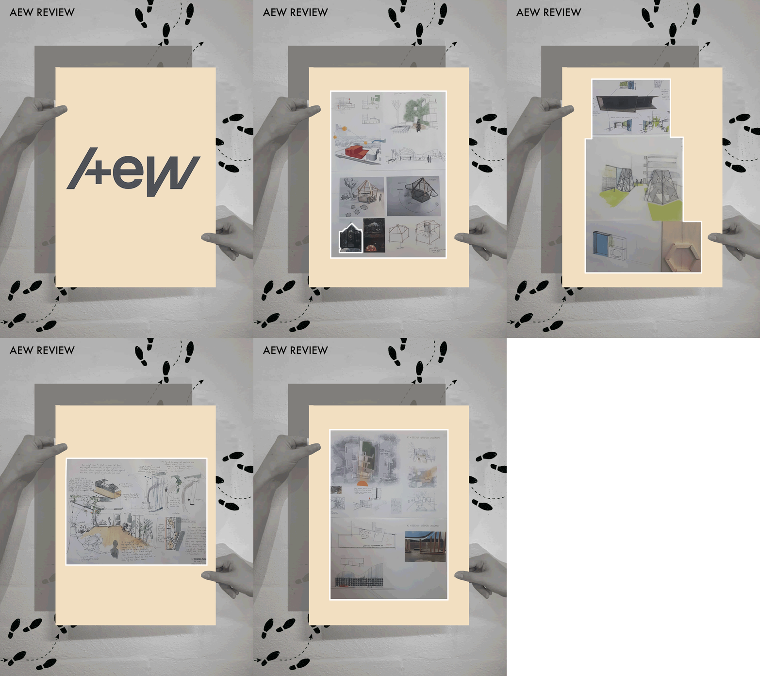
Last week, we had Emma and Alex from AEW Architects join us to review the group concepts so far. This gave the groups a chance to present their ideas.
Presenting can be quite a daunting experience, even for architects with years of experience. Practice makes perfect, therefore we had our students formally present their concepts in a 'crit' format. This will assist them in communicating their ideas vocally as well as visually.
All groups presented excellently, and the feedback was extremely useful, which allowed the students to look at alternative ways to progress their ideas.
Posted 1 Apr 2019 11:57

As part of each session, our aim was to discuss the skills and techniques that the students wanted to develop. This student feedback has been key during week 1 and has allowed us to tailor our guidance towards the students in a more specified way.
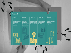
Day 1
During the morning session the undergraduates outlined areas of work to improve on. This allowed the 5th year students to dedicate time on specific software improvement, the session progressed with individual AutoCAD tutorials. The postgraduates circulated around the group to support the students throughout the task.
Day 2
The students carried out a drawing and measuring exercise during the site visit, this was followed by a desktop study back at the studio. On-site measuring was a first for a number of the students, this was raised at the start of the day following a discussion on what to expect from the morning on site. Further to the feedback, the 5th years focused their advice on measuring techniques.
Day 3
As part of the desktop site analysis, the students produced hand drawn and illustration style diagrams. The main response from the students was positive, however, guidance was provided on which aspects of the analysis would inform their proposals in the following week. This gave the 5th years a chance to describe how site analysis informs design techniques and provided the undergraduates with another layer of advice to work from.
Day 4
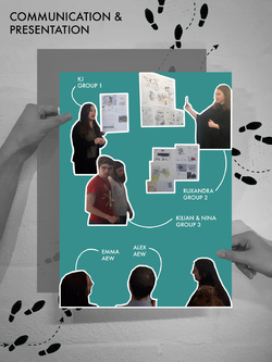
In preparation for the final presentation in week 2, the undergraduates presented the concept sketches and models to Alex and Emma from AEW architects. The 5th years helped with presentation and poster layout techniques following a discussion on what to expect from the review.
Day 5
This was the last chance for the undergraduate students to finalise their concept designs. Along with feedback from Alex and Emma at AEW architects, the students requested guidance on how to thread the response into the next stage of the design process. The 5th years suggested various options to carry the design forward and displayed precedent examples as inspiration on structure and materiality.
Posted 29 Mar 2019 21:39

Seeing as it’s the weekend, we thought we’d post some fun activities available to anyone and everyone who wants to get involved to raise money for the Ronald McDonald House Charities!
The charity is always finding new ways for adults, kids and companies to participate in to raise money for the development and running of the house. The 60 rooms at the house in Manchester are constantly fully booked and the charity has plans to increase the space, allowing for many more families who don’t have the chance to stay near to their children in hospital at this critical time in their life.
The house currently asks for a maximum of £25 per night if possible from residents, however this price is completely optional, allowing the residents the opportunity to stay there even if they cannot afford to pay the full amount if any. This price is based off the amount it costs to accommodate one family per night in terms of paying the staff, the food and the facilities.
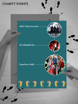
One of the charitable events that took place recently involved staff from AEW climbing Mount Snowdon. All staff left Manchester at 4am to get to Wales and up to the top for lunchtime. Another charitable event AEW organised was the superhero walk to raise money for the Steve Burne’s rooms at the Ronald McDonald House. A walk was organised through Manchester with staff, friends and family dressed entirely in superhero costumer. Through their efforts, AEW Architects helped to exceed the amount of £250,000 for the charity.
The next upcoming event is the 5K Inflatable run, running from April - November. This is a fun event for children and adults to take part in, including 15 gigantic inflatable obstacles around a 5km course. The registration fee is £20 and a recommended amount of £100 per person is advised. This is a great opportunity to raise money for a brilliant charity whilst participating in a fun-filled day out on an inflatable obstacle course. Get involved!
Posted 29 Mar 2019 19:59
Day 4 - Reviews with AEW Architects
This afternoon we had the pleasure welcome Alex and Emma from AEW Architects to the studio to review the students work up to date. Each group took turns to present their initial concept design ideas, showing sketches as well as physical and digital models.
After each group had presented their ideas Alex and Emma were able to give valuable feedback on their designs, giving them advice on where they should focus their concepts as well as thoughts on materiality and structure. It was great to see 3 completely separate and unique design concepts from the groups and the presentations were all of very high quality.
Some great suggestions were made from both the students and the architects on ways to move forward on the design and we were happy to see Alex and and Emma so excited about the project. The students will now have a couple of days to finalise their designs, taking on board all the valuable feedback from today.
Posted 29 Mar 2019 10:41

After analysing the terrace, our BA students have started to create 3D models of their initial concepts...
Group 1: KJ, Beena, Jasper & Jasmine
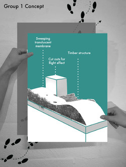
Group 1 took inspiration from the resident feedback, mainly focussing on the fact that some children of families have medical conditions where they cannot be exposed to direct sunlight. Their concept focussed on the pavilion more as a fully enclosed structure. They have initially decided on a light weight weatherproof canvas with parts cut out to allow light in. They wanted to connect the terrace to the garden below so families can keep an eye on their children so have thought about using a clear barrier such as glass to separate them whilst keeping them linked.
Group 2: Alice, Yumian & Ruxandra
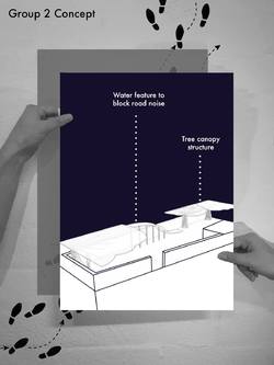
Group 2 have 3 main concept ideas, the first focussing on a tree structure, holding up a canopy with seating and tables designed within the structure. The second took inspiration from the residents feedback about the noise of the road. For this reason they came up with the concept of a running water feature to drown the noise out and create a calming atmosphere. This water feature runs overhead, creating fully enclosed and partially enclosed spaces, allowing the water to run overhead to the user below. The final concept incorporated a timber structure with a canvas rooftop allowing for hammocks to be connected between.
Group 3: Kilian, Nina, Drilon & Brandon
Group 3 took the idea from the residents feedback of wanting 50/50 enclosed and open spaces. They also took inspiration from the feedback that residents would like a space to ‘escape’ the hospital environment. This lead them to the design of pod structures. The idea is that a few pods of different sizes are dispersed on the terrace with some panels that cannot be seen through and some that can, manipulating views of the hospital from inside the pods and allowing residents to focus on the garden area.
Posted 28 Mar 2019 19:20

SITE ANALYSIS
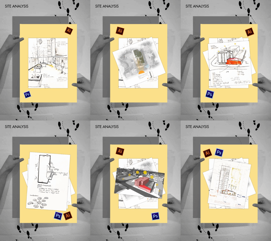
Students were divided into groups of 3 or 4 with mixture of both 1st and 2nd year students. This will be the final grouping system where all the groups will now work towards producing a final output together as a team.
A large site map were then placed on the wall and every student were asked to give their opinions on the current condition of the site as well as elements that would affect the site, as seen in their site visit. These opinions were then diagrammed onto a singular site map that could act as their main guidance and generator for their personal site analysis.
Next, examples for analytical diagrams and methods of producing simple yet informative diagrams were also shown to the students. Students were then introduced to diagrammatic methods through the use of Photoshop and Adobe Illustrator by the 5th years. After that, students were asked to produce their own version of site analysis among their respective groups, which would be able to assist them in the next design stage, design development.
Posted 28 Mar 2019 16:29

Day 2 - Resident feedback from questionnaire
After gaining feedback from the questionnaire we handed out to the residents last week, we got some valuable answers back to help the students with their designs.
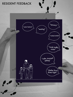
The questionnaire aimed to ask residents a number of questions. The first one asked how often they go outside and why. The feedback provided was that they didn’t go outside often due to the bad weather, therefore lots of them said they would like to see partly enclosed/partly open spaces. Another reason for wanting enclosed spaces was due to the fact that some children are not able to be exposed to direct sunlight because of their condition which was an interesting point we hadn’t anticipated.
Another question aimed at the residents asked them what kind of environment they would like to see on the roof terrace. All the feedback provided was aimed at calm, tranquil, sensory environments. This allowed us to focus on the fact that residents wanted this space to be aimed mainly at family members and not at the children themselves, providing a relaxing space where they can get away from the hospital environment.
Answers to the question about what would encourage residents to spend more time outside focussed on more seating areas for relaxation, and spaces to “get away” from the hospital environment. Many of the answers provided leaned towards not wanting views of the children’s hospital as well as masking the views from the road. Suggestions such as a water feature were also proposed to mask the noise pollution from the main road.
The answers from the questionnaire provided us with an excellent basis for the students to start designing from, essentially informing their brief. This type of user-centred design approach is particularly important to our scheme, allowing us to show the students that the end user should drive the project in this situation.
Posted 27 Mar 2019 11:14

Day 2 - Sketch Response to the site
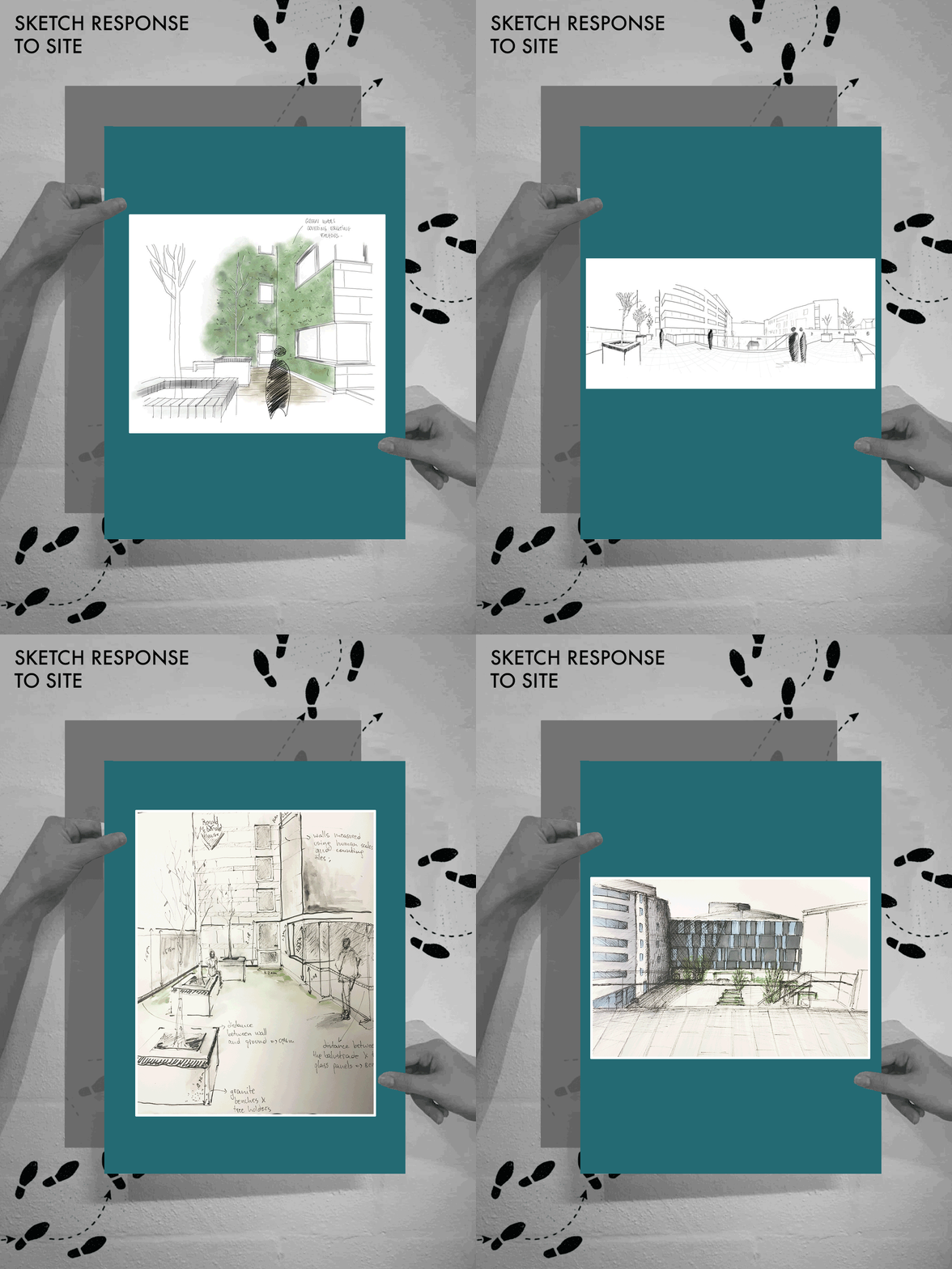
During the site visit the student groups started to produce some excellent sketches, annotating their findings. Notations on materiality, access and environmental qualities were being made as well as initial thoughts on how to improve the space.
A key theme of vegetation was apparent throughout all of the groups, both on the current lack of vegetation on the roof terrace and how greenery could be introduced to the space. We were able to advise the students on non invasive lightweight methods of introducing this greenery to the site including green walls and hanging trellis’.
It was also interesting to see how many of the sketches included the main garden area. This relationship between the ‘playground’ area and the roof terrace needs to be considered, inducing access, materiality choices and views.
Scale was also apparent in many of the drawings, highlighting the contrast between the roof terrace level and the mass of the attached House. Scale in their pavilion designs could be a crucial aspect in helping them move forward. We are excited to see what they come up with!
Posted 26 Mar 2019 16:36

SITE VISIT
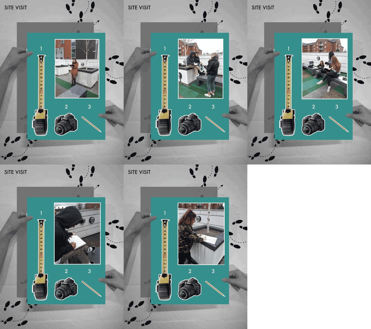
All students were brought on a tour around Ronald McDonald House Charity by Mike to get a better understanding of the history, user and dynamics of the charity house.During this tour, the students were given the opportunity to take a peek into the lifestyle and needs of the occupants as well as emerge themselves into the daily life of the residents. This helped the students to gain a better understanding on the users, which will in turn assist them in their design process. Students are expected to reflect their understanding of the user requirements on their proposed design concept.
After that, all the students were brought to the roof terrace before being split into 3 groups with 3 different tasks to perform during the site visit, being:
Group 1: Measurement of the site (To get a better understanding on the scale of the site)
Group 2: Photographs of the site (Capturing the different viewpoint of the site)
Group 3: Sketching and notes of the site (Aim to capture the mood and atmosphere of the site)
The students were also taught by the fifth years to analyse the space in an architectural point of view. Previous design implementations and strategies were also pointed out to the students. For example, the previous landscape designer tried to enhance the circulation from the ground floor garden towards the roof terrace by having strips of green wet pour as part of the pavement pattern, thus creating an indirect movement guideline to the users. These green patterns are also reflection of the charity house facade by having the same geometric language and colour profiles. Besides that, the existing grid lines on the site were also enhanced by placement of large planter boxes and concrete seating arrangements. Students were then asked to sketch out their personal perception and viewpoints of the existing site before developing an initial concept for the space.
Posted 26 Mar 2019 16:27

Day 1 - Reading List Sketches
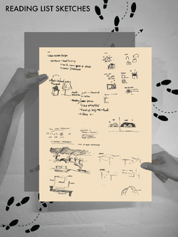
Having provided the key pieces of literature from the reading list that we had prepared for the first and second year students prior to our first meeting, we were able to engage in an in depth conversation between the students on their findings. The readings ranged from information on architectural pavilions, terrace design and theoretical research into spaces improving the health and well-being of its user.
We were all impressed with the contribution each of the students had with our discussion and the sketches produced will provide an excellent start to the conceptual design of the final output. Key analytical findings included consideration of materiality, form and user interaction that could be incorporated into the design of a terrace of reflection for the residents.
Initial mention of ‘organic forms’, ‘natural materiality’ and ‘acoustic buffering’ were coherent themes throughout the students findings which we found particularly interesting. It is clear the brief had been understood by each group member and the sensitive response to it was being taken on board. Architectural methods in designing peaceful and calming environments such as material choice, form and atmospheric controls were already being discussed. A great start to the design process!
Posted 26 Mar 2019 10:02

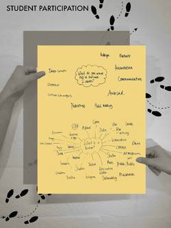
Day 1 - Student Participation
Our initial aim was to involve the students in a general discussion about the 2 week event period. After reviewing the brief and going into more depth about the structure of the project and overall outputs, we decided to evolve the first and second years into a brainstorming exercise.
The intention in this exercise was not only to get the students communicating but also to find out what exactly they were hoping to get our of the events project. Other than fundamental software skills, themes of learning how to properly communicate both verbally and through conceptual design were repetitive comments. This short exercise has helped us understand where we should focus our skills in order to help the students make the most of this project.
Our second brainstorming exercise was to find out what the students think when they hear ‘pavilion’. This exercise was particularly helpful, with excellent suggestions such as ‘shelter’ ‘materiality’ and ‘atmosphere’. It also allowed us to question certain suggestions in order to encourage the students to think in more depth about certain areas. For example, when ‘access’ was mentioned we were able to lead the conversation into circulation and user groups, making sure the space created will be accessible for everyone.
Posted 25 Mar 2019 17:28

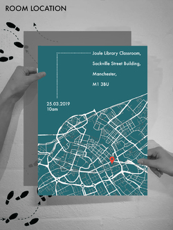
We have booked the Joule Library Classroom for the whole 2 weeks of Events. The poster provides the location of the classroom along with the email sent out the week before with a map, directions and where the 5th years will meet the students.
We will be using the classroom in the beautiful Sackville Street Building with plenty of open workspaces in the Joule library, as well as the specific classroom. This will give the students the freedom to choose their method of working whilst being in close proximity to each other.
Students have been advised to meet at 10am on Monday morning where we will run through the session plan for the 2 weeks with them, the brief, and what is expected from them. This will hopefully give the students a good insight into the project and get them excited to start a great 2 weeks.
Students have been reminded to bring their University of Manchester student ID as they will need this to access the library. They should access the building through the Vimto Park entrance and head up to Floor E where some of the 5th years will meet them to direct them to the classroom.
Posted 19 Mar 2019 23:00

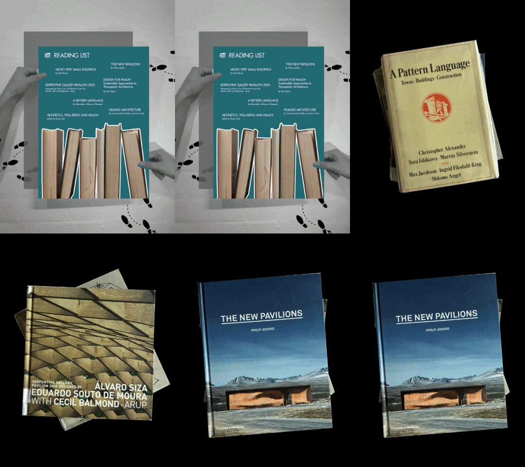
READING LIST
1. A Pattern Language
Describes an entirely new attitude to architecture and planning. It also provides a complete working alternative to our present ideas about architecture, building, and planning.
2.Serpentine Gallery Pavilion 2005
Serious of pavilion case studies.
3. Micro Very Small Buildings
Case studies with constraints of space where cost can liberate the imagination. Contain 5 thematic chapters: public realm, community spaces, on the move, compact living and extra spaces.
4. Aesthetics, Well Being and Health
Reflection on impacts of architecture and environmental aesthetics on their well being and health.
5. The New Pavilions
Containing more than 80 pavilion case studies for reasons of geography, variety and inventiveness. The image they define of contemporary architecture is far more relevant and revealing than any selected 'real' buildings.
6. Design for Health: Sustainable Approaches to Therapeutic Architecture
This issue of AD seeks out innovative and varied sustainable architectural responses to designing for health, such as: integrating sensory gardens and landscapes into the care environment; specifying local materials and passive technologies; and reinvigorating aging postwar facilities.
7. Healing Architecture
This title presents the fundamental principals behind the conception and design of built space and their effect on coping with illness. One of the key questions to be answered is how architecture can contribute to healing. Put another way, how does the environment, both built and unbuilt, influence the perception of healthy human beings, in order for them to remain healthy?
Posted 18 Mar 2019 18:22

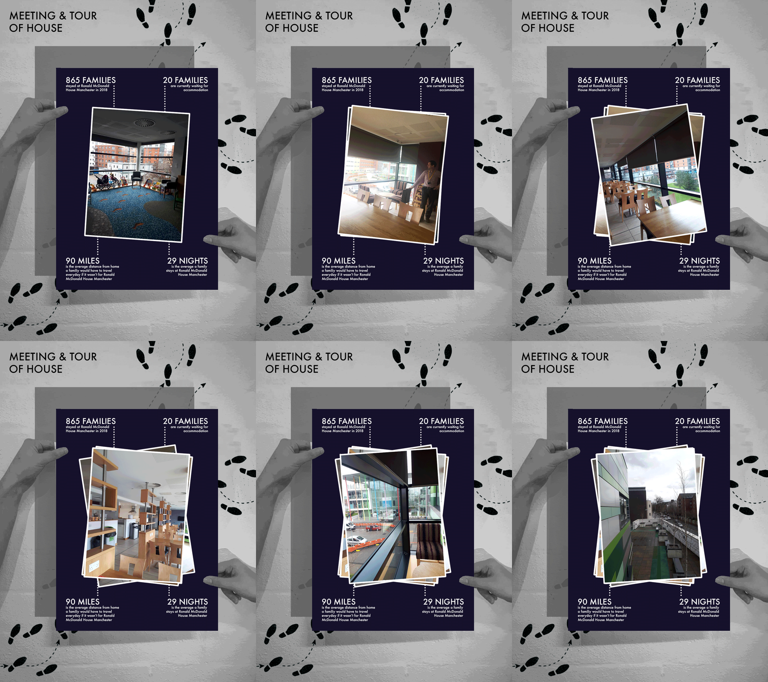
With one week to go until Events kicks off, we visited Ronald McDonald House Manchester for a meeting with Mike, the house manager, to run through some last details.
While we were there, Mike gave us a tour of the House. We were able to have a look round and see the spaces used by the families staying there, such as the kitchen and dinning spaces and playrooms.
Since our last visit, 2 new bedrooms have been added by upgrading communal spaces which were no longer required. As well as a new outdoor classroom being constructed within the garden.
Mike told us some interesting statistics about Ronald McDonald House Manchester from 2018, such as 865 families stayed there over the year.
We discussed the final presentation, which will occur on the last Friday of events, when Mike, Emma and Alex will judge the 3 models and posters curated by group T. We have been generously provided space at Ronald McDonald House Manchester to present. Our Judges will provide feedback on the models and pick a winner.
We will be back at Ronald McDonald House Manchester next week, on Tuesday, to have a site visit with the BArch Students. Looking forward to seeing what their initial observations and thoughts are of the terrace space!
Posted 18 Mar 2019 13:39

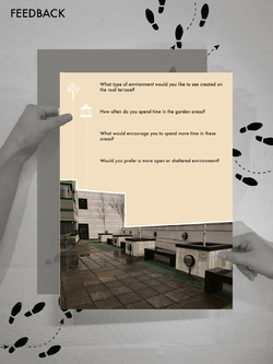
In order to gain valuable information on our design proposal we decided to create a feedback form to be handed to each of the residents. This will form some key research from our target audience and provide an interesting design driver.
The questions included:
What type of environment would you like to see created on the roof terrace?
How often do you spend time in the garden areas?
What would encourage you to spend more time in these areas?
Would you prefer a more open or sheltered environment?
We decided to post these question ahead of our events 2 week period in order to provide the students with a strong starting point on their projects. The feedback forms were placed in the rooms of each of the residents in order to remain respectful of their current situations. All feedback will be collected on the 24th March in preparation for our events period.
It will be crucial for the opinions of the residents to be taken into consideration when it comes to the design of the roof terrace. In order to create a suitable and sensitive environment the needs and desires of the residents must be at the forefront of design.
Posted 18 Mar 2019 13:26

There are currently 366 Ronald McDonald Houses in 64 countries and regions. These provide a place to stay for families with hospitalized children under 21 years of age who are being treated at nearby hospitals and medical facilities. Ronald McDonald's Houses provide over 7,200 bedrooms to families around the world each night.
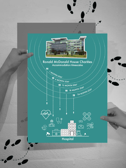
The succession of the Ronald McDonald House Charities allows families from the furthest reaches of the country to be near the vicinity of their child during the course of the specialist treatment. Many families are brought into Ronald McDonald House Charities each day, the length of their stay can vary depending on their child’s condition. The accommodation has become a home for many families, with some staying up to 2 years at a time.
The Ronald McDonald House charities provide free accommodation for as long as families need it, sparing them some of the financial issues that can arise during a prolonged hospital stay. According to a report by BLISS, families with a sick baby in hospital can face unexpected extra expenses of up to £2,000 per hospital visit. Ronald McDonald Houses enable parents to stay as close as possible to the children's ward and in doing so greatly reduce the need to travel and all of its associated stresses and costs.
Posted 25 Feb 2019 10:36

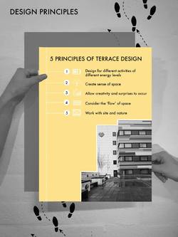
The aim of this event is to aid in the conceptual re-design of the Ronald McDonald House Charity roof terrace at Manchester, turning it into a garden of reflection for the residents within the charity house. The designs of the terrace area should be guided and shaped by these 5 main principles:
1. Design for different activities of different energy levels
The activities and programmes of the terrace should be taken into consideration before subdividing the space into different spatial zones. The terrace design should aim to create a peaceful environment for the residents to reflect upon themselves and relief mental frustrations.
2. Create sense of space
The design should be able to create a sense of space and belonging for the residents within the Ronald McDonald House Charity. It should have a strong sense of place that speaks to the culture, location, and “spirit” of community.
3. Allow creativity and surprises to occur
The space designed should not be too generic but able to provide a sense of discovery. This will help in creating a complete narrative and a well rounded experience for the users of the space.
4. Consider the 'flow' of space
Resident movements and spatial compositions through the site should be taken into consideration to be able to come out with a proposal that allows different paths of exploration.
5. Work with site and nature
Paths, edges, boundaries and surrounding of the site should be analysed before the designing process. This will help to ensure the proposal to have a coherent language and continuous flow with the existing outdoor terrace and Ronald McDonald House Charity.
Posted 17 Feb 2019 16:35

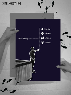
Today the group attended our first site meeting at the Ronald McDonald House to discuss the initial ideas for our project with the House Manager. We were informed on the type of work the Charities do worldwide and the impact they have on families.
Initially, we spoke with Mike Fairley in the Day Room of the house, allowing us to talk him through our idea following on from emails in more detail and gave us the opportunity to ask him any questions. We then talked logistics, discussing the branding and how our event can actually help promote the charity. We originally thought about asking the families in the house about what they might like to see in the terrace, however, he gave us the idea to do a questionnaire he could put under families doors, which seemed like a much less intrusive way of communicating.
We then went out to the proposed site on the terrace, taking photos and identifying initial constraints and issues, such as the busy road alongside the site, the entrances on to the terrace. We realised the terrace was much larger than we first thought, providing an optimum sized terrace for small scale outdoor pavilion design.
Posted 16 Feb 2019 18:23

The Royal Manchester Children's Hospital provides specialist healthcare services for children and young people throughout the North West, as well as nationally and internationally. The hospital tends to over 140,000 patients each year across a range of specialities including oncology, haematology, bone marrow transplant, burns and orthopaedics.
The Hospital is the largest and busiest children’s hospital in the UK with 371 paediatric beds. A further 60 neonatal cots also operate, within the same building, in the tertiary neonatal unit of Saint Mary’s Hospital. This enables the staff of the two hospitals to deliver completely joined up services for families, from prenatal care through birth and beyond.
The specialist equipment that is provided at the Royal Manchester Children's Hospital results in families from all across the UK, and in some situations even internationally, to travel to it. This highlights the importance of the Ronald McDonald House Charities providing free accomodation to families who are so far away from their own homes.
Posted 16 Feb 2019 18:19

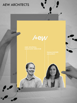
One of our two collaborators is AEW Architects. AEW are a team of 60 based in Manchester. They specialise in many different fields of architecture, including accommodation, industrial,
office, retail and sport and leisure.
AEW will be providing expertise knowledge on architectural design for hospital accommodation, having been the retained architects for Ronald McDonald House Charities for the past 14 years.
Understanding the stress in which the families are under whilst staying at the houses, they aim to create spaces which allow families to retain a sense of normality.
On the design of Ronald McDonald House Manchester, they said, “Our local House is located on a key gateway corner adjacent to the entrance to the new Children's Hospital. Recesses, projections and canopies define the street edges, principal elevation and articulate the corner of Hathersage Road towards the hospital entrance.
The 60 bedroom House reflects RMHC's high architectural ambition and importance of the site. Continuing brand development, the psychology of colour is explored in the facade. Green to provide harmony, peace and reassurance and grey to provide neutrality and a link with the new hospital building.”
During our first events week, Alex and Emma will provide feedback to our initial concept sketches in a design workshop.
To see more of AEW’s projects, visit their website here: https://www.aewarchitects.comPosted 14 Feb 2019 15:50
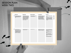
The session plan outlines the activities prepared for Week Two. Following on from concept design, this week will be focused on presentation. Students will produce presentation quality models within their groups using the workshop and studio space, making use of the facilities the university has to offer. Towards the end of the week, models will be finalised and an A2 poster will be put together showcasing the work produced from the previous week. The final day of Events will consist of an exhibition at the Ronald McDonald House, with each group presenting their poster and model to architects from AEW Architects and the staff involved at the House. Throughout these two weeks, students will have learnt skills in design, analysis, communication and presentation, setting them up with a wide range of skill set for future projects.
Posted 13 Feb 2019 13:21
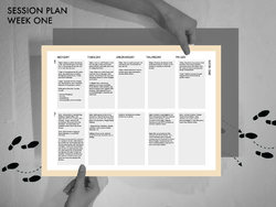
The session plan outlines the scheduled activities students will be participating in throughout the 2 weeks. Week One students will be introduced to the brief and attend a site meeting and tour of the Ronald McDonald House and terrace. As an entire group, we will run through site analysis, diagramming site features and constraints. Students will start to develop concept ideas, using sketches, diagrams and paper and card sketch models to produce initial designs. A meeting with members from AEW architects will give students an opportunity to get feedback on their concept designs in order to develop their proposals further. Emphasis this week will be on developing new skills through sketching and visual representation.
Posted 13 Feb 2019 12:16
Group site visit to the Ronald McDonald House - observing its location and close relationship to the Children's hospital.
The House is directly opposite The Royal Manchester Children's Hospital in central Manchester, enabling families to continue their lives with some degree of normality, knowing they are just moments from their child's bedside. This quick visit showed us the importance of the Ronald McDonald House Charities and all of the great work they are doing.
Posted 13 Feb 2019 12:15

Ronald McDonald House Charities has been providing accommodation and support to families in the UK for over 25 years. They are the leading provider of free family accommodation to NHS hospitals.
Ronald McDonald House Manchester provides free accommodation to the families of the children who are receiving treatment at the Royal Manchester Children’s Hospital and St Mary’s Neonatal Unit.
Due to the specialist treatments provided in these hospitals, families from all over the UK have to travel to Manchester for their children to receive the excellent care the hospital provides.
Designed by AEW Architects, Ronald McDonald House Manchester opened in May 2012. They provide over 60 ensuite rooms, as well as communal areas, lounges, self-catering kitchens, dining spaces, play rooms, laundry facilities and more. The staff provide support and care, creating a safe and homely environment during a difficult time.
During our first site visit, House Manager, Mike, told us how they rarely have a free room, proof of the importance of the accommodation to the families.
Posted 13 Feb 2019 11:47
Meet the group: Chloe Cann
Posted 22 Jan 2019 22:47
Meet the group: Christine Guan
Posted 22 Jan 2019 19:28
Meet the group: Emily Fettes
Posted 22 Jan 2019 18:54
Meet the group: Georgina Cormode
Posted 22 Jan 2019 18:40
Meet the group: Kate Silvester
Posted 22 Jan 2019 18:38
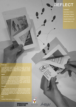
As a group we have decided to collaborate with Ronald McDonald House Charity that provides free 'home away from home' accommodation to families with children in hospital.
Our event proposes to aid in the conceptual re-design of the RMH Manchester terrace, turning it into a garden of reflection for the residents. You will not only have the chance to work on a live design project but also the opportunity to help an extremely worthwhile cause.
Please see our poster for more event information
Posted 9 Jan 2019 11:31
