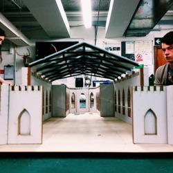
A look inside the church: our roof is placed on top of the walls. The most of the roof is covered with non-transparent material what creates gloomy atmosphere inside. The idea was to fully use the light to create the pattern on the floor and not use it to light up the building.
Posted 22 May 2015 13:00
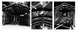
Final effect of shadows: shadows create pattern that represents
fallen trusses because of the church bombing
Posted 21 May 2015 17:59
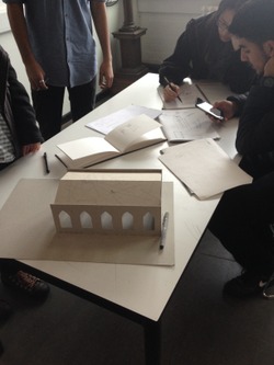
Final site model: we used layers to create thick wall and also to achieve the depth in windows
Posted 21 May 2015 17:53
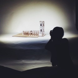
Kaili taking picture of our site model
Posted 21 May 2015 17:50
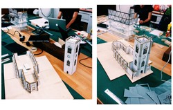
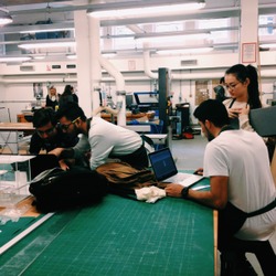
UoM Workshop: working on final model
Posted 21 May 2015 17:49
Brainstorms:
using sketch model to create final concept
Posted 19 May 2015 09:55
