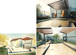
Interior perspective of the structure. Showing different level heights. The structure is quite simple one. two cantilevers facing each other providing shelter,protection and transparency. The pavilion I've designed has the purpose to serve as a place where people can rest and that is the concept of the project. By simplifying the structure, I've tried to create a low cost pavilion.
Posted 22 May 2015 11:03
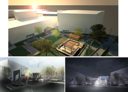
Developing design of an outdoor space. The render shows a top view from above capturing the whole scheme. This perspective demonstrates how architecture and landscape could work together, We, the architecture students collaborated with the landscape students for this project to create one peaceful outdoor space.
Posted 22 May 2015 10:58
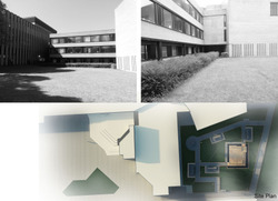
Site analysis. The site is actually a green unusable space which has a great potential. The idea of the client was to create a peaceful place for rest. At the moment the site is empty, people ignore it and our job was to bring it back to life as we redesign the landscape and create a flexible space for people to use.
Posted 22 May 2015 10:53
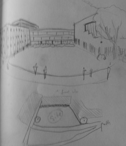
Site analysis, sketching and diagramming. First day we had to explore the site and investigate the surroundings. The site is quite enclosed and it is exposed to the sun only from the east side. Also we had to diagram the circulation and the hierarchy in order to understand the site.
Posted 22 May 2015 10:47
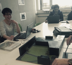
Discussing final presentation and design of the outdoor space. At the end we had several design options for the client. We thought that it is more sensible if we provide variety of options. However, the main scheme was creating a structure with water feature around it. In terms of landscape we all agreed with the planting, paths and water puddles.
Posted 22 May 2015 10:46
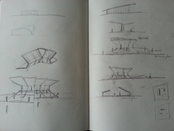
initial sketches and diagrams of the structure. Creating an outdoor space, a pavilion which is flexible and serve different functions.
Posted 20 May 2015 14:25
