Reflection
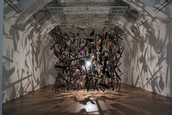
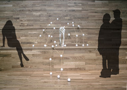
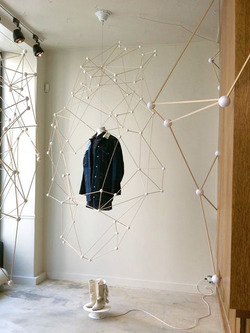
Visiting Whitworth Art Gallery on day 1 showed the varying approaches which can be taken when exhibiting artefacts. From simple display cases, to more extravogant interactions within a site's environment. Exhibits such as Cornelia Parker's 'Cold Dark Matter: An Exploded View' (Photographed on this post during my visit on day 1) exemplify this point, in this case using the confines of the room pictured to create dramatic shadows and the sensation that you are amidst this exploding mass of objects.
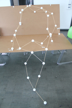
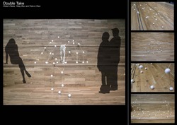
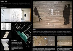
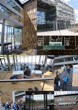
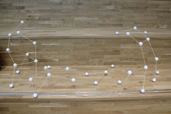
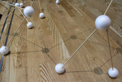
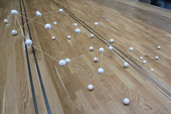
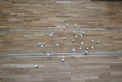
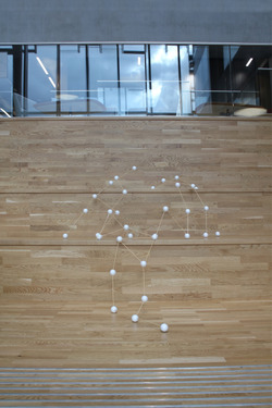
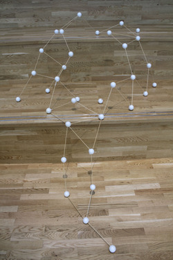
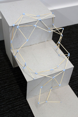
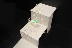
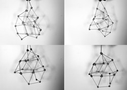
Working with the Brooks building has had a huge impact on my group's design for displaying the Femur stool,due to the prominence of the Spanish Steps. They have created a much stronger link from the molecular framework to the site, making the result much stronger than initial designs seen in my earlier blog posts.
Posted 22 May 2015 01:58
