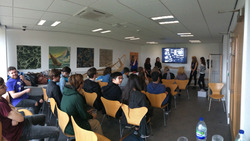
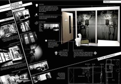
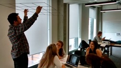
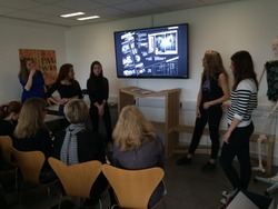
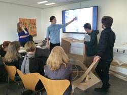
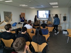
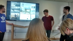
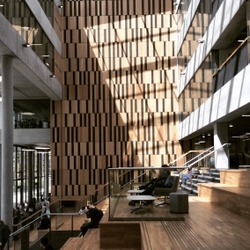
Day eight: Final Presentation to Special Collections. Two weeks of hard work presented in 10 minutes to special collections and MMU representatives. We received great feedback and overall felt our project fully met the requirements of the task in hand. We received good feedback in regard to our concept being fully incorporated into the fabric of the Mabel Tyecote Drama building.
Posted 22 May 2015 16:52
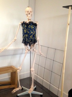
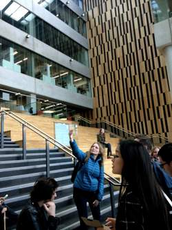
LAST BLOG POST! A group photo to round the week off.. (with apologies to Paul - stop eating your shirt - and Dishun)
We've already said it, but we were very impressed with the high quality of the work you all produced over the two weeks, especially given the tight timeframe, and the attention you showed to the brief in producing the final designs.
To back this up, Louise from Special Collections said to us after the presentations:
[This is] '...exactly what we want to do but never in our wildest dreams would we have thought of some of this - it is fantastic.'
They'll be keeping your designs on hand when they come to consider how to show special collections in the new Mabel Tylecote building, so a great effort all round!
It's been a pleasure working with you all over the fortnight, and all the best with your courses over the next few years..
We'll be around the sixth floor if you need anything!
Paulina, Jenny, Tim and Kamal
Posted 22 May 2015 16:09
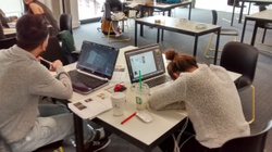
Day seven: Presentation preparation. We presented our sheet to our event leaders in turn they gave us feedback Running through each group's work and their respective presentation sheet that we have asked for, in order to best convey their final work before they present it to Special Collections tomorrow.
Posted 22 May 2015 16:03
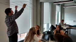
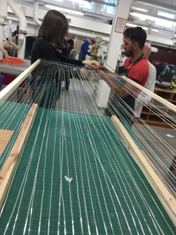
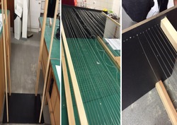
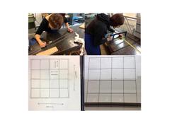
Day seven: Attachment grid. After a tutorial with our leaders we decided to produce the conceptual grid that would support our hanging structure in order to show MMU staff the following day. We felt this would help being our concept to fruition. Using welding techniques we produced a structurally stable grid that our display would hang from.
Posted 22 May 2015 15:46
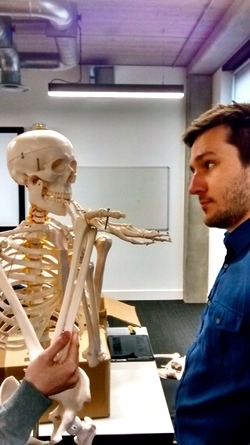
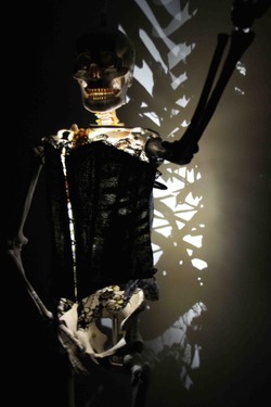
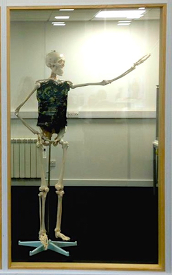
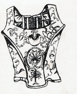
Anna, Kate, Sian, Emily and a skeleton present the Vivienne Westwood corsets, to be displayed in Mabel Tylecote.
Posted 22 May 2015 15:39
Nestor, Canon, Canon's sketchbook and Joe present their scheme, to place the Cantagalli jar in a curving, handle-inspired design that affixes to the columns of the Brooks building.
Posted 22 May 2015 15:33
Second A2 hand in sheet for our portfolio
Posted 22 May 2015 15:32
First A2 hand in sheet for our portfolio
Posted 22 May 2015 15:32
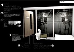
Day six: Informal presentation. Our group presented our work to 5th years in order for them to give us feedback on security, and health and safety concerns when presenting the corset from a hanging structure. Producing solutions such as LED lighting to prevent damage from natural sun light and ventilation to maintain humidity levels.
Posted 22 May 2015 15:29
Aysha, Shueb and Justyna present their ceiling-hung concept to show the Ashuach stool.
Posted 22 May 2015 15:26
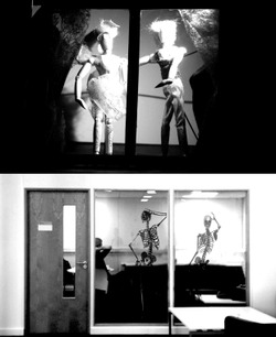
Day five: Investigation into shock. With the 'shock-value' of our concept being a main feature to reflect Vivienne Westwood's thinking, we decided to record the reactions of the targeted audience of drama students and how they interacted with the display.
Posted 22 May 2015 15:21
Presentations! Paul, Trev and Asim show their Piranesi-inspired bench.
Posted 22 May 2015 15:19
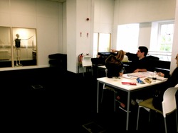
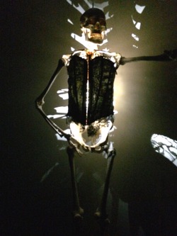
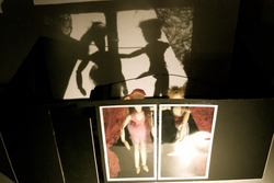
Day five: Investigation of light. We blacked out the room in order to cast shadows from the skeletons. By implementing lights around the inside of the ribcage and focusing lights onto the corsets produced interesting shadows around the room that we decided wanted to be a crucial feature in our display.
Posted 22 May 2015 15:17
Day four: Concept development. Creating concept visuals and prototype test models at 1:20 allowing us to play with the space of the room at a manageable scale. Experimentation of light at a small scale in preparation for our 1:1 model.
Posted 22 May 2015 14:50
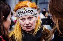
Day three: Design discussions. Tutorial day with 5th years discussing our individual group ideas and the process of developing them into prototype models the following week. Our group researched into Vivienne Westwood and how she was strongly inspired by the shock value of punk era fashion. Developing the use of skeletons to represent thin models as opposed to using mannequins placed in the drama school.
Posted 22 May 2015 14:31
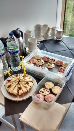
Day eight, Final Day! Red Velvet Cupcakes / Carrot Cake // Final project presentations to special collections and capital projects
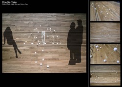
The culmination of the two weeks: the double takers presented their schemes to representatives from capital projects and special collections, including Louise who introduced us to the artifacts last week.
The presentations were clear, strong, and highlighted all the design elements that the groups had considered over the length of the project.
Our visiting critics were very impressed, and the feedback was encouraging, pointing out the breadth of ideas and the depth of information in the schemes presented.
Crucially, the feedback received matched exactly the concept of the brief - the idea of incorporating the collections into the fabric of university buildings and introducing a host of different ways to display artifacts housed within Special Collections.
Posted 22 May 2015 12:43
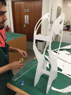
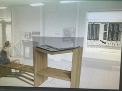
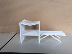
Quick 3D model of the femur stool using foam board.
Posted 22 May 2015 12:42
Kamal scrutinising the welding techniques of the skeleton-supporting grid.
Posted 22 May 2015 12:40
This is a process of our final prototype.
Posted 22 May 2015 12:40
Running through final presentations and tidying up loose ends..
Posted 22 May 2015 12:38
A1 process sheet
Posted 22 May 2015 12:26
A1 sheet
Posted 22 May 2015 12:26
Our skeleton ready for presentation
Posted 22 May 2015 12:24
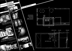
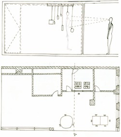
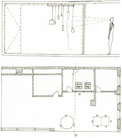
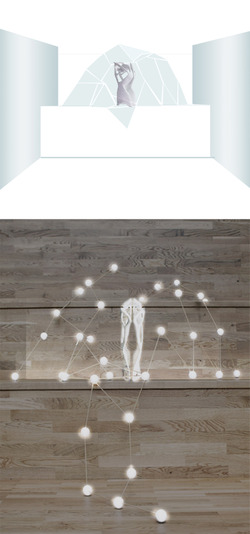
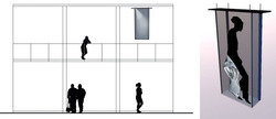
Plan and Section of final design for room.
Posted 22 May 2015 12:21
Day 2
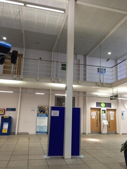
We also visited each of the three potential sites that we could choose from where we would later display our corsets. We decided to work with the Drama department in order to target the attention from the drama students
Posted 22 May 2015 12:19
Day 2
We visited the special collections to view the five artefacts that we could choose from. After a brief talk about each one our group decided to go for the Vivienne Westwood 1980's Corsets.
Posted 22 May 2015 12:16
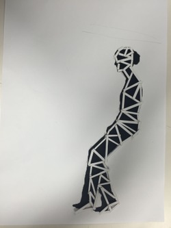
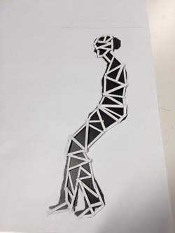
this is showing one of our process of making the person. the material we used was the mounting board.
Posted 22 May 2015 12:10
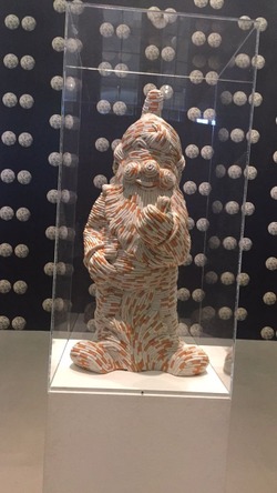
I like the ideas of using simple material such as cigaratte to make a very different art work.
Posted 22 May 2015 12:09
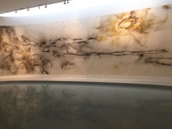
This image was taken in Whitworth art gallery. This image is showing environment. The idea is greta. i love the idea of using water for reflection.
Posted 22 May 2015 12:07
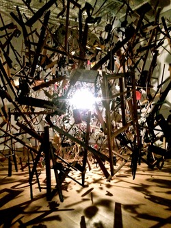
This image was taken in Whitworth art gallery. i found this work very interesting because how the lighting works and how it created shadows. The idea is very new and the material has been used was paper.
Posted 22 May 2015 12:05
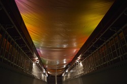
this image is taken in manchester museum. The lights are very dramatic, this could help me with my final prototype model. The lights are vert bright, the lights are very attractive.
Posted 22 May 2015 12:03
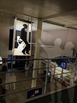
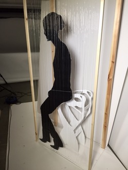
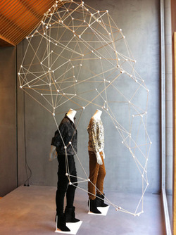
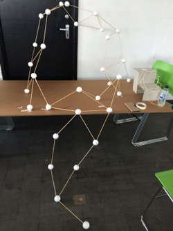
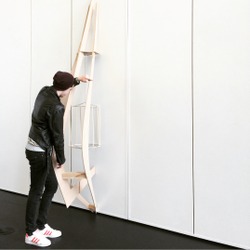
This is our 1:1 model for stool (which is from mmu special collection). The design is over 1.7m tall.
Posted 22 May 2015 11:55
Day two: Site Visit. Introduction into the potential sites; John Dalton, Mabel Tylecote or the Brooks building. Analysis of how the artefacts would engage with the buildings specific student group and weaving the object into the fabric of the building itself.
Posted 22 May 2015 11:52
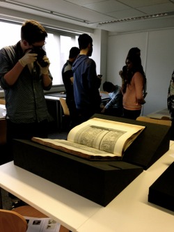
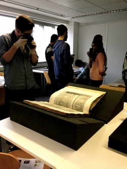
Day two: Special Collections Visit. Introduction talk into the history of 5 artefacts; Giovanni Battista Piranesi 1756 Book, 1980 Vivienne Westwood corsets, 3d Printed Femur stool, 1953 Posters and a 1898 Asalvie drug jar.
Posted 22 May 2015 11:49
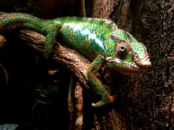
Day one: Manchester Museum Visit. Investigation into historical artefact displays and the implementation of lighting to draw attention to the object. Noted the use of shock and use of additional objects in order to highlight the exhibition thus making it more memorable to the viewer.
Posted 22 May 2015 11:42
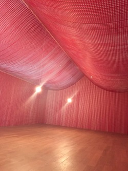
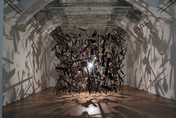
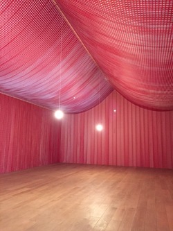
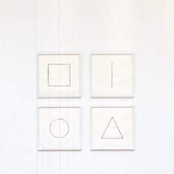
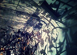
Day one: Whitworth Art Gallery Visit. Investigation into artistic exhibition displays to understand design factors that enhance its effectiveness to the viewer. For example Cornelia Parker, Cold Dark Matter, An Exploded View; uses shadow to magnify the exploded view.
Posted 22 May 2015 11:38
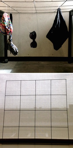
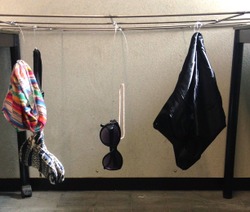
After welding the metal grid together we experimented with hanging 1980's style clothing off from it.
Posted 22 May 2015 08:39
Plan and section of our final display in our chosen site
Posted 22 May 2015 08:27
Reflection
Visiting Whitworth Art Gallery on day 1 showed the varying approaches which can be taken when exhibiting artefacts. From simple display cases, to more extravogant interactions within a site's environment. Exhibits such as Cornelia Parker's 'Cold Dark Matter: An Exploded View' (Photographed on this post during my visit on day 1) exemplify this point, in this case using the confines of the room pictured to create dramatic shadows and the sensation that you are amidst this exploding mass of objects.
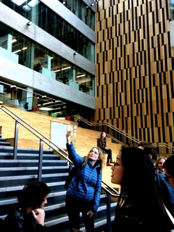
Working with the Brooks building has had a huge impact on my group's design for displaying the Femur stool,due to the prominence of the Spanish Steps. They have created a much stronger link from the molecular framework to the site, making the result much stronger than initial designs seen in my earlier blog posts.
Posted 22 May 2015 01:58
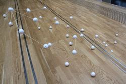
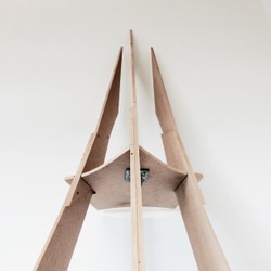
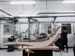
Initial 1:1 prototype created in the studio. This model was testing the stability of the framework and connection nodes. Once we took this model onto site, we made amendments to the overall shape,creating the abstract human form seen in previous blog posts.
Posted 22 May 2015 00:55
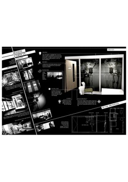
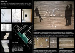
Presentation poster of final output.
Posted 22 May 2015 00:41
Development sheet for Special Collections presentation.
Posted 22 May 2015 00:38
The model at site with context to give an idea of how the design really works
Posted 22 May 2015 00:37
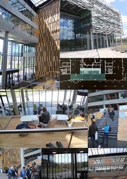
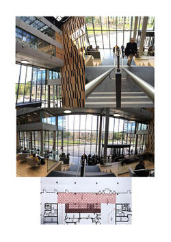
Brooks Building site photos.
Posted 22 May 2015 00:35
Final model done at 1:1 scale
Posted 22 May 2015 00:27
The process of making the final model 1:1 in the workshop
Posted 22 May 2015 00:21
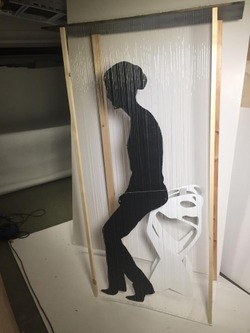
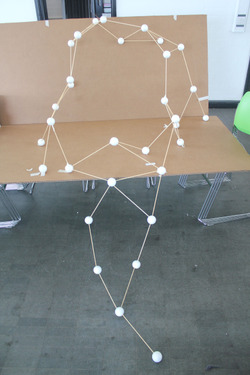
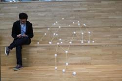
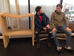
The model was built to impersonate a person sitting down to give the students a better understanding of the odd shape stool.
Posted 21 May 2015 23:45
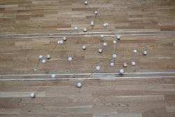
Top view
Posted 21 May 2015 23:43
Assembling on site 1
Posted 21 May 2015 23:42
assembling the 1:1 prototype in studio
Posted 21 May 2015 23:38
Further model development
Building scaled model around stairs
Posted 21 May 2015 23:37
Initial designs and model
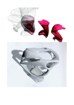
By looking at the surface of the stool and our precedent we decided to go for a more organic approach. Protecting the stool with a cage like structure
Posted 21 May 2015 23:36
The brooks building.
We choose this out of the three site we visited as it fascinated us the most. It is a very open space with many possibilities
Posted 21 May 2015 23:34
We choose the femur stool by assa ashuach from MMU special collection. The stool is 3D printed and is designed from human born structure aiming to archive the maximum load with the least material.
http://assaashuach.com/portfolio/femur-stool/Posted 21 May 2015 23:31
Refinement
After discussion with MMU staff, we further developed our concept in terms of protection and lighting issues. We proposed to employ glass canopy to prevent unexpected damage, and also to use LED lighting at the nodes to out-stand the structure in the environment.
Posted 21 May 2015 23:29
A quick model of our first design idea
Posted 21 May 2015 22:40
Visited 3 different sites, but we chose the John Dalton building as it was more appropriate than the other 2 sites and it also fits into our design scheme.
Posted 21 May 2015 22:37
Visited the Whitworth art gallery for insipiration and how different objects are displayed in various ways
Posted 21 May 2015 22:31
Section in context and a visual showing our design after final changes.
Posted 21 May 2015 22:07
When we experimented with lights inside the corset to produce shadows and highlights.
Posted 21 May 2015 18:53
Experimenting with the grid prototype on which we will hang the clothes and skeleton on.
Posted 21 May 2015 18:52
Displaying the skeleton in the site window to record peoples reactions.
Posted 21 May 2015 18:41
Detail and connection placed behind the panels giving protections and aesthetics
Posted 21 May 2015 18:41
Experimenting with light on the test model.
Posted 21 May 2015 18:40
Geometry play
Posted 21 May 2015 18:38
Viv West
After debating whether or not to pick the drug jar, we finally decided on the Vivienne Westwood corsets as our artefact.
Posted 21 May 2015 18:34
Prototypes on standing position , aesthetic of the panel will help to catch attentions as well as curiosity to explore the objects for the visitors
Posted 21 May 2015 18:32
Visit to Whitworth art gallery
Posted 21 May 2015 18:28
Site visit day , the goal is to integrate the display into the fabric of the building , and by observing the built environment we will get to know more
Posted 21 May 2015 18:27
The Grid
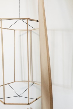
We decided from the precedents in the Whitworth that it would be a good idea to hang our entire display from the ceiling. We decided to make a metal grid, consisting of 1m lengths and welded them together to create a strong structure.
Posted 21 May 2015 18:27
Fabricating CNC cut model in mmu wood workshop , the tilted panels of the angles is the most challenging part
Posted 21 May 2015 18:25
Visual image of the exhibit in context
Posted 21 May 2015 15:21
By lighting the sculpture from within, the shadows fall onto the perimeter walls. This makes the person viewing the exhibit almost feel inside the exhibit itself with shadows all around them.
Posted 21 May 2015 15:18
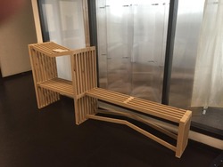
Despite being made from MDF as opposed to the more structurally sound Plywood, the bench could easily support people using it.
Posted 21 May 2015 15:13
The finished bench
Posted 21 May 2015 15:12
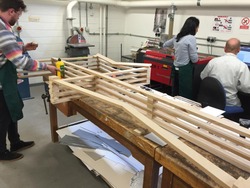
Paul nailing together the bench
Posted 21 May 2015 15:12
The design made construction easy. The bench is made from a series of 50mm MDF strips cut at varying lengths.
Posted 21 May 2015 15:12
Final edited picture of the frame into the site.
Posted 21 May 2015 15:11
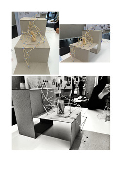
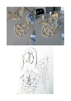
We made a series of test models in the design process
Posted 21 May 2015 15:09
