Posted 20 May 2015 16:40
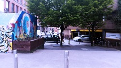
THE NEW ISLINGTON CPO DOES NOT FIT ALONG SIDE ITS COMMUNITY.
Posted 20 May 2015 16:38
Concept Idea
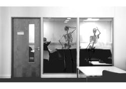
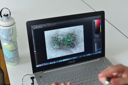
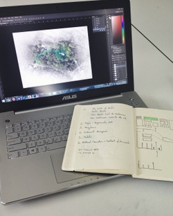
Using Photoshop we produced an image with skeletons in the site we chose to create a representation of what the exhibit would look like. This gave us an idea of the space available and how it would be seen from the outside.
Using Photoshop we produced an image with skeletons in the site we chose to create a representation of what the exhibit would look like. This gave us an idea of the space available and how it would be seen from the outside.
Posted 20 May 2015 16:36
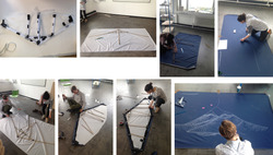
This week has been spent building our kite!
Posted 20 May 2015 16:35
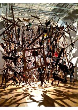
Whitworth Art Gallery Visit - Exploded Shed by Cornelia Parker
We visited the Whitworth and got inspiration for our project, looking especially at the light used and the way the art work was presented, eg. hanging.
We visited the Whitworth and got inspiration for our project, looking especially at the light used and the way the art work was presented, eg. hanging.
Posted 20 May 2015 16:31
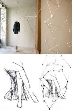
Precedent & Initial concept
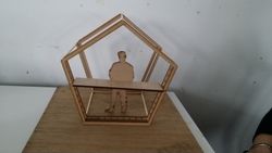
Employing the samba wood with Styrofoam ball as connection, the molecular structure is a good representation to the bone-shaped microstructures inside the core of the stool, as well as its polygon surface. Therefore, we had our initial concept to create such light-weight structure to protect and display the femur stool.
http://arnoldgoron.com/window-display-isabel-marant-2011-2010
Posted 20 May 2015 16:27
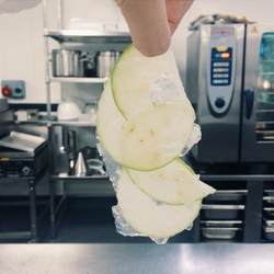
Gelatin with vinegar, thinly slice green apples.
Posted 20 May 2015 16:17
the final piece has a variety of textures
Posted 20 May 2015 16:15
experimenting with different lights on our final product
Posted 20 May 2015 16:11
Day 2 - we had to complete tasks in groups of creating plans sections and perspectives, from which we all combined our work to get a general idea of dimensions for us all to work from.
Posted 20 May 2015 16:09
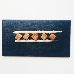
Translating Bauhaus architectural style into food. This architectural style generally has cubic shapes and favours right angles.
Main course - roast pork belly with parsnip sauce.
Main course - roast pork belly with parsnip sauce.
Posted 20 May 2015 16:08
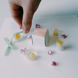
Experimenting food plating with paper models.
Posted 20 May 2015 16:05
The week was spent putting together our version of the Hut followed by a mini review with Tom & Harald.
Posted 20 May 2015 16:04
Day 1 - we took a trip to Z arts in Hulme to receive our brief and to take down measurements and diagrams from site analysis.
Posted 20 May 2015 16:03
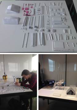
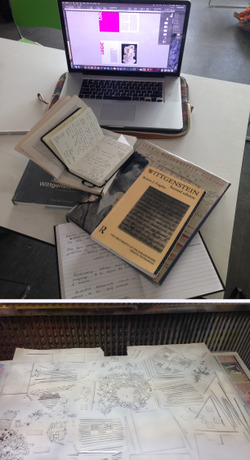
Last week was started by meeting with Tom & Harald, researching Wittgenstien's ideas on Logic & preparing the Hut components for our models
Posted 20 May 2015 15:52
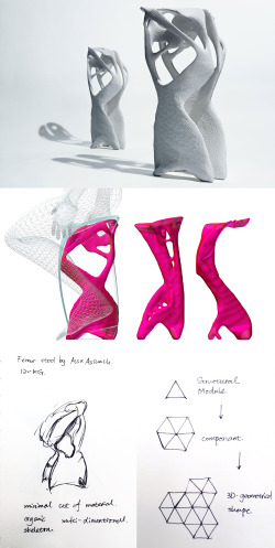
MMU special collection - femur stool by assa ashuach
The collection we chose to take is a 3D-printed chair. The stool is aimed to generate maximum load-bearing capacity with a minimum of materials, and is designed to mould itself to the weight and posture of whoever is sitting on it. The maximum load it can bear is 120KG.
http://assaashuach.com/portfolio/femur-stool/
Posted 20 May 2015 15:42
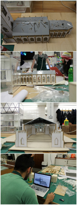
Working on the final model of the roof intervention in workshop today and yesterday, we were also creating sketch up model for final perspective presentation.
Posted 20 May 2015 15:28
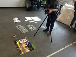
We then had to film the stop motion that we are going to make in order to make our model "perform"
Posted 20 May 2015 15:28
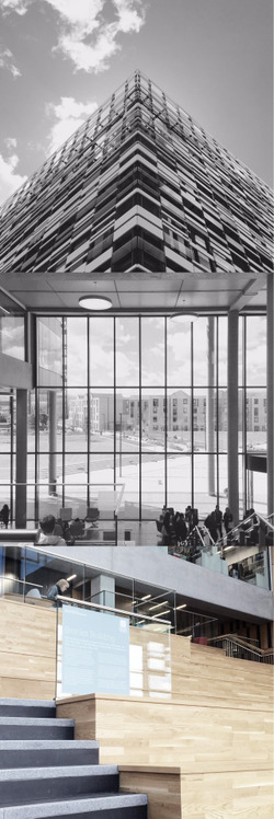
Site visiting - the Brooks building.
It is a new campus building for Faculty of Education and Faculty of Health of MMU. The most impressive part is the spacious public space on the ground floor, facing a large open outdoor garden. With plenty of chairs and staircases, students can enjoy an innovative communicating and learning environment.
It is a new campus building for Faculty of Education and Faculty of Health of MMU. The most impressive part is the spacious public space on the ground floor, facing a large open outdoor garden. With plenty of chairs and staircases, students can enjoy an innovative communicating and learning environment.
Posted 20 May 2015 15:27
This is how we turned a painting into a floor
Posted 20 May 2015 15:27
This is an example of how the extrusions work as well as another of corbusier's rule of a roof garden
Posted 20 May 2015 15:26
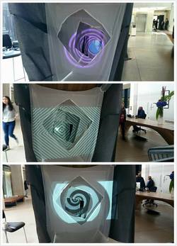
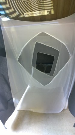
These photos show the experiments of different projections we carried out to see what works best.
Posted 20 May 2015 15:26
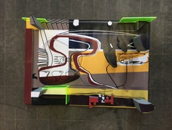
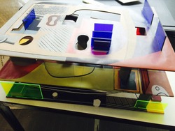
We then devised a way to slide the facade onto the front of our building (which is made out of the paintings)
Posted 20 May 2015 15:25
We then decided to use corbusier's rule of a ribbon window and continuing the idea of circulation, we designed a grey facade with primary coloured frames for the ribbon window
Posted 20 May 2015 15:24
In the last couple of days we have managed to instal and test out the final project. This process showed us the idea works better than expected!
Posted 20 May 2015 15:24
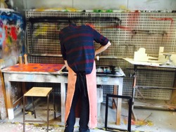
We then used the spraypaint workshop to spray paint the extrusions grey to make it look more Corbusier Style
Posted 20 May 2015 15:22
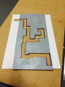
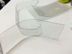
We then decided to extrude lines as walls and since some of them were curved, we used heat guns to bend and curve sheets of plastic
Posted 20 May 2015 15:21
We then laser cut the bits that we want extruded from our paintings
Posted 20 May 2015 15:19
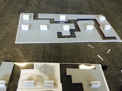
1:100 site model completed. It will be used for presentation and giving context to our memorial intervention.
Posted 20 May 2015 15:07
DAY 6/7
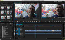
The last couple of days have been spent editing interviews, clipping footage and sieving through old film to create a rough draft to present to the group.
The last couple of days have been spent editing interviews, clipping footage and sieving through old film to create a rough draft to present to the group.
Posted 20 May 2015 14:50
Monday 11th May 2015
Thankfully the sun was out! A perfect day for a summer's BBQ. We mingled in the park until 4pm until we were called for a tour around Hulmes Hippodrome - once used as a grand theatre, then a Bingo hall, a club/bar, and now bought by an evangelist group.
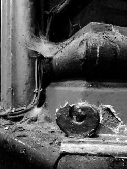
It is in a very poor state of repair but it was fascinating to see how once such a beautifully decorated building has now come to an end. Despite all the spider webs and pigeon poo, it still holds an unusual beauty. Its sad to see it go...
Posted 20 May 2015 14:48
2// first brief on the two intense week by event coordinators
Posted 20 May 2015 14:47
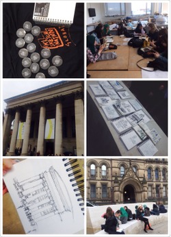
Day 1// We had a meeting in Chatham and received out sketchbooks& t-shirts. After that one of the 5th year students gave us some tips on sketching like line-weighting, shadowing and other drawing technique. We went to central library and Albert square in the afternoon to do some urban sketches. I never had experience that sketching with a group of people together. I quite enjoy it because we can learn much from each other.
Posted 20 May 2015 14:44
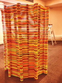
Hangers // colour // colour // colour
Posted 20 May 2015 14:35
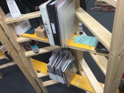
The ladder shelves displaying a range of borrowed materials
Posted 20 May 2015 14:30
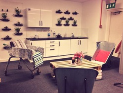
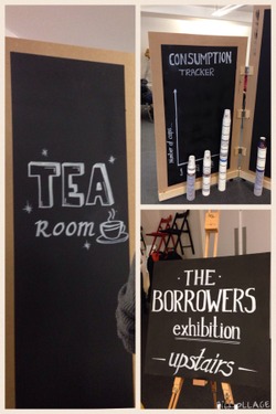
Working hard in the tea room. The wheelbarrow chairs are more comfortable than they look.
Posted 20 May 2015 14:28
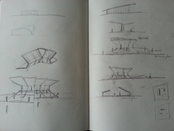
initial sketches and diagrams of the structure. Creating an outdoor space, a pavilion which is flexible and serve different functions.
Posted 20 May 2015 14:25
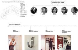
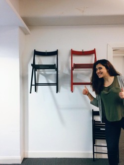
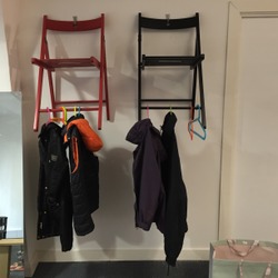
The folding chair shelves turns out to be a great place to hang coats
Posted 20 May 2015 14:23
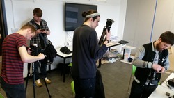
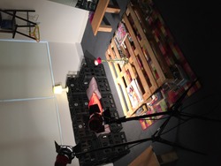
Behind the scenes, taking final photos for the presentation
Posted 20 May 2015 14:20
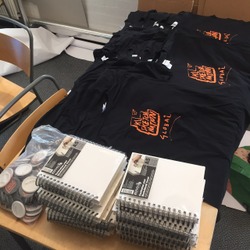
1// freebies !! we were lucky to be sponsored with these tools :)
Posted 20 May 2015 14:15
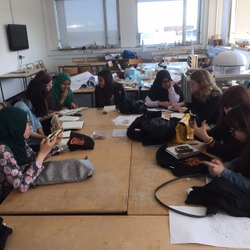
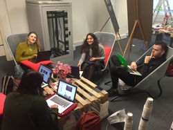
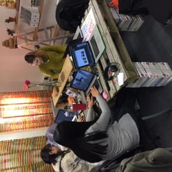
Making use of the space by getting some work done!
Posted 20 May 2015 14:11
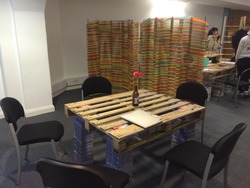
Flowers and stationary were the finishing touches to complete the office - which is now open for business.
Posted 20 May 2015 14:10
Final touches on the tables. Adding flowers, pens and notebooks to make the place more lively!
Posted 20 May 2015 14:06
Final touches to blackboards. The different boards lead to the different sections / areas of the room.
Posted 20 May 2015 13:58
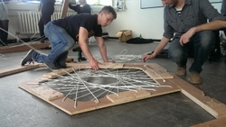
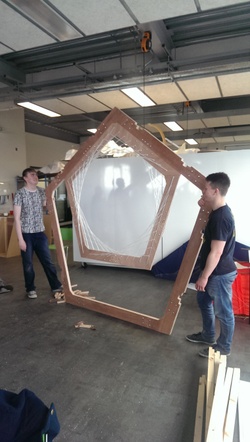
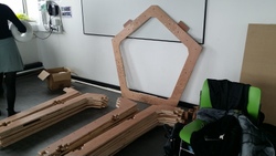
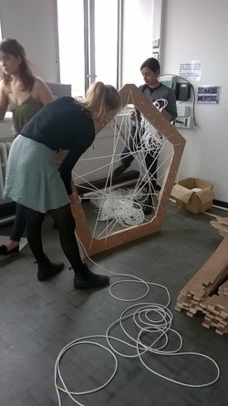
Assembling the actual pentagons for the booth structure today.
Posted 20 May 2015 13:15
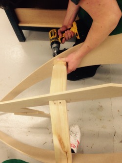
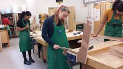
Making the the DJ table in the workshop today.
Posted 20 May 2015 13:15
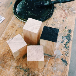
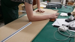
Sanding and finishing the wooden parts of the pentagons in the workshop.
Posted 20 May 2015 13:14
The Residences team finalising their site plan.
Posted 20 May 2015 13:12
Recording the movement of people inside Chatham.
Posted 20 May 2015 13:12
Iain getting excited with the visuals the museum team has prepared!
Posted 20 May 2015 13:09
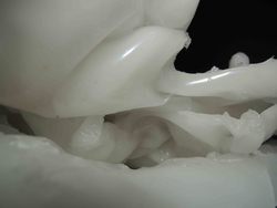
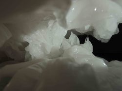
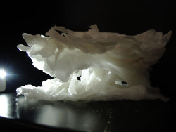
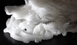
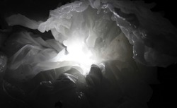
Our final product was built up in three sections, through using water to cool the wax and create the form. The form was inspired by caves, and reflects the natural form. The space can then be explored with light and shade.
Posted 20 May 2015 13:04
The artists' residences team bringing Iain up to date with their progress.
Posted 20 May 2015 13:03
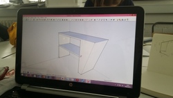
3D SketchUp model of the DJ table. The DJ table would go inside the pentagon structure of the booth.
Posted 20 May 2015 12:59
Small model of the DJ booth for Pangea.
Posted 20 May 2015 12:59
In the second week we had established our concept fully deciding to focus on the interaction with light and how wax can form an enclosure which represents natural forms.
Posted 20 May 2015 12:58
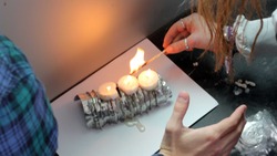
On our second day of experimentation we decided to look at how burning candles and the wax which is melted this way reacts with other objects. It is a slower process, but gets some interesting results.
Posted 20 May 2015 12:56
Initial filming site in Northern Quarter.
Posted 20 May 2015 12:38
Day 2.
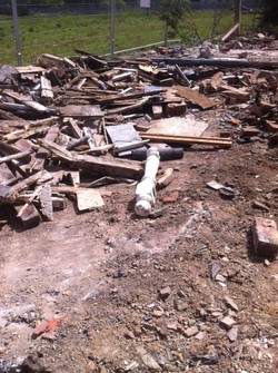
We went to the site hoping to find the remaining house but they were cleaning up after the demolition of the last house. We took photos of the site and the surrounding for further work back in the studio.
We went to the site hoping to find the remaining house but they were cleaning up after the demolition of the last house. We took photos of the site and the surrounding for further work back in the studio.
Posted 20 May 2015 12:25
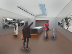
Interior and exterior renders were made for our scheme, showing the atmosphere and ideally the lighting within the exhibition spaces. The rooflights are carefully designed to minimise glare and to protect the photographs presented along the walls of the spaces. They are also orientated as such to bring as much natural light as possible. This space is the main exhibit hall consisting of models in relation to the Merz Barn, and important/iconic photographs during Kurt Schwitter's life.
Posted 20 May 2015 12:25
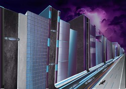
Cityscape - Proposed View
Posted 20 May 2015 12:24
With the final scheme, we allocated different drawings for each of us to complete within the group, later collating them together into a single presentation alongside the two other schemes. The site drawings show the context which we are designing upon and briefly describes the constraints that we had to work with.
Posted 20 May 2015 12:21
To finish the room and give it a homely feel we all brought in different objects such as rugs, stationary, books and more.
Posted 20 May 2015 12:14
DAY ONE // Graphic poster showing precedent study into repurposed places.
Posted 20 May 2015 11:52
[Day 4] Idea Development
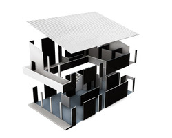
After doing the sketch model, we made a few elevations, sections, and plans. I did an axonometric view of the art shred, which shows the load transfers and the structural properties in fragments and their relations with each other. The axonometric drawing has three different colours, each represents one side facing on different elements.
After doing the sketch model, we made a few elevations, sections, and plans. I did an axonometric view of the art shred, which shows the load transfers and the structural properties in fragments and their relations with each other. The axonometric drawing has three different colours, each represents one side facing on different elements.
Posted 20 May 2015 11:51
Day 6 - 20th May
Try to link all our teamwork together into one so that it will be coherent and consistent for the presentation.
Try to link all our teamwork together into one so that it will be coherent and consistent for the presentation.
Posted 20 May 2015 11:43
Day 5 [Model making]
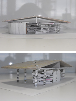
A test model was created with grey board strips and wood scraps from the wood workshop, in which Kurt Schwitters always did in his famous collages. He used local resources and especially scraps to frame his collages, like the one he did in London in 1940.
In our design, the stitch texture can be made by very thin wood obtained locally near the MERZ Barn, or by very thin steel strips that are welded or bolted by steel angles and channels to the Steel I columns. The texture shields the interior of the art shred from the strong wind and rain in the lake district, it also creates nice light effects on the interior walls, which also can identify places within.
Posted 20 May 2015 11:41
