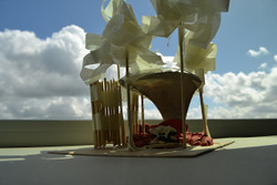
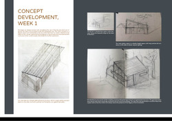
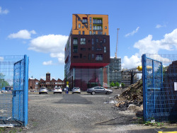
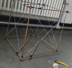
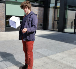
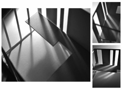
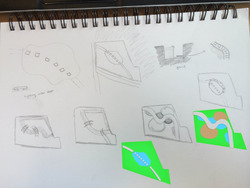
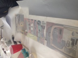
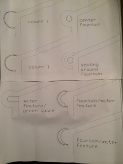
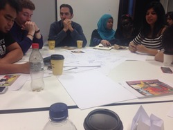
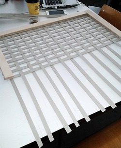
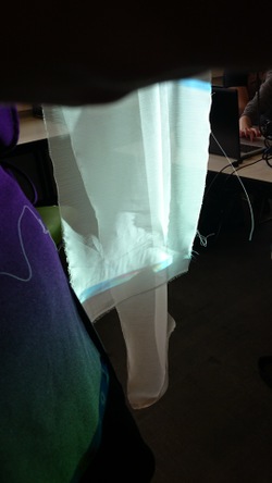
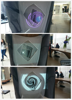
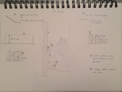
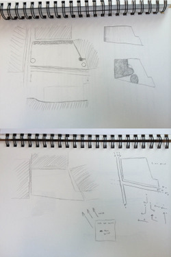
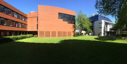
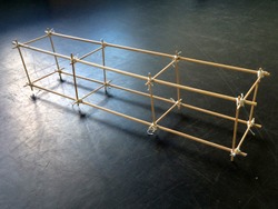
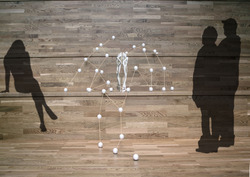
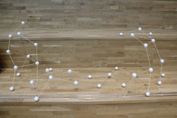
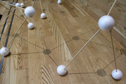
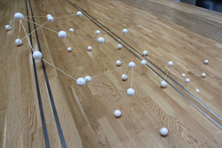
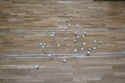
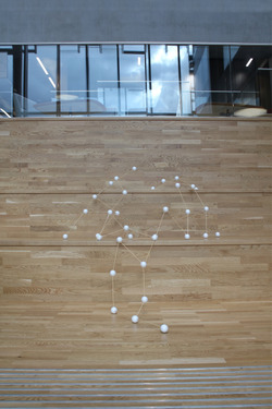
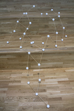
Sketch model showing the initial concept for the Mertz barn Agora - a semi enclosed amphitheatre, gathering and activity space designed to act as interface between our artists residence and the wider Mertz Barn. Development talks with client Ian Hunter yesterday suggest the structure might move towards a canvas roof, in keeping with the national park liking for transient construction
Posted 20 May 2015 11:38
Session 5 - 19th May
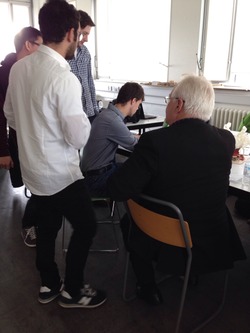
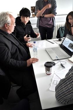
The client came to visit us and we showed him our idea and design. As shown in the picture, he is giving his suggestions.
Posted 20 May 2015 11:37
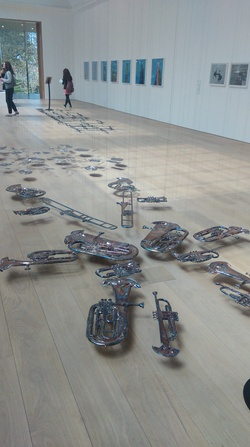
Interesting exhibits which stood out on the visit to Whitworth Art Gallery. Suspended on strings.
Posted 20 May 2015 11:36
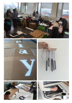
After creating the nets for the cubes we added playful elements to some of the nets. These elements included chalk painted sides on some of the cubes, creating wind chimes that would be installed into some of the cubes, creating stencils allowing us to spray paint games and letters onto the cubes and adding a variety of fabrics to some of the cubes to create variation and colour.
Posted 20 May 2015 11:31
[Between Day3 to Day4, over the weekends]
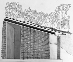
After a brief discussion with our group on 13th May 2015, I made a sketch on the facade in contex. The art shred is located on a green slope, and the structures surrounding it are made of steels and stones. They generates a peaceful and rural atmosphere to the area, with a rich historical background related to the famous modernist Kurt Schwitters.
"Everything had broken down and new things had to be made out of the fragments and this is Merz." Schwitters said in 1940.
We have two clients in this project, the main one is Kurt Schwitters. We would like to imply his idea of building on fragments and collages into our design theme. The preliminary idea is to put stone into steel mesh to create and woven texture. However, the idea lacks originality and does not create nice shadows and lighting effects to the interior of the shred, so we have decided to create a woven facade texture by ourselves.
Posted 20 May 2015 11:28
It's all coming together nicely!
Posted 20 May 2015 11:23
[Day 2 ] Site Visit
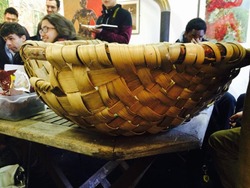
During the Visit to the Merz Barn on 12th May 2015, Ian Hunter, the client told us his requirements on the Art shred. He had consulted the structure with architect Sarah Beth Riley, he want the shred to be a temporary structure, with a woven texture on the facade, He showed us a wooden basket as an example of the texture stitch.
Our idea is to have have steel columns connected to a concrete cast footing, and holds the pitched roof on top. At the same time, the vertical I-columns holds panels of wooden facade, which creates a nice light and shadow effect to the art shred and takes natural lighting.
Posted 20 May 2015 11:18
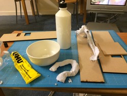
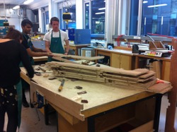
We cut out just under 70 nets from reinforced cardboard that would be used to create the cubes. Using nets allowed the instalment to be constructed on site. We ended up creating 3 different size nets so that we had a variety of sized cubes. The bigger cubes would then help create the framework for the instalment and used for seating and climbing, with the smaller boxes being movable including interactive and playful elements.
Posted 20 May 2015 11:14
Day 1
We explored Spinningfields to try and assess the site for ways in which rules might be subverted or questioned. One of the initial observations we made as a group, was that all the spaces which had been allocated for seating were rather uncomfortable. From this we returned to studio and began to brainstorm and sketch some ideas. We settled on some form of cushioning which might be applied to existing seating.
Posted 20 May 2015 11:13
Presenting our group models to the rest of the group. A group decision was made to use our concept for the final instalment. As a group we then discussed material options and looked at how we could make some of the cubes more interactive through sound and interactive games.
We then looked at the site in more detail to work out exact locations of trees and seating to work out how the network of cubes would fit into the space.
Posted 20 May 2015 11:03
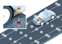
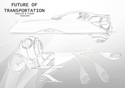
The scheme for my transport is that there ill be a casual what can hold and cater for four people comfortably. The capsules are equipped with wifi and screens so they can communicate with other pods if need be. There are rotating wheels that are electromagnetically charged and stick to the roads, these wheel scan also rotate 360 degrees enabling the pods to move vertically up the side of buildings at the same velocity, this is cause by magnetic pads being placed every 20 yards on the road.
Posted 20 May 2015 10:58
Day 2 - Developing our design.
We built a 1:1 test model developing one of the designs we sketched in the previous session. The idea was to create a piece of wearabe furniture that allowed you to stand upright while sleeping.
Posted 20 May 2015 10:57
[Day 3 ] Discussions
After the introduction on the first day and the site visit on the second day, we met in studio at 10 am and did a handful of sketches. We began our design process with considering the topography and the environmental details in contex.
We were put into the Art Shred sub group, with Jake Stephenson, Liv, Vessi, Cane and Magda Plonka. We start out design by planning out the shred from the client's requirements.
He wanted a double floor shred, with a pitched roof on top, located between the washrooms and the chicken house. He told us to look at the details of steel structures by Cumbria steel and he wants a woven texture on the facade, by showing us a wood woven basket.
Our aim is to create the art shred as an object of art, with rural features on it.
Posted 20 May 2015 10:51
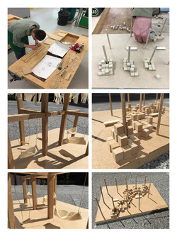
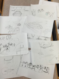
After developing a series of sketch designs we chose two of the ideas to model. These could then be presented to the rest of the group. Left - Framework that fits into the landscape of Piccadilly Gardens supporting a series of hanging elements. Right - Series of cubes that are installed around trees in Piccadilly Gardens that look at creating climbing, seating and playful spaces.
Posted 20 May 2015 10:51
Day 4 (15/5/2015)
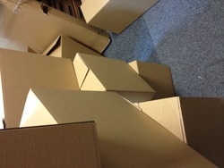
After 3 days of sketch walk, we decided to concentrate on the exhibition. We were given 25 boxes and thread and asked to plan a mobile exhibition using the materials given. We first build up the boxes and paint them over with white and orange paint. As a final output, we decided to make columns out of them with different heights and random arrangements. Hope they will turn out great!
Posted 20 May 2015 10:50
Concept Ideas.
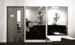
Having chosen our site we worked on concept ideas, working with the skeleton as the main focus for our project. We were inspired by Vivienne Westwood's shock-value approach to her displays.
Posted 20 May 2015 10:44

Day 2 (12/5/2015)
The second day of sketch walk starts at Piccadilly Garden. We were asked to sketch the scenery around the area which is quite hard for me! Before we went to Market Street, Hakym taught us few other aspects in sketching which are frame and subject. We did a 30-seconds sketching at Market Street which I find very interesting, there's not much you can do within that time but with the right technique, you can draw the subject well. We also went in to Arndale for some indoor sketching.
Day 3 (13/5/2015)
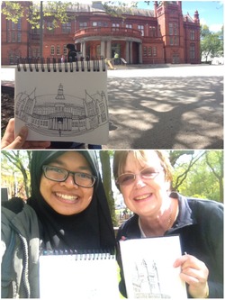
The last day for sketch walk was held at The Whitworth Art Gallery. We did sketches together with the Manchester Urban Sketchers and learned some useful tips from them. I met Cathy who is a teacher and she gave me very useful tips for sketching and even showed me some of her favourite tools for sketching. I used a different technique this time for sketching to explore the variation. The weather is just nice for some outdoor sketching but it was windy so some of us went inside the gallery to do indoor sketching.
Posted 20 May 2015 10:40
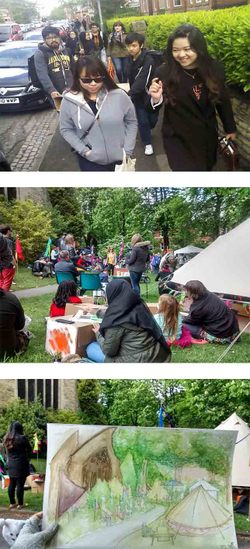
Sketchwalk and outdoor exhibition at Chorlton Arts Festival. The cardboard boxes were not only for exhibiton, it also became our portable table. I had a good time and it was a great experience as I never went and sketching at art festival.
Posted 20 May 2015 10:33
Day 1 - Visit to the Spinningfields site.
Although spinningfields is a public space it is privately owned so while exploring the site we were looking for signs displaying and rules and regulations to be adhered to. So when we did not find any that specified exactly what not to do and when we spoke to security guards and care takers they stated there were no rules exactly we began to speculate as to what would be inappropriate activities to complete on the site.
When we returned to studio we began to sketch ideas based upon this thought.
Posted 20 May 2015 10:31
The technology behind my scheme is that the elevated strips with the automatic cars will be electromagnetically charged. The wheels that at are either end of the automated capsules are magnetic and as they pass over the road they gain charge due to there being magnetic pads every 20 years on the road. This electromagnetic charge enables the pods to travel vertically with the same velocity as if they were travelling horizontally
Posted 20 May 2015 10:30
After looking at precedents and looking at potential spaces in Piccadilly Gardens for our instalment, we begun to sketch our ideas for a new interactive seating design that would relate to the site.
Posted 20 May 2015 10:29
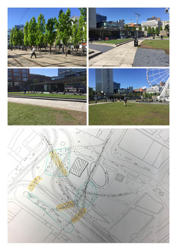
Analysing Piccadilly Gardens, looking at movement through the site. Through analysing the movement we were able to outline spaces within the site that are used the most. The seating instalment should then be located in one of these spaces to increase its impact on the public and increase interaction.
Posted 20 May 2015 10:20
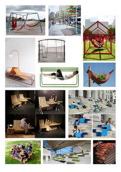
The first task involved looking at precedents of existing playful and interactive seating. I looked at precedents that involved high levels of interaction with fun and playful aspects. I was looking for existing seating that would make people stop and use it, and ones that could potentially fit into Piccadilly Gardens.
Posted 20 May 2015 10:00
Watching minority report gave me the inspiration for my scenario with having the vehicles that are automatic and electric. The basic scheme is that there will be manually driven cars that are driven manually by people and then there is the elevated highways around 30ft above the normal highways that have the automatic pods. The pods can travel vertically up the side of buildings, similar to Minority Report, and have parking bays on the roofs where they drop off the passengers.
Posted 20 May 2015 09:53
Final Future Cityscape
Posted 20 May 2015 09:34
Mode of Transport
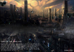
The mode of transport is different for the Ultra Rich (Tycoons) and the others (Fugalites) because within my scenario it is all based around the idea of humanity being divided in two different diverse classes based societies. Therefore, the Tycoons will be able to have more freedom than the Fugalites (having the ability to live in the Ultra Rich, Luxurious Skyline above the Fugalites) meaning they have the ability to fly around in the dragonfly (transportation). The Fugalites are more controlled within the overpopulated, poverty ridden society due to them travelling around in self-driven cars.
Posted 20 May 2015 09:33
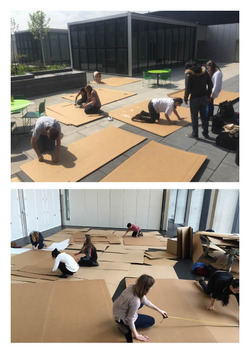
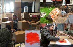
After three days of sketch walk, we now focus on planning the exhibition. Our challenge is to design a portable structure made from cardboard and thread. Since our event theme colour is orange, we decided to paint white as a background and smudged it with orange colour on each side of the cardboard. Due to the safety precaution, the spraying activity was done outside the building.
Posted 20 May 2015 07:26
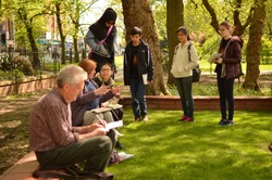
The events became more exciting when we were joined by Manchesters urban sketchers on the third day of our sketch walk. It was fun chatting while sketching with them. They all were very friendly and talented. I was amazed looking on one of the sketchers sketchbook. The guy in the picture whom I forgot his name (sorry about that) had been sketching for almost three years and he already had thirteen sketchbooks. His did mention practice makes perfect.
Posted 20 May 2015 06:39
It was cold and windy on the second day. We manage to sketch scenery of Piccadilly Garden and Market Street before we went inside the Arndale shopping center.i never knew that we need permission to draw or take picture inside the mall. Anyway, I had fun doing the 30 seconds quick sketch exercise where it train us on what to focus in our drawing.
Posted 20 May 2015 06:04
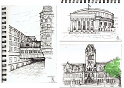
Sketches of central library, Albert square and town hall from our first day of sketchwalk. We were lucky because the weather on that day was sunny. One of the tips that Hakym shared to us is the line for sketching doesn't necessarily need to be straight.
Posted 20 May 2015 05:46
Day 6 ( Group 15 Tan Zhi Jie)
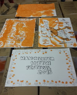
2nd day working in exhibition centre. Besides preparing for the exhibition, we did carry out group activities. We created our own posters with orange colour as theme. We are only allowed to use our bare hands to paint. The output turned out pretty well.
Posted 20 May 2015 03:42
[ Fig. 4 ]
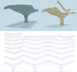
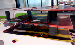
Our group decided to use interlocked slices as the model construction technique. Further improvement is made due to my concern towards loads transfer. The cad drawings is finally ready for laser cut in the end of the day.
Posted 20 May 2015 03:35
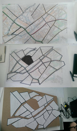
Day 3-4: We spent the days brainstorming ideas of how to represent what we found out in the best way possible. We went through ideas of collages, drawings, paintings and finally decided to build a model. Our idea was to create something artistic, with a metaphorical meaning, but still connected to the reality of what we saw. We finally decided to make a 3d puzzle, where every piece would be stained differently. The puzzle would be inspired by a map of the researched area, where every piece was set to be a different community. A piece which wont fit would be the area where the council intervened. At the end of day 4 we had it all planned out, the pieces cut out from paper, and we were prepared to begin building the actual object.
Posted 20 May 2015 03:02

Day 2. We decided to get in touch with New Islington, and spent the day roaming around the area trying to get a feel for what it was like, and what it has become. There were new houses built, but huge parts of the area, where houses were demolished, were left untouched ever since. It was obvious the council was trying to replace the old housing with new, modern constructions which are a lot more expensive. Back in 2003 the community was demolished. Furthermore the boundaries of New Islington were changed, in order for the council to be able to "free" a bigger area for the new constructions to take place. According to a lady we met on site, the local hospital was brought down, as well as many pubic gathering places which were in the area. The community was disassembled and people fled to many different parts of Manchester, while some even left the city. To my eyes the future plans for the area were also quiet ineffective. The feeling of loneliness was a great factor to my eyes while walking around New Islington. From what we observed, experienced and understood I would say it was a poorly executed CPO, which seemed to have washed away an otherwise stable community
Posted 20 May 2015 02:12
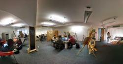
The office is now ready for exhibition
Posted 20 May 2015 00:51
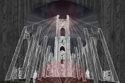
Since finalising our concept idea, we have been able to begin producing images representing our proposal for the intervention in St Luke's Church. This is a perspective of the church from within, showing the effect of the web, which creates a clear path from the tower to the altar.
Posted 20 May 2015 00:29
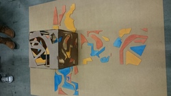
This is the box built up into the shape of the structure. the colored pieces create a landscape and the light creates an exploded painting when sourced within the cube.
Posted 20 May 2015 00:19
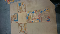
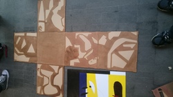
This is stage 2/3 of the painting stage. The cut out sections of the cube have been painted and the edges sanded so that the net cube can fold back into them, creating a painting when unfolded and a cube of light when it is not.
Posted 20 May 2015 00:18
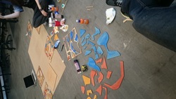
We began to paint the design using the three primary colors. This is stage 1/3 in the painting sequence.
Posted 20 May 2015 00:16
The CAD model has been laser cut and checked that it works correctly. This project has been challenging due to using software and tools that we have not come across before, although stretching beyond our comfort zone and being successful has been worth the effort.
Posted 20 May 2015 00:13
We started making our kite today using bamboo sticks as "main" material and reinforcing the whole structure with the thread. We also decided on what type and colour of fabric we will use. The only thing that is left for tomorrow is stitching the fabric to the kite so we can try to fly it on Thursday.
Posted 20 May 2015 00:12
We spend Monday on designing our kite and making a prototype that we later tried to fly. We had to change the design few times to make it fly properly.
Posted 20 May 2015 00:06
Day 5 (19/05/2015) - We decided to allocate a few vertical windows along the cladded walls and corners to crate sharp natural light effects inside the art space similar to the one created by the skylight in the corner of the Merz barn. The test model helped us to understand how this idea would interact with the mezzanine and the double volume exhibition space.
Posted 20 May 2015 00:04
initial concept designs for the site
Posted 20 May 2015 00:02
On the second day we split up into 4 groups each making individual outcomes. My group discussed our ideas and decided that we were going to make a Le Corbusier "museum". We are extruding different shapes from his painting making Le Cornusier art into its building. Going backwards. Expressing La Cprbusier architecture through his art. On that day we decided on design of the "building", materials and sketched out all the extrudions.
Posted 19 May 2015 23:56
design options for proposed plan element
Posted 19 May 2015 23:54
On the first day of a project we worked as a whole group discussing Our event as a whole and talking about different options/ideas what can be done over the next 2 weeks.
Posted 19 May 2015 23:49
Day 4 (18/05/2015) - A test model by Frederic W. of the locally sourced, woven timber cladding on the facade of the shed. We feel like its effect will fit in with the rural surroundings of the site
Posted 19 May 2015 23:48
-16.5- we found the right material for fabrication and it is transparent.
Posted 19 May 2015 23:47
-19.5-We've tested all things and it looked great !
Posted 19 May 2015 23:43
day 2 - went back to the site to survey building heights and topography
Posted 19 May 2015 23:42
day 1 - initial site diagrams
Posted 19 May 2015 23:36
Today has been a very slow, long,messy day of tunnel sculpting. I've found it very difficult to bend the wire (and then papier-mâché it) into a position that is not only structurally sound but aswell be practical for the adults and exciting for the children. Hopefully tomorrow things will start to come together!
Posted 19 May 2015 23:30
Day seven - structural pieces have been CNCed and everything should be ready for the test build on Thursday.
Posted 19 May 2015 23:30
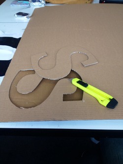
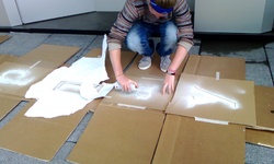
Cutting out the stencils to be used for spray painting.
Posted 19 May 2015 23:21
sun and shade on site
Posted 19 May 2015 23:07
day 1 - first site visit with the group. the site was set back from Oxford road so the site was reasonably quiet, with the only noise coming from a nearby construction, the site felt quite secluded, sitting in between 3 buildings, which makes it a good space for a peace garden.
Posted 19 May 2015 23:03
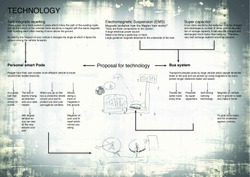
The bus system works by self-drive so a driver is not needed but there is an option to turn it off so you are also able to drive the bus as well just in case it breaks. It uses magnetic levitation like the Maglev train does but has a track above the ground high enough in the sky so the infected cannot reach it.
The pods that people have are very small and efficient as they do not use any fuel or anything that harms the earth or contributes to climate change. There is a track of magnets on the existing roads and a magnet in the pod repelling each other making to float above the ground and moving the magnet on the pod makes it move in the direction you want it to, the higher the angle you move it at the faster it travels.
Posted 19 May 2015 22:56
I started off by creating a few sketches of my idea and diagrams of how my future transport was going to work.
My chosen technology is magnetic levitation of a bus system in the air, similar to the maglev train that travels from one city to another through the infected territory at high speed through a long distance by picking up people's personalised pods which uses magnets to move and levitate above the ground as they repel each other, that travel shorter distances through the protected cities.
Posted 19 May 2015 22:48
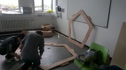
Some wooden pieces of the pentagons that were sanded today at the workshop.
Posted 19 May 2015 22:45
The pieces for the DJ table are now cut and ready to be assembled.
Posted 19 May 2015 22:38
We continued to decorate the box today and I did another abstract portrait. Then we had a fun sketching section that we used our hands to draw and only worked with one colour. Our group leader was trying to tell us that sketching does not have to be expensive and there are always numerous medium to use. Experimenting with different medium and drawing with hands is exciting and fun, the results may not look professional and refined, but the process took me out of my comfort zone and challenged me.
Posted 19 May 2015 22:06
Complete structural frame: Front and Rear Isometrics
Posted 19 May 2015 22:04
Testing out various shapes and sizes to see which will work best for our ribbed vaults.
Posted 19 May 2015 21:18
Starting point for our kite, The construction of frame
Posted 19 May 2015 20:50
Image showing how people can sit around the frame, allowing them to view the interesting surface detail of the artefact.
Posted 19 May 2015 20:47
Method for transporting the frame.
We split the model into three larger sections, allowing for an easier reassembly process.
Posted 19 May 2015 20:43
1:1 model on site.
Shadows created from the structural frame.
Posted 19 May 2015 20:40
1:1 model on site.
Posted 19 May 2015 20:38
1:1 model on site.
View from balcony area above.
Posted 19 May 2015 20:37
1:1 model on site.
We have made use of the balcony seating area behind the model as a viewing platform. This also provides a greater degree of protection for the structural frame and artefact within.
Posted 19 May 2015 20:36
While waiting for the casting wax to set we prepared wire mesh structures to be painted on with wax later.
Posted 19 May 2015 20:28
1:1 model on site.
Posted 19 May 2015 20:22
Casting wax_2nd trial: result. The wax "skyscrapers" came out well with sharp edges so we continued with this method for another batch.
Posted 19 May 2015 20:22
testing the structure
Posted 19 May 2015 20:19
bending the walls with a specific curve
Posted 19 May 2015 20:18
Day 5 (19/05/2015) - Ian Hunter visited us this afternoon to have a look at the visuals we proposed for his site. He seemed happy with the ideas we presented and commented that we challenged his visions to create much more interesting architectural pieces than he initially anticipated. He appreciated the motives we came up with to bring the narrative of Kurt Schwitters and spatial quality to the buildings.
Posted 19 May 2015 20:17
Spray painting some of the faces using the stencils we created earlier
Posted 19 May 2015 20:09
