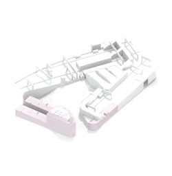
Group 06 { Cornerhouse }
Challenging the impending demolition of the Cornerhouse. // Download Poster
Atelier: CiA
- DAY TWO
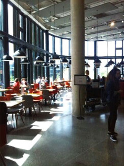
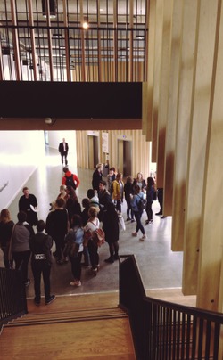
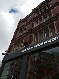
We took a site visit to the old Cornerhouse on Oxford Road, to understand the structure with which we would be working with, and to its new location on First Street. The old Cornerhouse has a strong red brick and Victorian style, historically a furniture shop until 1985, when the building became property of Manchester City Council and Arts Association Charity. The lower floors of the structure have been modified with open glass facades and (arguably distastefully) grey accents/supports. The new structure, pictured above, also attempts this modern and open plan approach from the old structure, but in moving to a new build has lost it's character and historic attributes that makes me question the change.
Posted 13 May 2015 19:13
Day 2- Today we went to the Cornerhouse to diagram and photograph the site. We then went to the new location of the cinema, the 'Home' building. we compared the two, and met after lunch to discuss our thoughts on the two buildings. We spoke about our proposals for the Cornerhouse, and began sketching and planning our ideas.
Posted 13 May 2015 19:07
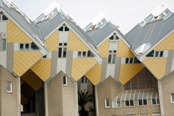
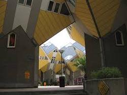
On Monday we were introduced to our event, and we were put in groups of four (two first, two second years) to go away and find precedent studies of buildings that have been remodelled. Our group found the Cube Houses by Piet Blom. These houses are made for youths about to be released from juvenile centres. After presenting our findings we discussed whether they were forms of intervention, installation or insertion.
Posted 13 May 2015 18:57
-DAY ONE
We met as a group initially to discuss the task ahead - to propose a new scheme for the now defunct Cornerhouse buildings. In groups we began to look into our own choices of renovated, reused and recycled buildings: in our group, we focused on the idea of reusing Cornerhouse to address the homeless issue in Manchester and based our research around this. We found the primary precedent pictured above, Piet Blom's 'Cube' housing, and how these were recently renovated into more appropriate 'halfway-house' style housing for delinquents in their final stages of detention: communal areas and single dorm style housing.
Posted 13 May 2015 18:52
Day Three:
Programme Development:
Because of the scale of our proposal, we decided to narrow down the focus to the main corner house building, which will become the decanting// packaging// storage building- and the face of the new real ale company.
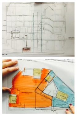
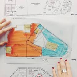
we separated the building into 2 main functions- the factory floor, and the visitation/ observation axis, which are separated by a void. This void allows the visitors and workers to see into different areas of the building, and witness the methodology behind the buildings programme, which works from the basement as the copper storage of the ale, up through the floors for decanting, then branding and packaging, and finally storage. This simplified the logic behind the buildings layout and gave different spatial qualities and hierarchy, making the programme readable and valid.
Posted 13 May 2015 15:15
Working to develop plans and sections of our idea for Corner-House. We are also developing a perspective to show how our design would look if it were to exist in the real world.
Posted 13 May 2015 13:15
We went on a site visit to the old corner house. We sketched it and explored round the surrounding area. We also went to visit the new corner house. We did some sketches there as well.
Posted 13 May 2015 13:08
We investigated the history of the Corner-House and began to look at ways of re-purposing the space through renovation. We looked into precedents and presented what we had found out.
Posted 13 May 2015 13:07
DAY THREE // Today we are developing the programme of our buildings. Our concept is to turn the cornerhouse into a brewery, connecting the surrounding pubs and cornerhouse buildings. The brewery will be housed in the 1930's cinema, and the cornerhouse building turned into a brewing journey, including packaging, storage and distribution. At the top of the building will be a bar open to the public, suitable in the very nightlife driven area. We want to create a void which opens up the whole building to reveal the programme on every level, today is about experimenting with how the programme will work on each level.
Posted 13 May 2015 12:11
Day Two - In the morning we did a site visit to the Cornerhouse and did some site analysis, including sketches, diagrams and photographs. We diagrammed our initial feelings towards the site and the how the building related to the surrounding context. We then visited 'HOME', to compare it with the original Cornerhouse building. In the afternoon we started to think about our initial ideas and how we may evolve the buildings.
Posted 13 May 2015 11:46
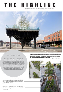
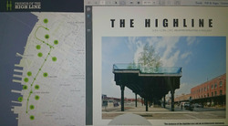
Day one - On the first day we were introduced to the project and given the brief. We then went away in small groups to find a case study of a building or space that been altered in some way from its original intended purpose. We studied the Highline in New York and put together a small presentation with our findings.
Posted 13 May 2015 11:10
Day Two: Afternoon
Programme development
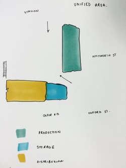
The Pubs the thirsty scholar, the salisbury and the grand central are all under threat of closing due to the proposed expansion of network rail. As well as this, other surrounding bars would be affected, and this is the primary function of the surrounding area. From this we derived a programme to design a real ale brewery that could then distribute the beer the the local pubs and bars. Not only would this unify the area it would create a hive of activity and encourage local networks and interaction. The diagram above shows how the buildings would be divided up into production, storage and distribution.
Posted 13 May 2015 10:40
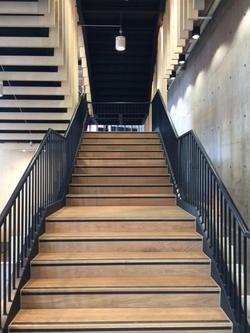
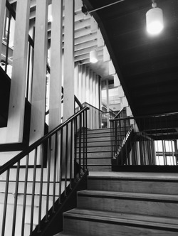
DAY TWO // In order to gain a wider understanding and knowledge of our site, the Cornerhouse, we went on a site visit to both the old and new Cornerhouse buildings. We sketched, diagrammed and photographed the old Cornerhouse site, looking at aspects of the building we would want to maintain and understanding how the building connects and responds to its environment. We then walked down to the new building, HOME, which is very different to the old building. The staircase in the building is beautiful and well considered, delivering an experience. However, the rest of the building I was not fond of, lacking character and inspiration.
Posted 13 May 2015 10:37
DAY ONE // Today we began our events by been given a short presentation overview about continuity in architecture. We then split into groups and researched buildings which sat within the categories of 'insertion/intervention/instillation'. As a group I researched the highline park in NYC, unveiling that parts of it connected to all three of the groups given. This gave us a good understanding of what repurposed architecture looks like.
Posted 13 May 2015 10:33
Day Two: Morning
Site Visit and New visit:
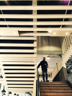
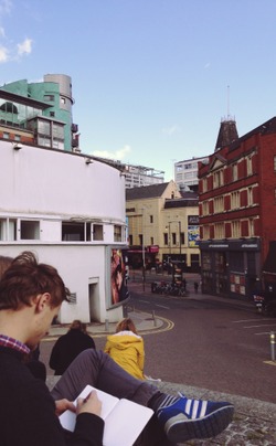
Spent the morning analysing the corner house site and surrounding area, to see if a programme could be developed. Then went onto the corner houses new location, now aptly names "home". The building it is now housed in is fairly generic, going for the industrial, unfinished look with exposed services and raw concrete. The problem is, that all the corner houses character has now been lost. The one redeeming character, however, was the staircase as its design had actually been considered. The change in ceiling heights from landing to stair well opened up, creating a transitional space.
Posted 13 May 2015 10:30
Day One:
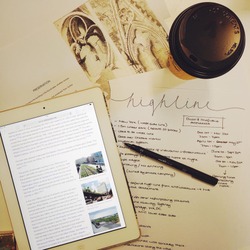
In a group of four we had to research precedents that somehow repurposed architecture. Within our group we looked at the New York Highline, because it synthesised the three categories defined by the events leaders:
Insertion
Instillation
Intervention - terms categorised in Re-readings by Sally stone and Graeme Brooker. In the Corner House re-appropration scheme I will look to also include elements of all three repurposing tools.
Posted 13 May 2015 10:22
Today we visited the Cornerhouse site as well as the relocated site and new venue called HOME. Despite a very interesting and successful staircase (as shown above) I found HOME's use of concrete and wood with mid century furniture generic, similar to other recent projects in Manchester such as the MMU Student Union, and lacking in character. This was disappointing as I felt the original appeal of the Cornerhouse was its unique atmosphere the building created. Consequently, I want my project to compliment this positive atmosphere and take advantage of the prominent location of the building. My initial thoughts are to create a temporary homeless shelter with architectural installations to cater to needs of sleep, eating and washing.
Posted 12 May 2015 20:50
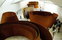
We began by looking at Case Study's which exhibited an installation, interference or insertion into a building or space. Personally, I liked Richard Serra's sculptural installation in the Guggenheim Museum and how its large scale, enabled it to be interactive for visitors. A temporary installation such as this one by Serra seems appropriate for the Cornerhouse- a space with an uncertain future that's longevity could be preserved if the flexible nature of the building is upheld.
Posted 12 May 2015 20:33
Day Two
First Thoughts.
Sketching initial ideas on program and key moves in response to individual observations of context.
Posted 12 May 2015 20:17
Day Two
Visit to HOME/Group Discussion
_What does this new building say about the 'moving' of the Cornerhouse?
_Continuation or New Start?
_Oxford Road Corner vs First Street
Posted 12 May 2015 20:15
Day Two
Understanding Oxford Road Corner
_Recording the site.
_Exploring architectural features.
_Sketching + Analysis
Posted 12 May 2015 20:12
On our site visit today I sketched and photographed the Cornerhouse and the surrounding areas, in order to begin to think of new programs for the building. What I noticed most about the building was the difference between the street level appearance and the floors above. Due to the grey cladding, the lower section of the building looked much newer than the rest. I had not noticed this before when passing by, it was only once I began studying it that it caught my attention.
Also visiting the newly built HOME building I noticed a stark contrast between the warm character of the Cornerhouse to the cold, new HOME building. There is little atmosphere to this building and I much prefer the Cornerhouse. This led me to start thinking of possibly creating an installation within the building which acts as a protest to the opening of HOME and the closing of the Cornerhouse.
Posted 12 May 2015 17:40
12/05/2015
Day 2
Today, we went on a site visit, to do a bit of analysis. We visited the Cornerhouse and the buildings surrounding it, before heading down to HOME, the site of the relocated Cornerhouse. There was a noticeable lack of emotion at the new site, making it seem like it was only the function of the Cornerhouse that was relocated, and not the emotion and atmosphere. Having wandered round, and gotten an idea of what HOME was like, we headed back to uni to discuss what we had found during the site visit and were asked develop any ideas that we had in pairs.
Posted 12 May 2015 16:05
11/05/2015
Day 1
Today, having been introduced to the event, we were sent away to find precedents of re-modelled Architecture. This fell under three categories: Insertion, Installation and Intervention. Our group of four managed to find an example that had aspects of all three, the New York Highline, a repurposed trainline that was turned into a linear public park spanning 1.49 miles
Posted 12 May 2015 15:52
Day_01
We looked at a series of case studies which examined the different methods of reusing a site. These methods were divided into three categories: Intervention, Insertion and installation.
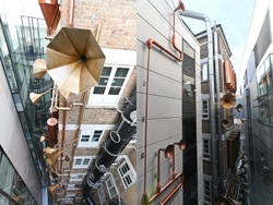
In small groups we researched individual case studies. My group looked at the Lullaby Factory at the Great Ormond Street Hospital- an installation by Studio Weave.
Posted 12 May 2015 10:53
Today in the introduction to our event we discussed the different types of re-use/rescue such as installation, insertion and intervention as discussed in 'Re-readings' by Sally Stone. In groups of 4's we then found case studies which showed one of these types of re-use/rescue. Our group picked Dresden's Military Museum which had a bold, politically motivated extension added (insertion). This was useful to begin thinking of different techniques we could use in our Cornerhouse projects.
Posted 11 May 2015 20:56
70 Oxford Road Drawing Pack and Zmap
Issued by email, give me a shout if you don't have it.
Posted 11 May 2015 16:55
Day One
Introduction.
Exploration of building re-use schemes through three main categories:
_Intervention
_Insertion
_Installation
Posted 11 May 2015 16:45
