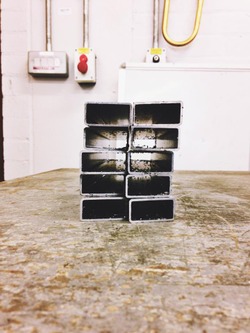
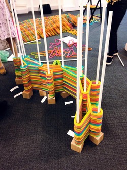
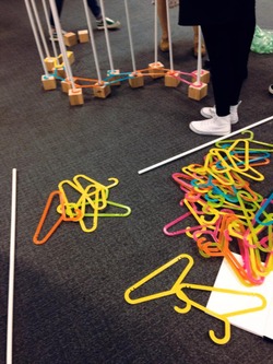
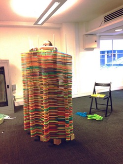
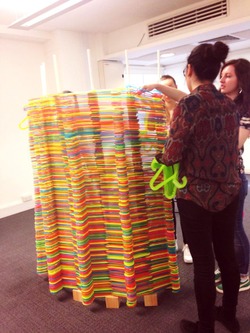
DAY FOUR// Metal base for the hanger screen is being constructed in the Metal Workshop.The metal will create stability and hopefully hold the structure upright. Created in response to our previous attempt which fell over.
Posted 14 May 2015 18:06
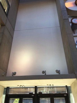
We roamed the Benzie building looking for suitable sites to project onto. The entrance to Benzie was identified as a potential space to work with as we recognized the huge flow of people through this space would lead to interesting interactions with out projection
Posted 14 May 2015 18:06
On the first day we were divided into groups. We began brainstorming and bounced ideas off each other then decided to go away and each come up with several ideas of not only the site but what we wanted to project onto
Posted 14 May 2015 18:03
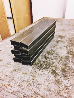
The metal bars, cut and ready to weld from the Metal Workshop
Posted 14 May 2015 18:03
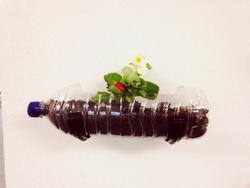
SOIL AND PLASTIC// NATURAL AND MAN-MADE
Posted 14 May 2015 17:53
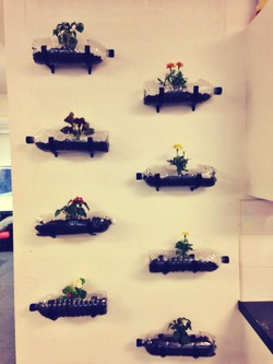
GREEN WALL, made from recycled 2l bottles with "borrowed" plants
Posted 14 May 2015 17:52
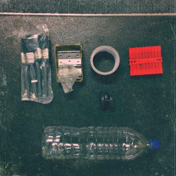
In The Borrowers toolkit
Posted 14 May 2015 17:51
FOREGROUND// New hanger screen// Double curved for extra balance
BACKGROUND// Previous hanger screen lying in it's grave
Posted 14 May 2015 17:48
After the collapse, we tried to create a more stable structure // widening the surface area and increase the amount of poles
Posted 14 May 2015 17:47
HANGERS VS GRAVITY
Posted 14 May 2015 17:46
From the morning of DAY 2// TRIAL 2// image taken previous to it's collapse
Posted 14 May 2015 17:44
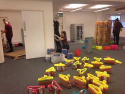
TEAMWORK// Sanding wood// Drilling the green wall// Constructing the hanger wall
Posted 14 May 2015 17:42
The Borrowers HQ - a room borrowed from the St James Building - Grade II listed building in Oxford Street, Manchester, England, completed in 1912.
Posted 14 May 2015 17:39
Day 04
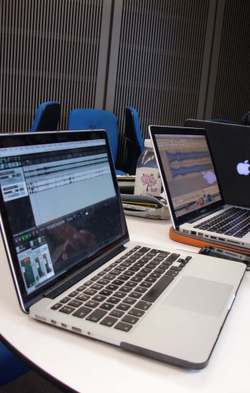
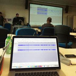
Workshops with NAVARS. Today we learnt how to use sound editing software such as Audacity, Reaper and GarageBand. It also enabled us to come up with ideas for eventual final output - sound - responsive installation.
Posted 14 May 2015 17:08
Day 03
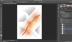
This day we got to listen to the sounds we recorded the day before. We have been asked to produce the photo collage of sound site analysis from the previous day therefore within my group we considered archetypal, keynote, signal sounds alongside circulatory and human sounds and semantic effects. The final output of this task is a map made of overlaid analysis of each sound qualities transformed into beautiful photo collage.
Posted 14 May 2015 16:59
Day 02
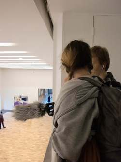
Having collected the recording equipment, we headed to our sites in order to acknowledge the sounds that constitute them. We started in Afflecks where we heard mostly music and sales staff. Afterwards, we moved on to St. Peter's Square which was surprisingly loud keeping in mind that it is the Central Library site. Maintenance construction work and trams dominated the soundscape of the site which we tried to recognise from different key points on the site - entrances to the main buildings (Central Library, Midlands Hotel and offices around the square). Our next destination was the roundabout with nature surrounded by cars and eventually we reached Whitworth Art Gallery which allowed us to explore the differences of the quality of the sound in spaces of different volumes.
Posted 14 May 2015 16:51
Day 01
After having split into smaller groups of 4, we were distributed the sites from which we chose 1 of each category for further analysis. The categories were public realm, transport hubs and two types of interior spaces. We decided to analysis the roundabout under the Mancunian Way behind the MMU Business School, St. Peter's Square, Whitworth Art Gallery and Afflecks Palace.
Posted 14 May 2015 16:37
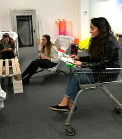
Testing different objects such as shopping trolleys and wheelbarrows as chairs.
Posted 14 May 2015 16:04
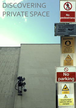
Today we ventured into Spinningfields to discover the extent and impact of privately owned space. Once aware of the change in land ownership and sole commercial interests of its inhabitants the area became unwelcoming and hostile.
We talked to a security guard who, when asked 'what are the rules around here' swiftly replied 'what aren't the rules, there is nothing you're allowed to do here!'.
We noticed the instant cleanliness, the narrow demographic of users and the hostility to the space being used in any other way than adhering to the for profit motif.
Touches of 'homeliness' had been attempted with sorry looking 'meet me here' litter bins and the addition of a false area of grass named 'The Lawns', which we were soon told we could not used as this was 'Private Property'.
Posted 14 May 2015 15:57
03 | Workshop with NOVARS. They showed us how to clean up and filter recorded soundscape with the help of Audacity and Reaper audio software.
Posted 14 May 2015 15:56
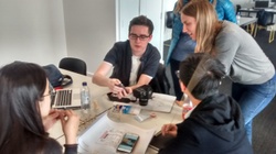
Design discussions - Cantagalli drug jar
Posted 14 May 2015 15:53
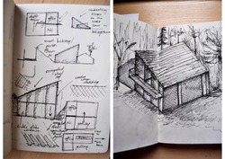
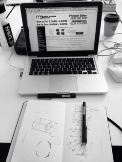
Day 3 (13.05.2015) - After dividing ourselves into 3 subgroups we started brainstorming our ideas and began to do initial visuals through quick sketches and diagrams. It was important to consider the context of the rural environment as well as the materiality of the installations so that we can then develop coherent renders which convey atmosphere next week.
Posted 14 May 2015 15:52
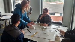
Design Discussions - Ashuach Chair
Posted 14 May 2015 15:51
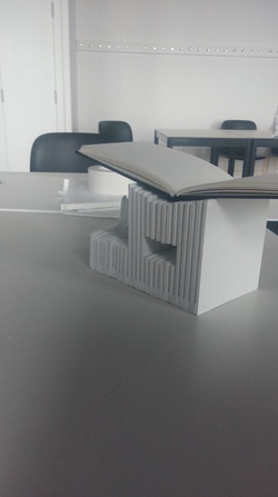
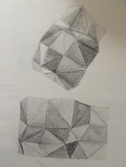
First prototype of our initial design to be used to display Piranesi's book Le Anchita Romane, taking the technique used for etching his images (linear lines) and converting it into an architectural form.
Posted 14 May 2015 15:49
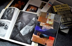
Day 3 (13.05.2015) - Today we gathered all of our thoughts together on where we want to go with the project. I decided to read a bit more about the Merz works of Kurt Schwitters to make sure that the legacy of the artist was visible in our ideas, as the client seemed keen on keeping the history as the narrative throughout the 3 new installations. It is clear that Schwitters was a pioneer in making use of found objects and everyday materials in abstract collages. I feel like this should be translated in our building through the use of locally soured materials, typical to the site to keep the rural theme.
Posted 14 May 2015 15:48
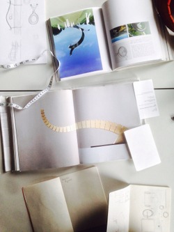
Design discussions - Piranesi volume
Posted 14 May 2015 15:48
Finalising Design and Tallying Material Costs for the DJ Booth.
Posted 14 May 2015 15:44
Day 3 and 4
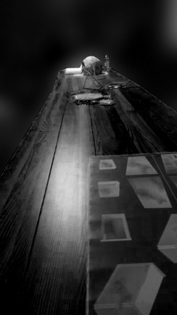
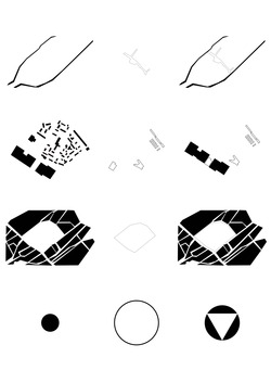
We have been discussing how we want to portray New Islington as a void, we decided on creating a 3D puzzle. The puzzle will be made up of wooden blocks signifying different communities. Above is the process we went through to get from map to puzzle.
Posted 14 May 2015 15:43
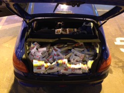
Another trip around Manchester (by car this time) "borrowing" as many Argos and Wickes catalogues as we can.
Posted 14 May 2015 15:38
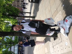
Walking around town grabbing as many catalogues as we can get our hands on to start building our tables.
Posted 14 May 2015 15:36
Second Session - Design Proposals/Presentations judged by the Pangea Committee. Fingers Crossed.
Posted 14 May 2015 15:33
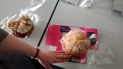
Day Three: Victoria Sponge / Carrot Cake (*Cough-Shop bought-cough*) // Design concepts and models
A tutorial day to round off the first week, with the double takers running through their individual group ideas and how they would see these come to fruition over the following days.
Posted 14 May 2015 15:30
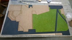
My Site Model - Currently 2D
Posted 14 May 2015 15:07
-14,5-Finally we came up with a final idea! We are going to fabricate something behind the stair. There will be five layers with holes and these holes can guide people focus on the final layer. On the final layer we will present a video. We've made some sketch models and it looks work.
Posted 14 May 2015 15:00

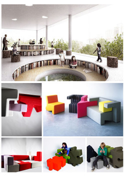
On the third day of our project we got the opportunity to present some ideas through precedents that we found interesting and creative. The most exciting aspect of our project is that we don't just need to design a simple, modern area but we particularly need to focus on creating a playful environment that would attract a child's attention and direct it towards the artistic activities that will take place in the centre. Therefore while brainstorming and designing we need to try and view this room from a child's perspective which is both fun and challenging at the same time. Sharing our ideas with students from older years was really helpful because with the advice they gave us and the questions they asked they led us into finding our own solutions in the development of our concepts. My idea is a combination of two precedents that I found that is related to creating an area were plays can be conducted by changing the levels of the floor. When the play is over the circular, amphitheatric area can be covered up in soft furnishings or colourful balls creating a ball pool where children can play. In this way the same area can have second use.
Posted 14 May 2015 14:47
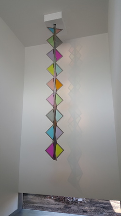
Visiting the Whitworth gave my group the idea of hanging our chosen artefact above ground. No one interfering with the artwork.
Posted 14 May 2015 14:44
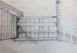
Observational sketch of the site
Posted 14 May 2015 14:34
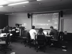
On our next session, having our final idea, we started to explore various software. We were using different websites like 'Lynda' and 'YouTube' to develop skills in animation and to see how the projection mapping actually works
Posted 14 May 2015 14:32
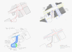
Diagramming the site..looking at circulation, degrees of enclosure, organisational strategy, geometry and line hierarchy.
Posted 14 May 2015 14:31
DIAGRAMS OF THE SITE: ANCOATS MCR
1. CANALS. EXISTING- NEW
2. OLD BUILDINGS - BUILDINGS DEMOLISHED. CPO. - SITE NOW
3. AREA CPOed
4. COUNCIL- COMMUNITY- HOW COUNCIL DOESN'T FIT IN THE COMMUNITY (CPO)
WE CAME UP WITH AN IDEA; CREATING A PUZZLE OUT OF THE SITE- AN INTERACTIVE PIECE THAT WOULD SHOW CONCEPTS OF THE CPO.
Posted 14 May 2015 14:27
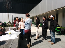
On our third session each member of our group had to come up with different ideas of site, object and projection. We had to present our suggestions and findings in front of the whole group. After we had our feedback we chose one idea to develop further
Posted 14 May 2015 14:26
COLLAGE ON HOW THE ANCOATS COMMUNITY FEEL ABOUT THE CPO
"SAY NO TO DEMOLITION. WHEN IT'S GONE IT'S GONE."
Posted 14 May 2015 14:25
14/05/15
Today's meeting is in full swing with quite a few really well expressed proposals based on yesterdays solidified concepts. Big topics for today are addressing planting, pathways, and water features, helped along greatly by our members from the Landscape Architecture course. The Architects have been busy too, working on a a few different schemes for a centrepiece structure for the Peace Garden. We're seeing some really exciting proposals based on the intimate use of materials to create an inviting and calming atmosphere. The group has also showed impressive foresight with the consideration of the actual implementation of the scheme, acknowledging the different stages in construction with relation to budget constraints. Keep up the good work people!
Joe (5th year)
Posted 14 May 2015 14:24
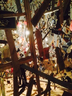
Exploded Shed by Cornelia Parker at the Whithworth Gallery. Hanging objects which inspired us in the design of our project
Posted 14 May 2015 14:19
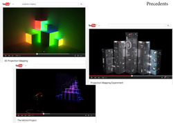
On our second session we were looking into different precedents of 3D projection mapping in order to develop a better understanding of our task and to find an inspiration
Posted 14 May 2015 14:13
13/05/15
After a whirlwind first few days the Transgression in Peaces group came together in the glorious sunshine on the 4th floor roof terrace for a tutorial to discuss everyone's initial ideas and the direction of the project. We managed to discuss and channel the wealth of fantastic individual initial proposals down in into a coherent direction for the group to focus on. We agreed to meet the next day to further refine the proposal. Fantastic effort by all involved!
Joe (5th year)
Posted 14 May 2015 14:08
Research on structural and sculptural forms. Santiago Calatrava & Thomas Heatherwick.
Posted 14 May 2015 14:06
On our first day of Events after we received our brief we were divided into groups of five people. We had to discuss three main subjects- finding a site for our installation, the object on which we are going to project, what to project on it and how to relate that to architecture of transgression
Posted 14 May 2015 14:03
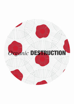
Design Concept: Organic Destruction versus Anthropic Destruction. This image was created to sum up the design concept that was forming at the early stages of the project. It features the poppy flower which is a symbol of sleep, peace and death as well as the symbol of Remembrance Day in the Western World. In Classical Mythology, the bright scarlet color signifies a promise of resurrection after death. This linked well with the idea of resurrecting the ruin with the use of life and nature. This concept developed further to include an annual war memorial day which would take place on the site around early spring during the celebration of VE Day.
Posted 14 May 2015 13:31
With this site we hd the idea of animating the bridge as people moved from one side to the other. We where looking at how to do this, either using rapping or digital animation on after effects.
Posted 14 May 2015 13:18
We began to investigate into different sites for us to project, looking at different angles and materials to project on.
Posted 14 May 2015 13:15
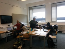
For the first session we met in 713 and received our brief. It had changed to projections from 3d graffiti due to an issue with acquiring a place to spray on.We split into groups and brainstormed ideas.
Posted 14 May 2015 13:11
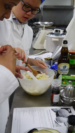
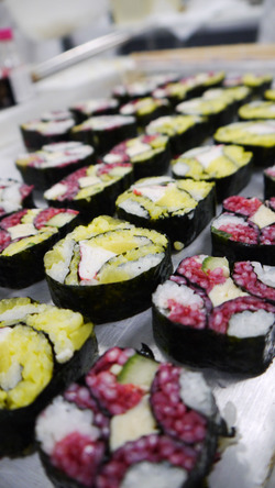
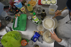
Kitchen Creations Part 3
Posted 14 May 2015 13:03
Hard at work in the Kitchen
Posted 14 May 2015 13:02
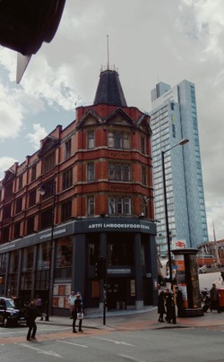
During the second day we've visited the Cornerhouse site in order to examine the context in which the building is placed, which helped us generate the first program and design ideas. Besides the basic elements which had to be analysed, like geometry, degree of enclosure, accessibility etc. , I've also looked at how people walk and talk around the site, at their facial expressions and body language. This experience allowed me to understand better the significance of this specific site and how it acts like a gate inviting people coming from the train station into the city.
Afterwards, we went to the new location of the cinema, "HOME". Although this building has a contemporary flair due to the combination of materials and interior circulation, it doesn't seem to have a sense of place, to truly belong to Manchester, like the former Cornerhouse.
Posted 14 May 2015 13:02
Kitchen Creations Part 2
Posted 14 May 2015 12:57
Kitchen Creations Part 1
Posted 14 May 2015 12:57
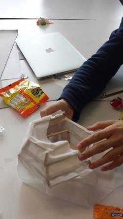
Today we all brought in materials to make test models for the extruded walls. Our initial idea was to use fabric stretched out and fixed on vertical poles. But then we found it did not give much stability as expected. We then started to test on other materials.
Posted 14 May 2015 12:48
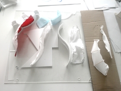
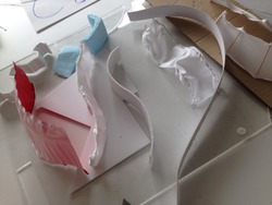
Testing maquettes
Posted 14 May 2015 12:39
Our event, Performing Architecture, had the first session on 13th May. Our fifth year coordinators showed us a short film about the life of Le Corbusier. After having a brief introduction to his life, we started a group discussion about what we wanted to produce for our performance.
At the end of the day, we decided to make a model of a building incorporating the 5 elements of Le Corbusier's buildings, with three of his paintings as our building plan. By extruding lines and planes from the paintings, we aimed to create rooms and circulation out of the paintings.
Our performance at the end would be a short film showing how we assemble the model, and how the floors transform into individual paintings.
Posted 14 May 2015 12:28
Unfortunately today our subgroup faced some problems of actually projecting onto our initial space as it wasn't dark enough and was too dangerous to be authorised. Therefore we had to chose a new space and think of new ideas which went very well.
Posted 14 May 2015 12:25
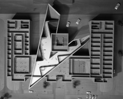
On the first day we've started analysing various case studies regarding methods of rescuing/ re-using a site and we've discussed the notions of insertion, installation and intervention. We were split in groups of four and presented the results of our research.
The most interesting building we had found was Dresden Museum of Military History by Daniel Libeskind, "a fundamental dislocation", a bold example of insertion, which aggressively interrupts the existing building's rigid geometry and creates a connection between the past and the present, offering its visitors a new and unique experience. This extension to the museum also makes a political statement, as it represents the freedom and openness encountered in a democratic system, while the old building reminds of the rigour of the totalitarian regime.
Posted 14 May 2015 12:00
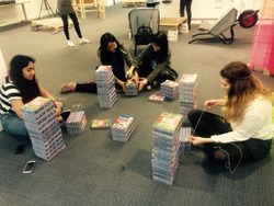
Planning out which way to position, stack and bind the wickes books to create the table legs.
Posted 14 May 2015 11:56
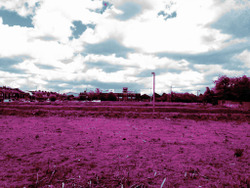
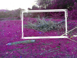
Today we started to collate our photographs of the site together and brainstorm idea on what type of installation we would like to produce. Our main inspiration came from the photographer Richard Moose who used a colour infrared film so as to create a new perspective on conflict. So we edited our images to mimic his style.
Posted 14 May 2015 11:49
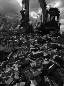
The last four remaining houses we initially discovered to have been on the CPO site in Clayton had recently been demolished. Although this was not what we were expecting, it produced the opportunity for some excellent observation for such a derelict site. We photographed and collected found objects in the vicinity.
Posted 14 May 2015 11:45
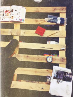
Coffee table for the Borrowers. Wood. Drills. Tape.
Posted 14 May 2015 11:26
initial concept design render with atmosphere & habitation
Posted 14 May 2015 11:23
Day 4. We've been editing our photos from the site with reference to what information we have gained about the CPO site in Clayton.
Posted 14 May 2015 11:23
Day 3.
Edited photo taken from the site we visit on day 2. We use Photoshop to modify the photos in such a way to create a toxic/industrial look as the area is surrounded by chemical factories.
Posted 14 May 2015 11:23
Soundscape workshop with NOVARS
Posted 14 May 2015 11:19
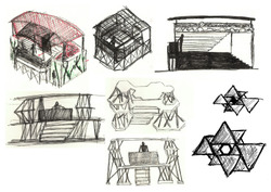
Initial concepts for the stage, focussing on the form first and the façade second.
Posted 14 May 2015 11:18
Plastic hunting for DJ booth facades.
Posted 14 May 2015 11:14
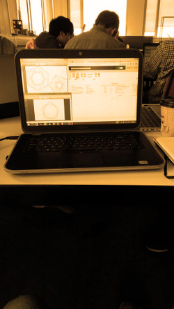
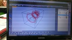
Inventing some kind of new dimension on Grasshopper
Posted 14 May 2015 10:54
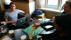
Playing scrabble to promote creative ideas and team building
Posted 14 May 2015 10:53
First year students' proposal for the DJ booth
Posted 14 May 2015 10:52
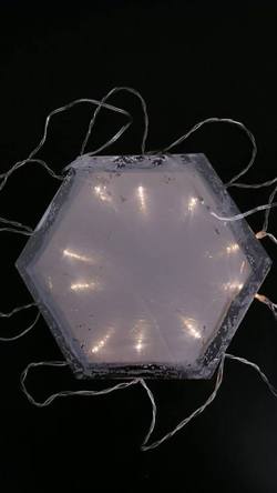
Prototype Infinity Mirror
Posted 14 May 2015 10:52
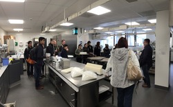
An introduction to the state of the art kitchen facilities in Hollings Faculty
Posted 14 May 2015 10:14
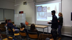
Students presenting some initial ideas to members of Hollings Faculty
Posted 14 May 2015 10:13
