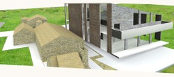
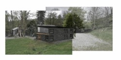
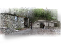
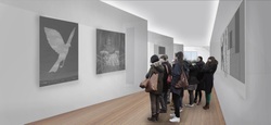
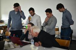
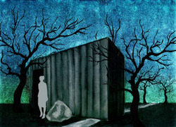
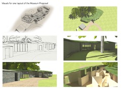
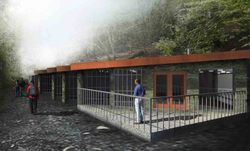
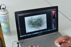
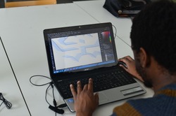
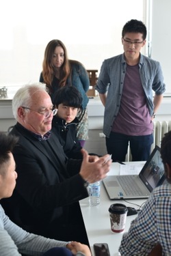
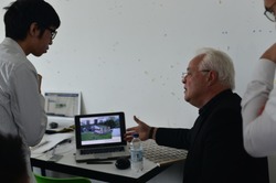
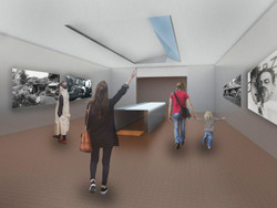
We added realistic features to our perspectives to add extra dimension and depth to them. This was enjoyable and brought the project to life, we were confident with the final outcome of the project and we're happy with the feedback we received from the client.
Posted 22 May 2015 16:51
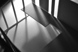
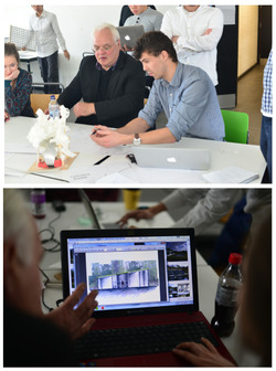
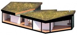
We also created a a model to add another interesting aspect to our scheme.
Posted 22 May 2015 16:49
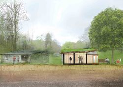
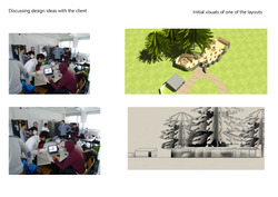
We created perspectives from a few angles to show the client a good visual understanding of our design we created for him.
Posted 22 May 2015 16:48
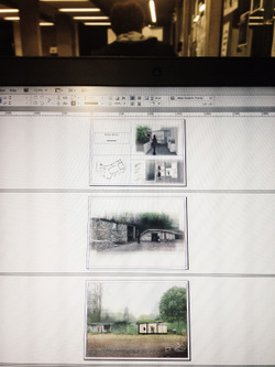
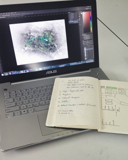
I rendered the designs using photoshops, experimenting with the different textures. Creating the visuals was enjoyable and helpful to show the client the design.
Posted 22 May 2015 16:46
Once we sketched what we wanted we started a sketch up model to get a good visual idea of what we wanted
Posted 22 May 2015 16:44
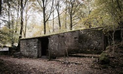
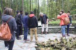
Day 1. We visited the merz barn. It gave us a good understanding of what the client wanted and where to take our designs
Posted 22 May 2015 16:43
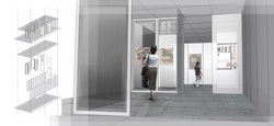
Facade design for the building. Materiality, context and alignment of lines are carefully considered.
Posted 22 May 2015 16:32
Exhibition path, with "staircase-shaped " wall for displaying artworks in a more interesting way.
Posted 22 May 2015 16:30
Temporary art space, with movable wall panels, enable the space to be adaptable for all art exhibitions.
Posted 22 May 2015 16:29
"Dark Corner" , exhibition space specially designed for showing historic narrative on the Nazi's degeneration on modernist art. Connected to a minni theatre.
Posted 22 May 2015 16:27
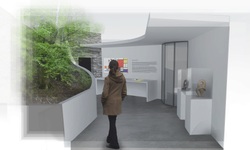
Courtyard designed for exhibition about modernism.
Posted 22 May 2015 16:26
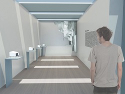
Diplay room designed specifically for displaying the 4 Merzbau experimental models and one 3d Merzbau art piece done by Kurt Schwitters.
Posted 22 May 2015 16:24
Attempting to talk the talk
Posted 22 May 2015 15:50
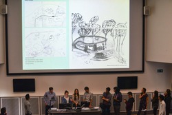
Final presentation for the Merz Barn Events project. I hope we have been a help to Ian and proposed a suitable set of designs for his vision. It has been an interesting and enjoyable experience working with my first client and to a specific brief. A great two weeks, thank you to our wonderful team!
Posted 22 May 2015 15:14
Presentation delivered, project finished - Great fun to be a part of. Thanks squad.
Posted 22 May 2015 14:51
Pulling it all together! Final morning gathering together our booklets and organising our presentations.
Posted 22 May 2015 14:24
One of the most interesting parts of the project, for me, was interacting with a real client. Some interesting feedback that Ian gave was that although the appearance of the building needs to fit the surroundings due to specific planning regulations, the design should still look original and exciting due to the 'exhibition' nature of the project as a whole.
Posted 22 May 2015 14:24
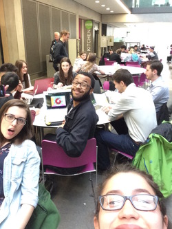
Final day! Pre-presentation selfie! Really glad I chose Merz 15 for this years events as everyone in the group was really enthusiastic and especially enjoyed interacting with the client.
Posted 22 May 2015 14:18
Day 5
Buzzing for the return of Ian where we presented our ideas to him! We spent the rest of the day trying to create a script and a few slides for our Friday presentation
Posted 22 May 2015 14:16
Day 4
At the start of the second week, we collated our ideas together and I spent the day trying to hack photoshop as I thought this would be a great time to explore it. We worked on polishing up our presentations for Ian the next day.
Posted 22 May 2015 14:03
Day 3
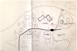
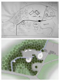
Back in the studio, the residential aspect which was initially 2 static caravans developed into 4 different elements: statics, a bothy, a library and an amphitheatre. I really enjoyed this session brainstorming with the other 3 in my group where we researched precedences and soaked up each others ideas. By the end of this session, we divided up the residential areas (I got the bothy) and we made a site plan of the residential area.
Posted 22 May 2015 14:01
Day 2
Really enjoyed the trip to Windermere but most of all enjoyed meeting Ian who is just inspiringly enthusiastic about the whole concept. His ideas were just forever expanding and developing and his passion was just brilliant.
Posted 22 May 2015 13:58
Day 1
We spent the day being introduced to Kurtschwitters and the concept Ian (the client) had. We split into 3 different project groups and I chose to be in the residential team
Posted 22 May 2015 13:55
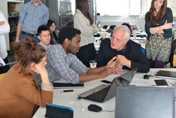
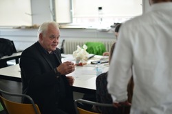
Second meeting with the client to discuss our design ideas
Posted 22 May 2015 13:45
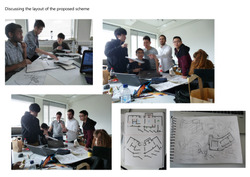
Discussing the scheme layout
Posted 22 May 2015 13:05
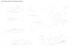
Sketches of initial ideas
Posted 22 May 2015 12:49
An in hindsight look at our concept layout for the artist residence, comparing it Schwitter's wall installation - the "crazy shapes and juxster positions" defiantly come through.
Posted 22 May 2015 12:04
The whole events experience was amazing, i really enjoyed getting to know what is feels like to work with an actual 'client' and this will be very useful in terms of changing my presentation techniques in the future.
Posted 22 May 2015 11:52
Day 6
Forming the final presentation booklet of the project.
Posted 22 May 2015 11:46
Day 5
Ian came to visit us and review the progress so far, He was very pleased with the schemes we presented to him even though his original vision looked nothing like that.
Posted 22 May 2015 11:43
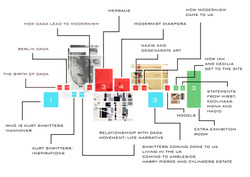
Timeline corresponding to the plan showing narrative and political context.
Posted 22 May 2015 11:35
Day 4
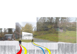
The space around the museum set out as a journey.
Site plan colour coded.
Posted 22 May 2015 11:34
Day 3
Started to come up with initial ideas of what we see the museum as trying to incorporate them with Ian's original vision. We started to form a floor footprint and making decisions on the all of the materials.
Posted 22 May 2015 11:26
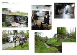
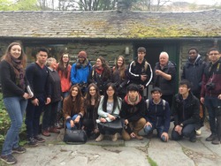
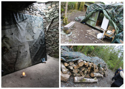
Some photos from the site visit on day 2
Posted 22 May 2015 11:25
Day 2
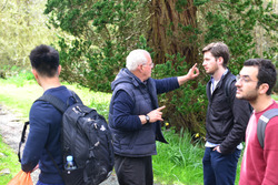
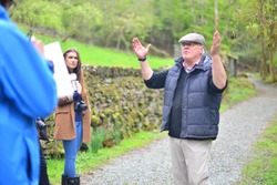
Site visit of the Merz barn, meeting Ian and Cecilia. The history and significance of Kurt Shwitters was explained and Ian gave us an idea of what he wants from each proposal as a 'client'.
Posted 22 May 2015 11:22
Day 1
Briefing of the project and organizing the site visit for for 12/05 to the lake district, 3 groups were formed for the different outputs that needed to be created - artist accommodation, art shed and the museum.
Posted 22 May 2015 11:15
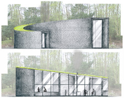
Front and back elevations of the library. Glass covers the side facing away from the path to let in light while maintaining privacy.
Posted 22 May 2015 11:11
Perspective of the final museum design in context.
Posted 22 May 2015 03:44
Preliminary perspective showing the main exhibition space inside the museum. Visitors would have access to an external seating area which would provide spectacular views of the lake district.
Posted 22 May 2015 03:14
Initial perspective showing the space which would house the Merzbau models. A visual link would be created between the Merz Barn just outside the museum and Schwitters' work on Merzbaus inside the museum.
Posted 22 May 2015 03:08
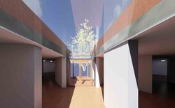
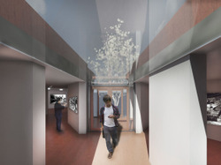
A preliminary internal perspective showing the relationship between the entrance space and the glazed roof which gives a view to a specific Beech tree at the site.
Posted 22 May 2015 03:01
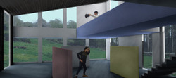
A sectional perspective looking to show part of the main exhibition space and the relationship between the sloping roof and the other exhibits.
Posted 22 May 2015 02:56
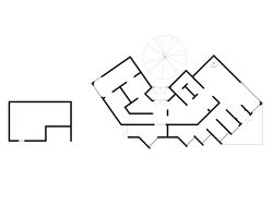
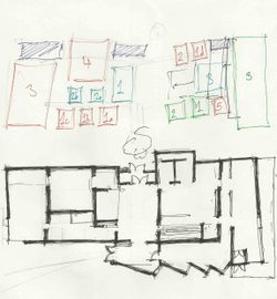
The initial sketch plan was developed to account for the specific conditions of the site. Key in the development of the plan was the consideration of a particular tree which had special importance to our client.
Posted 22 May 2015 02:46
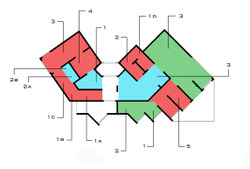
On top is a diagram which shows the basic arrangement of the exhibits in the museum, giving space for both the work and the information regarding the political context in which the work was created. Beneath this is the initial sketch plan that was formulated from the diagram.
Posted 22 May 2015 02:38
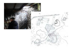
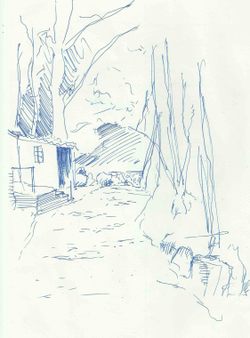
A site sketch trying to show the point at which you would first see the museum if approaching from the current main building.
Posted 22 May 2015 02:27
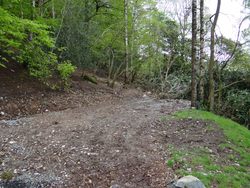
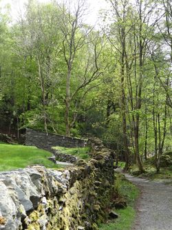
Having been split into teams to tackle the different project proposals at the site, we began taking photos of the specific locations in which our proposed buildings would be. The photo above shows the site for the Kurt Schwitters Museum.
Posted 22 May 2015 02:19
A view showing the approach to the last Merzbau experiment by Kurt Schwitters. On the second day we took to the Lake district to meet our client (Ian Hunter) and to view the site on which we would be working.
Posted 22 May 2015 02:13
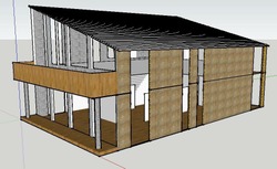
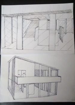
A couple of quick perspective sketches of the shed design, showing features such as the balcony, mezzanine and exhibition space.
Posted 22 May 2015 01:39
Busy working in studio using Photoshop to render our designs and present our visuals to convey our ideas. Some of our initial images were watercolours and scanning and editing these was a learning curve for some of us less technologically-abled!
Posted 22 May 2015 01:33
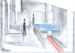
Interior perspective ideas include incorporating the abstraction of the primary colours as part of the fabric of the building reflecting Schwitters' ideas and work. Display panels and part of the mezzanine in the exhibition space are show to be coloured in this design.
Posted 22 May 2015 01:30
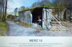
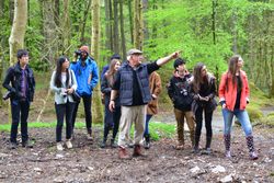
Our first productive day on the Merz Barn project was marked by our site visit to Windermere in the Lake district. At the site of the barn we met our inspiringly passionate client Ian, who told us more about Kurt Schwitters and his artistic and architectural influence. On our tour round the site, we analysed different zones, took photos and made sketches.
Posted 22 May 2015 00:29
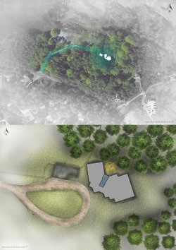
A location and site plan of our museum proposal.
Posted 22 May 2015 00:22
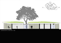
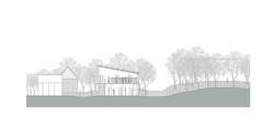
front section of the design proposal with context.
Posted 22 May 2015 00:03
View out of the museum space overlooking the Merz Barn.
Posted 22 May 2015 00:03
An interior perspective looking out towards the birch tree that Ian Hunter wanted. It becomes a central element in the orientation of the building, where a clear view of it is seen upon entry.
Posted 22 May 2015 00:01
Teamwork. Modelling for the perspective. We tried to actually create a more realistic situation so that we can incorporate the human figure in the proposal design.
Posted 21 May 2015 23:56
[Day 6] Finalizing
On the last day before final presentation, we were visited by Ian Hunter, the owner of MERZ Barn. He was satisfied with the project we had, and we have seen some good work from the other subgroups, especially some nice viusals. After the presentation we have decided to make more interior perspectives.
Posted 21 May 2015 12:55
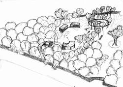
A quick sketch - arial perspective of the Langdale site (NW conner) showing the residence area and denoting the relationship of the it's four component structures. Could definitely use a render though.
Posted 20 May 2015 21:20
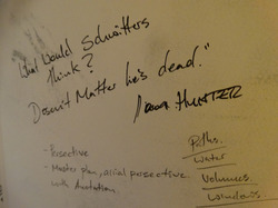
"And what would Schwitters think? Doesn't matter! He's dead." - Iain Hunter: The rhetorical question master who is our wonderful client. Possibly my favourite quote of so far. I felt it needed recording for prosperity.
Posted 20 May 2015 21:12
In preparation for the presentations, we formulated a document showing the narrative and process of our design approach. This document discusses how we went from the three initial schemes to our final scheme, and the reasons for certain orientations and placements.
Posted 20 May 2015 20:46
Lake district. Kurt Schwitters. Merz barn. The treasures that this place holds amaze every visitor and passer-by.
Posted 20 May 2015 17:56
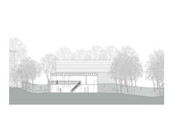
Sideways section complete. I wanted to keep it as simple as possible - neutral colours which will emphasize not the surroundings but the design proposal itself.
Posted 20 May 2015 17:29
First try with the section. At least now I know not to put a section on a perspective view - not working.
Posted 20 May 2015 17:28
First and last site plans mapping out the four key parts of the artists residence (static caravans, amphitheater, library and bothy)
Posted 20 May 2015 17:18
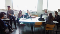
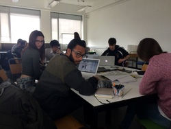
Everybody is in a mood for work. Preparing the presentation for the design proposal.
Posted 20 May 2015 17:16
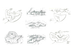
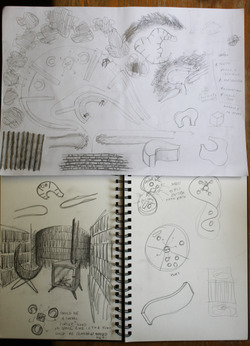
Some initial sketches for the library- exploring different shapes that best fit the landscape
Posted 20 May 2015 17:01
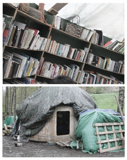
Original yurt library containing about a third of the client's book collection (a new design would need to be more spacious)
Posted 20 May 2015 16:57
The Residences team finalising their site plan.
Posted 20 May 2015 13:12
Getting ready for presentations!
Posted 20 May 2015 13:11
Iain getting excited with the visuals the museum team has prepared!
Posted 20 May 2015 13:09
Next up: the shed team...
Posted 20 May 2015 13:06
The artists' residences team bringing Iain up to date with their progress.
Posted 20 May 2015 13:03
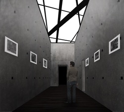
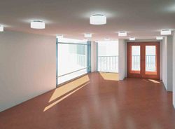
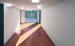
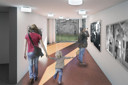
Interior and exterior renders were made for our scheme, showing the atmosphere and ideally the lighting within the exhibition spaces. The rooflights are carefully designed to minimise glare and to protect the photographs presented along the walls of the spaces. They are also orientated as such to bring as much natural light as possible. This space is the main exhibit hall consisting of models in relation to the Merz Barn, and important/iconic photographs during Kurt Schwitter's life.
Posted 20 May 2015 12:25
With the final scheme, we allocated different drawings for each of us to complete within the group, later collating them together into a single presentation alongside the two other schemes. The site drawings show the context which we are designing upon and briefly describes the constraints that we had to work with.
Posted 20 May 2015 12:21
[Day 4] Idea Development
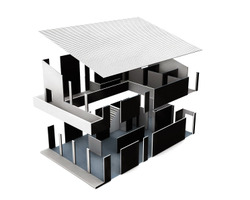
After doing the sketch model, we made a few elevations, sections, and plans. I did an axonometric view of the art shred, which shows the load transfers and the structural properties in fragments and their relations with each other. The axonometric drawing has three different colours, each represents one side facing on different elements.
Posted 20 May 2015 11:51
Day 6 - 20th May
Try to link all our teamwork together into one so that it will be coherent and consistent for the presentation.
Posted 20 May 2015 11:43
Day 5 [Model making]
A test model was created with grey board strips and wood scraps from the wood workshop, in which Kurt Schwitters always did in his famous collages. He used local resources and especially scraps to frame his collages, like the one he did in London in 1940.
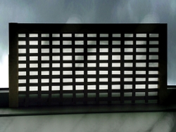
In our design, the stitch texture can be made by very thin wood obtained locally near the MERZ Barn, or by very thin steel strips that are welded or bolted by steel angles and channels to the Steel I columns. The texture shields the interior of the art shred from the strong wind and rain in the lake district, it also creates nice light effects on the interior walls, which also can identify places within.
Posted 20 May 2015 11:41
