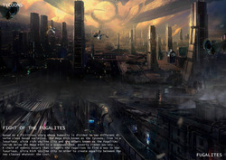
Based on a fictitious story where humanity is divided in two different diverse class based societies. The Mega Rich known as the Tycoons, live in a luxurious, ultra rich skyline city and the others known as the Fugalites reside below the Mega Rich in an overpopulated, poverty has ridden society.
A chain of events occurs that triggers the Fugalites to find a way to the luxurious, Ultra Rich Skyline city in order to create equality between the two classes whatever the cost.
Posted 19 May 2015 13:43
Elysium: Idea of control between two different classes. Isolate the two distinct classes by situating them in two different places (poor on the overpopulated planet and the ultra rich on a luxurious ship). No equality but the idea that everyone can achieve the American Dream and that you can gain equality from perseverance.
Posted 19 May 2015 13:40

Minority Report: I was specifically looking at the different modes of transport and the effect of this control element. The film included completely autonomous, self driven cars which the passengers had some but not a lot of control over. The fact that the cars were self driven with no manual override demonstrated that the public are controlled in respect of where they could venture within the environment and illustrated the inequality. Certain individuals were not comfortable with this inequality and wanted the ability to control and manage their future. The self drive cars were obviously a small part of this control mechanism. Ultimately they wanted the abilty to make their own decisions so that the pre-crime division could not prempt their actions.
This is a quote from the film Minority Report:
John Anderton: Why'd you catch that?
Danny Witwer: Because it was going to fall.
John Anderton: You're certain?
Danny Witwer: Yeah.
John Anderton: But it didn't fall. You caught it. The fact that you prevented it from happening does not change the fact that it was *going* to happen.
Posted 19 May 2015 13:39
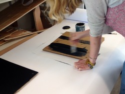
Day 7.
Applying blackboard paint on the cardboard. The public can then draw and write on the boxes with chalks. :)
Posted 19 May 2015 13:35
Cutting out chessboards for the boxes adding a "playful" aspect
Posted 19 May 2015 13:23
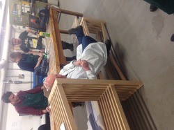
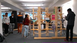
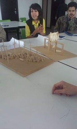
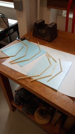
One of our fellow students testing the rigidity of the design.
Posted 19 May 2015 13:22
Model making
Posted 19 May 2015 13:21
We had to transport the model from the workshop to Chatham to present to the 5th year students.
Posted 19 May 2015 13:18
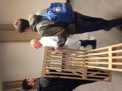
Completion of the 1:1 prototype was christened by Jim from the workshop
Posted 19 May 2015 13:15
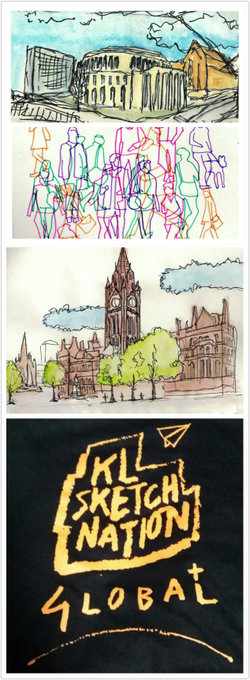
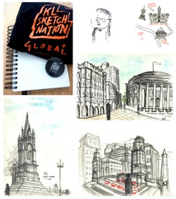
The first day starts with a briefing in Chatham by the event leaders. We received our sketchbooks, badges and t-shirts. Hakim taught us some basic sketching skills like the line weight, the shapes, the technique of drawing shadows and different perspective drawing methods.
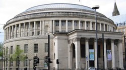
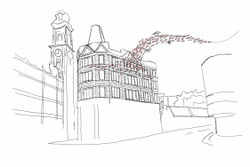
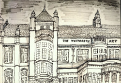
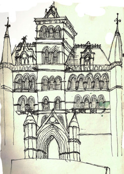
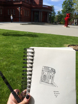
In the afternoon, we walked from Chatham to the Central Library. We sketched the central library and the town hall. As it is the first sketch walk, my main subjects of the drawings are the landmarks, the drawings are focused on the outline of the building and the general environment around them. I also did another sketch to show the busy movement in the Albert Square.
Posted 19 May 2015 13:09
Some great ideas going around on how best to present their food
Posted 19 May 2015 13:08
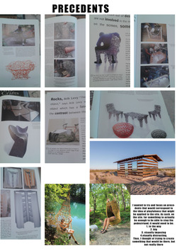
Precedent behind seating idea - dangling egg shaped woven chairs that would dangle from structure
Posted 19 May 2015 12:47
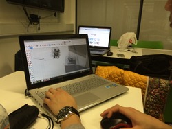
Sketch up model of structure and seating
Posted 19 May 2015 12:45
Template for boxes, spelling out "PLAY". Four of the boxes will have a different letter painted on to them
Posted 19 May 2015 12:23
Today the group split into two with one group working on cutting the back and leg boards and the other creating the personally moulded back and leg support.
Posted 19 May 2015 12:19
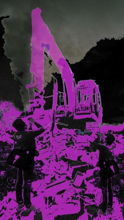
Adverse space. It relates to sites that were demolished throughout the years due to the CPO. We were tasked to choose a site in relation to that and create a depiction of that space currently. Therefore, my group chose Clayton as our site, which used to lay vastly rows of houses but now has been immensely demolished. During our visit, the site was still under demolition at the last stage, therefore we could still see bricks and glasses covering the site.
The interesting thing about this site was how it was industrialized therefore, unsafe for habitation, but we found out there was a food factory nearby. Unsafe to stay, but safe for food production. Ironically, this is how it works for this site.
We edited the photos taken of the site to depict an industrial feeling in which we will use for our installation.
Posted 19 May 2015 12:18
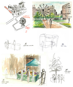
On the second day we set off to sketch at more crowded places: Piccadilly gardens and the market street. Before starting we were taught using different composition (1-point, 2-point and 3-point perspectives) and medium to start developing our own style. It was in this session that I learnt about distorted perspective and it seemed really interesting. We did some 1-minute lightning sketches in which we had to pick a subject and draw a simple line drawing to represent, all within 1 minute!
I chose a different medium in sketching this day and I'm happy with how effective watercolours are in making my drawings look better.
Posted 19 May 2015 12:12
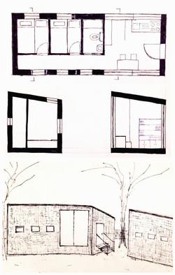
In the first week, there is some homework left. I continued sketching and came to the design.
Posted 19 May 2015 12:10
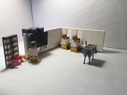
I decided to move onto the use of lego to keep up a continue quality of the image. I used the same set design as i did for my drawings an the slightly moved each figure to produce a short animation taking about 250 photographs.
Posted 19 May 2015 12:04
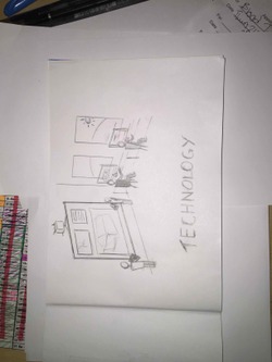
We decided to chose 5 subjects and then produce/find 6 videos that relate to the subject. Mine was technology and i wanted to look at the possibility of stop motion animation. this was one of the frames that I drew.
Posted 19 May 2015 12:02
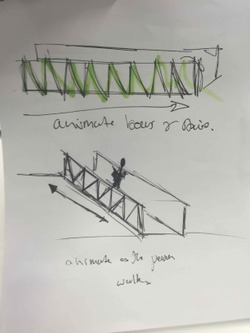
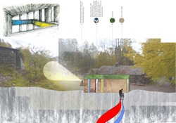
this was an initial idea that i had for the projection. The idea was to project onto the bridge with white cloth on the outside and then to animate as people walked past by extruding the beams using aftereffects. I decided to not push this idea as it was too bright and too complex in such a small time frame.
Posted 19 May 2015 12:01
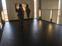
This was the location that we chose to project our final idea. we decided to use this space as it is passed by students on a fairly regular basis and is slightly out of the way allowing us to create a piece of installation here.
Posted 19 May 2015 11:59
Session 03 - Sketching - 13th May
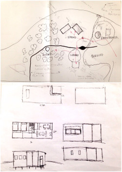
We made a decision of what shall be on site and the lay-out of residential, bothy, library and the charcoal burning area and then made initial sketches for the design.
Posted 19 May 2015 11:55
Day Five
We presented our schemes to architect and urban designer Jim Chapman. Jim's practical feedback and strong local knowledge enabled the group to develop their designs through the week in preparation for Friday's final review.
Posted 19 May 2015 11:51
Session 02 - Site Visit - 12nd May
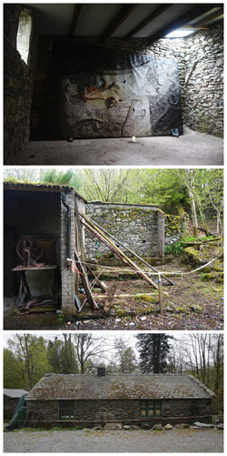
Today is the day trip. We took the early train to Windermere and paid a visit to the site. Here, the client talked about his requirements and ideas.
Posted 19 May 2015 11:45
DAY SIX// occupying the space
Posted 19 May 2015 11:36
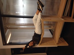
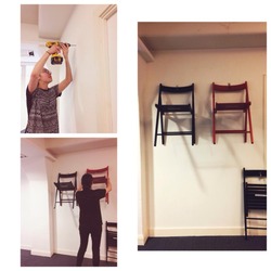
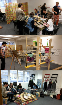
DAY FOUR// The hanging chairs were placed on the wall to create shelving and a coat rack in the reception area.
Posted 19 May 2015 11:35
Session 01 - Introduction - 11st May
We met up to talk about the projects and objectives. The brief is fully explained and information of the site is supplied.
Posted 19 May 2015 11:32
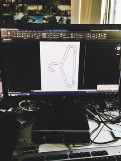
DAY THREE// WEDNESDAY// to create a more precise base we began to create a drawing in AutoCAD. It was here that we could measure the angles and lengths of the hangers.
Posted 19 May 2015 11:29
20/05/15
Another quick (figuratively) roundtable meeting to discuss the tasks assigned yesterday. In a large group like this, communication is key to remaining on task and avoiding any surprises at the last minute when assembling all the material. Luckily our group are all sharp crayons when it comes to collaboration! Hurrah!
Joe
Posted 19 May 2015 11:25
Lots of ideas and sketches being brainstormed. We have decided on the structure, types of plants and lighting so far. We have also thought about the typography of the site and how that may effect building costs.
Posted 19 May 2015 11:24
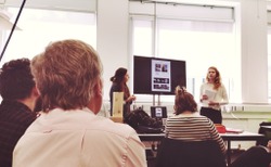
On Friday our individual proposals were presented to a representative of Z-arts centre. Through this procedure I believe that our main learning outcome was that our presentations ought to be clear and straight to the point. That is a skill that we have been working on from the beginning of the year however the fact that our ideas were presented to a client, who is not involved in the field of architecture or design in general, made it even clearer for me to realize the significance of it. After the presentations we were separated into four groups aiming to develop a design combining two ideas that were proposed in class.
Posted 19 May 2015 11:23
19/05/15
The group assembled for a quick site visit under the grey Manchester skies to refresh our visions before we met Rev Jayne Prestwood to present our initial proposals. The meeting went down extremely well with all the designs received with enthusiasm by Jayne, after which we divided up some tasks between group members in order to ensure that the relevant work will be completed. Its been a great first week and Myself, Nat and Bry are really excited to see the work becoming one homogeneous project that has a very real chance of progressing into a built form. Top Stuff!
Joe
Posted 19 May 2015 11:19
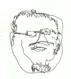
On the first day we were given a brief on the Sketch Fest event (the aim of the project and the plans for the following two weeks) and some basics in sketching: line, shape, shade and perspective. We then had a quick sketching activity in which we had to draw a person's face without looking at the paper. Hakym explained that the purpose of this activity is to train our hand-eye coordination, which is important in urban sketching because it's about capturing the essence of the scene truthfully. It isn't about getting perfect lines or a perfect drawing; it's to draw what we see, not what we think we see.
In the afternoon we had our sketch exercise at the central library, the townhall extension, and Albert square. I find it difficult to plan the composition of my drawings within such short time frame but still I decided to just sketch without thinking too much. I think that's when the fun starts!
Posted 19 May 2015 11:18
On the first day in event Adverse Space we were devided into 3 groups. We were asked to chose an area in Manchester which has been CPO'd and research on it. Throughout our project we have to acknowledge the affect of the given CPO on the community, the affect on the area, and its architectural aspects and value either lost or gained in the city context as well as any other useful info we could find which would shed light on the aftermath of the CPO done and whether it had an overall positive or negative affect. We went to Manchester Central Library, where we did some research and chose New Islington,development which is a currently ongoing CPO programme, and has been for more then ten years. I didn't really know what to expect, but it seemed interesting to me, to see how the area was affected, what processes led to the CPO, the reasons behind it and why it seems, most of the planned building were not even started.
Posted 19 May 2015 11:11
Elevation, showing the back of the contemporary art shed.
Posted 19 May 2015 11:06
Day 1 - Research
In the morning, we have researched different CPOs in Manchester, with a particular focus on East Manchester. As a group, we have chosen a CPO site New Islington, which at first glance seemed very user oriented in terms of the housing that they were producing. In order to find more information about the projects undergoing in New Islington we have spent the afternoon in the Central library. We have taken notes of the books and articles to consider which would provide us with further insight into New Islington.
Posted 19 May 2015 10:57
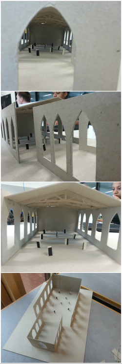
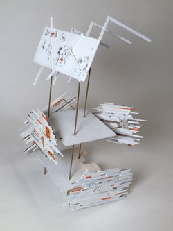
Day 6: Sketch Model Developed. It was used for testing the position of trusses and the pattern of the jagged holes in the roof. It has also illustrated the spacial relationship between the exhibition boxes and the building volume, we later found that it seems unsympathetic to the human scale so we decided to change our method of displaying the exhibiting items.
Posted 19 May 2015 10:54
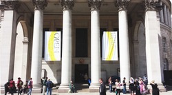
On Friday we had a discussion with Polly Bentham, from the Save the Cornerhouse campaign. She came to talk to us about her project and their attempts to save the iconic Mancunian building. Afterwards, we presented our scheme and talked about how we plan to develop it. Our main goal is to remind people of the beauty and importance of the Cornerhouse, but we do not intend to alter the existing design in any way. We created an artistic installation made of bricks which seem blown away by the wind, as if the building was decomposing after being closed. And because Manchester is such an animated city during the night, we included external and internal projectors showing images which recall the building's glory days.
Posted 19 May 2015 10:52
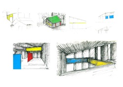
Initial sketches drawn by Magda, Preliminary ideas about the design of the contemporary art shed.
Posted 19 May 2015 10:50
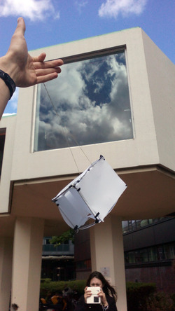
Yesterday, we made a test model of the kite and tested it.
Posted 19 May 2015 10:38
Successful week last week making our model, excited to move on to the kites this week.
Posted 19 May 2015 10:21
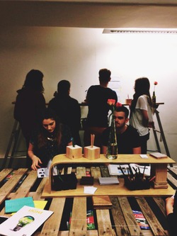
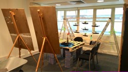
Easels as partition!
Posted 19 May 2015 10:15
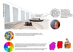
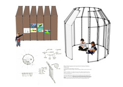
Day four - individually, we presented our initial proposals for the room and/or outside space. We used precedents, drawings and models to convey our ideas. Getting feedback from both the client and 5th years really helped to develop the designs further. This is my proposal for wrap around pods which can be used as both partitioning walls and as an enclosed space for creative play.
Posted 19 May 2015 10:15
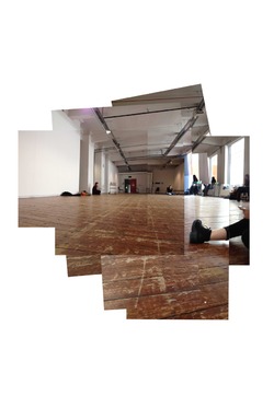
Day two - we used the information gathered from our site analysis to produce a collection of plans, sections, diagrams and photo montages so as to better understand the space. With these, we could then begin to think about how to redesign the space to fit the requirements of the client.
Posted 19 May 2015 10:10
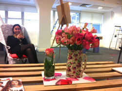
Office getting 'homey'!
Posted 19 May 2015 10:09
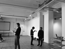
Day one - we visited the site of Z arts to grasp an idea of how the building functioned with its various hosting requirements - from dance and drama to music, childrens play and this redundant gallery space. We were told that the room in question was to be redesigned to be multifunctional and ignite the imagination of children from just months old to 15 years. What particularly interested me was the enclosed outside area and the suggestion that the room might be opened up to create a better dynamic between inside and out.
Posted 19 May 2015 10:00
More discussions before meeting the chaplain to discuss the direction of the project.
Posted 19 May 2015 09:58
Developing the concept with nice sketches and drawings
Posted 19 May 2015 09:56
Brainstorms:
using sketch model to create final concept
Posted 19 May 2015 09:55
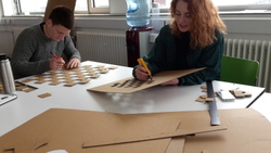
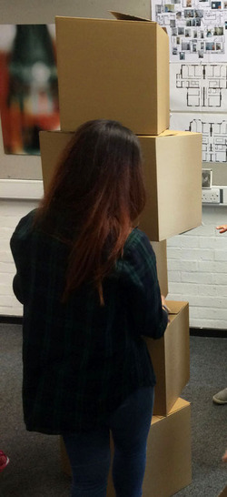
We started work on the boxes. The cardboard proved extremely heavy and difficult to cut, and a massive collective effort was undertaken. I enjoy group projects, they motivate me to work harder so as not to seem a slacker. I enjoyed creating a template to help fit as many cube faces on one piece of cardboard for minimum waste and effort.
Posted 19 May 2015 08:56
In the end, the chosen proposal is the installation of a number of boxes - cube elements - which can act as seats or be rearranged to form benches or enclosures. The boxes were originally supposed to be made of wood, but for economic reasons, the material chosen was thick cardboard. Maybe I'm the only one, but I cannot say I was very happy with this idea. The design is very simple and can easily be adapted - but does not seem extremely "fun".
Posted 19 May 2015 08:53
The first thing we were asked to do was gather precedents of playful urban furniture. I really enjoyed this part, as there was a project a few years back in which i participated, to construct rather peculiar looking rest and shelter spots along a mountain trail and overlooking a lake. The results of it were amazing. I also looked at other precedents, thinking of the best way to integrate an attention grabbing elements without being overly obstructive.
Posted 19 May 2015 08:49
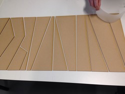
Day 3, Today we have come up with a story board and a sketchup model. The model has been exported to CAD file and is ready to be laser cut tomorrow.
Posted 19 May 2015 04:15
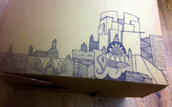
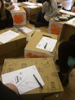
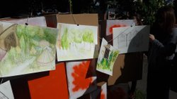
When preparing for our final exhibition we spent two days at the Spaceport, in the Northern quarter, decorating our cardboard boxes with patterns and sketches.
Posted 19 May 2015 04:13
We spent the fourth day deciding on how to display our sketches as a final exhibition. As a starting point we were given 25 plain cardboard boxes, along with string and orange and white paints. This limitation of materials forced us to be more creative and come up with innovative ways of displaying our work in order to maximise its aesthetic value.
Posted 19 May 2015 04:10
On our last sketching session the whole day was spent at Whitworth art gallery, where we were accompanied by the Manchester Urban sketchers. This was a good opportunity to network with people who are much more experienced in sketching and gain an insight into some of the techniques they have picked up over the years.
Posted 19 May 2015 03:57
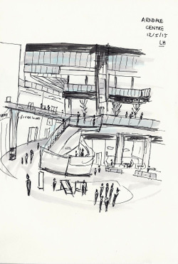
The second sketching session took place around the busy location of the Arndale centre. We were given short tasks in which we were allocated only a few seconds to sketch an element of our surroundings. This forced us to become efficient in sketching a moving environment quickly and accurately; preparing us well for the remainder of the day, which we spent sketching inside the busy shopping centre.
Posted 19 May 2015 03:55
During the second part of the first session we spent a few hours utilising the tips we had learnt from the event leaders, whilst sketching the central library and various buildings close by. In my sketch I tried to use the technique of maximising the imperfections by purposely avoiding the use of straight lines, as we were taught in out first tutorial.
Posted 19 May 2015 03:46
On our first session we were given a short induction which told us about the background of the sketchfest festival and its foundations in Malaysia. We were then given tutorials on the basic elements of sketching including; line, shape, shade and perspective. The drawing above shows my attempt at the first task set, whereby we had to draw the person in front of us without looking at or taking our pen off the paper. I feel like my blind drawing of the event leader was quite accurate. :)
Posted 19 May 2015 01:56
Day 3: On our final day sketching we were joined by the Manchester urban sketching group at the Whitworth art gallery. We added more sketches to our books ready for the exhibition and got advice from the urban sketchers.
Posted 19 May 2015 01:20
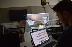
We got to experiment with the projectors on Monday after lunch.
Posted 19 May 2015 01:20
We presented our final ideas and went on to analyse possible sites.
Posted 19 May 2015 01:19
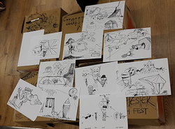
Day 5: Today we worked at the exhibition space in the Northern quarter. We continued to work on the exhibition boxes by covering them in sketches and doodles. We also participated in group sketch activities such as the 'sketch-jam' where we each added to a drawing then passed it on.
Posted 19 May 2015 01:12
Day 5 (Group 15 Tan Zhi Jie)
First time working in SpaceportX which is also our exhibition centre. Each of us is responsible to sketch on two sides of a box. We had a group sketching session which allows us to adapt and learn each other's sketching on a piece of paper.
Posted 19 May 2015 01:05
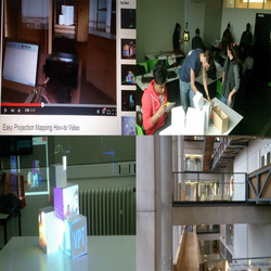
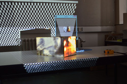
On Monday (18.05) we started with each group presenting our work so far. After we looked at more precedents our group finalized our idea as we decided to project different videos on each plane of a composition of boxes creating the effect of transgression. After watching some tutorials we built up the composition and started experimenting with the projector and the boxes projecting different videos. After we learnt how to use the software we started recording our own videos showing the movement in different spaces in Chatham.
Posted 19 May 2015 01:03
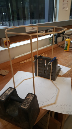
The "bird cage" design that we chose to house the artefact. Easy part nearly finished
Posted 19 May 2015 00:59
Day 4 ( Group 15 Tan Zhi Jie)
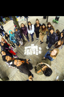
We went to St Clement Church to participate in the Chorlton Art Festival. It was a fun yet lively event. We took the opportunity to share our interest in sketching. We made use of those painted boxes for exhibition of our sketches.
Posted 19 May 2015 00:58
Construction of the bird cage begins. Finally starting the final prototype
Posted 19 May 2015 00:57
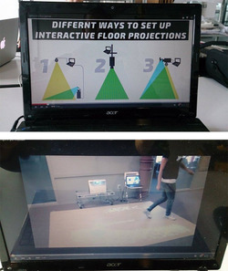
The third session on Friday (15.05) was drop in session. After having our tutorial with the coordinators we changed our idea and instead of projecting people`s footsteps and at the same time projecting live stream their actions for them and the people around to see and have fun we decided to make it more interacting by projecting a game that people would be able to play on the floor like a touch screen and at the same time still projecting their reactions.
Posted 19 May 2015 00:52
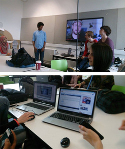
On Wednesday (13.05) all groups presented their ideas. As our group had a few we managed to narrow it down to 1 and after the presentations we continued working to develop our design.
Posted 19 May 2015 00:42
This is an image from one of the groups projector trial. Here we saw how the projector works and realised that there is so much you can do with this software. In a way this is a medium which can creatively convey the message or a project. Today seeing the a group testing their idea gave us the green light to how we can pursue our idea.
Posted 19 May 2015 00:32
After we made a presentation on how we could realise our proposal we decided to get together and collect our work to finalise it. This will then be used to project it on the chosen site.
Posted 19 May 2015 00:28
Day 2: Today we had our second sketching event in the busy Market Street area of Manchester. We were allocated a specific amount of time to complete the sketches and learnt how to sketch effectively in a busy environment.
Posted 19 May 2015 00:23
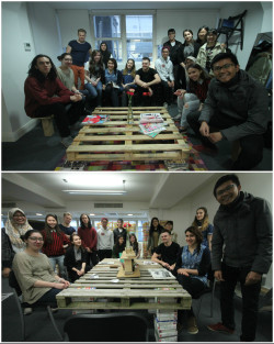
The Borrowers Team group photos
Posted 19 May 2015 00:22
Won't be able to achieve these without the help and commitment from 1st and 2nd year students. They are absolutely amazing people and have done fantastic job. I hope they enjoy this event as much as I do.
Posted 19 May 2015 00:08
Adding the last touches and creating a warm and comfortable atmosphere by accessorising the space appropriately to the need of the work space. We really enjoyed this project and actually learnt new ways of making ourselves comfortable.
Posted 19 May 2015 00:06
