// FINAL PUBLICATION
The 'Cultural Spaces and Homelessness Design Handbook' is the final output of our two week event. This is primarily an online document and will be published on the With One Voice website as a design guide for inclusive cultural spaces, both existing and new.
Posted 7 May 2019 11:53
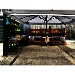
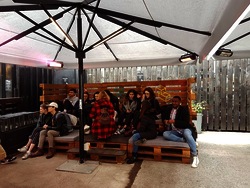
Up-to-date use of our seating area
Posted 7 May 2019 11:25
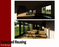
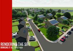
A final interior visualisation produced by the detached housing group captures the quality of space in the design. The students explored these qualities using the Lumion visualisation software. Considerations were made for materials customisation, daylighting, and framing the overall perspective for the image where it helped them to understand how to express the mood of a space.
Posted 7 May 2019 10:27
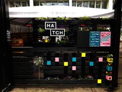
Living wall is finished on time and looks better than expected. We experienced a few setbacks along the way in terms of planting, painting and fixing but the final result is more than pleasing.
Posted 7 May 2019 09:45
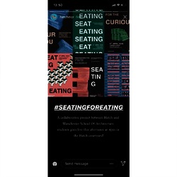
The launch of the event #seatingforeating was extremely successful as both tutors and students from MSA enjoyed the final output.
Posted 7 May 2019 09:43
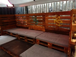
The seating installation is all ready and set to be put in use.
Posted 7 May 2019 09:41
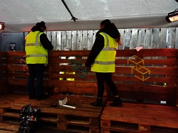
Construction team doing final touches before the launch of the event.
Posted 7 May 2019 09:41
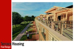
The Terrace housing group have designed homes using SIPS panelling this provides a highly insulated and airtight external shell that is highly efficient, the use of SIPS also speeds up the construction process due to the modular nature. There was a keen focus on the social aspects of the design allowing for individual privacy while promoting the interactions between neighbours.
Posted 7 May 2019 09:33
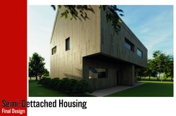
The Semi-Detached Team has utilised a portal frame structure to provide the maximum building efficiency with minimal material usage. The materials have been chosen with a focus on reducing embodied carbon, the timber cladding for instance is milled on site from trees cleared during construction. These factors have led to the design of a highly sustainable home.
Posted 7 May 2019 09:28
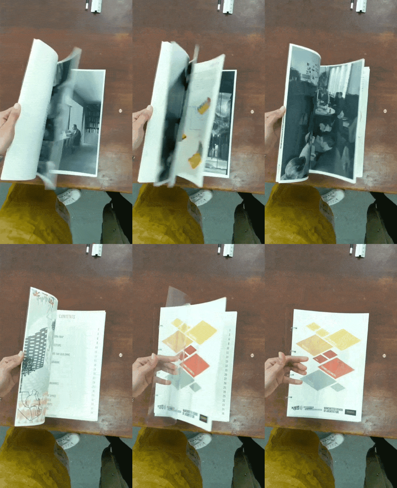
THE PUBLICATION: PAGE TWO
And here's page two!
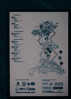
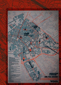
Side B features an axonometric resource showing locations that provide services to those living on the streets, such as free haircuts, food and coffees.
Special mentions also went to businesses working with charities and organisations that help the homeless.
Posted 6 May 2019 23:21
Official Hatch page on Instagram promoted the launch of our event.
Posted 6 May 2019 17:26
Graphics and Marketing team created a social media page to update the process of the design and construction.
Posted 6 May 2019 17:25
Friday 05/04/2019
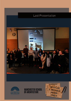
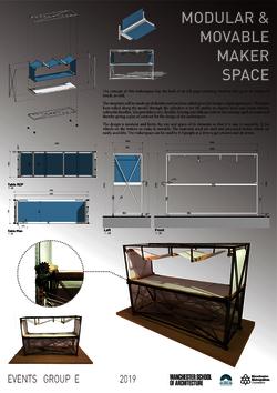
On our Last presentation with Janneke, We presented to the special collections team, our final output in the form of one 1:10 detailed scale model of the final scale model, 2 posters showing the final idea we went with and an alternative idea, along with a drawing package for both ideas
Posted 6 May 2019 13:18
Friday 05/04/2019
10:00
We had our final presentation with our client Janneke Geene, where Team A explained the Final design development. A drawing package was generated for the concept and was handed over to Janneke. We also created a poster, as seen above, presenting the idea, final design, details and pictures of the model. This can be further used as a brief for presenting it to prospective contractors.
Posted 6 May 2019 13:12
Thursday 04/04/2019
The final model of the primary design (Group A) was finalized on Thursday, just in time for the final presentation to the collaborators on Friday.
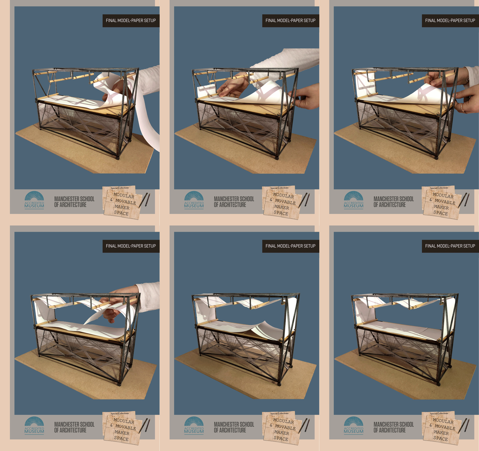
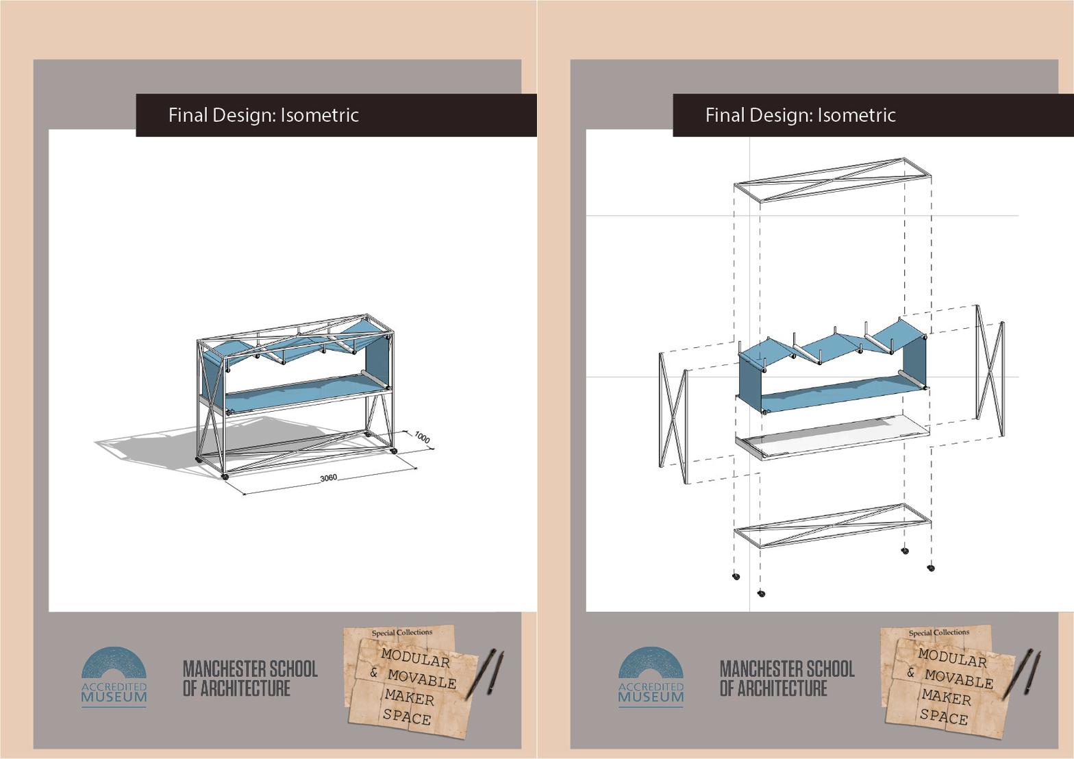
This GIF represents the process the Special Collections Team would need to go through when setting up the paper on the Maker Space. This process would happen every cycle of the exhibition, and the authorized personnel can remove the used paper, and insert a fresh strip in this process.
The mechanism of this Maker Space is done in such a way, that it is receptive of the paper in a convenient manner. Once the paper is passed over and under the pulleys, the two edges of the strip can be glued together while resting on the table top.
Posted 6 May 2019 13:07
Friday 06/04/2019
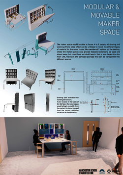
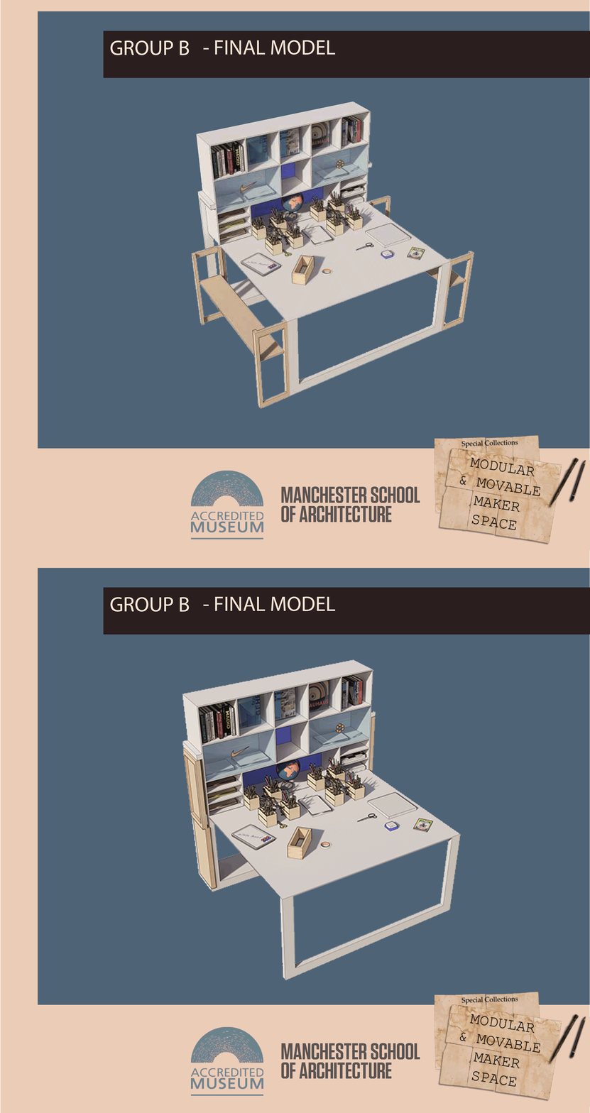
This is a poster designed for the special collections, detailing out group B's final outcome for Janneke to present in her networking meetings, showing the concept of this idea.
This poster contains a drawing package, a sketch model, and final renders of the modular maker being used on-site.
Posted 6 May 2019 12:36
Wednesday 03/04/2019
GROUP B: Final Isometric of the secondary design
The above post is the final model of Group B which is our secondary option. Their concept was to have a Maker Space ,which is compact and holds foldable seating.
The width of the Maker Space is 3500MM and the height is 2100MM. It can be easily moved into the lift as well as different spaces.When the maker space is unfolded , it can accommodate 4-5 people.
Posted 6 May 2019 12:19
Thursday 05/04/2019
Group A: FINAL DESIGN
Isometric and Exploded Isometric
Posted 6 May 2019 12:00
THE PUBLICATION: PAGE ONE
If you haven't seen it around the city centre already, here's the final product!
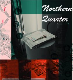
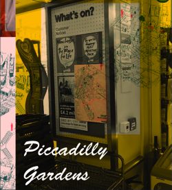
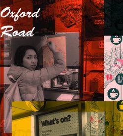
Side A features a map of our three research sites, highlighting charities and organisations who help the homeless.
Posted 6 May 2019 01:00
We must make a difference, but first, we must make people aware. Because together, we can make a bigger difference.
#MAKEADIFFERENCE #AREYOUAWARE #WOAH
Posted 5 May 2019 19:00
A quick recap to the success of our launch day! Friday 5th of April - The ARE YOUR AWARE distribution day, where the team distributed 300 publications to our 3 sites, aiming at businesses and organisations, raising awareness and grabbing public's interest in the purpose of our event. Keep an eye out and make sure to show your support for these businesses around these popular sites in Manchester, to encourage more business and local firms to get involved in helping the community Without A Home. #WOAH #AREYOURAWARE #MSA
Posted 5 May 2019 18:59
A quick recap to the success of our launch day! Friday 5th of April - The ARE YOUR AWARE distribution day, where the team distributed 300 publications to our 3 sites, aiming at businesses and organisations, raising awareness and grabbing public's interest in the purpose of our event. Keep an eye out and make sure to show your support for these businesses around these popular sites in Manchester, to encourage more business and local firms to get involved in helping the community Without A Home. #WOAH #AREYOURAWARE #MSA
Posted 5 May 2019 18:58

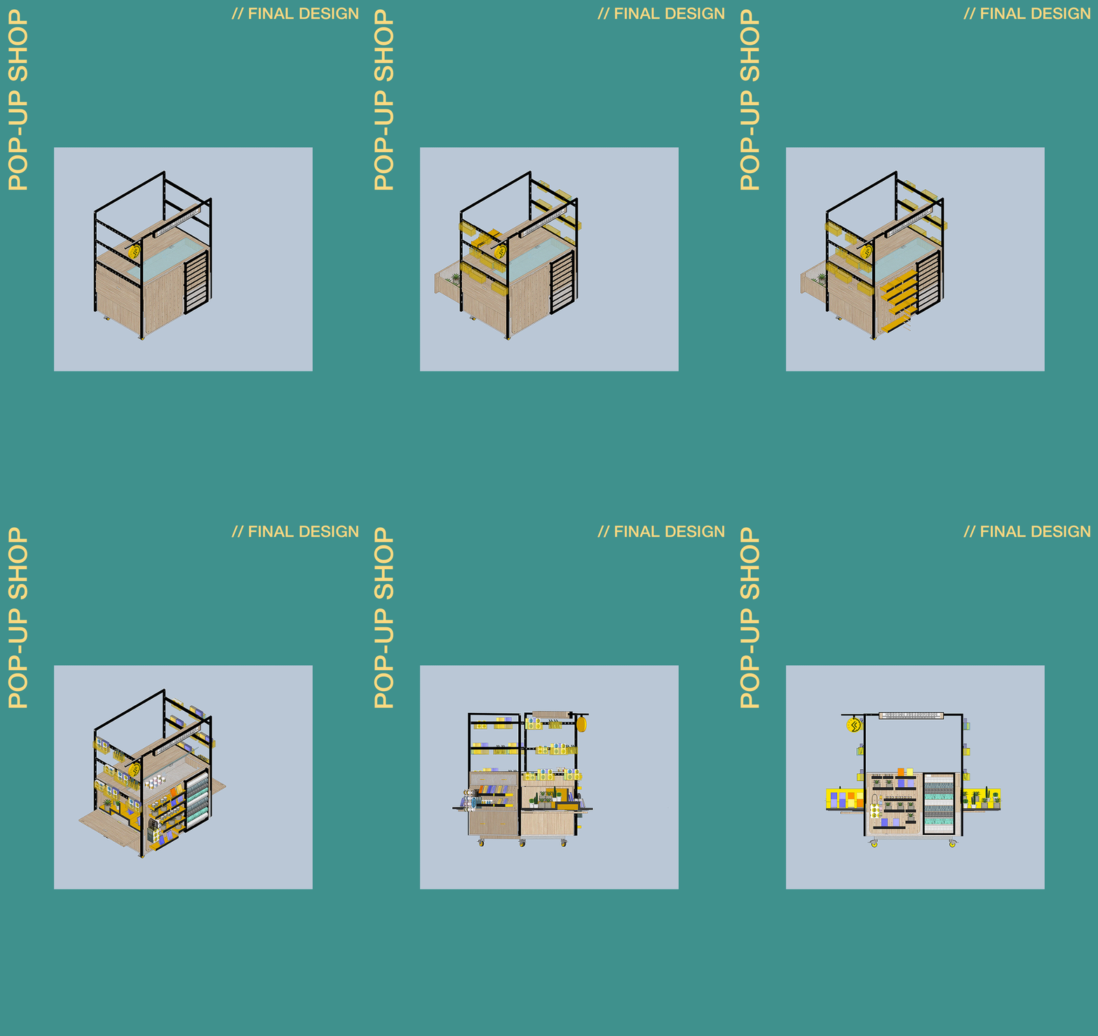
//DAY 10//FINAL PROPOSAL
As team leaders, we were incredibly impressed with the quality of the Pop-Up shop and the innovation that the undergraduates used in designing each of the components combining to make the final product. We would like to take the opportunity to thank all of our undergraduate students for offering their time and creative skills for the two weeks.
We hope during their time that they learned some new valuable skills in the design process. We aimed to create a project that closely reflected life in practice giving them a chance to meet with the client, brainstorm their designs, utilise sketch/computer-based mediums and develop time management. All of the students showed an aptitude in all of these areas and the output reflects this in the shops’ creative storage and display resolutions. It is also apparent in how tangible the approach is considering the fixtures and fittings that must be used to make the different functions a reality.
We would also like to thank our collaborator and client Janneke Geene for providing the brief. She has made the process a joy to be a part of showing a passion for all of the ideas for all of the special collections Events. Her presence at the presentations at key points in the development has been crucial not only for the students, to raise questions they have on the project, but also for the schemes sharing her preference towards varying design ideas. She has shaped the final product through her input and allowed us to produce something that can be realistically used by the special collections.
Thank you, everyone, involved in Group K from, Constantina Alambriti, Justin Chung, Carmen Maxim, Daria Pavlova, and Ethan Schofield.
Posted 5 May 2019 17:10
This is the construction sequence of our final design proposal. As can be seen, the design is made up of a complex range of wooden components which all attach in various ways. Throughout the design project, all the undergrad students took it upon themselves (with some assistance from the masters team) to figure out some of the joints and connection points. With the use of sketching, detailing and model making, the students were able to finally produced a well thought out design proposal as reflected above.
Posted 4 May 2019 23:23
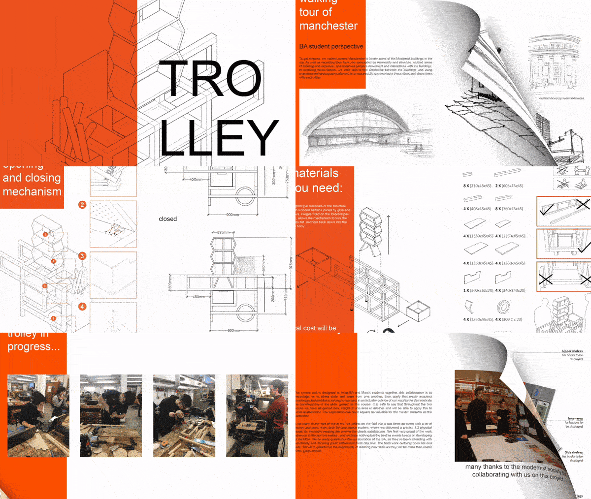
As the project slowly comes to a close, this post gives insight into our publication in highlighting some of our best work. With consideration to the amount of work done by myself and my fellow Trollfesters, the publication offers details about the project and insight into our design process. This includes drawings from the introductory workshop we did on hand-drawing, AutoCAD and SketchUp details of our proposal, and photographs of the models made by the undergrad team.
Posted 4 May 2019 23:15
// PROPOSED NETWORK OF INCLUSIVE CULTURAL SPACES
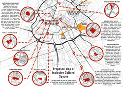
This map locates cultural spaces that have the potential to welcome people who are or have been homeless and can be a valuable source of information for those seeking temporary shelter. The development of this network is also a means to ensure that gradually, all such spaces are designed/modified to be more inclusive.
Posted 4 May 2019 18:33
GHS // AFTER EVENT
GOOD NEWS FROM GHS!
Last Friday we received good news from Caroline that Gorse Hill Studio had been successfully funded on the redevelopment of studios! Hurrah!
Posted 30 Apr 2019 16:06
The Friday afternoon was spent presenting to our collaborators from CCHG. The teams have come an immense distance in just 2 weeks. This group project format, working under short timescales, replicates a practice environment. The students have managed to pull together a very articulate and well represented scheme using their new software skills and in depth research to produce annotated sections and details. They've also communicated it to CCHG in an impressively descriptive manner with a lot of reference to their design iterations. The detached group, for example, managed to rapidly produce 4 different options with various perks and draw backs, all modelled and assessed.
Posted 24 Apr 2019 09:38
//The Exhibition
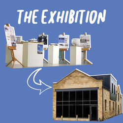
Now that Events week is over, the next move for the exhibition is to travel up to the garage in Brierfield. In-Situ are currently commissioning for a mobile hut to be built and as part of this project, they are hosting an exhibition weekend at their garage which invites the local residents in.
Our exhibition will also be on show which allows the public to view it and hopefully provokes ideas of their own, continuing and pushing thoughts on the concepts for the gasometer.
Posted 20 Apr 2019 14:00

Northlight // Day 10
//The Exhibition
Sadly, it’s the end of Events. All the groups brought together their proposals in an exhibition in the popular Benzie atrium. This is a space constantly filled will life of students, creatives and the general public; therefore, it was the perfect space to show case the future ambitions for Brierfield Gas Tower.
The gas tower model was positioned central to the atrium with each of the proposals following to show the progression of scheme sizes. Each proposal stood proud on an individual plinth so that each one could be viewed from a range of angles. Presentation boards were placed behind each model so that visitors could understand the scheme.
The exhibition had a positive outcome! Visitors to the Benzie stopped by the exhibition with curiosity to ask questions about the project, this was great publicity for Brierfield and the great work In-Situ do! We heard some great feedback which we repeated back to Paul from In-Situ. Next the exhibition will move on to Brierfield to see what the opinions of the local residents are.
Posted 14 Apr 2019 22:05
The Finished Masterplan
Our finished masterplan, working on the base material given to us by our collaborators, has been populated with the models that the typology groups designed. Suggestions for changes to the masterplan were made and were taken into consideration when looking at the optimal layout for the site. The semi-detached group wanted to orientate their houses in a way that the main rooms were south facing, whilst still maintaining the least number of roads. The detached group changed the orientation of their building to increase privacy as well as natural light penetration. The terraced group wanted to make it so that the communal space in between each row was accessible by each house through their own private space.
Posted 10 Apr 2019 14:45
Northlight // Day 9
//Macro
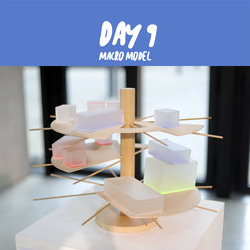
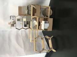
The Macro group have finished their modular concept model today. By stacking acrylic boxes on top of the timber levels, which rest on timber dowels that are supported between the core and the gas towers steel frame. This concept allows the gas tower to have many uses over a series of staggered levels.
Posted 10 Apr 2019 10:26
Northlight // Day 9
//Meso
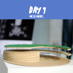
The Meso group have finished constructing their conceptual model of a theatre space with MDF and metal rods. The green roof represents the ground floor public space and the scalloped steps represent the reading area. This scheme allows the gas tower to become an entertainment space for the public to enjoy.
Posted 10 Apr 2019 10:25
Northlight // Day 9
//Micro
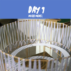
Today the micro group finished the concept model. By winding ribbon and colourful string around the wooden frame constructed from timber dowels and coffee stirrers, they produced their model. The concept for this scheme was to create a facade that could become interactive when activated with light, create a ramp walkway with platforms that allow views out over Pendel and create a multi-use public space at ground floor level.
Posted 10 Apr 2019 10:24
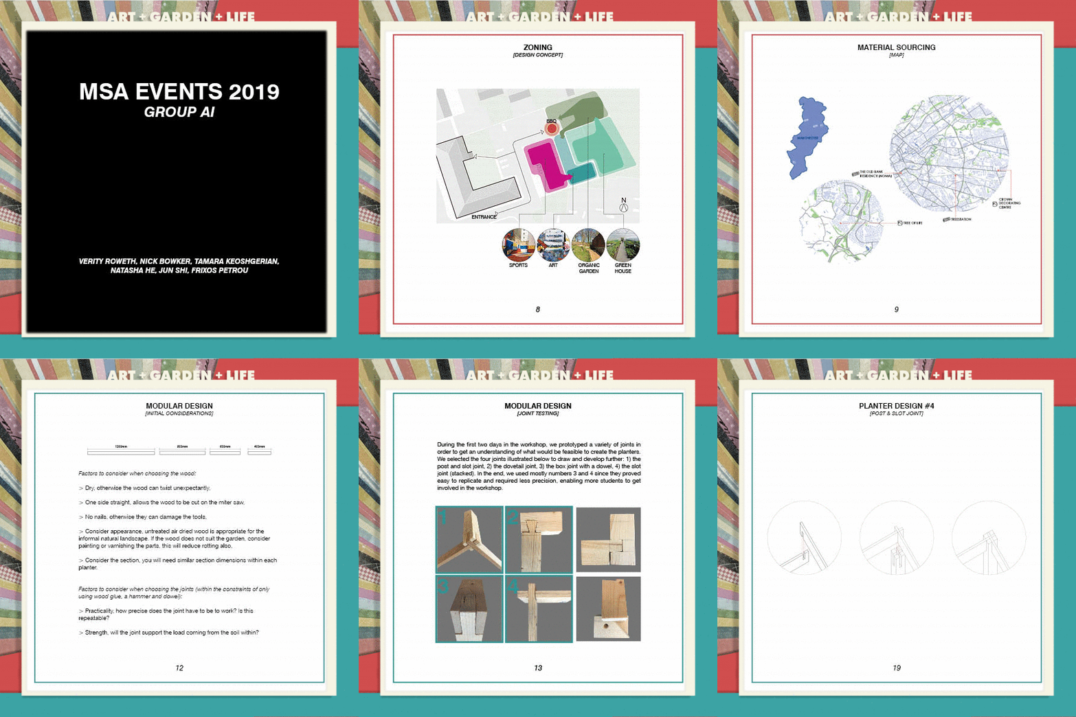
DAY 10: PUBLICATION COMPLETE
On our last morning we finished setting up our publication, one of the final outputs that will be marked. This will be printed and bound at a later date.
Posted 9 Apr 2019 21:15
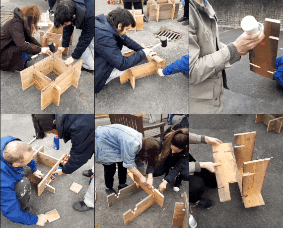
DAY 10: PLANTER ASSEMBLY
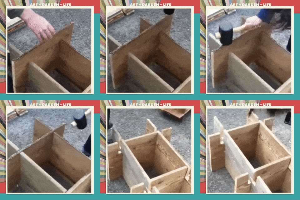
A short clip demonstrating the knockdown joints that do not require nails or screws, allowing easy and collaboratively fun assembly on site rather than just transporting a finished object from the workshop.
Posted 9 Apr 2019 21:08
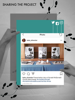
Instagram posts about the final output of this project was shared to the public through social media outlets and word of mouth. The main aim of this event is to create awareness and public understanding regarding the importance and significance of the Ronald McDonald House Charities. The amazing work the charity participates in deserves to be shared. Every students participated in this event REFLECT were encouraged to spread the awareness to people around them.
Posted 9 Apr 2019 15:18
Many thanks to Ronald McDonald House Manchester for your input and support throughout the event's project. The feedback from the users has been vital to the progression of our project.
Thanks to Alex and Emma for your involvement in REFLECT. Without such participation, this bespoke events group would not have come about.
Finally, thank you to all of the undergraduate students for your excellent contribution over the past two weeks! We hope you've enjoyed it as much as we have!
Posted 9 Apr 2019 15:00

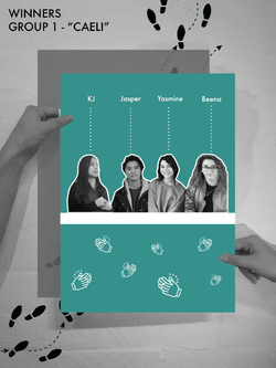
Congratulations to Group CAELI: KJ, Beena, Jasper & Yasmine!
The collaborators along with Alex and Emma from AEW architects came to the conclusion that group 1 should be the winning scheme. However, all of the projects were to an excellent standard! Well done events group, REFLECT!
The winning concept:
The design prioritises its users, hence, careful consideration was integrated into the design process.
Sunlight, sound and privacy were the first factors studied which later branched into secondary uses of the decided installations.
The terrace required shaded and unshaded spaces where its users can choose where they wished to be. The shaded areas are required where medical conditions prevent direct exposure to sunlight while the unshaded are for other users wish to bask in the sun when possible.
Overall, the canopy designed is a dynamic form which varies in height and space; an airy and lightweight space is created, allowing a relaxed ambience to seep into the user. The trellis will support creeper and tendril plants, hence shadows form will sway to create a whimsical play to entertain thoughts.
To break up sound from entering the terrace, a green wall is placed, street-side, where a concrete wall exists; the growing wall will provide privacy from the street and houses that may be able to peer into the space. Additionally, the green wall can provide cleaner air and a natural touch to the harsh, concrete context. It is also planned in a way where the residents can place their favourite plants on the rack and raise them.
An enclosed space at the end is designed as a semi-private area of the terrace. Movie nights could be set up or used as a meditative space.
By the balustrades, picnic tables are placed for the parents to have their morning coffee and breakfasts. The view towards the inner garden is clear, hence the children can also be observed from the terrace.
Posted 9 Apr 2019 14:53
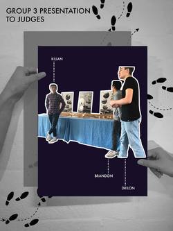
Group 3: ARCHI-POD
Group 3 presented their work in a clear and professional manner. As part of the final design, the group focused on different user experiences.
Following the draft presentation, the group improved the discussion to explain each type of pod and its dedicated user group.
The projects focus on each individual user was praised by the collaborator at Ronald McDonald House. A discussion was initiated on how to provide different user functions if the project were to progress.
Posted 9 Apr 2019 14:51
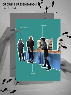
Group 2: RE-FOLD
The final presentation for group 2 received great feedback from the collaborators and their peers. The development from the first week through to the final presentation was conveyed well through the model and final poster.
Following the draft presentation conducted on day 9, the group improved their presentation to include a detailed explanation as to how their project developed from the initial presentation to AEW architects on day 5.
The development of the project was discussed at length between the collaborators in the post crit discussion. This displayed to the students the importance of documenting the progression of a design project.
Posted 9 Apr 2019 14:50
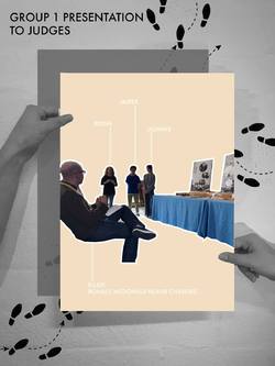
Group 1: CAELI
Group 1 presented their work to the panel of judges invited to represent Ronald McDonald Charity House and AEW Architects.
The students each took an allocated time to present their group idea to the panel of judges in a systematic and well composed way. They started by talking about initial ideas, research development, precedent inspiration, feedback from previous presentation, choice of materiality and final concept. They also answered questions regarding their design confidently to the panel of judges.
Posted 9 Apr 2019 14:45
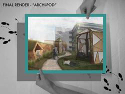
ARCHI-POD
Final render demonstrating the overall mood and atmosphere created by the roof terrace design. Besides that, render also show the relationship between the proposed design with the charity house and how users could interact with the space.
The pods were furthur developed in terms of materiality and opening size. Semi transparent materials were integrated into the overall design of the pods to control the privacy value of each pods. Grasslands were also proposed to be placed around the pods to soften the overall design and provide picnic areas for the users.
Posted 9 Apr 2019 14:43
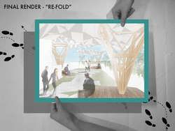
RE-FOLD.
Poster demonstrating the final render of rood terrace proposal where different lightweight papermetrics structures positioned around the site to create semi open space for the users. The render also showed the overall mood and atmosphere of the space generated from the design installation. Different size of seating treatment were also designed at the bottom of each 'tree' to create a nice environment for the users to relax.
The geometrical pattern along the pavement which was generated from the pattern of the roof structure also produced a nice and subtle circulation path along the site.
Posted 9 Apr 2019 14:42
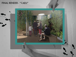
CAELI
Final Render of Group 1's project CAELI. The render displayed the area of the design where it is more enclosed with high privacy value. This is also a convertible space that could be used as a weekend outdoor theater space during the summer.
Render also demonstrated the proposed furniture design of the space and how users could interact with the space created in relation to the type of planting chosen by the designers. As seen in the render, small trees and trellis were chosen to create a more enclosed atmosphere for the area so that the users would have a space to reflect and get their mind off from the hospital setting.
Posted 9 Apr 2019 14:42
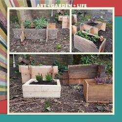
DAY 10: FINAL PLANTERS
Additional planters on the site.
Group AI looked at the final output and felt that their work was successful and was able to complement the site, as well as providing framed/ designated zones across the garden. One resident said he was grateful that our work has provided him a starting point to develop their garden plans using our Masterplan.
Posted 9 Apr 2019 13:40
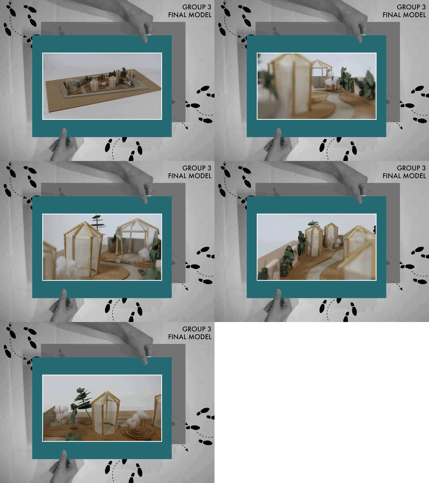
Finally, here is group 3's final model. They did a great job on it, we love it!
Group 3 used different textiles and materials to experiment with the privacy and envelope opacity of the pods. It was difficult to transcribe this exactly into a model with limited materials and time, however the students did a great job using three different materials including net and linen.
The structure was created using timber structures, and the terrace flooring was represented using a flexible cork sheet. We also loved the way the group used foam for plants!
Posted 9 Apr 2019 13:29

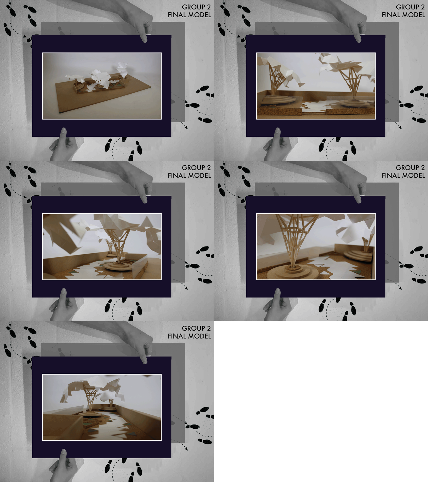
Next, we have Group 2's re-fold model! Group 2 responded really well to AEW feedback in events week one, and this is reflected through their model.
Group 2 created delicate structural columns which hold the sheltering canopy. We loved the simplicity of their model, allowing the beautiful geometrical shapes of the column, canopy and flooring to have an impact.
Wooden sticks were used to represent the timber columns. They were carefully glued together to create the strong structure required. Proto paper was used to create the folding canopy, and again on the ground for the path so that the geometric pattern was repeated. A quick visit to the workshop allowed the students to quickly cut out the circular seating from a MDF sheet.
We did have some issues with getting the structures to stay up, with one taking a bashing from the wind. This taught the students how the structure of a model is just as important. If it can't stay up in a model, it probably wouldn't on site! We were able to fix this and create a great technical model.
Posted 9 Apr 2019 13:10
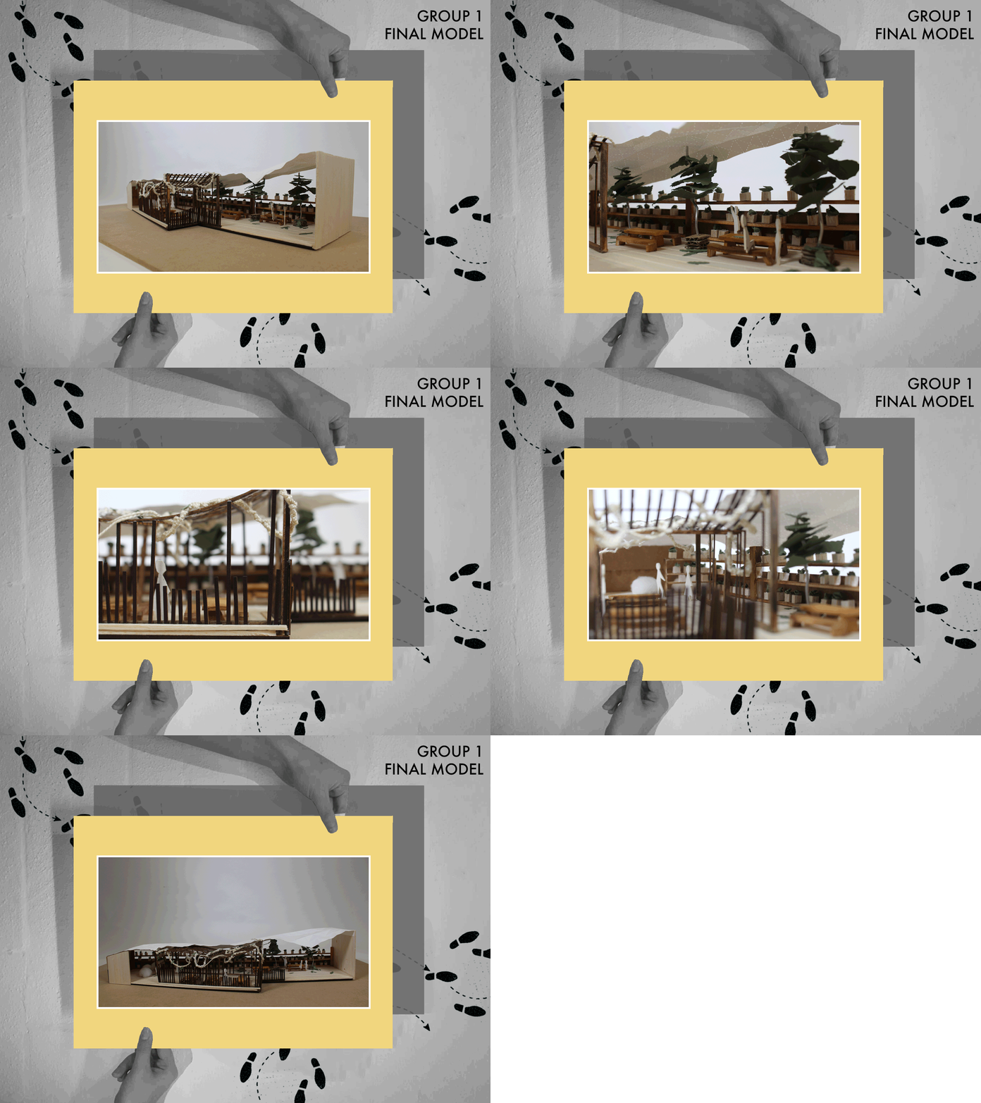
Here's a quick GIF of our Group 1's final model! We're so proud of what they achieved over events. They did a great job developing their concept through to a feasible design.
We particularly loved the way they created different spaces to respond to the resident feedback, for example the covered seating areas as well more open areas for the summer months.
Group 1 created the main structure using a laser cutter. Each beam was carefully glued together. Balsa wood was used for the furniture elements; the tables, benches and plant shelves. A piece of proto paper was used to create the curving canopy impact.
The detail the students went to was really impressive, they even included fallen leaves on the floor and plant pots.
Well done Group 1! You worked really hard and created a beautiful presentation model.
Posted 9 Apr 2019 13:01
After an informal chat with Eddy, from the Modernist Society, we discussed the process of building the 1:2 model and handed over a completed publication that documented this process. We brought along the finished trolley and discussed the aspects of design that require further consideration before a 1:1 scale model would be made.
Posted 8 Apr 2019 18:30
A trolley of Trolleys!
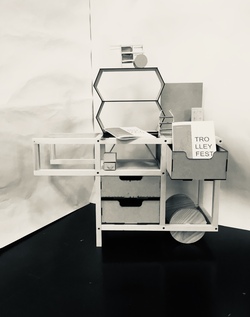
The finished 1:2 scale model, carrying some of the test models used to push forward the design and solve problems.
Posted 8 Apr 2019 18:26
Well done and thank you, to all the BA students for their continued hard work and dedication to Trolleyfest during Events19!
The complete 1:2 scale model is group three's design, chosen by the Modernist Society to pursue as the final product.
Posted 8 Apr 2019 18:21

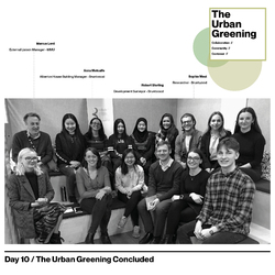
The Urban Greening // Day 10 End of Events Conclusion
And so, week two of events come to an end and with it the presentation to our collaborators, which we have been researching and working up to.
Apart from Simon Bushell and Robert Sterling, Sophie West and Anna Metcalfe from Bruntwood as well as Marcus Lord from MMU who has been helping us to co-ordinate this event also joined in our conversation
Sophie West is currently researching into implementing biolphilic and sustainable interventions into other Bruntwood properties across the UK. She was interested in the proposals we presented, asked many questions on various aspects in the design so that hopefully some parts of them may be implemented into real-life projects across the UK. This was the exact intention of Group AA’s brief and we were happy that we could share the knowledge and design skills gained from these past two weeks on Urban Greening with others, and with that promote biophilia as a way of creating more engaging and healthier urban spaces.
Anna Metcalfe who is the building manager for Alberton House (our case study site), was particularly useful in providing feedback on other aspects of the building which may have been missed out in our proposals. As for some of the students this was the first time presenting a project to a real-life ‘client’, we hope that it was a valuable experience for you as designers, which you can continue to implement thought your careers.
We have now shared our work with Bruntwood and look forward to the article that Simon is going to put together and distribute though Bruntwood’s social media. In this way the promotion of Urban Greening will be made available to an even wider audience.
Thank you to all our collaborators and all involved for making this event possible, and engaging in the conversations on the importance of implementing greenery into the urban fabric.
And finally thank you to all of our undergraduate students, for all your hard work, engagement and great design ideas. We hope that these two weeks have been useful for you.
Posted 8 Apr 2019 14:49
DAY 10: GROUP PHOTO
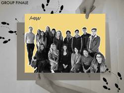
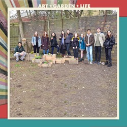
Group AI Master's would like to thank all the undergraduates, collaborators and residents, suppliers and donators that have been a part of our project and helped it become realised! It was great to see and be involved with people who were kind enough to provide us with materials and donations necessary to support Victoria House.
Posted 8 Apr 2019 14:13
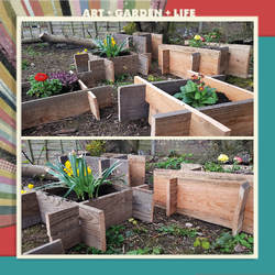
DAY 10: FINAL PLANTERS
Group AI and the residents of Victoria House are happy to show that these are the final planters provided for the site. A few residents said they felt proud of their new garden and were excited to start looking after their space. They said it has really made a difference as well as now creating a relaxing setting where they can place seating around and enjoy the views.
Posted 8 Apr 2019 14:10
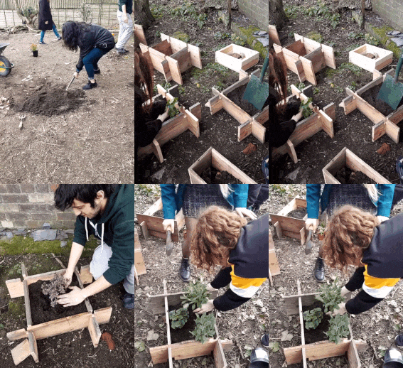
DAY 10: PLANTING
To finish the activity, Group AI were happy to see the residents and staff taking part in filling each of the planters with soil, digging holes and planting the plants. A dirty task but very enjoyable that brought all residents and students together, in a collaborative activity that provided them with a sense of shared experience.
Posted 8 Apr 2019 13:49
DAY 10: PREPARING TO PLANT
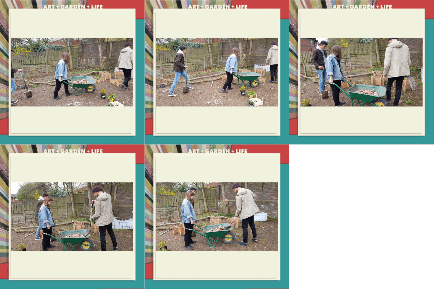
Before planting, we filled each of the bases of the planters with gravel to allow for suitable drainage.
Posted 8 Apr 2019 13:45
DAY 10: PLANTER LOCATION ALLOCATIONS
Once the planters were covered with a waterproof varnish and dried (to avoid the wood rotting), we placed the planters in their allocated locations based on our masterplan design. Some planters were stacked, others on one level to show a variation of levels.
In the design, spaces were left on corners with cut joints to allow for future additions by Victoria House.
Posted 8 Apr 2019 13:25
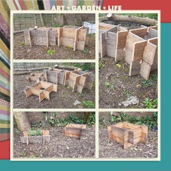
DAY 10: ON SITE ASSEMBLY
After delivering our kit of parts to site, we were welcomed by Victoria House who were excited to see our output. We were lucky to have a few residents gather round and take part in assembling the planters using our provided instruction manual. They found it easy to follow and were able to assemble a planter individually.
Using the wood glue, we applied it to the corner edges before sliding the pieces together and knocking them down using the rubber hammer.
Posted 8 Apr 2019 13:01

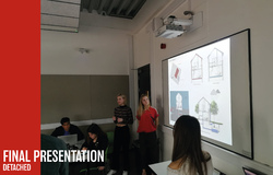
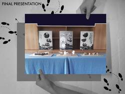
FINAL PRESENTATION
All 3 groups presented at the Ronald McDonald House Charities, Manchester in the board room situated below the terrace.
The groups had one model and one poster each and took it in turns to present to Alex and Emma from AEW and Elliot who works at the Ronald McDonald House.
The 5th years introduced the project to the judging panel to recap them about the brief and introduced each group. All 3 groups had prepared a 5 minute presentation where they spoke clearly and concisely about their proposals.
Each presentation was followed by feedback from the judging panel and comments from the rest of the group. The judges were also asked if they were to take each of the proposals further, what would they look for next from the group.
The afternoon exposed the BA students to presenting to a client and gave them valuable insight to Stage 2 in a real-life project, allowing them to assess what they would have to do next.
After a difficult decision, the judges decided on a winning team, although it was a very close call. Group 1 - Caeli was the winning team and all received Easter eggs as a prize.
The 5th years also gave the collaborators Easter eggs as a thank you for working with us and gave the rest of the group cream eggs as a thank you and a well done.
AEW were asked if they would take part in 'Events' again and they said they definitely would if asked, noting that they thoroughly enjoyed the experience.
The presentation acted as an excellent way to finish the 2 weeks.
Posted 8 Apr 2019 10:56
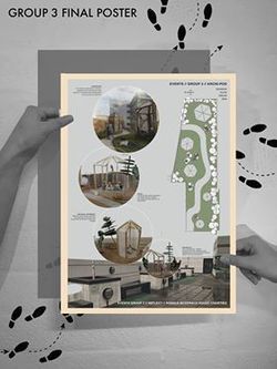
GROUP 3 - FINAL POSTER
Group 3's final poster indicates their final proposed plan of the roof terrace. The series of collages on the poster also demonstrates the type of spaces created by the proposed design of the team.
Pods of different sizes will be placed at different part of the site where the entrance point for each pods were carefully calculated to improve privacy as well as create mini private gardens at different area of the terrace. The difference in pod sizes also provided opportunity for different activities to take place within each of the pods. For example, the larger pods will be used for BBQ and team bonding activities while the small pods can be used for meditation.
Besides that, the pictures also reflected the type of materiality as well as atmospheric pressure created by the proposed design. The whole terrace will provide an opportunity for the users to reflect upon themselves and get their mind off the hospital surrounding.
Posted 8 Apr 2019 10:06
Northlight // Day 8
//Site Analysis
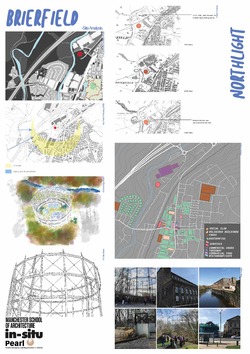
The site analysis which was undertaken in the first couple of days and whilst at Brierfield was correlated and laid out onto an A1 presentation board to give the exhibition some context of the surrounding area.
This analysis included site plans one of which highlighting sun path and prevailing winds and another showing the building typologies in the surround area, historic maps showing how the area has changed over time, photos of the Gas Tower and the surrounding area and some sketches of the Gas Tower, one done from the drone footage and one done whilst at the bottom of the Gas Tower.
Posted 7 Apr 2019 23:10
Northlight // Day 8
//Micro
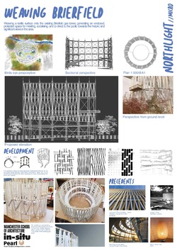
The micro scale group, Weaving Brierfield, used mainly an elevation and photos of their intricately woven model to show how their second skin façade would wrap around the gas tower and also highlighting the viewing platforms on the outside, showing how they would be accessed through the internal ramp.
A selection of sketches and development models show how they have experimented with different weaving methods for the outer skin. The schemes precedents which are La Licorne Office Building by Peripheriques Marin+Trottin Architects, Penguin Pool by Berthold Lubetkin, Reichstag Dome by Norman Foster + Paul Wallot and Ikea’s Boja Table Lamp are also shown on the board.
Posted 7 Apr 2019 22:49
Northlight // Day 8
//Meso
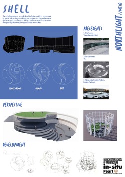
The meso scale group, The Shell, used a selection of perspective renders and drawings to show how the performance space is framed by upper floors which wrap around and form the stepped seating. The labelled pans show how the spaces work and how the whole proposal flows from space to space.
A selection of sketches done whilst at Brierfield in the Garage show where the idea came from and has been developed from. The schemes precedents which are The Scoop by Townshed Architects, Panda House by BIG and The Steve Jobs Theatre Pavilion by Foster + Partners are also shown on the board.
Posted 7 Apr 2019 22:46
Northlight // Day 8
Today the groups finalised their drawings and compiled them onto A1 presentation boards which will be used in the exhibition to convey the scheme a long with each group’s model.
//Macro
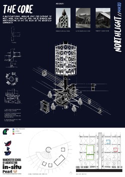
The macro scale group, The Core, utilised a hand drawn exploded axonometric drawing which showed how the different modules would interact with the surrounding structure and the gas tower. Their section also shows the use of different levels and different types of modules connected with the lift core and the spiral stair.
Design development is shown through the development sketches and the schemes precedent studies which were the Nakagin Capsule tower, the Alpine Viewing Platform and a Treetop Holiday Home.
Posted 7 Apr 2019 22:45

Week 2 – concluded
Week 2 has come to an end and so has events. This week was a very intense and productive week with a lot of blood, sweat and tears mainly due to Jim's laptop dying, however, progress was made, and the film was completed. Both teams came together to work on the Film to make sure that 100% of the possible work effort could be directed towards the final outcome. The 1st and 2nd years gave their all to make sure that the tasks they had been working on were completed before Thursday's test screening at the Cornerhouse theatre.
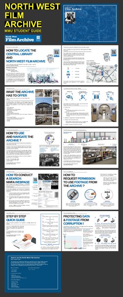
The MMU Student booklet on how to use the North West Film Archive was near completion and had been sent to our collaborator Geoff Senior for final comments. The comments and feedback received were beneficial in providing more in-depth input into the guide before being finalised.
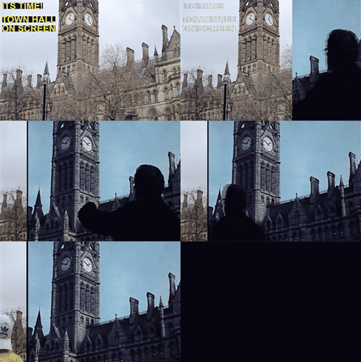
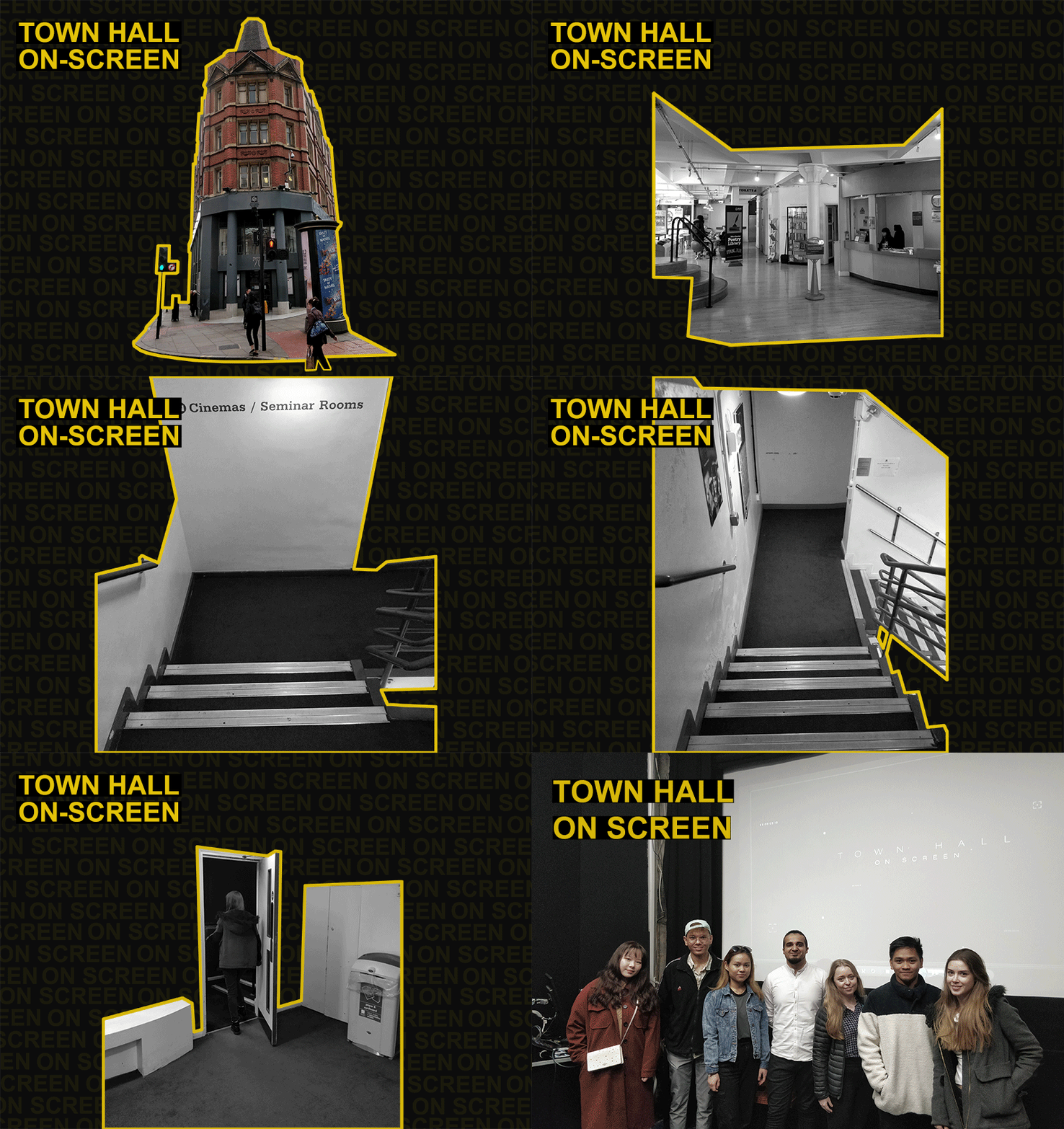
With everything completed, it was finally time for the debut of Manchester Town Hall: On Screen. This couldn’t have happened without everyone’s help and valuable effort over the past two weeks. The premiere was a massive success with both the public and our collaborator enjoying the final outcome. In the end, the premiere concluded without a single problem, and we even got to enjoy the film with popcorn.
Posted 7 Apr 2019 22:25
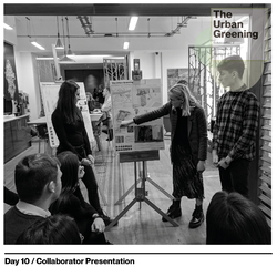
The Urban Greening // Day 10 Collaborator Review
The final day for the events week saw each group present the final design to a panel of Bruntwood representatives. The purpose of the task was to showcase the hard work the groups had done throughout the two weeks and receive feedback on the designs of the proposals.
We started with a brief introduction of the project and included our approach to the brief. Then each group stood and presented the parameters of each design while showing a large consideration for biophilic design, which was the focus for each design iteration. Following each group, we then opened the floor for discussion, to which each representative offered their thoughts and opinions on the proposal.
The event was very successful, each of the students was involved in discussing the design and found it very engaging in discussing with the clients. All in all a very successful event.
Posted 7 Apr 2019 22:15
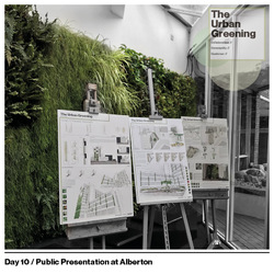
The Urban Greening // Day 10 Public Presentation at Alberton House
The final day of events started by firstly setting up our three presentation boards in the reception area of Alberton House. This enabled us to interact with the users of Alberton House and answer any questions they may have about the three design proposals.
We also left a triptych leaflet of the design proposals at the reception of Alberton House for additional information.
Posted 7 Apr 2019 18:17
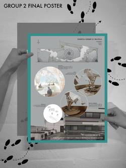
GROUP 2 - FINAL POSTER
The poster layouts work as a series of the 3 teams together showcasing the different proposals of the terrace re-design.
Group 2's poster consists of the terrace plan, showing the pavilions, landscaping and seating areas. The pictures of the model populated with people show the types of activities people are doing in those areas, as well as the light and shaded areas under the canopies. The exploded axonometric drawing showing the structure of the timber tree-like legs and waterproof membrane canopy. The render shows clearly everything brought together, as well as the atmospheres created within the terrace.
The variation in media used to convey the tree-like structure pavilion idea is contrasted with the dismal picture of the existing terrace, clearly showing the existing and proposed in an artistic way.
Group 2 should be extremely pleased with what they have produced, bringing many different skills within the group into one great idea.
Posted 7 Apr 2019 11:28

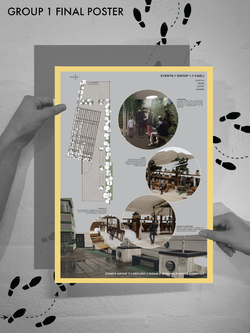
GROUP 1 - FINAL POSTER
Group 1's final poster clearly demonstrated the unique experiences that would be found within the terrace proposal. After photographing the already detailed physical model we were able to populate them to clearly show the uses of each area of the design.
These included a more enclosed space that could be used for individual self reflection throughout the day as well as social theatre screenings throughout the evening. Communal seating were shown both in the open area as well as the covered. The interactive green planting wall can also be seen, a change for the residents to take part in daily activities and add to design of the terrace in a personal way.
The plan of the terrace design was also included on the poster in order to clearly show where each perspective image is located from.
It was important to show the existing terrace on all of the posters in order to make it clear for the need of these new design proposals, especially for those that are not aware of the House design.
Posted 7 Apr 2019 09:05

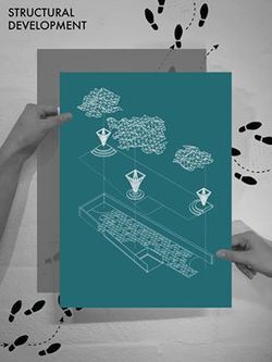
Group 2 - STRUCTURAL DEVELOPMENT
Group 2 came out with their final proposal with the concept of the tree garden being integrated into part of the canopy structure. The 'tree trunks' was proposed to be constructed through timber joists while the canopy will be constructed through carbon fiber. The whole structure will generate a light and open environment to the whole roof terrace. Timber seating were also in cooperated as part of the structure to provide seating for the users.
The organic roof structure will also be built it repetitions of triangles where the same triangle language will be reflected to the pavement design on the roof terrace. The triangular pavement design will be used to provide guidance for the user along the site, creating a circulation path. The triangular pavement will be placed at strategic locations to create a 'fading' effect and to soften the boundary between the pavement and wetpour material used for the other parts of the site. Certain triangular formed grass patches were also integrated as part of the pavement design.
Posted 7 Apr 2019 08:44
Week 2 - Day 05
Here is a poster showing each page within the completed booklet on 'How to use the North West Film Archive' which will be used to highlight the facilities and steps required for students to request footage from the Archive.
Posted 6 Apr 2019 22:52

Week 2 – Day 05
Town Hall On-Screen Premiere
Friday marked the last day of Events. It was also the make or break day in regards to the Film premiere. However, thanks to everyone’s valuable effort, careful planning and thorough checks throughout the two weeks of the events. We were very optimistic that everything was going to work out, which it did.
We started the morning by meeting at the Cornerhouse theatre at no. 70 Oxford Road. We had a look at the venue space to make sure that everything was ready. All equipment was set up to allow for everything to transition smoothly with this done we carried out a test premiere before members of the public arrived. We already knew that the film was already going to be formatted correctly with both sounds and visuals being at the optimum levels, but it’s always good to double check.
At 1 pm, it was time to premiere the Film. Everything went exactly as planned with the master students providing a brief introduction to the Event and the archive guide booklet. Finally, the Film was shown to the public and our collaborator Geoff Senior. The overall reception was great, and our collaborator was also pleased with the outcome and mentioned that both the film and guide booklet would be great additions to the archive to further advocate the uses of the archive to Higher Education Students.
We want to thank everyone who attended the premier to view Manchester Town Hall: On-Screen. We would like to especially thank the 1st and 2nd years for the valuable contributions and engagement over the past two weeks, without you it would not have been possible and to such a high standard, thank you. We want to thank, Geoff Senior and all the members at the North West Film Archive and Sam Heitzman from the Digital Media+ team for providing the information and skills necessary to make the film and booklet and we hope you enjoy the final outcomes as much as we did making them.
Thank you,
Group D
Posted 6 Apr 2019 22:45

As Events is coming to an end, our group worked towards finalising the film. Brushing up on minor errors to ensure it is of high quality. We started off the day by reviewing the final film and making notes of a few improvements we could make to the texts, sound effects, video transitions & etc. Together we worked hard as a team to make these minor changes as time was running low. Sound in particular was adjusted as there were moments were the volume of the footage would appear to get dramatically louder. This was a simple fix and adjusting the sound bar allowed us to fix this issue.
The leaflet team were working on the final output by putting sheets together and adding final touches to the booklet. The booklet had been sent to Geoff Senior for comments and these had to be incorporated in the final booklet, before review tomorrow. It was at this point where we ensured the booklet was referenced properly where appropriate and added the acknowledgements.
The final touches were completed and we’re ready for the premiere of Town Hall: On Screen and the release of the instructional guide tomorrow!
Posted 6 Apr 2019 22:02
DAY 10
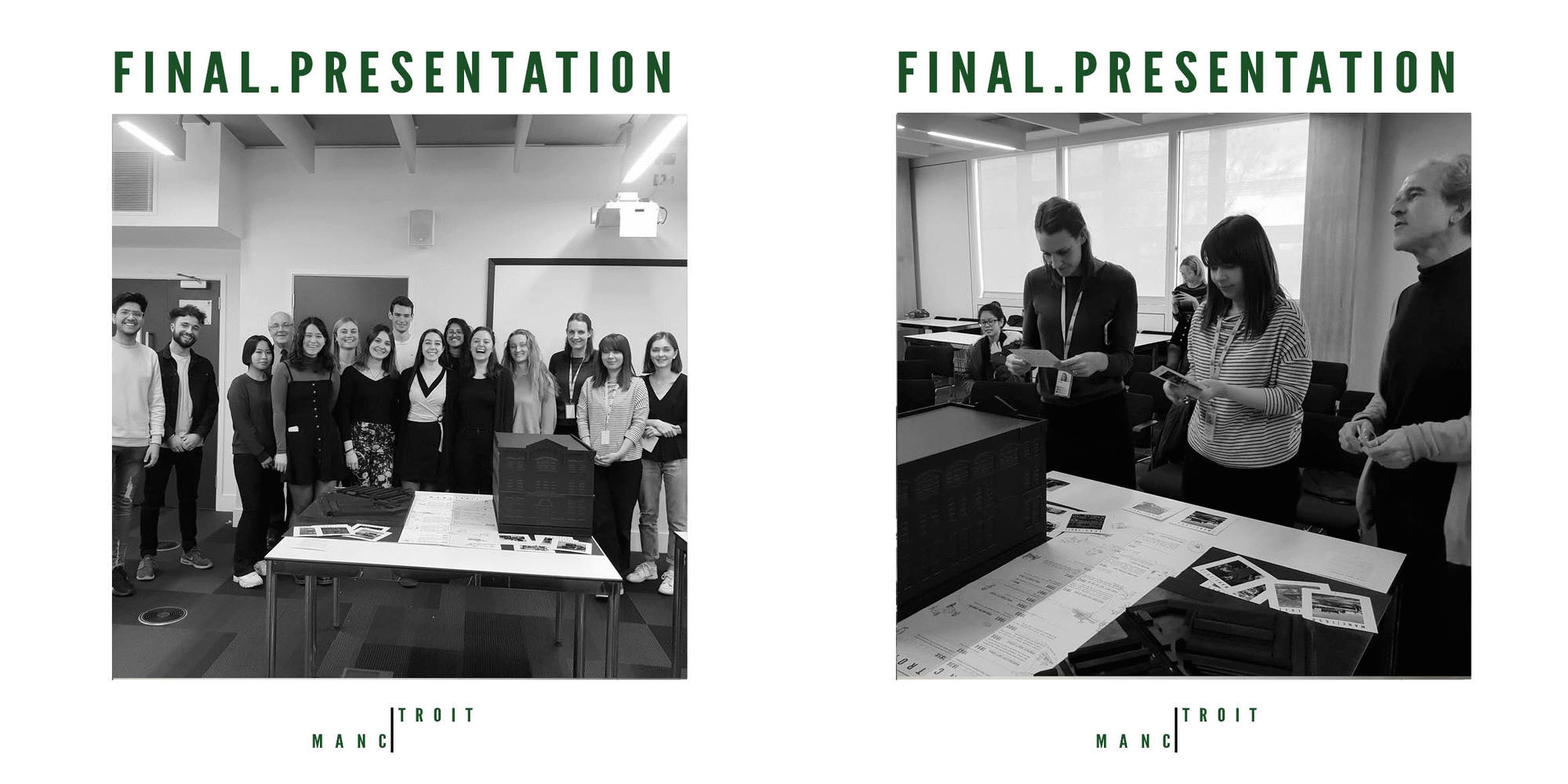
The final day marked the end of the 2 week events project. We were able to practice our presentations in the morning and also ensure the model was all ready to go. We presented to our collaborators from the Science and Industry Museum, Dominic Sager as well as Kevin from the St Anthonys centre in Trafford; a small heritage centre in trafford park! The presentations were a success and all collaborators were thoroughly impressed with the level of detail shown in the models, as well as the information provided to them. We aim to donate the exhibition piece to the St Anthonys Centre in June, where Kevin hopes to display it and invite local historians too view it too! Katie was impressed with the quality of work and has gone away with ideas for the museum! To conclude the project, we have worked towards our original brief of 'how can we tell a story through model making' with particular attention to Henry ford, his journey to Manchester and the much loved Model T!
Posted 6 Apr 2019 20:59
FINAL OUTPUT
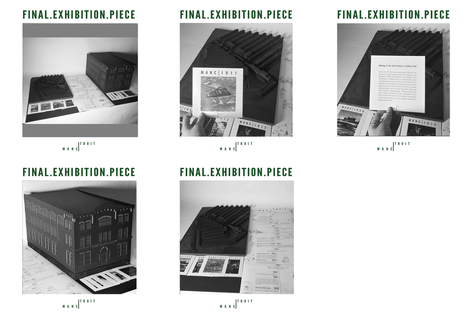
We were finally able to put all of our hard work together into a coherent exhibition piece. To the right we have the 1:50 model of the Piquette plant in detroit from 1905. In the middle we have displayed the timeline, documenting the history of Henry Ford and his journey to Manchester and ultimately this journey ends on the left with the Ford factory in Manchester (modelled from 1926!) (Manc Left, Troit Right!) The post cards correlate to key dates from the timeline and give the audience a more thorough insight into that particular date or event!
Posted 6 Apr 2019 20:52
PICTURE OF OUR MODEL
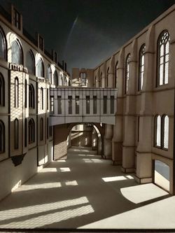
Final complete model.
Posted 6 Apr 2019 17:34
PICTURE OF OUR MODEL
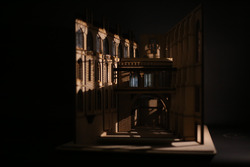
The model with shadow.
Posted 6 Apr 2019 17:30
PICTURE OF OUR MODEL
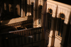
To make the model detailed, each part of the model has more than three layers.
Posted 6 Apr 2019 17:24
